19 Purple Bedroom Ideas with Elegant Decor Inspiration
Purple has long been associated with royalty, mystery, and creativity, and in the bedroom, those qualities create an atmosphere that feels both elegant and deeply personal. From soft lavender and airy lilac to silvery wisteria, rich plum, and dramatic aubergine, every shade of purple brings its own character. It can feel romantic, calming, luxurious, or bold depending on how it is layered.
The secret to a beautiful purple bedroom is confidence and balance. Rather than using purple as a small afterthought, build the palette with complementary metals, natural textures, and carefully chosen accent tones. These 19 purple bedroom ideas explore different shades, styles, and levels of intensity to help you create a space that feels sophisticated, distinctive, and beautifully put together.
Lavender Linen Bedroom Retreat
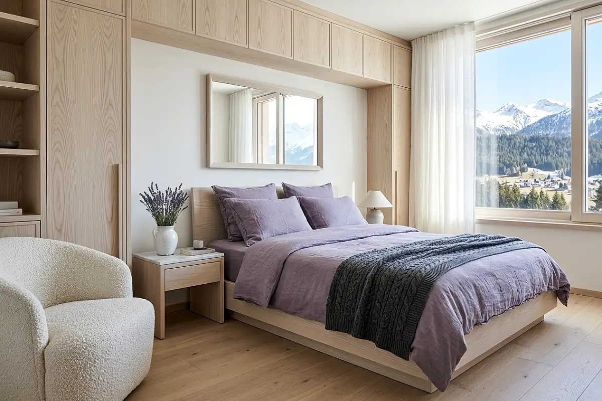
Lavender — the softest, most translucent end of the purple spectrum — in an unwashed linen or stonewashed cotton bedroom creates a space with the specific quality of early morning light through net curtains: pale, quiet, slightly luminous, and deeply restorative. Paint the walls in a genuinely soft lavender that retains warmth rather than tipping into cold lilac — Farrow & Ball’s Calluna at half strength, or Benjamin Moore’s Lavender Mist in a flat finish, both achieve this balance between colour presence and airy lightness. Echo the lavender across every textile in slightly varying tones: a duvet cover in washed linen the colour of dried lavender flowers, pillow covers in a slightly greyer mauve, a waffle-weave throw in the palest blush-lavender. The furniture should be in pale bleached oak or white-painted wood — nothing heavy or dark — so the room keeps its airy, weightless quality throughout. Fresh lavender bunches in a simple white ceramic vase on each nightstand introduce the scent that completes the sensory picture. A linen drum shade on each bedside lamp in warm white throws the gentlest possible light, and at dusk the entire room takes on a quality somewhere between lilac and gold that no other colour palette can quite replicate.
Pro Tip
Lavender paint reads very differently under natural and artificial light — it can shift from a warm, rosy mauve in morning sun to a cooler, bluer lilac under overhead LED light. Test swatches under both conditions in your specific room before committing, and choose bulbs at 2700K to maintain the warm, rosy quality that makes lavender feel elegant rather than clinical.
Deep Aubergine Velvet Luxury Bedroom
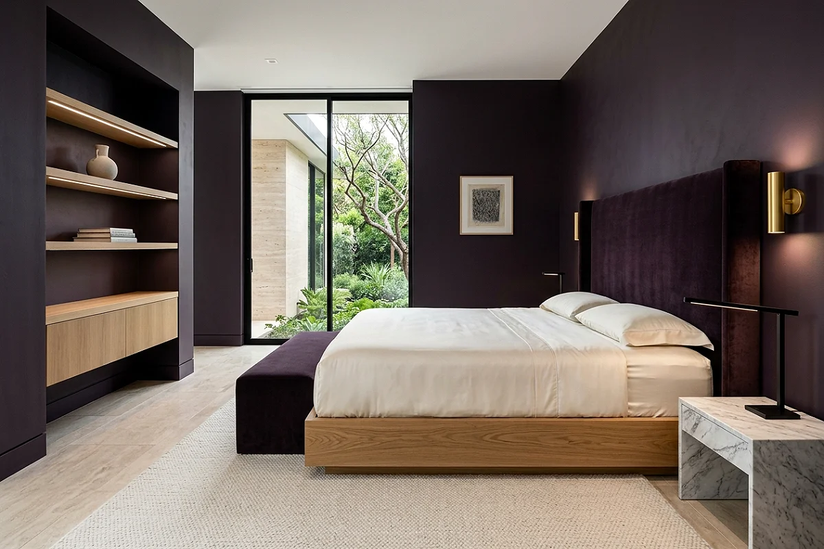
Aubergine — that deep, nearly-black purple with as much brown and red in it as blue — is arguably the most sophisticated shade in the entire purple family, and in a bedroom, it creates a space of genuine, unambiguous luxury. It belongs in the same conversation as midnight blue and forest green: a dark, enveloping wall colour that transforms the room after dark into something that feels deliberately and specifically designed for rest and indulgence. Paint all four walls in a rich aubergine — Little Greene’s Purpleheart or Farrow & Ball’s Brassica pushed a shade darker — and introduce the same tone across the primary upholstered surfaces: a velvet headboard in deep plum, a quilted velvet duvet in the same aubergine family, cushions in slightly lighter and darker versions of the core tone. The furniture should be in dark, warm materials: aged walnut, lacquered ebony, or black-painted wood with brass hardware. Introduce gold throughout as the accent metal — a pair of gilded sconces flanking the headboard, a brass-framed mirror above the dresser, a tarnished gold-leaf side table — because aubergine and aged gold share a warm, red undertone that makes them deeply harmonious. Bedding in ivory silk or cream satin provides the only light surface in the room, glowing against the deep walls with the quality of candlelight.
Pro Tip
Aubergine walls benefit enormously from a single large artwork in warm tones — a deep amber abstract, a ruby-and-gold botanical illustration, or an oil painting with ochre and umber in its palette. Art with cool or blue-dominant tones will recede against aubergine walls almost entirely; warm-toned art advances and anchors the room with a focal point the dark colour would otherwise absorb.
Plum and Gold Victorian Bedroom
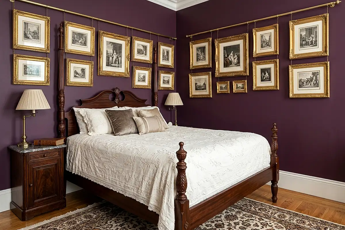
The Victorian era understood plum better than any design period before or since — it appeared on drawing-room walls, on velvet drapes, on the spines of cloth-bound books, and on the upholstery of button-back chairs in the rooms of people who understood that beauty and comfort were not competing values but complementary ones. A bedroom built on Victorian plum principles begins with rich, deeply saturated walls in a true plum — a purple with unmistakable red in its base, like Farrow & Ball’s Pelt or Benjamin Moore’s Plum Perfect — and layers in every material associated with Victorian domestic comfort. A cast iron or carved mahogany bed frame with a tall, arched headboard. Bedding in cream or ivory with lace trim or an embroidered coverlet. Heavy velvet curtains in matching plum or in a complementary deep burgundy, pooling slightly on the floor. Gold picture-rail hooks suspending a salon-wall arrangement of gilded frames above the bed: oil portraits, botanical prints, a convex mirror, a small landscape. A crystal chandelier overhead. On the dresser, a collection of brass candlesticks, a cut-glass perfume tray, and a hand mirror with a gilded handle. This bedroom should feel like it belongs to someone who reads widely, collects deliberately, and takes genuine pleasure in the rooms they inhabit.
Pro Tip
Victorian-era plum rooms used picture rail rather than individual wall fixings — a horizontal rail running around the room near the ceiling from which pictures hang on adjustable chains or cords. Installing a proper picture rail not only allows you to reposition art without new nail holes in dark paint, but it is one of the most authentic and period-correct details you can add to this aesthetic.
Wisteria and White Romantic Bedroom
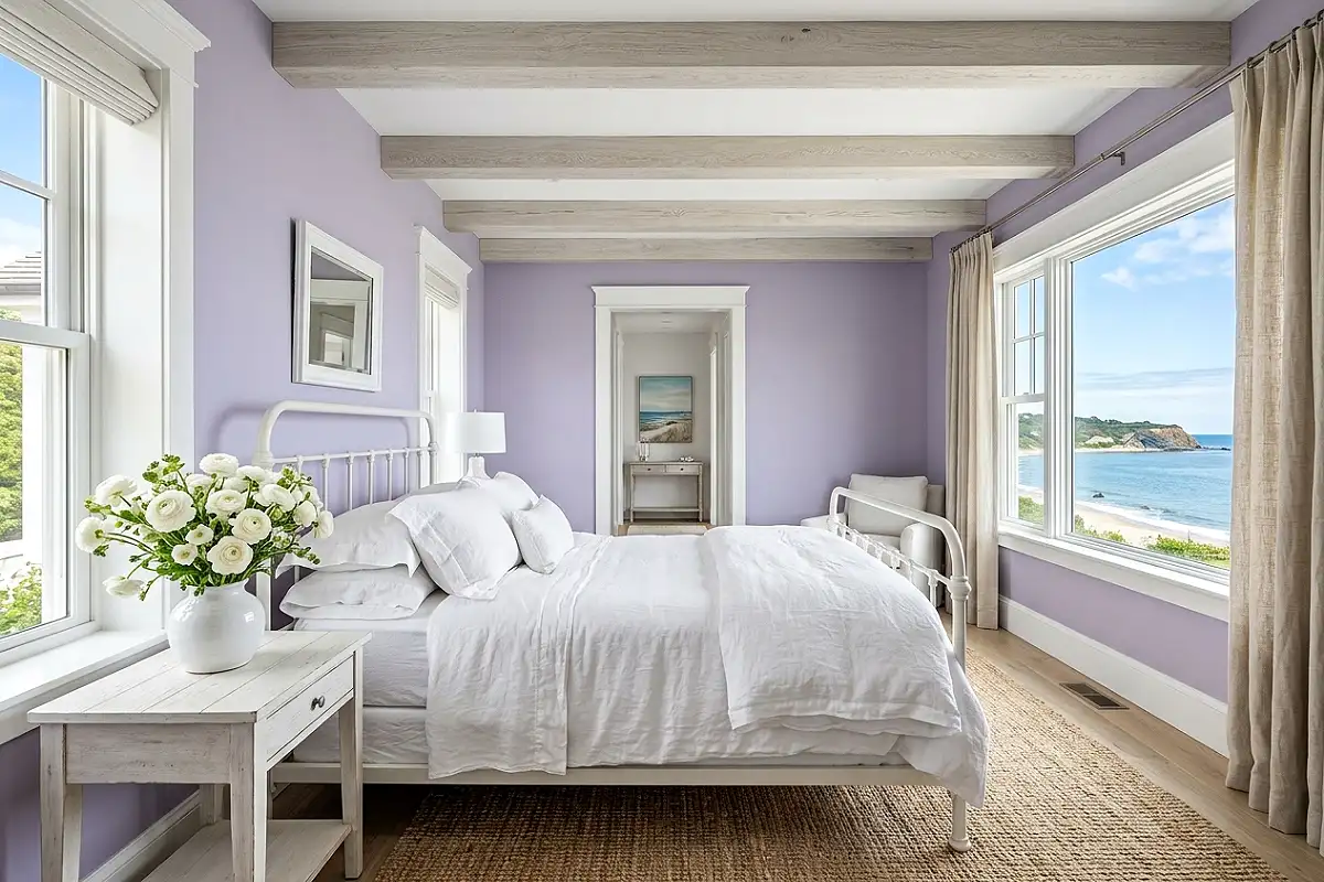
Wisteria — the particular purple that sits closest to grey and blue simultaneously, the colour of the flower itself at the moment just before it opens fully — in a bedroom with white woodwork and white linen creates the most effortlessly romantic atmosphere of any purple shade. It has a quality that designers call “romantic without trying”: the colour does the emotional work so gently that the room never feels over-decorated or self-consciously pretty. Paint the walls in wisteria — Sherwin-Williams’ Wisteria or Benjamin Moore’s Spring Violet in a flat or low-sheen finish — and keep everything else in the room in crisp, clean white: white woodwork, white linen bedding, white-painted furniture. Dress the bed in an abundance of white linen: an oversized duvet, pillow covers in white cotton and the palest grey-lavender linen, a white cotton matelassé coverlet. Add fresh flowers liberally — white ranunculus, pale purple sweet peas, white garden roses in generous posies on the dresser and nightstands — because in this bedroom, fresh flowers are not a decorative accent but a structural element of the design. A delicate wrought-iron bed frame in white or antique ivory. Sheer linen curtains at the windows. Morning light turns the whole room the colour of a sky about to become entirely clear.
Pro Tip
Keep all white elements in the room tonally consistent — all warm white, or all cool white, but never mixed. Warm whites beside wisteria create a soft, vintage quality; cool whites beside wisteria create a crisper, more contemporary freshness. Decide on your tonal register and hold it across every white surface in the room.
Mauve and Dusty Rose Tonal Bedroom
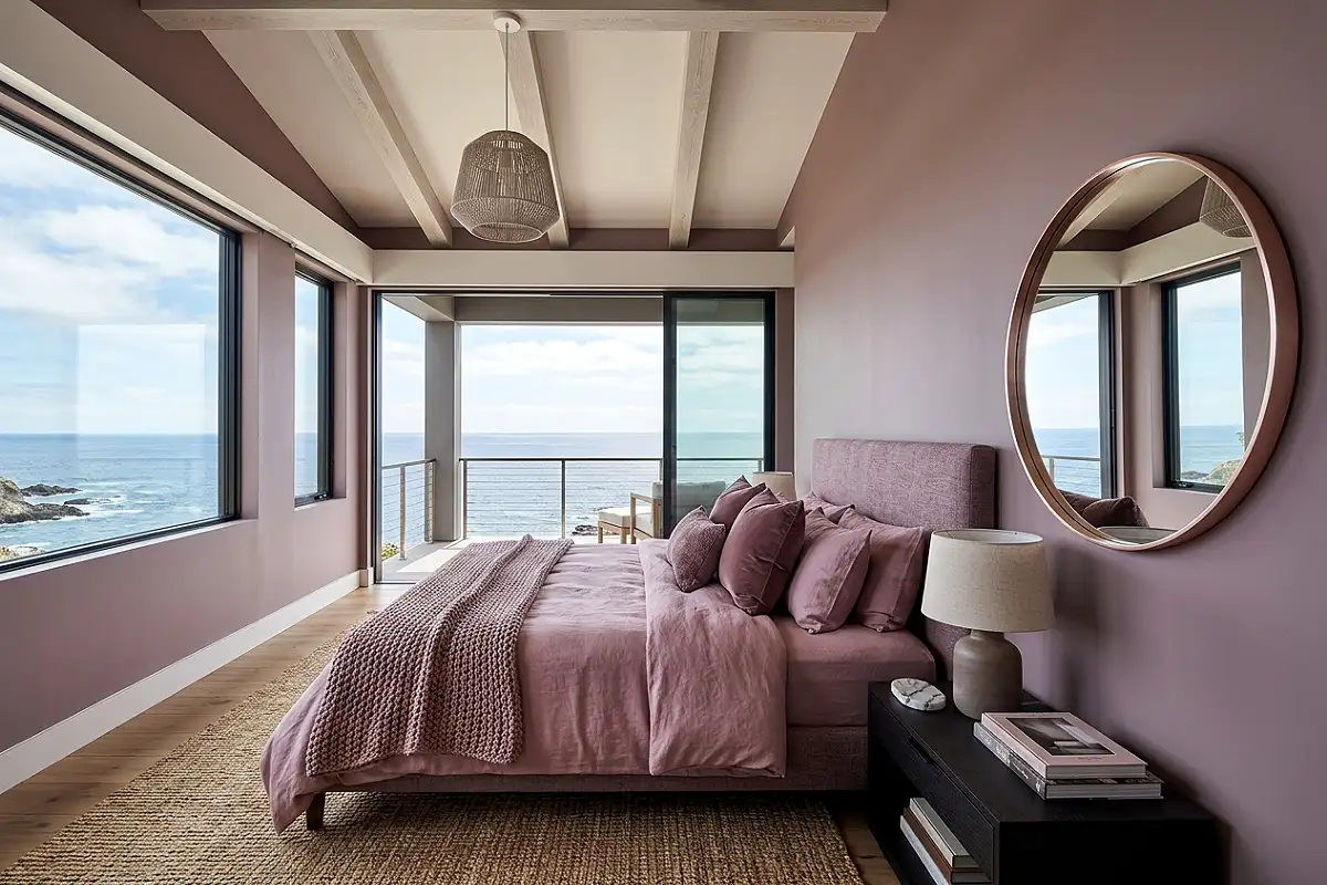
Mauve occupies the exact territory where purple meets pink meets grey, and in a tonal bedroom — where every surface exists within the same dusty, muted rose-mauve family — it creates a room of extraordinary visual softness and contemporary elegance. The key is that the tones must genuinely vary: walls in a slightly greyer mauve, bedding in a warmer dusty rose, cushions in a deeper plum-pink, a throw in the palest blush. None of these should be bright or saturated; they all need that dusty, slightly greyed quality that makes them feel like colours bleached by decades of good light and gentle use. Choose paint for the walls in Farrow & Ball’s Sulking Room Pink or Mizzle pushed toward its purple reading — something that refuses to be definitively pink or definitively purple. Furniture in pale stone, natural linen, or white-painted finishes. Brass or rose gold in all metal fixtures — the warm metal responds to the warmth in the mauve’s pink undertone and prevents the room from reading as cold. A large round mirror in a rose-gold or brushed brass frame reflects the layered tonal palette back at itself and doubles the apparent depth of the room’s colour story. The Zara Home bedding collections consistently offer exactly the kind of dusty, non-synthetic mauve and rose tones this look demands at an accessible price point.
Pro Tip
In a tonal mauve-and-rose bedroom, texture variation is the entire design. Every piece should have a different surface quality — matte plaster walls beside a woven linen duvet beside a velvet cushion beside a knitted throw beside a silk pillowcase. The colour barely changes; the surfaces change constantly. Without that textural variation, a tonal room reads as flat and unfinished.
Violet and Dark Wood Moody Bedroom
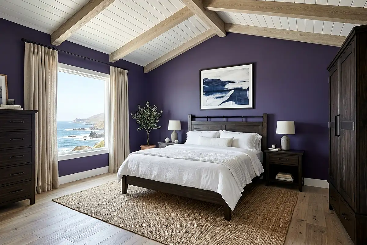
A true violet — neither too red nor too blue, sitting at the centre of the purple spectrum with maximum colour intensity — paired with dark, richly grained wood creates a bedroom of considerable moody authority. This is not a gentle or ambiguous room: it makes its intentions clear from the moment you walk in. Violet walls — Benjamin Moore’s Violet Mist deepened by two shades — create a ground of genuine colour presence. Against those walls, introduce dark wood furniture in aged walnut, blackened oak, or a deep espresso stain: a solid timber bed frame with a panelled headboard, a matching dresser with turned legs, a wooden trunk at the foot of the bed. The contrast between the vibrant violet walls and the sombre dark wood creates a tension that feels genuinely sophisticated — the colour and the material check each other, preventing either from overwhelming the room. Bedding in white or the palest silvery grey linen gives the eye a resting point. A large antique or dark-framed mirror. Iron or pewter hardware throughout — darker than brass, cooler and more serious, perfectly calibrated to violet’s complex undertone. One large amethyst-toned art glass vase on the dresser bridges the colour of the walls and the material of the furniture in a single beautiful object.
Pro Tip
Violet and dark wood need a strong vertical element to prevent the room from feeling heavy at eye level — a floor-to-ceiling bookshelf, tall drapes hung well above the window frame, or a tall artwork that draws the eye upward all work well. Without vertical relief, the combination of a dark wall colour and dark furniture can compress the room visually in a way that feels oppressive rather than intimate.
Lilac and Silver Contemporary Bedroom
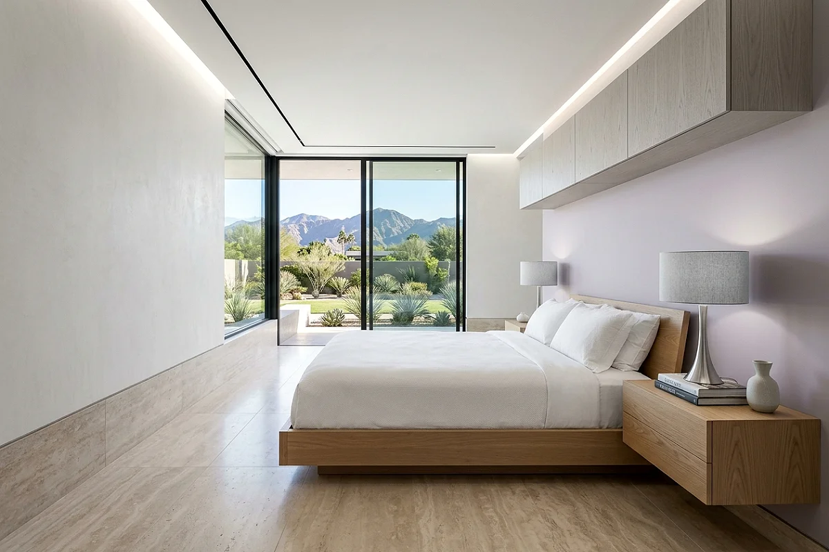
Lilac — the coolest, most blue-inflected of the lighter purples — responds to silver and cool metallics in the same instinctive way that warm purples respond to gold. The combination is contemporary, precise, and carries a particular quality of winter light: clear, cool, slightly crystalline. Paint the walls in a genuine lilac — Dulux’s Lilac Mist or Benjamin Moore’s Amethyst Shadow at half strength — and introduce silver as the accent metal throughout: brushed silver bedside lamp bases, a polished nickel mirror frame, silver-threaded cushion covers in a pale silk or jacquard, chrome or satin nickel drawer hardware. The bedding in the crispest possible white cotton — no warmth, no cream — because cool white beside lilac creates a freshness that ivory would interrupt. Furniture in pale grey-painted MDF or light ash wood stays tonally cool and lets the lilac be the room’s warmth. A silver or mirrored ceiling light fixture overhead — a flat disc pendant or a cluster of glass globes. Sheer voile curtains in white or the palest icy grey at the windows, allowing maximum light while softening the view. This bedroom has the uncluttered, modern quality of a very good boutique hotel room without any of the impersonal quality that description usually implies.
Pro Tip
In a lilac-and-silver bedroom, avoid any warm tone entirely — no wood, no brass, no cream. The moment a warm element enters the palette, the cool precision of the combination dissolves. If the room needs visual relief, add it in a cool accent: a pale icy blue cushion, a grey-toned plant pot, a white marble surface — never amber, honey, or terracotta.
Purple Botanical Maximalist Bedroom
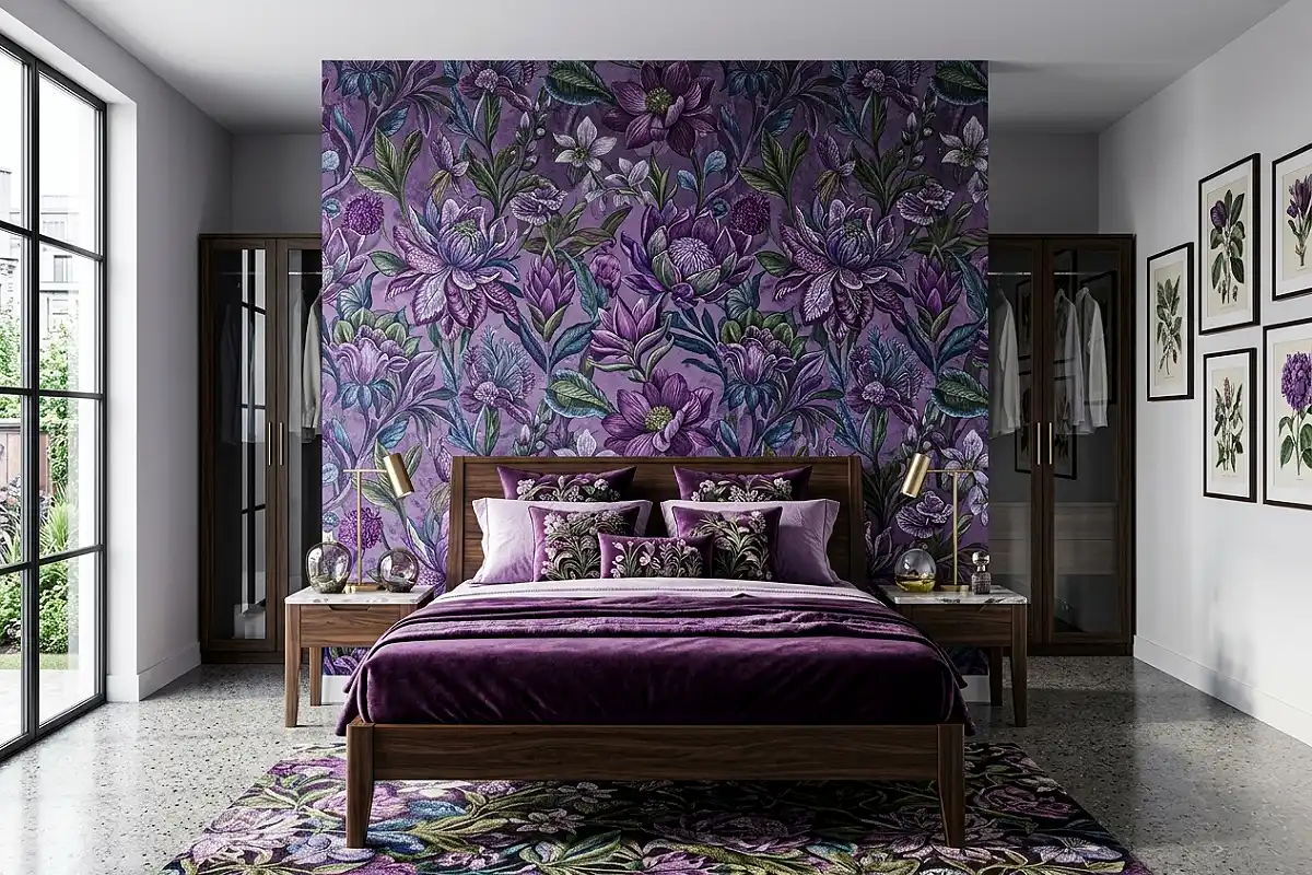
A maximalist bedroom built around purple and botanical references — the two most naturally allied design languages in existence, given that the finest botanical prints have always been full of purples, lilacs, and violets beside deep greens and ivory grounds — creates a room of genuine visual abundance that never tips into chaos because the colour palette holds it together. Wallpaper the bed wall in a large-scale botanical print where purple and violet flowers dominate the composition against a deep green or ivory ground — Designers Guild’s Tulipa Stellata collection produces exactly this kind of richly coloured botanical drama. Paint the remaining walls in a tone pulled from the wallpaper’s ground colour — a deep sage, a warm ivory, or a muted lilac. Layer the bedding in complementary tones: a velvet duvet in the deepest purple from the wallpaper’s flower palette, cushions in a botanical embroidered cotton, a green silk throw that references the paper’s foliage. Frame botanical prints on the walls that relate to the wallpaper’s species. Stack flower-illustrated hardcover books on the nightstand. Fill a generous jug with fresh peonies, sweet peas, or irises in the room’s purple tones. The room should feel like a Victorian conservatory transported indoors, all colour and botanical reference and the particular pleasure of being surrounded by things that grew.
Pro Tip
In a botanical maximalist bedroom, vary the scale of every floral reference deliberately — large overscaled wallpaper print, medium-scale embroidered cushion, small-scale sprig print on a throw pillow, tiny botanical detail on a ceramic lamp base. Consistent scale variation is the structural principle that keeps maximalism from becoming overwhelming: every element needs breathing room at its own level.
Purple and Cream French Bedroom
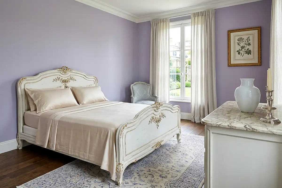
The French decorative tradition — drawing on the Louis XV and XVI periods, when the finest rooms in Europe were furnished with carved gilded wood, woven silk upholstery, and walls in the most refined colour the dyers of the time could produce — handles purple with a particular grace and lightness. In the French tradition, purple never threatens; it charms. The walls in a pale violet or soft parma-violet tone — a dusty, refined purple that has more grey in it than colour, approximating the historic shade called gris-violet. Against those walls, choose furniture with genuine French character: a curved Louis XV-style bed frame in white-painted carved wood with gilt detailing, a marble-topped commode, a bergère chair in the corner upholstered in pale cream silk with a purple woven border. Hang a large ornate mirror in a gilded frame above the dresser. Bedding in cream or the palest champagne silk, with perhaps a single purple silk cushion and a cream-and-gold throw. A chandelier in crystal or ormolu overhead. Place fresh white garden roses and sprigs of lavender together in a porcelain vase on the nightstand — the Astier de Villatte ceramics range produces pieces with exactly the right handmade, cream-glazed quality this aesthetic calls for. The room should feel like it belongs to someone who has excellent taste and is entirely comfortable with beauty.
Pro Tip
The French bedroom aesthetic requires that carved or decorative furniture details be genuinely present at close range. From across the room, all carved details read as texture; it is only on approach that the quality of the carving becomes apparent. Invest in furniture with real carved detail rather than routed or machine-pressed approximations — the distinction is always visible and always matters.
Eggplant and Copper Industrial Bedroom
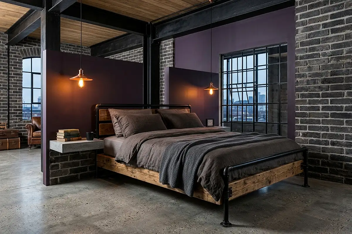
Eggplant — the deepest, most red-inflected dark purple, the colour at the very bottom of the purple spectrum where it begins to merge with burgundy and dark brown — paired with hammered copper and raw industrial materials creates a bedroom of surprising warmth and originality. The combination reads as both richly coloured and materially honest. Paint the walls in a deep, browny-purple — Farrow & Ball’s Pelt or Brinjal, both of which carry enough red to create the eggplant rather than aubergine quality — and introduce copper as the dominant metal: copper-shaded Edison pendant lights hanging above each nightstand, a hammered copper bowl on the dresser, copper pipe wall shelving beside the bed. The furniture in reclaimed timber and black steel — an industrial pipe bed frame, a reclaimed wood dresser with black metal legs, a concrete nightstand surface. Bedding in rough, undyed linen in natural oat or warm charcoal. A worn Persian rug in rust and ochre on the floor. The room has the warmth of craft and the authority of a deeply saturated colour, and the copper runs through it like a thread of firelight.
Pro Tip
Allow copper elements in this room to patina naturally rather than polishing them. Aged copper responds to eggplant walls with far greater richness than bright new copper does — the dark, warm-toned patina that develops with air exposure echoes the depth and complexity of the dark wall colour in a way that polished copper interrupts entirely.
Purple Ceiling Jewel Box Bedroom
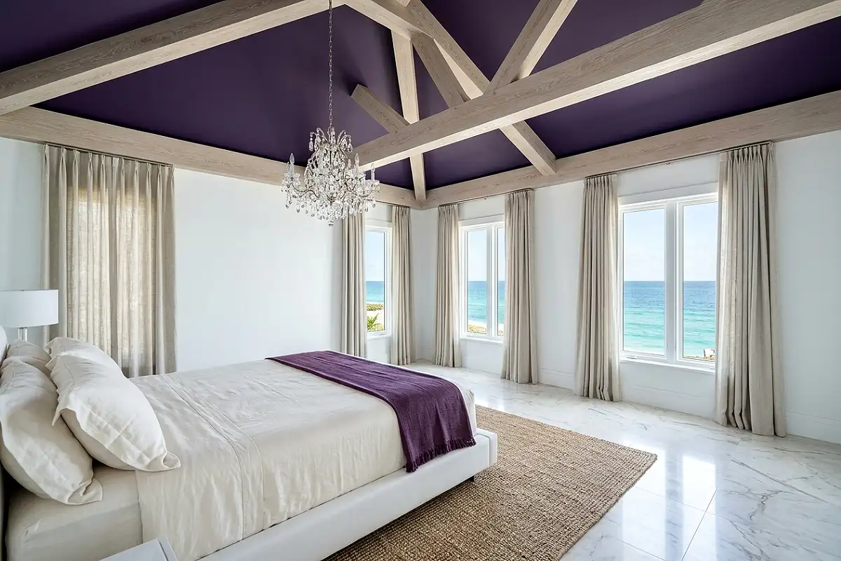
One of the most under-explored purple bedroom treatments is reserving the colour entirely for the ceiling while keeping the walls in white or the palest neutral — creating a jewel box effect where the colour sits overhead like an interior sky rather than pressing in from the sides. A ceiling in deep violet or rich plum, surrounded by white walls, creates a visual envelope that feels surprisingly intimate without the potential weightiness of four dark walls. The colour seems to float above the room rather than enclosing it. Choose a ceiling colour with genuine depth — a purple-violet like Farrow & Ball’s Pelt or Benjamin Moore’s Exotic Purple — in a flat finish so the ceiling absorbs light and appears to recede upward. The purple ceiling makes the bed below appear as though it is sitting under a velvet canopy. Hang a chandelier that drops low enough to read clearly against the coloured ceiling — a crystal piece will catch both the ceiling colour and the light, throwing tiny violet prisms across the white walls. Bedding in white or ivory with a single deep purple throw across the foot. The rest of the room in white or pale natural wood. The ceiling colour will be all that’s needed.
Pro Tip
Carry the ceiling colour 8 to 12 inches down the wall from the ceiling line before transitioning to the white wall colour — this prevents the hard junction between ceiling and wall from looking like a paint line and instead creates a soft architectural transition, as though the ceiling colour is melting gently into the room rather than stopping abruptly at the cornice.
Heather and Natural Linen Cottage Bedroom
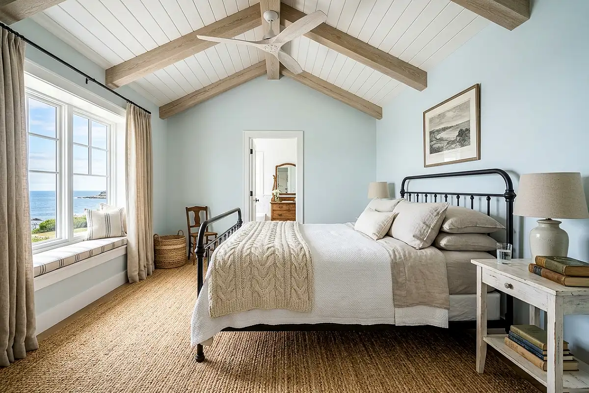
Heather — the muted, slightly smoky purple of Scottish moorland in late summer, where purple and grey and brown exist simultaneously in the same flowering landscape — brings a particular outdoor, organic quality to a bedroom that more vivid purples cannot replicate. It is a purple that has spent time in weather: faded, complex, and entirely without self-consciousness. Paint the walls in a heathered tone — Farrow & Ball’s Brassica at half strength, or a custom mix of violet with significant grey and a whisper of brown — and layer the room in natural, undyed materials that feel as though they came from the same landscape. Undyed linen bedding in the natural colour of raw flax. A chunky wool throw in an unbleached cream or a herringbone weave in cream and soft heather-purple. A jute rug, densely woven, in natural honey tones. A wrought iron bed frame in warm off-black or dark charcoal. On the nightstand, a small collection of dried heather, a candle in a simple iron holder, and a cloth-covered book. The dresser in white-painted or waxed pine. Window treatments in a soft wool or cotton stripe in cream and the room’s heather tone. This bedroom requires no effort to feel complete — it has the settled, unhurried quality of a room that has always been exactly this way.
Pro Tip
Heather tones are at their most beautiful in rooms with genuinely good natural light — the slight grey in the colour reads as silver-purple in daylight rather than simply grey. In rooms with limited natural light, push the colour a shade warmer or deeper to prevent it from reading as muddy; a touch more red-violet in the base mix keeps heather alive in low-light conditions.
Grape and Emerald Jewel Tone Bedroom
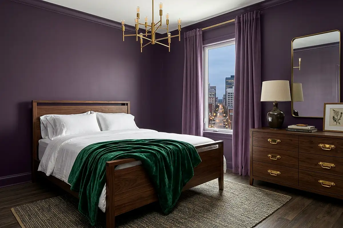
Grape purple and emerald green are colour-wheel complements that intensify each other — making the purple more purple and the green more green when placed side by side. In a bedroom, this combination has a richly jewelled, almost Byzantine quality: maximalist in its colour presence but not chaotic, because the two tones belong in the same visual family of deep, saturated hues. Wallpaper one wall in a pattern incorporating both tones — a damask, a botanical, or an ikat that moves between grape, violet, emerald, and deep jade — and paint the remaining walls in the darker of the two colours in a deep matte. Introduce the green through textiles: a silk velvet throw in emerald across the foot of the bed, an embroidered cushion with both colours in a floral pattern, a set of emerald linen pillow covers beside a grape velvet duvet. A dark walnut bed frame and matching nightstands anchor the composition so the colour pairing has a structured, furniture-led framework. Gold throughout — gilded hardware, a brass chandelier, a gold-leaf framed mirror — because in a jewel-tone room of this richness, only warm gold metal has the weight to match the colours.
Pro Tip
When combining two strong jewel tones in a bedroom, assign them a clear hierarchy before anything else: one is the dominant colour (the walls and primary upholstery) and one is the accent (throws, cushions, and smaller accessories). Trying to use both at equal visual weight creates a competition that exhausts the eye — one must lead, and one must respond.
Purple Ombre Accent Wall Bedroom
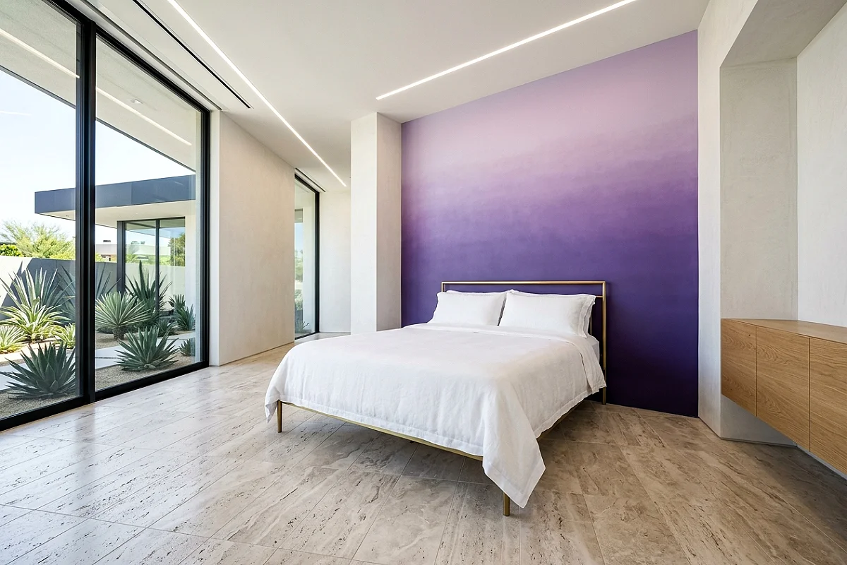
A hand-painted ombre wall that transitions from the deepest, most saturated violet at the floor line through mid-toned lavender at eye level to the palest lilac or near-white at the ceiling creates a bedroom with an almost atmospheric visual quality — the sense of colour dissolving upward into light, the way a violet sunset moves from deep colour at the horizon through progressively lighter tones toward the top of the sky. The technique requires three to five dilutions of the same purple base paint, blended wet-into-wet in broad horizontal bands. Apply it to the bed wall only, where it becomes the primary visual experience of the room. Keep the remaining walls in the very palest tone from the ombre’s top — a near-white with just enough violet to feel related. White bedding so the gradient reads clearly from the bed. A slim brass or chrome bed frame that doesn’t interrupt the wall’s colour. A single large, simply framed art print positioned within the mid-tone section of the gradient where the lavender is at its most beautiful, anchoring the ombre at human scale. This treatment is genuinely bespoke — no two hand-painted ombre walls are exactly alike — and produces a bedroom that belongs entirely to the person who made it.
Pro Tip
Use the same base paint colour in five progressive dilutions — 100%, 75%, 50%, 25%, and 10% mixed with white — rather than using five different purple paints. This keeps the ombre within a single colour’s tonal family and prevents the transitions from looking like separate colour choices rather than a continuous gradient. Work each band while the previous is still slightly wet for the smoothest possible blend.
Soft Purple Scandi Bedroom
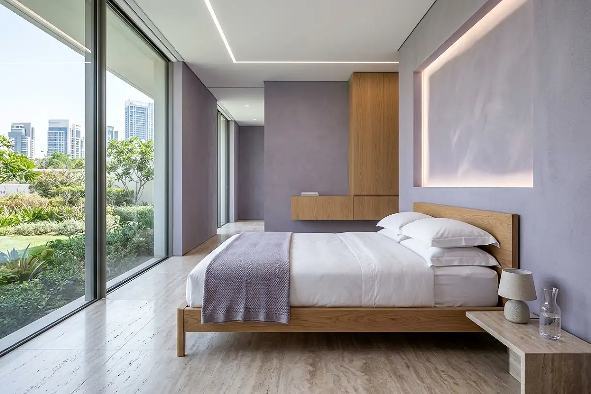
The Scandinavian interior tradition handles soft purple with a restraint and clarity that produces some of the most quietly beautiful purple rooms imaginable. The Scandi approach to colour is never to overdo it: one carefully chosen colour, applied with precision, in a room where everything else practises perfect discipline. Choose a soft, slightly greyed violet — a tone sitting between lilac and wisteria and grey all at once — and apply it to the walls in a flat, chalky finish. The furniture in pale birch, whitewashed pine, or white-painted wood throughout: a simple platform bed frame in white-oiled oak, a pair of matching nightstands, a low dresser with clean horizontal lines and simple cup pulls. Bedding in white cotton, precisely folded. A single good blanket in the wall colour’s textile equivalent — a woven wool throw in soft violet-grey — draped over one corner of the bed. A paper lamp or a simple ceramic base with a white linen shade on each nightstand. One plant in a white or grey ceramic pot: a monstera, a rubber plant, or a peace lily, chosen as much for its form as for its greenery. The room is spare, composed, and specific — the purple present enough to define the room’s character but never assertive enough to demand attention.
Pro Tip
In a Scandi purple bedroom, the single textile that introduces softness — the throw, the cushion, the bedside rug — should be in a tactile, natural material of genuine quality. A single merino or lambswool throw in a muted soft violet costs more than a synthetic alternative and performs completely differently: it has weight, drape, and warmth that changes the room’s atmosphere from furnished to genuinely comfortable.
Purple and Blush Art Nouveau Bedroom
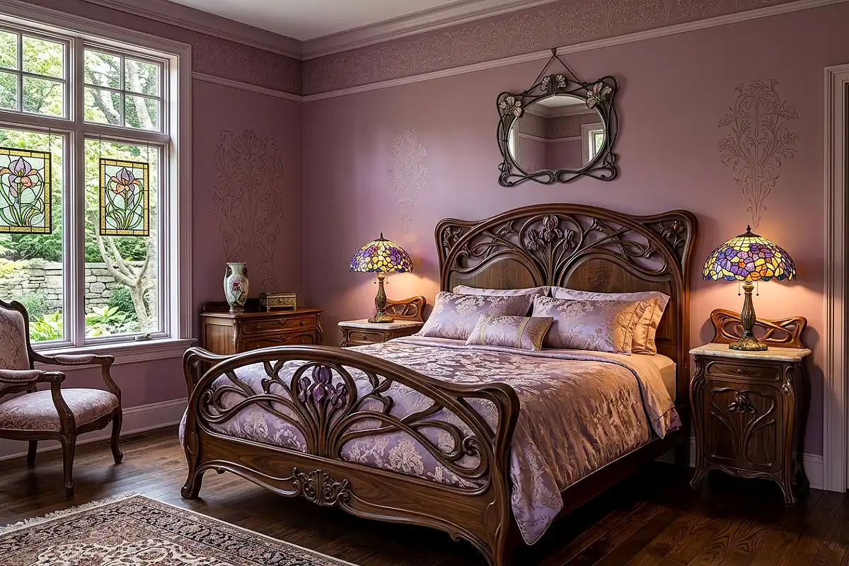
The Art Nouveau movement — which drew its entire formal vocabulary from the natural world, from the curve of a lily stem to the spread of a peacock’s tail — produced some of the most beautiful purple interiors ever designed, because purple appeared so naturally in its botanical and organic references. An Art Nouveau-inspired bedroom in purple and blush begins with sinuous, curvilinear furniture: a bed frame with a headboard whose lines flow like a wave or a tendril, a dressing table with curved legs and an organically shaped mirror, a wall lamp with a dragonfly or lily motif in stained glass or hand-blown art glass. The walls in a muted violet-rose — somewhere between mauve and dusty rose, the specific tone of a full-blown garden rose in its final hour. Textiles in silk, silk velvet, and embroidered cotton in the blush-and-violet palette. Tiffany-style stained glass lamps on each nightstand — original pieces are extraordinary, but quality reproductions in violet and amber glass create an equivalent quality of light that no conventional lamp shade can replicate after dark. The curved lines of everything in the room give it an organic, living quality that is the essence of Art Nouveau at its best.
Pro Tip
Art Nouveau’s defining formal characteristic is the avoidance of straight lines and right angles — every edge curves, every transition flows. When selecting furniture for this style, exclude any piece with sharp corners or angular profiles, no matter how beautiful it is in other respects. Straight lines in an Art Nouveau room create a visual disruption that no amount of organic styling can resolve.
Monochrome Purple Bedroom with Texture Play
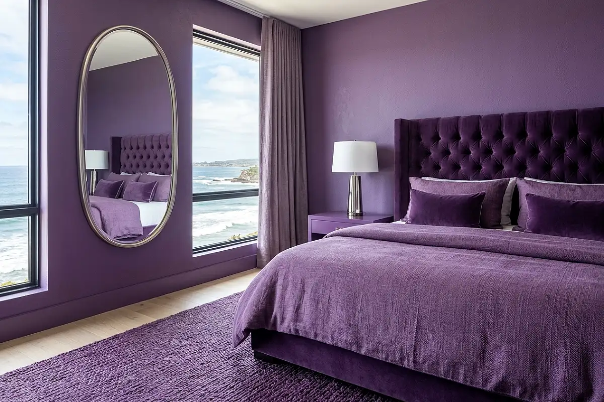
A monochrome purple bedroom — where every surface exists within a single purple tonal family, from the deepest plum on the walls to the palest lavender on the ceiling — achieves the same immersive, enveloping quality as a monochrome black room while retaining all the warmth and personality that only a colour can provide. The walls in a mid-depth violet, the ceiling in a tone three shades lighter, the floor in a pale lavender-grey stone or painted timber, and every textile in varying purple tones from near-white lilac to near-black plum. What prevents this from reading as flat is texture variation applied as aggressively as possible: matte painted walls beside a velvet headboard beside a woven linen duvet beside a silk cushion beside a hand-knit purple throw. Every surface in the same tonal family; every surface with its own material character. The hardware and fixtures in silver, pewter, or nickel so that the metals read as cool and tonal rather than introducing a warm accent that breaks the palette. A large oval mirror in a brushed silver frame multiplies the purple environment and makes the room feel dimensionally larger within its own tonal world.
Pro Tip
In a monochrome purple room, the tonal relationship between the wall colour and the ceiling colour is critical. The ceiling should be exactly three to four shades lighter than the walls — use the same paint brand’s tonal scale to select both. Too little difference and the ceiling loses its sense of height; too much difference and the pale ceiling reads as white and breaks the monochrome quality entirely.
Amethyst Crystal and Candlelight Bedroom
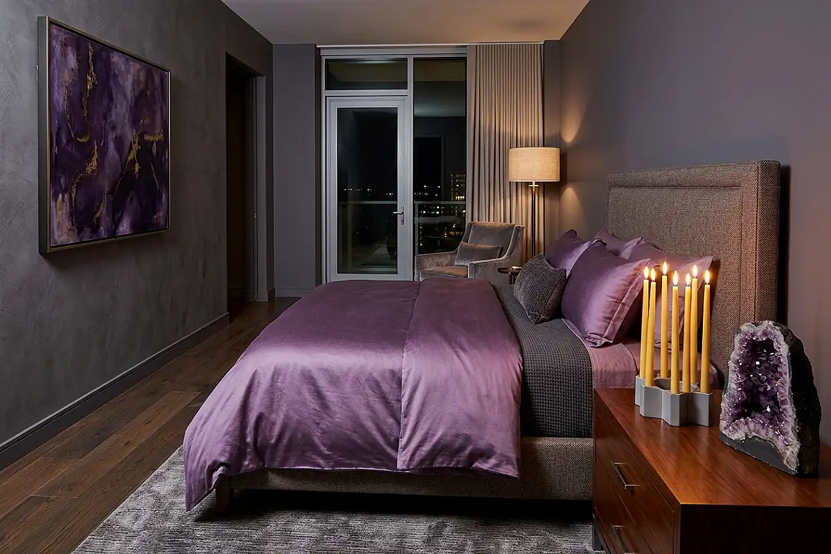
Amethyst — the specific purple of that semi-precious stone, a slightly cooler, more blue-inflected violet with an inner luminosity that catches light from multiple angles — is one of the most genuinely beautiful colours for a bedroom designed, first and foremost, for sensory pleasure after dark. Paint the walls in a cool, clear amethyst violet — Benjamin Moore’s Amethyst Shadow or a custom mixture with a slightly blue base — and design every decision around how it will look under warm, flickering light rather than daylight. Choose textiles with reflective qualities: a satin duvet cover in deep amethyst, silk cushion covers in violet and lilac, a crystal-beaded throw pillow that catches candlelight in dozens of small points of light. The furniture in pale silver-grey lacquer or mirror-polished chrome — cool and reflective, amplifying candlelight. A cluster of crystal candlestick holders on the dresser in varying heights, holding unscented beeswax tapers. A rock amethyst crystal cluster displayed on the nightstand — the single most on-theme and genuinely beautiful styling object this room can hold. After dark with candles lit, this bedroom has a quality of light found in almost no other domestic interior.
Pro Tip
Design this bedroom’s lighting in two completely separate modes: daytime functional and evening atmospheric. Install a dimmer on every circuit, use standard warm LED bulbs for daytime tasks, and then — for the room’s true evening character — rely on candlelight alone supplemented by a single very low-output lamp. The shift between modes is dramatic, and the candle-lit version of an amethyst bedroom is its defining experience.
Purple Bedroom with Natural Stone and Linen
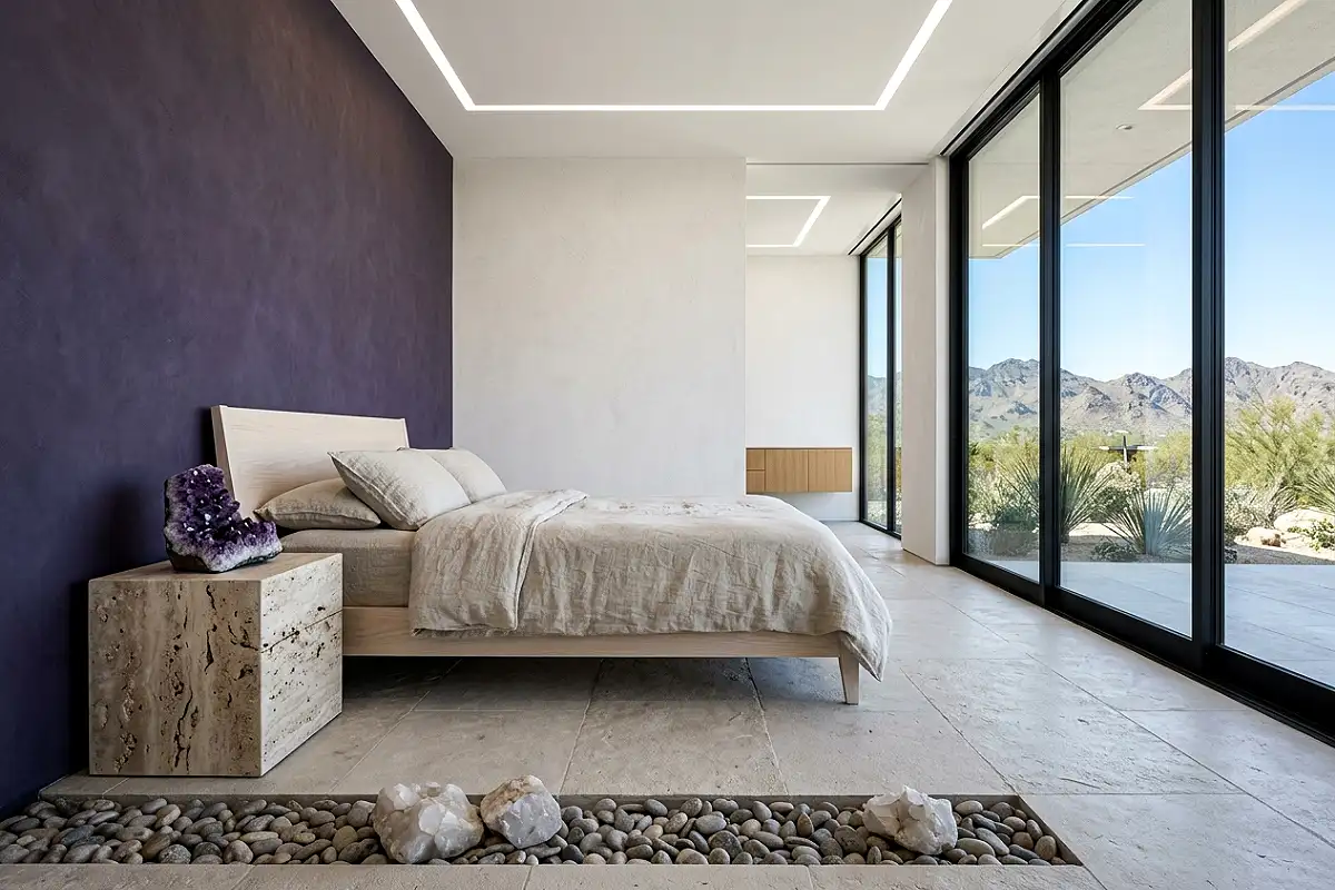
One of the most current and considered approaches to the purple bedroom pairs it with raw, honest natural materials — travertine, limestone, undyed linen, raw plaster, unfinished timber — that ground the colour’s inherent romance in something tactile and genuinely elemental. This is a contemporary purple bedroom built on the principle that a single powerful colour beside honest natural materials creates a more interesting and more lasting room than either could achieve alone. Paint the walls in a strong, clear purple — a medium-depth violet or a warm lavender with genuine colour presence — and introduce stone surfaces throughout: a travertine nightstand, a limestone floor, a raw plaster bedside shelf. The furniture in unfinished oak or pale ash, natural grain visible. Bedding in undyed linen in its natural flax tone — not white, not cream, but the actual colour of raw linen, which has a warmth and specificity that manufactured neutrals cannot replicate. One large raw-edged amethyst stone — genuinely large, placed on the floor beside the bed or on a low stone shelf — bridges the mineral quality of the stone surfaces and the colour of the walls in the most direct possible way. This bedroom has the confident simplicity of a room designed by someone who understands that beauty doesn’t require complexity, only conviction.
Pro Tip
When pairing purple walls with natural stone surfaces, ensure the stone’s undertone responds to the purple’s base colour. Travertine with warm honey tones pairs beautifully with warm, red-based purples like plum and aubergine. Cooler grey limestone or white marble works better beside cooler, blue-based purples like lavender and lilac. The wrong stone-purple combination creates a colour clash that no amount of styling can resolve.