
21 Pink Bedroom Ideas with Chic Decor You’ll Love
Pink is one of the most underestimated colors in bedroom design. Far from being overly sweet or predictable, it offers an impressive range of tones—from barely-there blush that works like a warm neutral to sophisticated dusty rose that adds depth and character.The key is choosing a specific shade and balancing it with texture, natural materials, and thoughtful contrast. A successful pink bedroom feels intentional rather than themed, with every element working together to create warmth and personality.
These 21 ideas explore the full spectrum of pink, from subtle accents and soft palettes to bold, statement-making rooms. Whether you’re refreshing an existing space or starting from scratch, use these ideas as inspiration to find a pink look that feels stylish, layered, and uniquely yours.
Dusty Rose Linen Walls
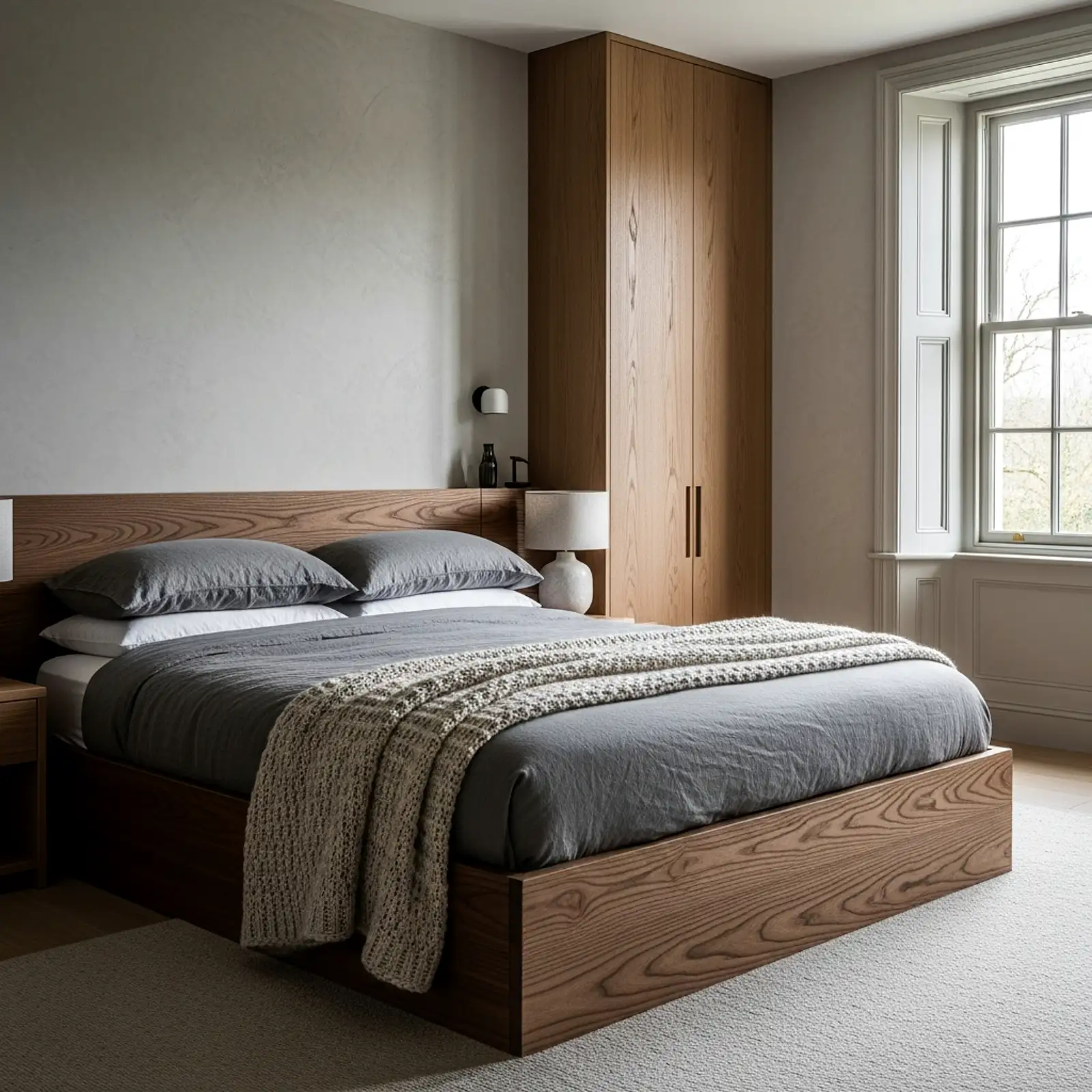
Dusty rose — not candy pink, not hot pink, not the blush that comes in most paint store sample booklets, but the specific grey-pink that sits between a faded terracotta and a muted mauve — is the one pink tone that functions as a warm neutral and as a genuine color simultaneously. On walls, it deepens in the evening under warm amber lamplight into something that reads almost like a very faded antique rose, and it warms the complexions of everyone in the room in a way that no grey or greige can match. Farrow & Ball’s Calamine and Dead Salmon, Benjamin Moore’s Pale Blush and Brick Dust, and Sherwin-Williams’ Mellow Coral all sit in this category. Pair with warm ivory woodwork, natural linen bedding, unlacquered brass hardware, and a jute rug for a bedroom that reads as warm and considered rather than overtly pink.
Pro Tip
Test dusty rose paint swatches in the evening under your actual bedroom lamp rather than in daylight. The warm undertones in this family of pinks activate under amber lamplight in a way that looks beautiful but can surprise — some shades that read as perfectly muted in a showroom tip orange or salmon by lamplight in a bedroom with warm bulbs. Evening testing eliminates this discovery after the room is painted.
Hot Pink Velvet Headboard with Neutral Bedding
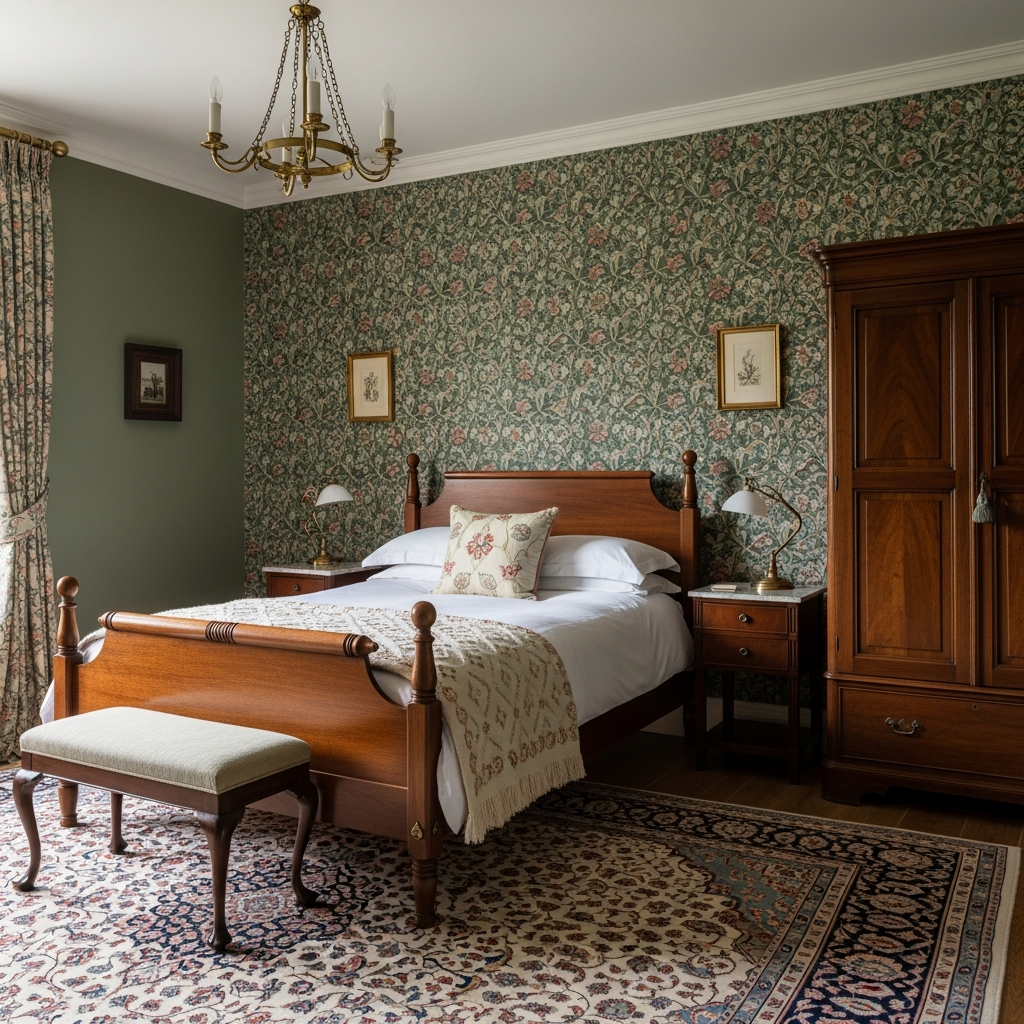
The most confident pink bedroom move available is a hot pink or fuchsia velvet headboard against a plain warm white wall — not qualified, not softened, not toned down — paired with bedding in the quietest possible neutral: plain ivory linen, crisp white cotton, warm oatmeal. The headboard does all the work; the bedding gets entirely out of its way. The visual tension between the saturated, unapologetic velvet and the completely neutral bedding is what makes this look chic rather than overwhelming — the pink has somewhere quiet to land. A tufted or channel-stitched headboard at a height of at least 48 inches works best; the drama requires scale to read correctly. This is the version of a pink bedroom that photographs best and generates the most conversation.
Pro Tip
When pairing a saturated pink velvet headboard with neutral bedding, choose bedding with a very slight warmth in its white — a true brilliant white reads as stark and clinical against the warm richness of velvet. Warm white, ivory, or the very palest warm cream bridges the temperature gap between the two without introducing a third color into the composition.
Pink and Sage Green Color Pairing
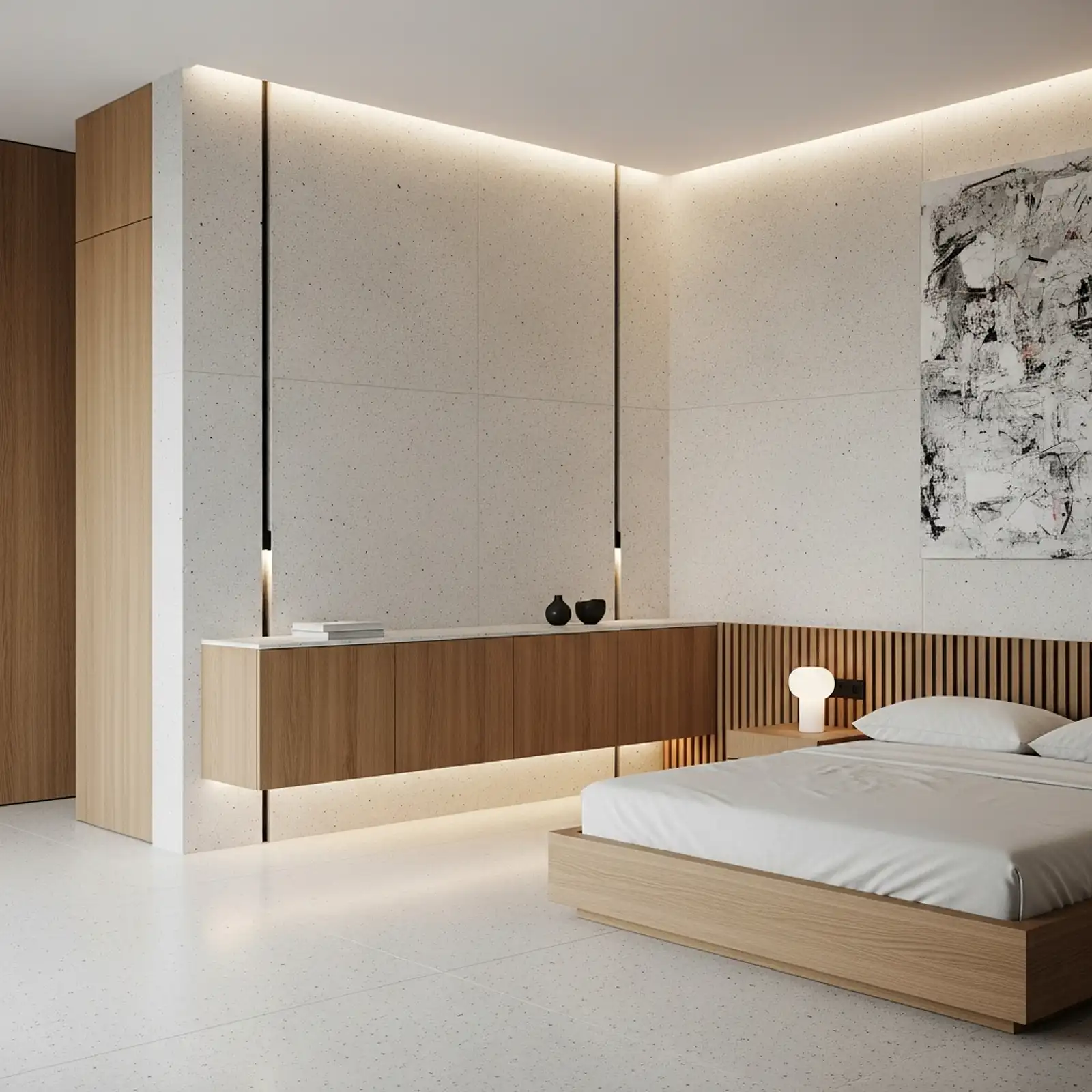
Dusty pink and sage green are one of the most naturally harmonious color pairings in the spectrum — both are muted, complex, and rooted in the same organic, botanical world that makes them feel genuinely complementary rather than coordinated by committee. Pale sage walls with a dusty rose linen duvet cover, sage green ceramic lamps with a blush pleated shade, a pink throw draped across a sage green velvet bench at the foot of the bed — the pairing works at every level of commitment. The key is keeping both tones in their muted, grey-toned versions; bright pink against bright green reads as graphic rather than beautiful. Think faded garden rather than Christmas decoration, and the combination delivers a bedroom that is quietly stunning in natural morning light.
Pro Tip
Anchor a pink-and-sage palette with a natural material that belongs to neither color — raw linen, warm oak, natural jute, or unfinished terracotta. The neutral material acts as a bridge between the two tones and prevents the room from feeling like it was decorated in a complementary pair, which reads as effortful rather than organic.
Blush Limewash Accent Wall
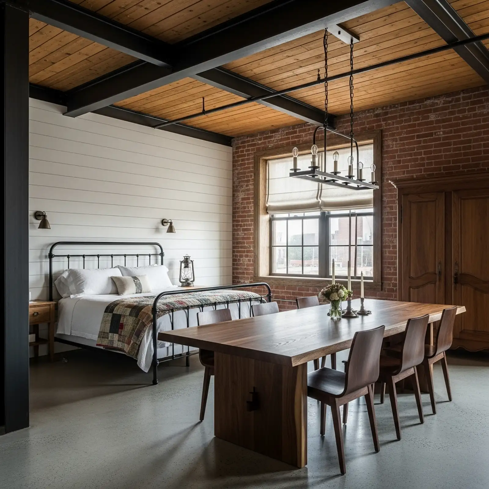
A limewash finish in a dusty blush or pale rose tone on a single wall — typically the wall behind the bed — is one of the most sophisticated ways to introduce pink into a bedroom without committing to flat painted surfaces throughout. The limewash technique creates a layered, mottled texture on the wall surface that shifts between a barely-there rose and a deeper, more saturated blush as the light changes throughout the day, producing a living quality that flat paint cannot replicate. On a headboard wall, it creates a backdrop for the bed that reads as naturally aged plaster — beautiful, organic, and entirely unlike anything that comes out of a standard paint tin. Portola Paints’ Roman Clay in Petal, Oat Cake, or Pink Champagne all sit in the right tonal range for this treatment.
Pro Tip
Apply limewash in a deliberate X-stroke pattern with a wide natural-bristle brush rather than in horizontal or vertical passes. The cross-direction application creates the most naturalistic variation in coverage — some areas lighter, some deeper — that makes the finished wall read as genuinely aged plaster rather than as a paint technique applied to drywall.
Pink Floral Wallpaper with Warm Brass Fixtures
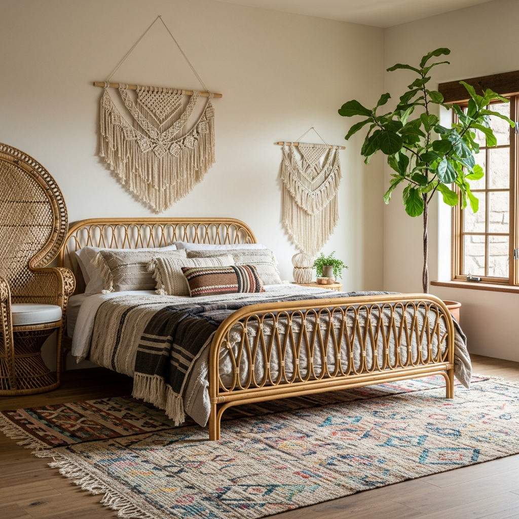
Pink florals on wallpaper — particularly large-scale English garden prints with roses, peonies, and trailing vines in a dusty pink and warm ivory palette — come fully to life when the fixture finishes in the room are chosen to complement rather than contrast with them. Warm unlacquered brass in the curtain rod, the lamp bases, the picture frame corners, and the drawer hardware picks up the warmth in the pink tones without introducing the coolness of chrome or the heaviness of black iron. The result is a room where every material speaks the same warm, slightly antique language — the wallpaper, the brass, the ivory bedding, the warm amber lamplight — creating a coherence that reads as effortless even though it required specific decisions at every stage.
Pro Tip
Paint the remaining three walls in the exact ground color of the floral wallpaper rather than in white or a contrasting tone. When the wallpapered wall and the plain walls read as the same base color, the floral pattern appears to emerge from the room’s surface itself rather than looking like a panel applied to it — a significantly more sophisticated and architecturally resolved result.
Millennial Pink Minimalist Bedroom
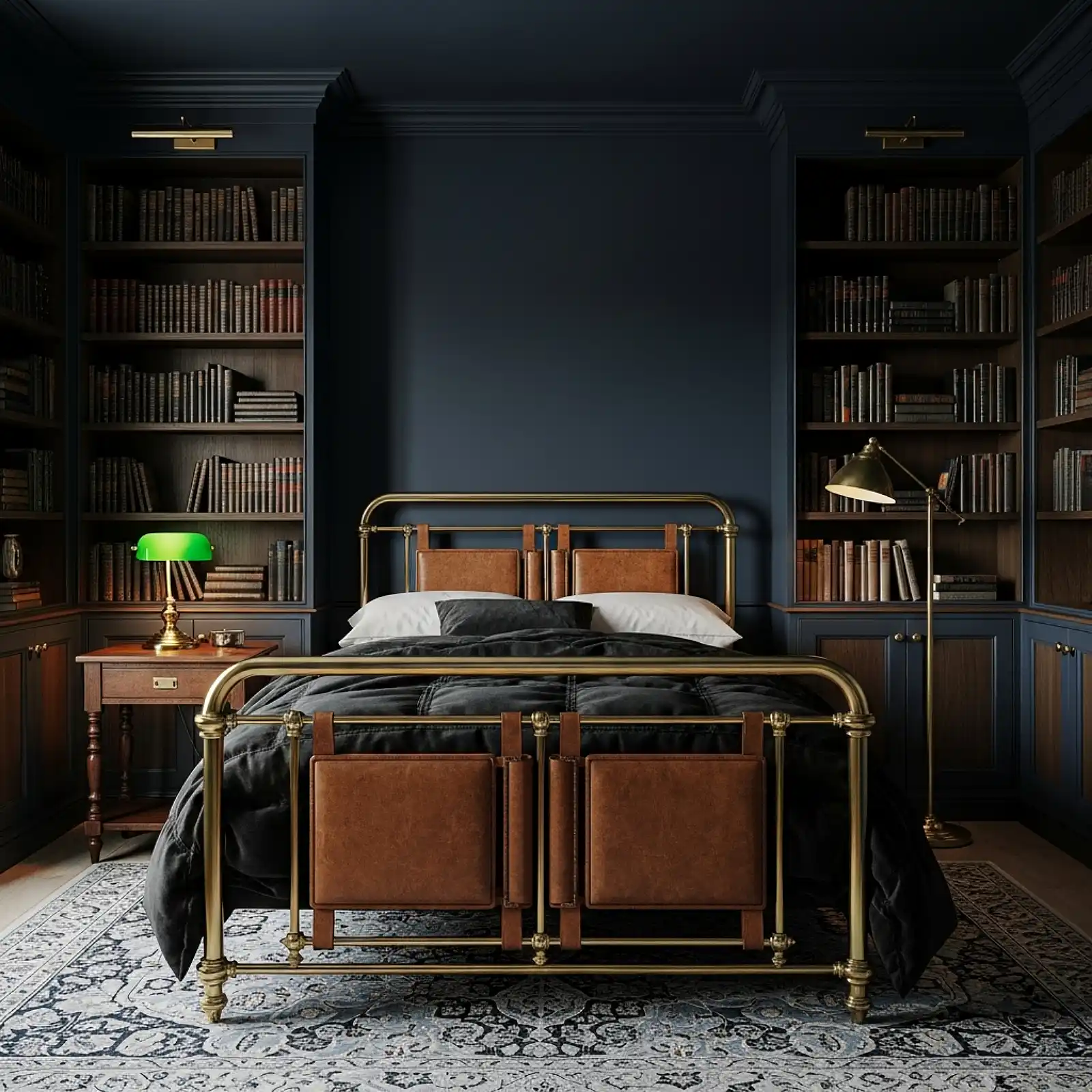
The specific shade known as millennial pink — a warm, peachy, slightly desaturated rose that functions as a warm neutral for an entire generation — works exceptionally well in a deliberately minimal bedroom context where its warmth is the entire point. Plain walls in this tone, a simple low-profile white or light oak bed frame, crisp white bedding, one oversized abstract print in ivory and blush above the headboard, and absolutely nothing else. No pattern, no decorative objects, no layered textiles. The restraint is the design: the pink wall warming the white bedding and the light wood grain, the single large artwork providing the only visual complexity. This is the version of a pink bedroom that appeals across taste profiles and photographs beautifully in both warm and natural light.
Pro Tip
In a minimal pink bedroom, the quality of each individual object matters more than in a layered room because there is nowhere to hide a poor choice. Invest in the best bedding and the best lamp you can afford — in a minimal context, these two pieces carry the entire room’s quality signal between them.
Deep Rose Ceiling Treatment
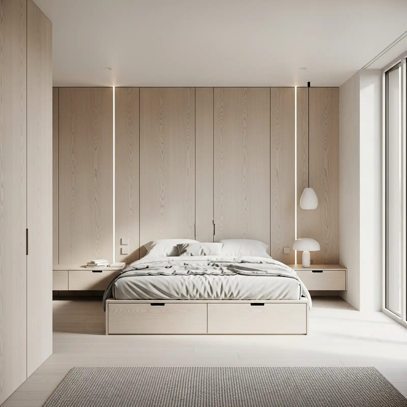
Painting the ceiling in a deep, saturated rose — while leaving the walls in a near-white or very pale blush — creates a fifth-wall moment that is one of the most unexpectedly dramatic and beautiful things available in a pink bedroom. The color overhead creates a warm, enveloping quality in the room that wraps around its occupants rather than sitting behind them, and the effect in the evening under warm amber light is genuinely extraordinary. Choose a tone two to three shades deeper than the wall color: if the walls are pale blush, the ceiling might be in a true rose; if the walls are warm ivory, the ceiling might be in a deep dusty pink. Farrow & Ball’s Cinder Rose, Nancy’s Blushes, or Setting Plaster all work beautifully in this application.
Pro Tip
Paint a colored ceiling in a flat or matte finish rather than eggshell or satin. A sheen on a ceiling catches overhead light in a way that emphasizes any imperfections in the plaster surface — bumps, brush marks, and roller texture all become visible. A flat finish absorbs light evenly and makes the ceiling color read as a single, smooth, enveloping surface.
Blush Pink and Warm Chocolate Brown Pairing
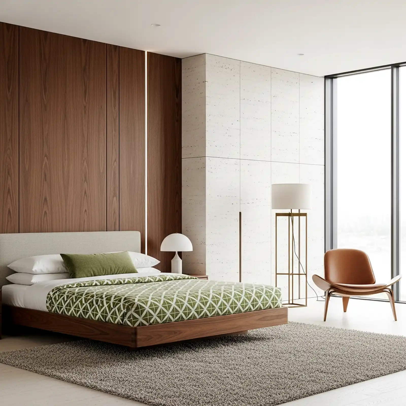
Blush pink paired with deep, warm chocolate brown is a combination that has the same sophisticated warmth as a classic cognac leather chair in a well-appointed room — the two tones share a warm undertone family that makes them feel genuinely complementary rather than contrasted. Blush linen bedding against a chocolate brown upholstered headboard, a warm rose throw on a dark walnut bench, blush scatter cushions on a deep brown velvet sofa, warm wood nightstands beside a blush-toned bed — the combination works across every furniture scale and commitment level. It reads as fashion-forward and warm simultaneously, and it completely sidesteps the sweetness that can make all-pink rooms feel cloying by grounding every pink element in something darker and richer.
Pro Tip
Keep the ratio approximately 60 percent blush to 40 percent brown — enough chocolate to ground the pink without making the room feel dark, and enough blush to keep the warmth present. Flipping the ratio tends to make the room feel heavier than intended; keeping the pink as the dominant tone with brown as the anchor maintains the balance that makes this pairing feel chic rather than somber.
Pink Ombre Painted Wall

An ombre wall — transitioning from a deeper dusty rose at the base to a barely-there blush at the top, blending in a soft gradient — creates one of the most visually interesting wall treatments available in a pink bedroom without requiring pattern, wallpaper, or any material beyond paint. The gradient is achieved by blending two or three tones of the same pink family wet-on-wet with a large dry brush, working in horizontal bands that feather into each other at the edges. Positioned behind the bed, the ombre creates a natural visual weight at the lower portion of the wall — anchoring the headboard — while fading to near-white at the ceiling to maintain height and openness. The technique requires about three hours and roughly two quarts of paint in coordinating tones.
Pro Tip
Work in small, manageable sections when blending an ombre wall — paint dries too quickly to blend a full wall width at once. Roll one 24-inch-wide vertical strip in your darker tone, immediately apply the lighter tone above it, and blend the overlap with a large dry brush before moving to the next strip. Keeping the sections narrow is what makes the final blend seamless.
Rose Gold Metallic Accents
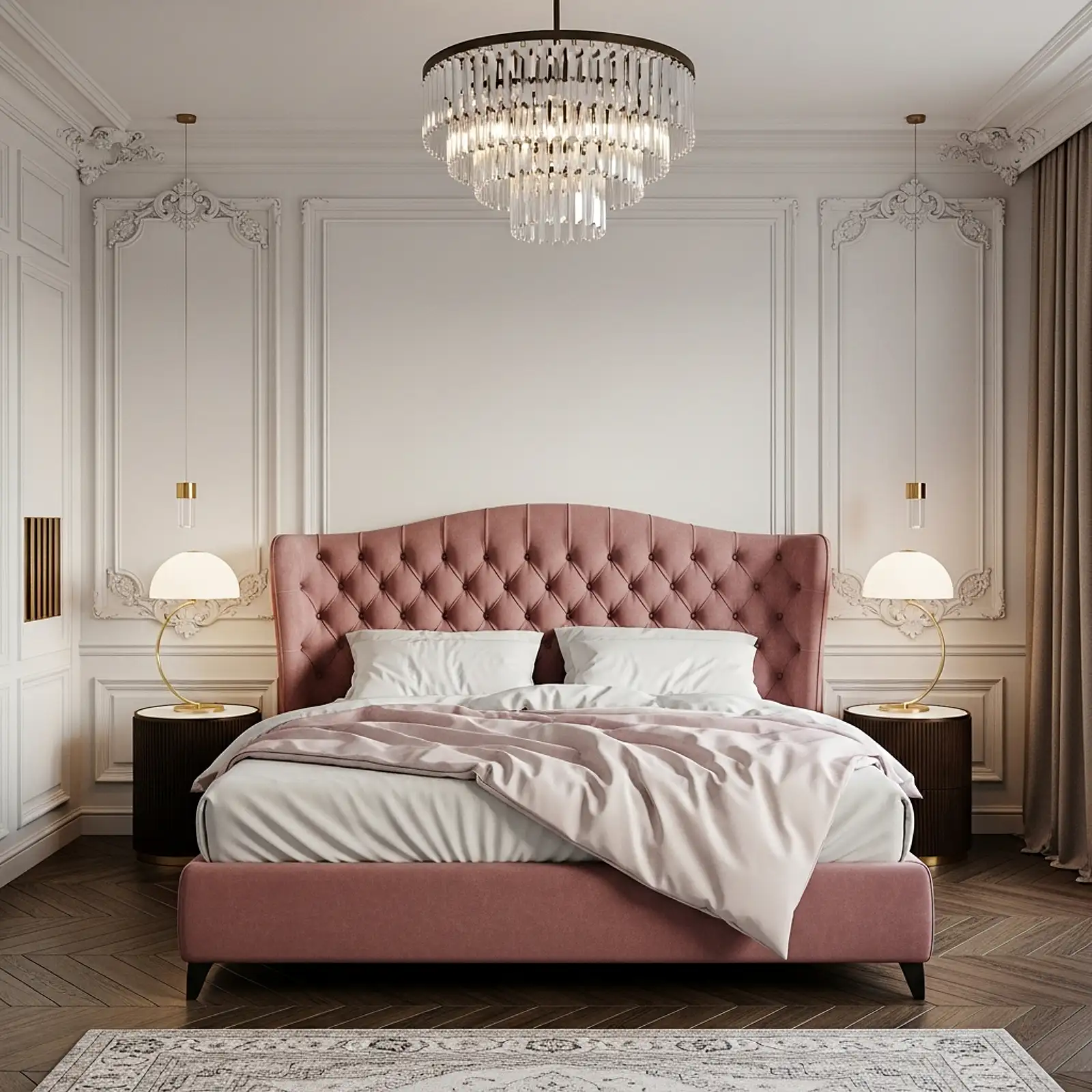
Rose gold — the warm, slightly pinkish copper-gold alloy that sits perfectly between brass and blush — is the metal finish most naturally at home in a pink bedroom, and it works at every commitment level from a single lamp base to a full hardware suite. A rose gold table lamp with a white drum shade, rose gold curtain rod finials against ivory linen panels, a rose gold picture frame holding a botanical print, a rose gold tray on the dresser corralling perfume bottles — each addition is individually modest, but the cumulative effect of a consistent rose gold accent running through the room creates a cohesion and a warmth that reads as genuinely considered. The finish pairs beautifully with blush, dusty rose, warm ivory, and cream without the harshness that chrome or the formality that darker brass can introduce.
Pro Tip
Limit rose gold to one metal finish in the room and do not mix it with brass, chrome, or black. Rose gold is a specific finish with a specific warmth, and mixing it with other metals dilutes its effect and makes the room feel assembled rather than designed. One metal finish throughout — rose gold in this case — is what creates the sense that every decision in the room was made by the same mind.
Terracotta Pink and White Stripe Bedding
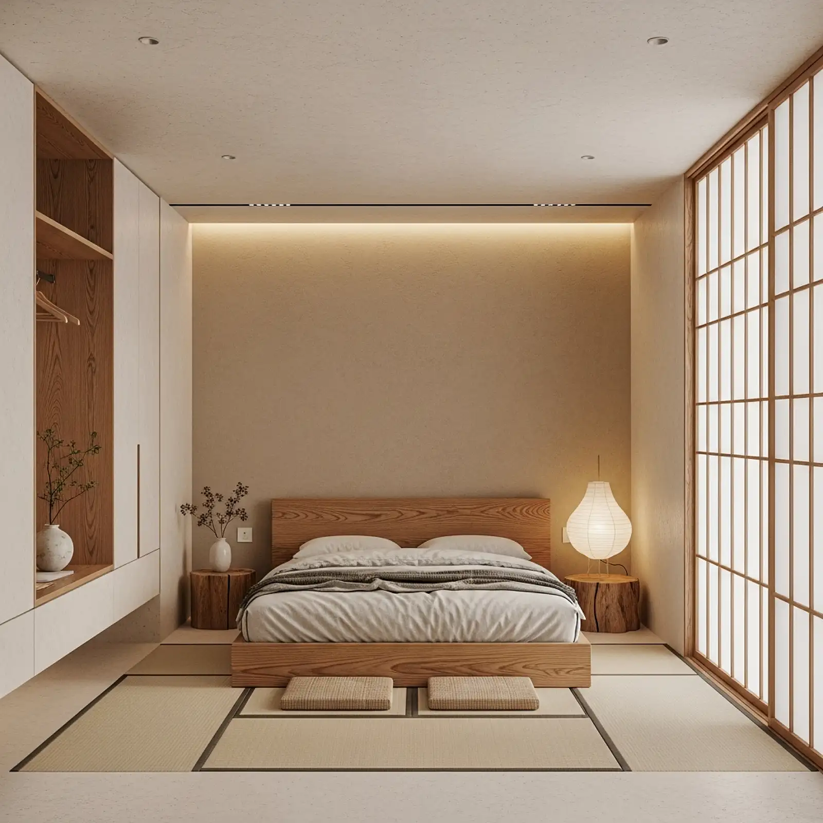
Striped bedding — particularly a classic ticking stripe in a warm terracotta-pink and white combination — brings a crisp, graphic quality to a pink bedroom that sets it apart from the softer, more romantic approaches in this list. The stripe introduces visual rhythm and structure without pattern complexity, and the terracotta-pink tone is warm enough to feel genuinely pink while grounded enough by the warm earth in its undertone to avoid any sweetness. Layer a terracotta-stripe duvet cover over a plain white sheet and pair with solid blush Euro shams — mixing the stripe and the solid at the pillow level creates the material variation that keeps the bed arrangement visually interesting. Vintage-style ticking stripe bedding is widely available at IKEA, H&M Home, and specialty linen retailers at every price point.
Pro Tip
Pair ticking stripe bedding with plain, unadorned walls and simple wood furniture — the stripe provides all the visual interest the room needs at the bed level, and adding pattern or busyness elsewhere competes rather than complements. The restraint required to let striped bedding be the room’s pattern statement is what keeps the look chic rather than chaotic.
Pink Canopy with Fairy Light Glow
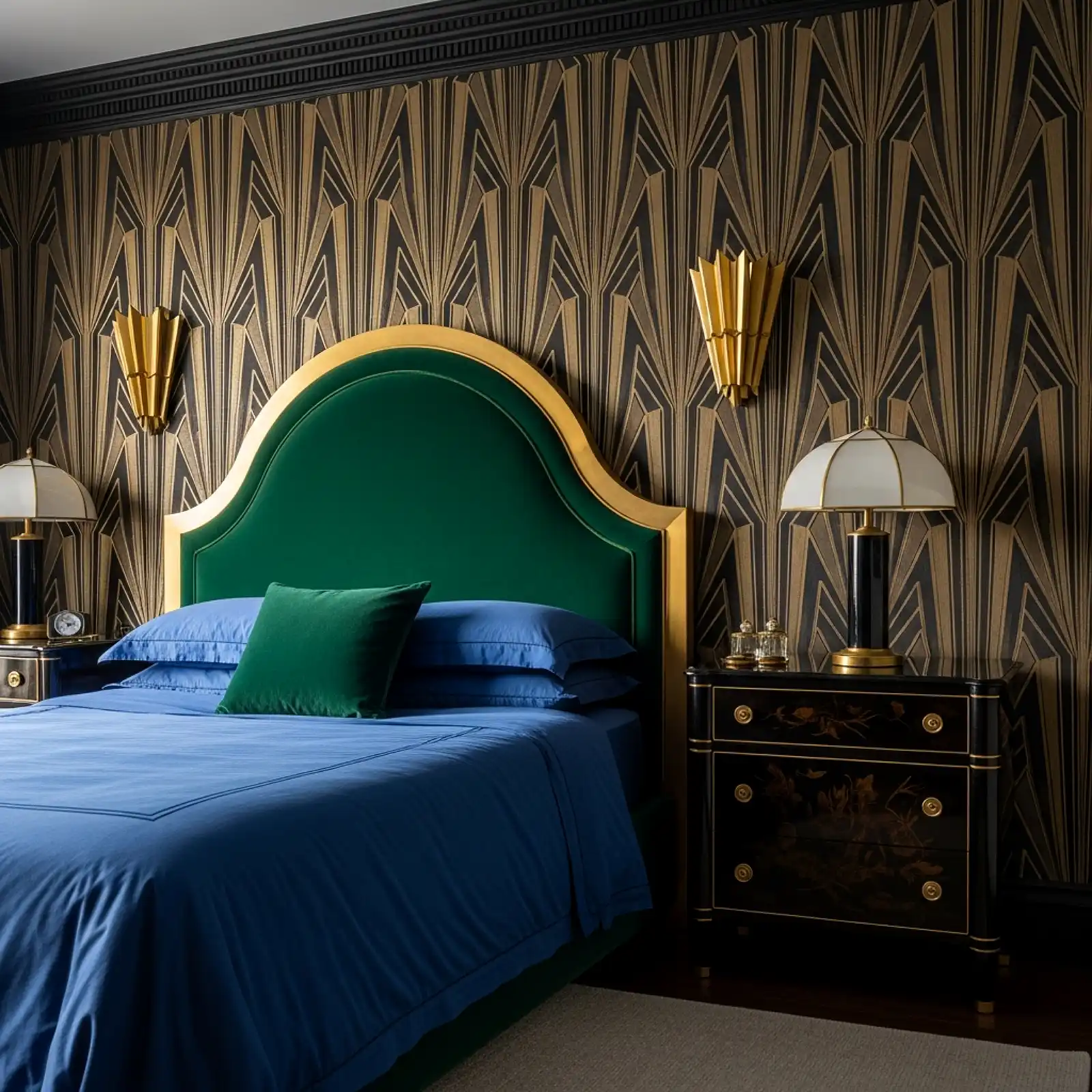
A simple canopy of blush or dusty rose sheer fabric gathered at a central ceiling hook and draped outward to four corner points above the bed — interwoven with a single strand of warm amber globe fairy lights tucked along the inside of the fabric — creates one of the most dreamily beautiful pink bedroom moments available at a genuinely accessible budget. The sheer pink fabric diffuses the fairy light glow into a warm, rosy wash that fills the canopy interior and spills softly into the room. During the day, the fabric itself is the visual element; at night, the lit canopy becomes the room’s primary light source and atmosphere. The total investment — sheer fabric from a fabric store, a ceiling hook, and one string of globe lights — rarely exceeds $30 to $40.
Pro Tip
Use a warm 2200K globe fairy light string rather than cool white or multicolor. The amber tone of warm globe lights filters through blush or dusty rose sheer fabric to produce a deeply warm, almost candlelit glow inside the canopy. Cool white lights through pink fabric produce a harsher, less flattering result that reads as festive rather than romantic.
Pink Painted Built-In Bookshelves
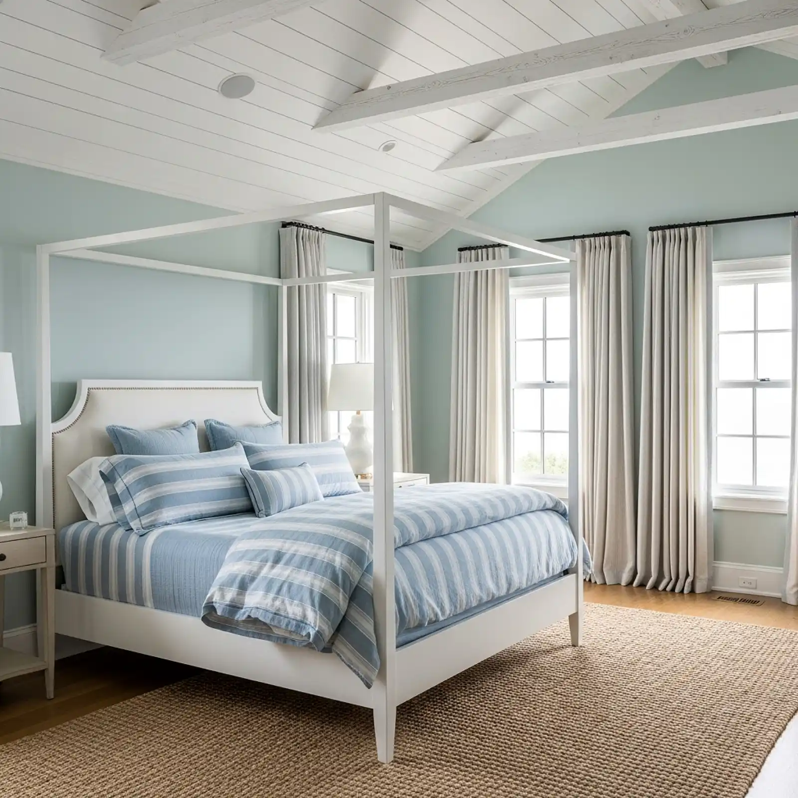
Built-in bookshelves — or freestanding bookshelves treated as built-ins by painting them the same color as the wall behind them — painted in a warm dusty pink or deep rose create one of the most striking and unexpected focal points available in a pink bedroom. The books themselves provide the color and texture variation across the shelves; the pink case and shelving provide a warm, cohesive backdrop that makes the arrangement feel curated and composed rather than just stored. A warm blush on built-ins beside a fireplace, a dusty rose bookshelf in a reading corner, or a full-wall library in a deeper rose tone all work. Style the shelves with a mix of books, ceramics, dried botanicals, and small framed prints rather than only books, and leave at least 25 to 30 percent of the shelf surface empty for breathing room.
Pro Tip
Paint the interior back panel of each shelf two to three shades deeper than the shelf frame and the outer casing. The deeper back creates a shadow-box effect that makes objects placed on the shelf read as three-dimensional and intentionally displayed rather than simply stored — a detail that is small in effort and significant in the resulting visual quality.
Blush Pink with Black Accents
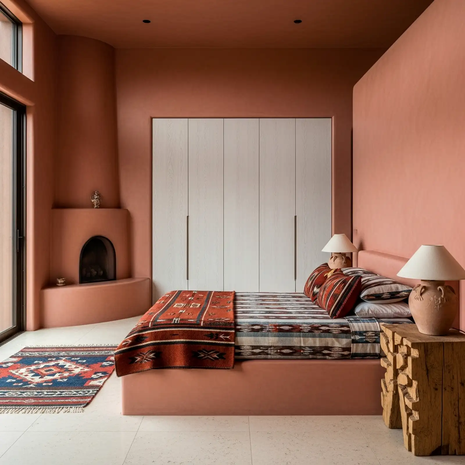
The most sophisticated, editorial version of a pink bedroom is one where blush or dusty rose meets matte black in a deliberate, graphic pairing — black picture frames against a blush wall, a matte black bedside lamp beside blush linen bedding, black curtain rod and rings against dusty pink curtain panels, black drawer hardware on a white dresser in a pink room. The black accents do for the blush palette what a red lip does for a neutral outfit: they sharpen it, make it decisive, and push it from pretty to chic. The contrast is stark enough to give the room visual authority and editorial edge without diminishing any of the warmth that the pink tones contribute. This is the pink bedroom direction most likely to appeal to someone who doesn’t think of themselves as a “pink person.”
Pro Tip
In a blush and black bedroom, keep the black confined to hard objects — frames, hardware, lamp bases, curtain rods — rather than introducing it in soft furnishings like cushions or throws. Black in textiles reads as moody and can make a pink room feel darker than intended; black in hard, graphic objects reads as precise and fashion-forward against the softness of the pink around it.
Pink Plaster Textured Walls
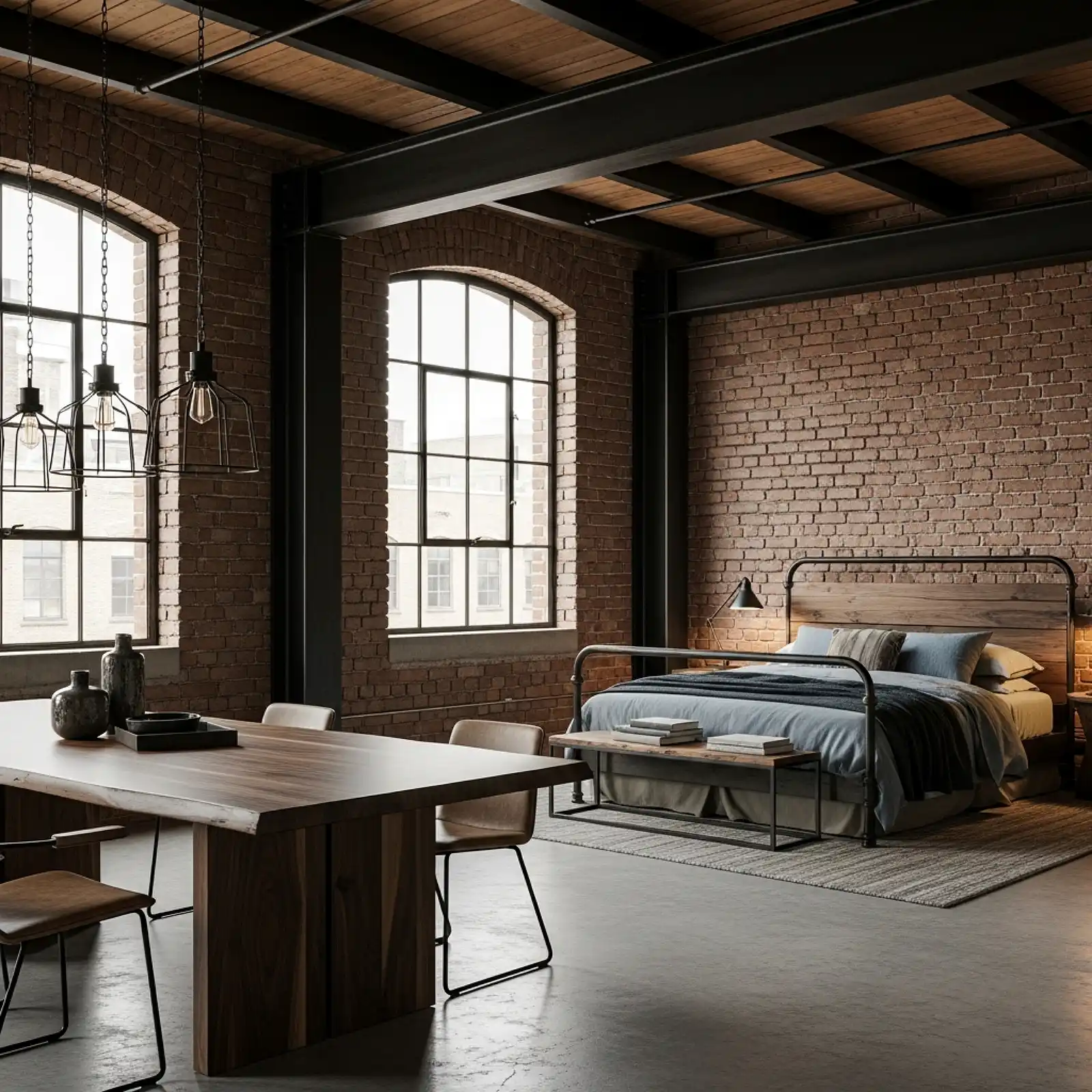
A skip-trowel or Venetian plaster finish in a warm pink tone — applied over drywall to create a surface with shallow, irregular texture that catches light in different ways across its area — produces a wall treatment that reads as genuinely architectural and artisanal rather than painted. The texture creates depth and movement in the wall surface that flat paint cannot replicate, and the warm pink tone in a textured plaster finish has a specific quality of age and material richness that connects the room to the long tradition of pale pink plaster in European historic interiors. DIY skip-trowel texture applied with a wide drywall knife and then painted in a warm dusty rose is an accessible entry point; genuine Venetian plaster in a blush tone is a more demanding but visually extraordinary application.
Pro Tip
After applying texture and paint, run a warm amber lamp along the wall surface at a low, raking angle to check the texture distribution before declaring it finished. Raking light reveals high and low spots, thin areas, and texture inconsistencies that are invisible under normal overhead lighting — identifying and filling these before the final coat is the detail that separates a professional-looking textured wall from an obviously DIY one.
Blush Velvet Armchair as Statement Corner Piece
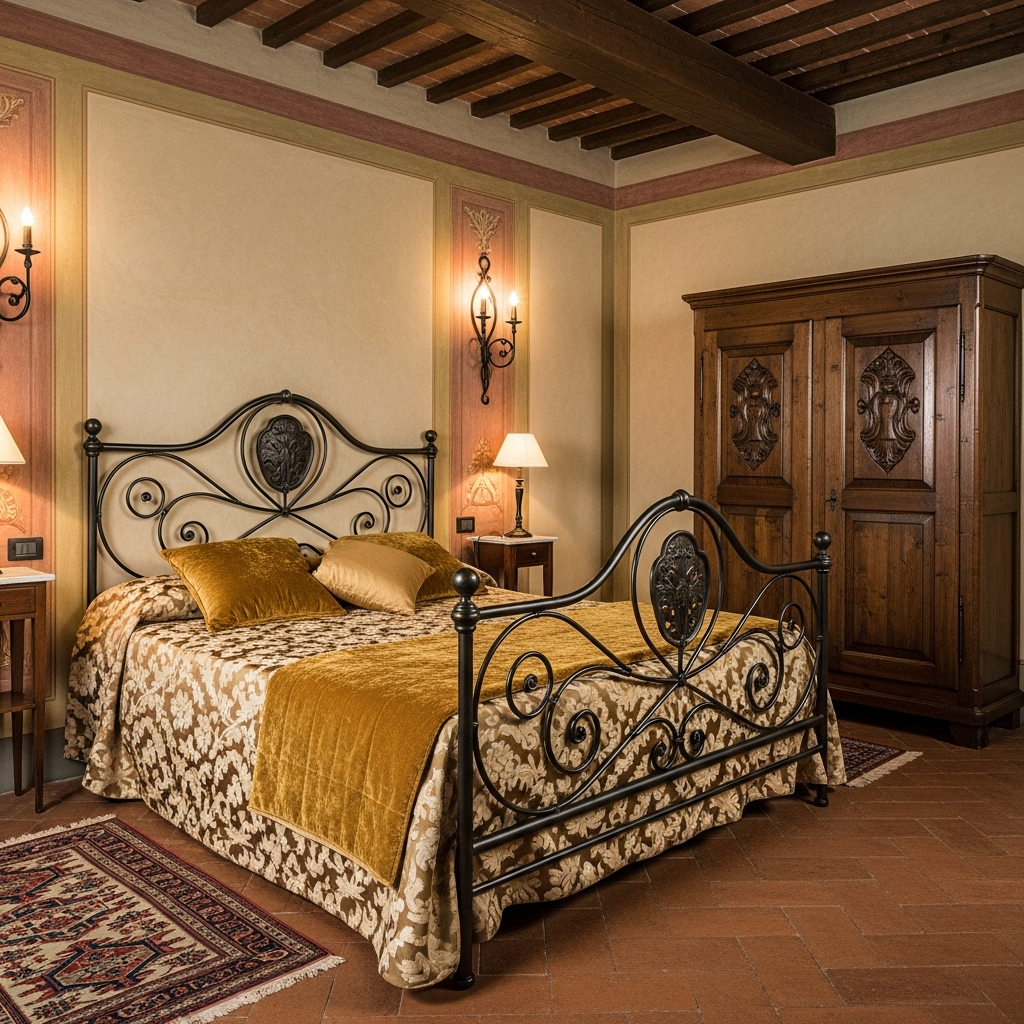
A single blush velvet armchair — in a curved, low-slung silhouette with a slightly oversized seat — placed in a corner of the bedroom with a slim brass arc lamp and a small marble side table creates a sitting moment that is both the most functional and the most photographed corner in the room. The blush velvet chair is one of those objects that seems to exist outside of trend cycles: it was beautiful in 1960, it was beautiful in 2005, it was beautiful in 2020, and it will be beautiful in 2035. The chair earns its place in a pink bedroom not just as a color accent but as a piece of furniture with genuine sitting quality and visual weight. Pair it with a cashmere throw in ivory or warm cream draped over one arm and a stack of beautiful books on the side table beside it.
Pro Tip
Choose a blush velvet chair with a slightly deeper, more saturated tone than the other pink elements in the room — the chair should be the richest pink in the space, which gives it the visual weight to function as a genuine statement piece rather than blending into the background of the palette it’s meant to anchor.
Pink and Gold Gallery Wall
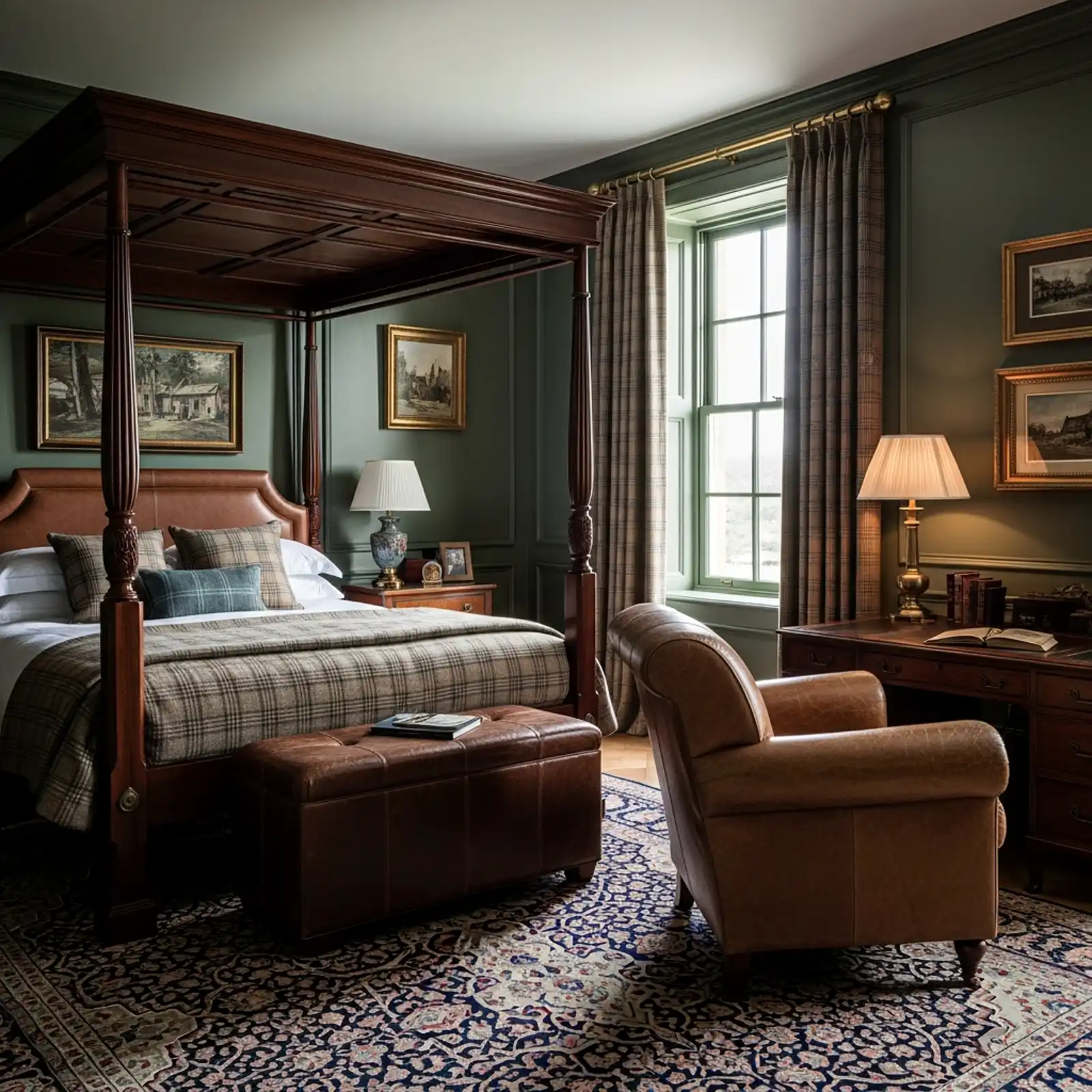
A gallery wall composed of prints, illustrations, and framed objects unified by a palette of dusty pink, warm ivory, and aged gold creates one of the most cohesive and personal wall moments available in a pink bedroom. The art subjects can be anything — botanical prints, fashion illustrations, abstract watercolors, pressed flower specimens, vintage perfume advertisements, antique map details — as long as the tones stay within the warm pink-ivory-gold family. Frame everything in thin gold or natural wood frames with wide ivory mats, hang in a loose, organic arrangement rather than a rigid grid, and leave 2 to 3 inches between each frame. The total cost, using public domain art downloaded and printed locally, can be under $50 for an arrangement that covers an entire wall.
Pro Tip
Include one piece in the gallery wall that is significantly larger than all the others — at minimum twice the size of the next largest piece. This anchor piece gives the arrangement a visual center of gravity that the eye finds first and returns to, preventing the gallery wall from reading as a collection of equally weighted items rather than as a composed arrangement with a clear focal point.
Dusty Pink Bed Frame with Rattan Details
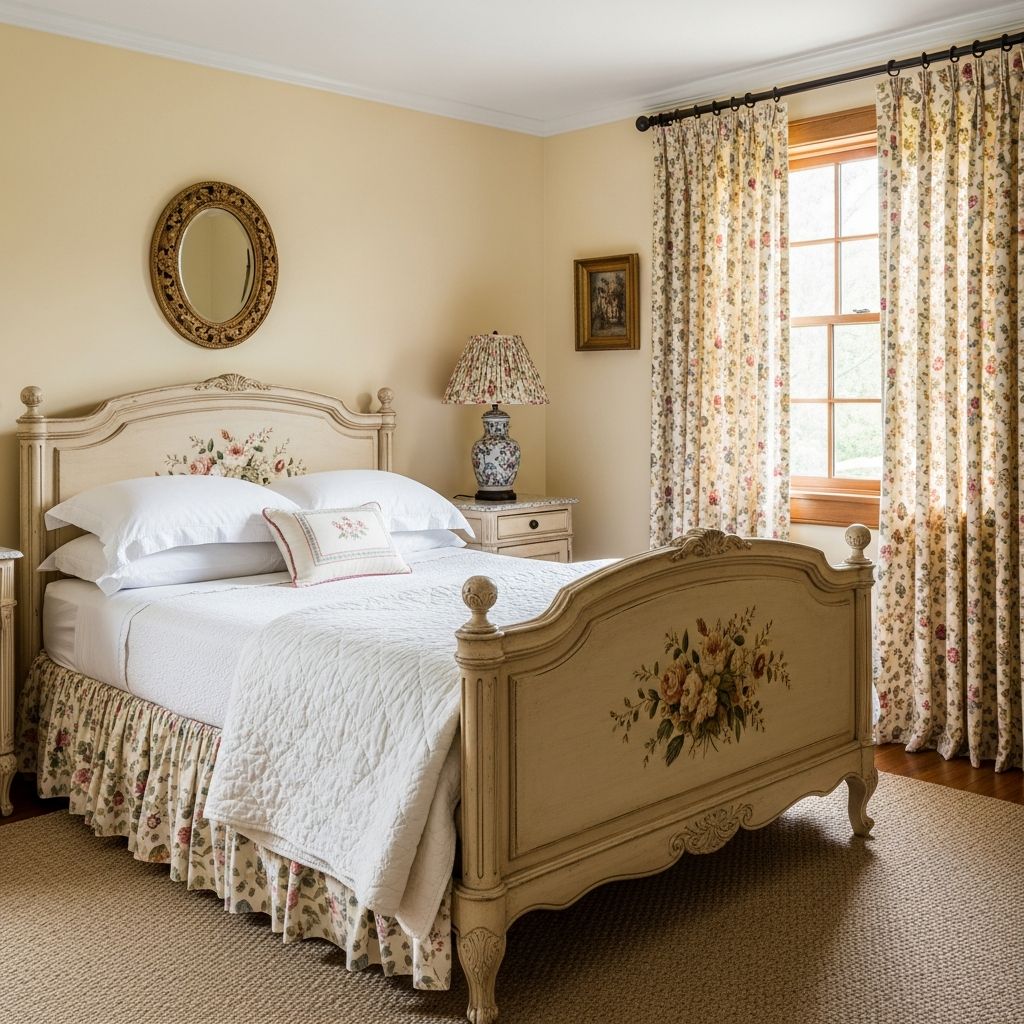
A bed frame in a painted dusty pink finish — particularly one with rattan, cane, or woven panel details in the headboard or footboard — brings together two of the most distinctly charming material combinations available in contemporary bedroom design. The organic warmth of natural rattan against a muted, chalky pink creates a reading of the room that is simultaneously relaxed and considered: part garden room, part boutique hotel, part collected-over-time personal space. Look for bed frames with a visible brushstroke or chalky paint finish rather than a high-gloss lacquer — the slightly imperfect, artisanal quality of a chalk-painted or clay-finished surface suits the natural texture of the rattan far better than a perfect, uniform coat of paint.
Pro Tip
If painting a bed frame in a dusty pink yourself, prime thoroughly first, apply two coats of a chalk or clay paint in your chosen tone, then seal with a clear matte furniture wax rather than a varnish or polyurethane. The wax finish allows the slight texture of the paint to remain visible and touchable, preserving the handmade quality that makes a painted bed frame look intentional rather than like factory spraying at home.
Pink Tile or Mosaic Feature Behind a Bed
In a bedroom where the walls behind the bed are tiled — or where a tiled panel is being added as part of a renovation — glossy pink ceramic tiles in a warm blush or dusty rose create a headboard backdrop that is both unusual and surprisingly beautiful. Smaller mosaic tiles in a ranging pink-to-ivory gradient, larger format square tiles in a solid warm rose with subtle variation between tiles, or hand-painted Zellige-style tiles in a blush tone with natural color variation all work — the key is choosing a glaze with warmth rather than cool whiteness in its undertone. The reflective quality of glazed ceramic bounces candlelight and lamplight in a way that painted walls and wallpaper cannot, and the texture of the grout lines adds a material specificity that makes the installation read as architectural rather than decorative.
Pro Tip
Use an unsanded grout in a tone that closely matches the tile color rather than a standard grey or white. A tone-matched grout makes the tiles read as a continuous surface with subtle texture rather than a grid of individual tiles separated by visible joints — a significantly more sophisticated result that reads as custom rather than installed.
All-Pink Maximalist Layering
The maximalist all-pink bedroom — where every surface, textile, and object occupies the same family of pink tones in different shades and textures simultaneously — is one of the most joyful and visually bold rooms in contemporary interior design when it’s executed with genuine commitment rather than timidity. Blush walls, a deeper rose ceiling, pink linen bedding, a pink velvet throw, dusty pink curtain panels, rose ceramic lamps, pink picture frames, pink cushions in three different tones and textures, pink flowers in a pink ceramic vase — the room works because the color is the organizing principle rather than an accent. The variety of tones — pale blush, warm dusty rose, deep mauve, true pink, terracotta-pink — is what prevents the room from reading as a single flat mass of color and instead creates the layered, rich complexity that makes maximalism succeed.
Pro Tip
In a maximalist all-pink room, introduce at least one material that is not pink but that belongs naturally to the warm pink tonal family — raw linen in natural, unfinished wood, warm honey jute, or aged brass. This single non-pink natural material is what prevents the all-pink layering from reading as a costume and instead grounds it as a room that simply happens to love pink above all other colors.
Pink Neon Sign as Accent Art

A custom or ready-made LED neon sign in a warm pink tone — a meaningful word, a simple botanical line drawing, a crescent moon, a single initial — mounted on the wall beside or above the bed adds a contemporary, slightly irreverent energy to a pink bedroom that almost no other single object delivers. The warm pink glow of a neon sign in a room with otherwise warm, soft lighting reads as playful and confident rather than garish — particularly when the sign itself is simple and the surrounding room is restrained enough to give it context. Against a blush wall, the pink neon reads as a tonal echo; against a white or ivory wall, it reads as a graphic accent. Several online retailers including Neon Mfg and Sketch & Etch offer custom LED neon in flexible pink tones starting at under $80.
Pro Tip
Plug a neon sign into a smart plug set to a timer or a dimmer so it turns on automatically at a low brightness in the evening and switches off at a set time. A neon sign at full brightness in a room with otherwise low, warm ambient lighting is too dominant; at 30 to 50 percent brightness on a smart dimmer, it contributes a warm glow without competing with the rest of the room’s lighting composition.
Frequently Asked Questions
What shades of pink work best in a bedroom?
The most universally livable pink bedroom shades are those with warmth and some grey in their undertone — dusty rose, blush with a slight terracotta lean, warm mauve, and muted antique rose all fall into this category. These tones work in both natural and lamplight without looking either washed out or garish, and they function as warm neutrals in most lighting conditions. Avoid cool pinks with a blue undertone — they read as cold and can look lavender in warm light — and very bright or candy pinks, which are the most difficult to live with over time in a bedroom context.
How do I make a pink bedroom look sophisticated rather than childish?
Material quality and tonal choice are the two factors that most reliably push a pink bedroom toward sophistication. Choose dusty, muted, or warm pinks rather than bright, candy, or cool pinks. Use materials that have adult associations regardless of color — velvet, linen, silk, aged brass, solid wood — rather than materials that read as juvenile in any tone. Add one element of contrast — a black accent, a deep jewel-tone pillow, a natural material like jute or rattan — that prevents the pink from existing in a bubble of sweetness without anything to ground it.
What colors go well with pink in a bedroom?
The most beautiful pink bedroom pairings are sage green (muted versions of both tones share botanical warmth), warm ivory and cream (the most reliable neutral companions for any pink tone), warm chocolate brown (grounds the pink in something richer and darker), aged gold and unlacquered brass (shares the warmth in the pink’s undertone without introducing a contrasting cool), and matte black (the most editorial and contemporary pairing, sharpening the pink into something more decisive and graphic). Cool greys and bright whites are the least successful pairings — they drain the warmth from most pink tones and leave the room feeling flat.
Can a pink bedroom work for adults?
Entirely — and some of the most admired bedroom interiors in contemporary design are built around pink. The distinction between an adult pink bedroom and a child’s pink bedroom is almost entirely in the tone choice, material quality, and styling restraint: a deep dusty rose on limewash walls with a velvet headboard, linen bedding, brass fixtures, and curated art is unambiguously an adult room. A bright bubblegum pink with synthetic textiles and themed accessories reads as a child’s room. The color itself is neutral on this question; the everything else around it is what determines the answer.
How much pink is too much in a bedroom?
There is no categorical answer to this — it depends entirely on how deliberately the pink is handled. A fully all-pink maximalist bedroom where every surface and textile occupies the pink tonal family can be extraordinary when executed with genuine commitment and tonal variety. A room with pink on one wall and a pink throw can look underdeveloped if those are the only design decisions made. The question is not how much pink but how intentionally the pink has been chosen, supported by appropriate materials, and given the contrasting elements it needs to read as designed rather than default.
What is the best pink paint color for a bedroom?
Farrow & Ball’s Setting Plaster is the most widely admired bedroom pink in contemporary interior design — a warm, complex dusty rose with grey and terracotta undertones that shifts beautifully throughout the day. Their Dead Salmon and Calamine are close companions in the same muted family. Benjamin Moore’s Pale Blush and Smoked Salmon both offer accessible alternatives with similar warmth and complexity. Sherwin-Williams’ Romance and Mellow Coral perform well in spaces with less natural light. All of these should be tested as large swatches in the actual room before committing — pink tones shift more dramatically between daylight and lamplight than almost any other color family.
Pink is not a timid color choice — in the right hands, in the right tone, with the right materials beside it, it is one of the most confident and beautiful decisions a bedroom can make.