
20 Blue Bedroom Ideas with Calm Coastal-Inspired Decor
Blue is the color the human eye is most drawn to in nature — the sky at every hour, water at every depth, the far distance of every landscape — and it is no coincidence that it is also the color most consistently associated with calm, rest, and the specific quality of mental quietness that a bedroom is supposed to provide. A well-done blue bedroom does something that other palettes struggle to achieve: it makes the room feel simultaneously expansive and sheltered, as though the walls have been pushed out to the horizon while the space itself remains intimate and protected. That paradox is what distinguishes blue as a bedroom color from blue as a living room or kitchen color — in a room devoted to rest, the quality of psychological spaciousness it creates is genuinely functional.
The coastal-inspired direction explored in these 20 ideas does not mean seashell borders and lighthouse prints. It means the colors, materials, and textures of the actual coast in its most beautiful, most elemental form — the washed white of weathered driftwood, the warm sand of aged linen, the layered grey-blue of deep water, the bleached warmth of sun-dried natural fiber. Blue at its best in a bedroom is grounded by these natural companions, given warmth by the right lighting, and given character by the specific shade chosen — because not all blues are calm, and the difference between a blue that soothes and one that chills is often only a few degrees of undertone. The 20 ideas below navigate that range with precision.
Soft Powder Blue Walls with White Linen Bedding
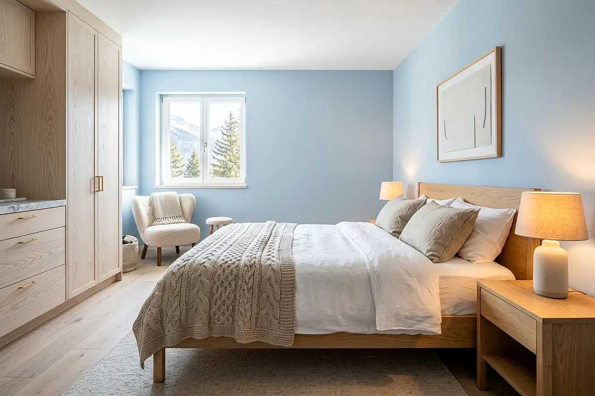
Powder blue — the specific muted, slightly greyed pale blue that sits between sky and mist — is the gentlest and most universally flattering of all the blue bedroom tones, and it works particularly well in rooms that receive strong natural light, where its softness prevents it from washing out. Against this backdrop, white linen bedding in a loosely rumpled, unironed state creates the specific combination of cool and warm, soft and airy, that makes a bedroom feel genuinely restful rather than merely decorated. Farrow & Ball’s Skylight, Benjamin Moore’s Pale Blue Sky, and Sherwin-Williams’ Iceberg all sit in this tonal family. Pair with natural oak furniture, warm amber bedside lamps, and woven jute or seagrass floor texture for a room that reads as effortlessly calm in every light.
Pro Tip
In a powder blue room, always use warm amber bulbs at 2200K rather than daylight or cool-white options. Cool-white light against a pale blue wall produces a clinical, slightly cold atmosphere; warm amber light activates the warmth hidden in the blue’s undertone and makes the room feel genuinely serene rather than simply pale.
Navy and Natural Linen Coastal Layering
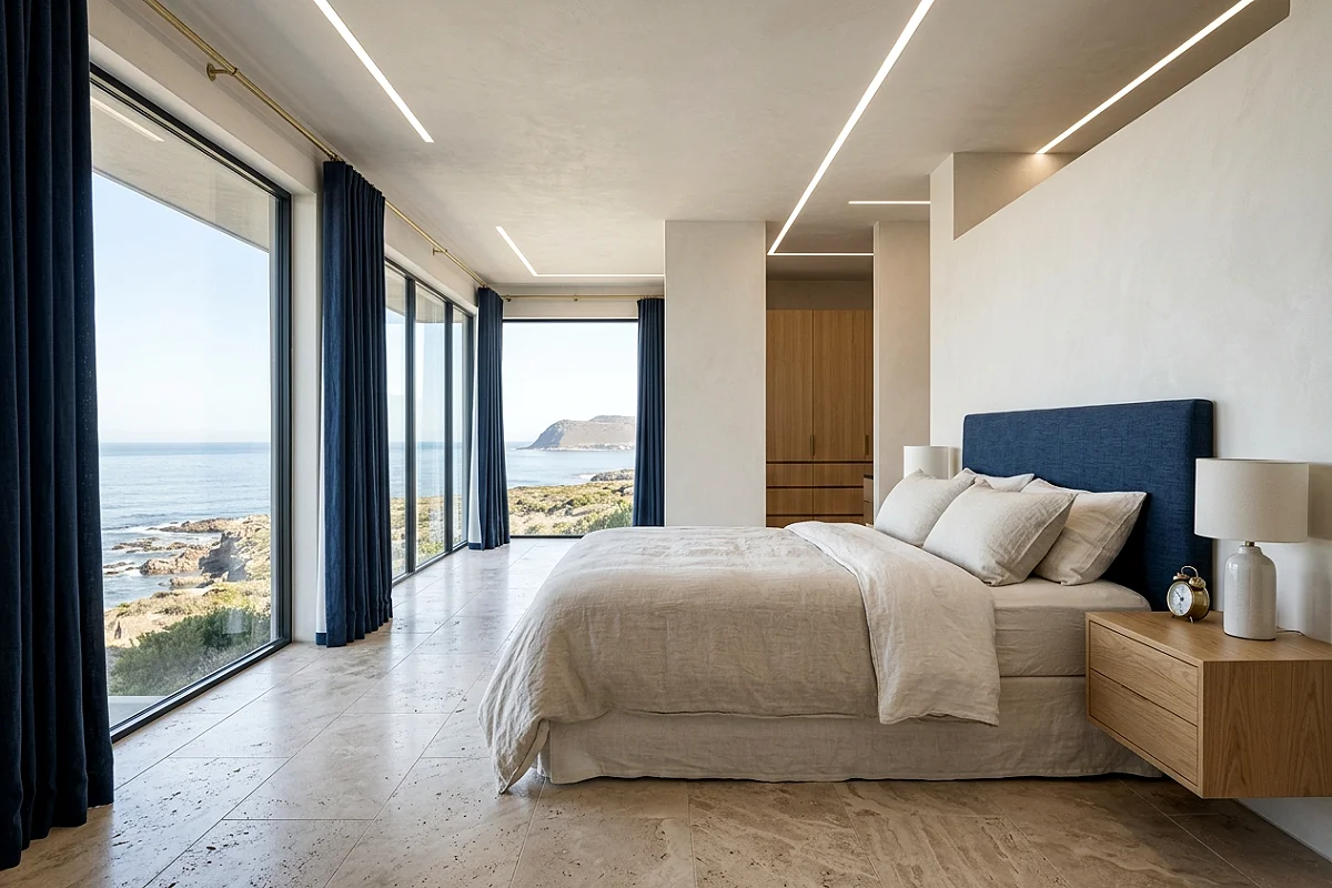
Deep navy and natural, unbleached linen is one of the most enduringly beautiful material pairings in coastal design — the combination references the blue of deep water and the undyed canvas of sailcloth in a way that feels genuinely rooted in the materials of the sea rather than in any decorating trend. A navy upholstered headboard or bed frame against a warm white wall, natural linen bedding in oatmeal and warm ivory, a navy throw folded at the foot of the bed, and navy linen curtain panels hanging from a simple brass rod creates a bedroom that reads as quietly nautical without a single anchor or rope motif in sight. The material quality of the linen — particularly in its slightly textured, uneven weave — is what elevates this from theme decoration to genuine design.
Pro Tip
When using navy as the dominant color in a bedroom, introduce at least two distinctly warm natural materials — raw oak, jute, warm-toned linen, unfinished brass — to prevent the room from reading as cold. Navy is a cool color at its core; the warmth needs to be actively introduced through the materials beside it rather than assumed from the room’s existing elements.
Slate Blue Limewash Feature Wall
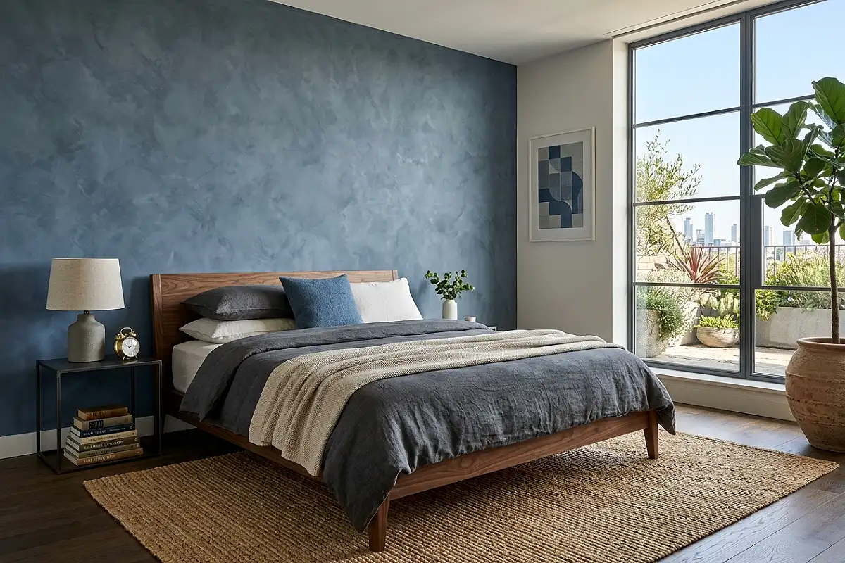
A limewash finish in slate blue — the grey-blue tone that references the specific color of the sea on an overcast day, neither fully grey nor fully blue — applied to the wall behind the bed creates one of the most atmospherically beautiful backdrop treatments available in a coastal bedroom. The mottled, shifting quality of the limewash surface means the color appears slightly different at every hour as the light changes, reading closer to pewter grey in morning sun and a deeper, more saturated blue-grey in the afternoon. This living quality is what makes a limewash feature wall feel so much more interesting and alive than flat paint in the same tone. Portola Paints’ Roman Clay in Storm, Fog, or Tempest all sit in this range; Farrow & Ball’s Mole’s Breath limewashed reads similarly.
Pro Tip
Limewash in cool tones like slate blue benefits from a wall surface with slight existing texture — a light skim coat with a slight skip-trowel pattern beneath it — rather than perfectly smooth drywall. On a textured surface, the limewash settles into the low points and skips across the high points, producing the most authentic aged-plaster appearance. On smooth drywall, it can read as simply unevenly applied paint.
Coastal Blue and Warm Sand Palette
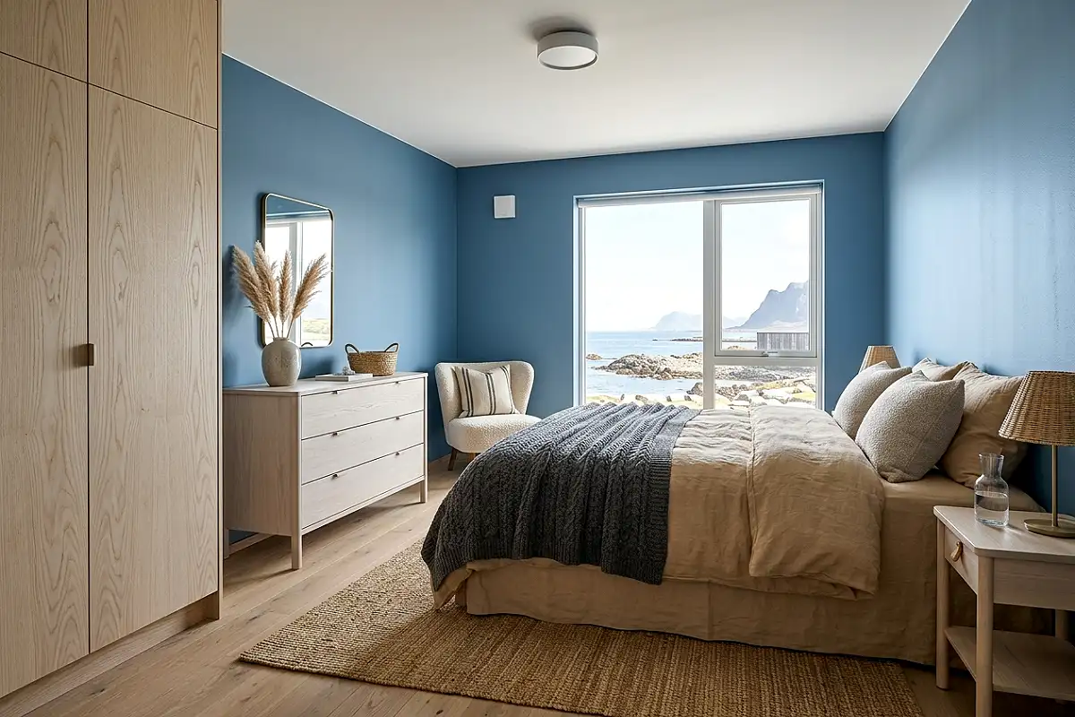
The most reliable and most beautiful coastal blue palette pairs a medium, slightly muted blue — the tone of shallow Caribbean water over sand, neither too bright nor too dark — with the warm, sun-dried tones of beach sand: pale amber, warm oatmeal, bleached natural, honey. Blue walls or a blue headboard wall against bedding in warm sandy linen, a jute rug in a natural honey tone, wooden furniture in a light blonde or whitewashed oak, and woven seagrass accessories across the nightstand and dresser. The warmth of the sand tones prevents the blue from reading as cold, and the blue prevents the sand tones from reading as beige. Together they create the specific quality of warmth and expansiveness that a beach environment actually produces — which is what good coastal design references, rather than the decorative trappings of the coast.
Pro Tip
Choose your blue first, then select your sand tones to match its warmth level. A blue with a green undertone pairs best with warm, yellow-toned sands; a blue with a grey undertone pairs best with cooler, more neutral sands and linens. Mismatching the warmth levels — a warm green-blue against a cool grey-sand — is the most common source of a coastal palette that looks slightly off despite all the right elements being present.
Inky Midnight Blue Bedroom Enveloping All Walls
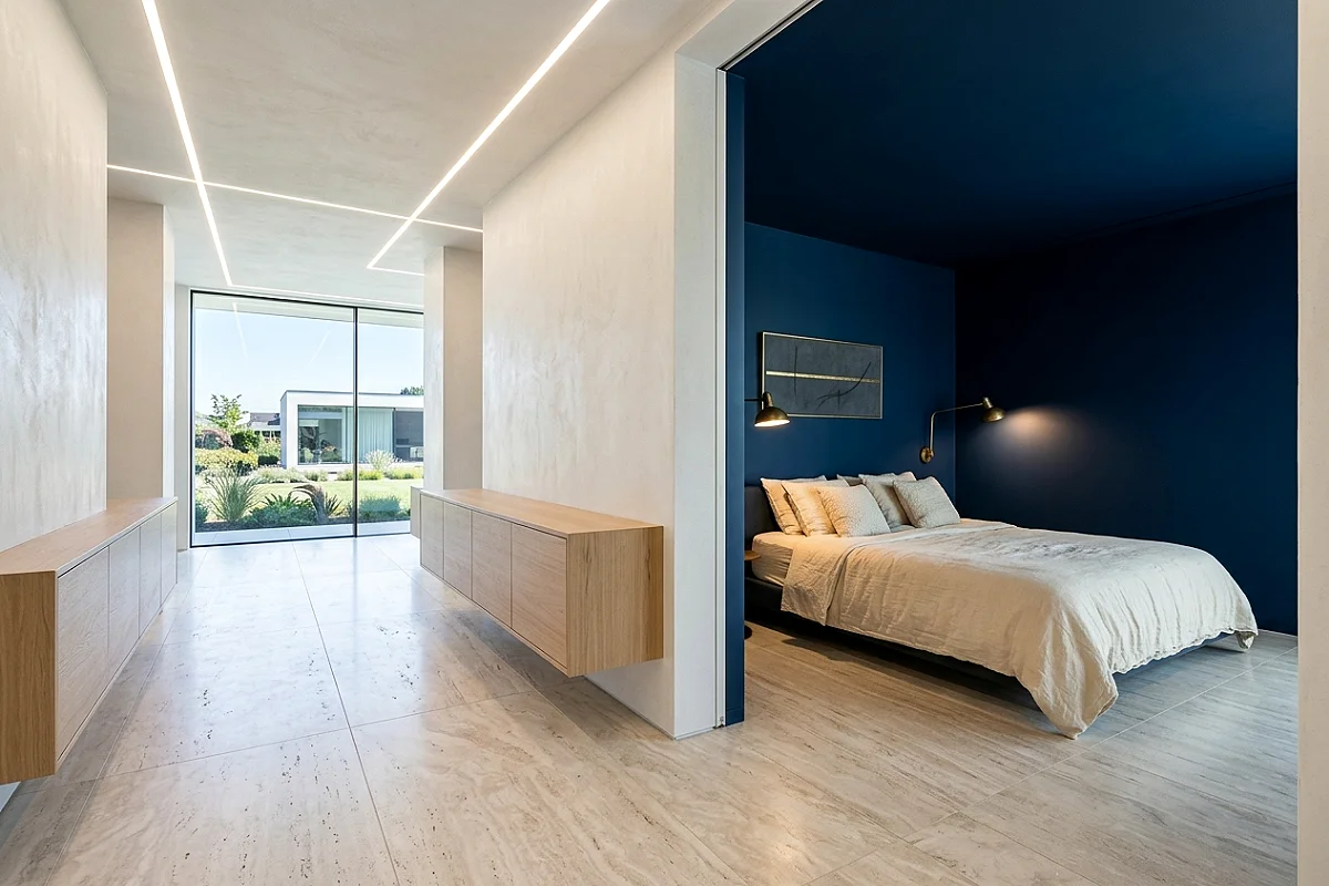
A bedroom painted in deep midnight blue — Farrow & Ball’s Hague Blue or Stiffkey Blue, Benjamin Moore’s Hale Navy, or Little Greene’s Obsidian — on all four walls and the ceiling simultaneously creates a sleeping environment that is the opposite of what most people expect: not cold or oppressive, but deeply enveloping, profoundly calming, and genuinely conducive to sleep in a way that lighter rooms rarely achieve. The darkness of the room at night — when the walls disappear into the background and only the warm amber lamps and any candles provide light — is extraordinary. Against this deep blue backdrop, bedding in warm ivory or cream glows, unlacquered brass fixtures warm the room’s cool tones, and any natural wood in the furniture reads as particularly rich and grounded.
Pro Tip
Paint a dark blue bedroom in an eggshell or satin finish rather than matte. In a very dark room, eggshell picks up and reflects the warm light from lamps and candles in a subtle glow that makes the walls seem to participate in the room’s lighting rather than simply absorb it. Matte finish on very dark walls can read as flat and light-consuming in a way that makes the room feel smaller rather than enveloping.
Driftwood and Blue Textile Bedroom
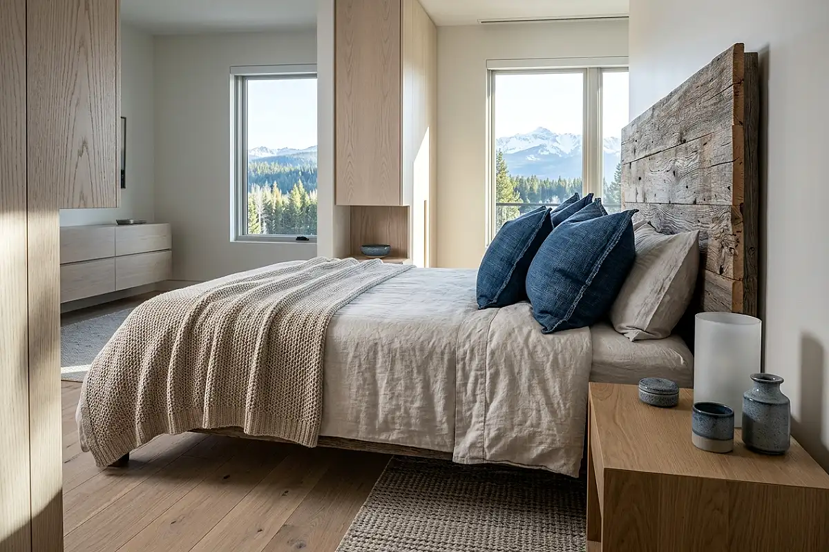
A bedroom built around the specific material palette of the coast at its most elemental — bleached driftwood, raw linen, and the particular blue of faded indigo — has a quality of weathered, natural beauty that no trend-driven coastal decorating can replicate. Pieces of genuine driftwood as decorative objects, a headboard or shelving in whitewashed or lightly bleached reclaimed wood, indigo-dyed linen cushions in varying tones from deep navy to near-white, a hand-woven cotton throw in natural and indigo stripe, and ceramic accessories in a sandy, salt-glaze finish all speak the same material language. The room reads as gathered from the shore rather than assembled from a store — and that specific quality of authenticity is what makes coastal design feel genuinely restful rather than themed.
Pro Tip
Collect genuinely coastal natural objects — smooth river or sea stones, a piece of real driftwood, a few dried sea grasses — and use these as anchor pieces in shelf and surface vignettes. The real objects, however modest, carry an authenticity that manufactured coastal accessories cannot replicate, and they cost nothing beyond the time it takes to find and bring them home.
Cerulean Blue Painted Ceiling
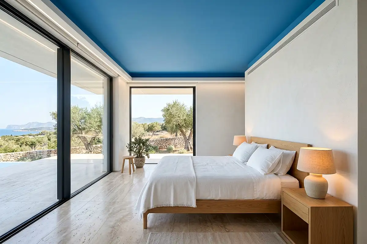
Painting the ceiling in a clear, saturated cerulean blue — the specific blue of a cloudless midday sky — while leaving the walls white or warm ivory creates a room with an extraordinary quality of openness overhead: lying in bed looking up, the effect is of looking directly into a sky, with the white walls functioning as the horizon line all around. This is one of those treatments that photographs as dramatically as it reads in person, and it works in any room with a ceiling height of 8 feet or above — below that it can feel slightly pressing. Pair with white bedding, natural wood furniture, and warm amber lamps, and allow the ceiling to be the room’s single color statement. Sherwin-Williams’ Bluebird, Benjamin Moore’s Harbour Side, or Farrow & Ball’s Cook’s Blue all hit the right tone for this specific application.
Pro Tip
Paint the ceiling two coats before doing the final wall coats — any ceiling paint that drips or rolls onto the walls will be covered when you cut in the final wall color. Cutting a crisp line between a colored ceiling and white walls is the most technically demanding part of this treatment; use a high-quality angled brush and take your time with the cut-in rather than rushing it with painter’s tape, which often pulls the ceiling paint.
Blue and White Striped Bedding with Rattan Accents
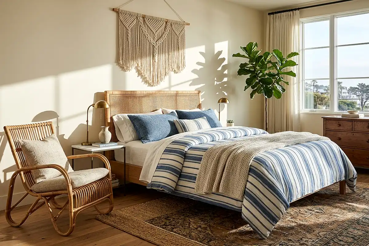
The classic combination of blue and white stripes — in a wide ticking stripe or a bold horizontal stripe across the duvet cover and pillowcases — paired with rattan and natural wicker furniture is the most directly coastal of all the bedroom directions in this list, and the one most people picture when they think of beach house design at its best. The key to making it feel genuinely chic rather than thematic is the quality and scale of the stripe: a wide, confident ticking stripe in a faded indigo blue and warm white reads as design; narrow nautical stripes in bright navy and brilliant white reads as a child’s beach-themed room. Pair with a rattan headboard or side table, woven seagrass baskets, a jute rug, and driftwood-finished floating shelves for a complete material palette that requires no further decoration.
Pro Tip
Keep the wall color in a striped-bedding bedroom in a warm white or very pale warm ivory rather than a true white or a contrasting color. A warm white wall allows the stripe pattern to be the room’s pattern statement without competition, and it prevents the blue tones in the stripe from reading as cooler than intended against a stark brilliant white wall.
Sage Blue and Terracotta Accent Pairing
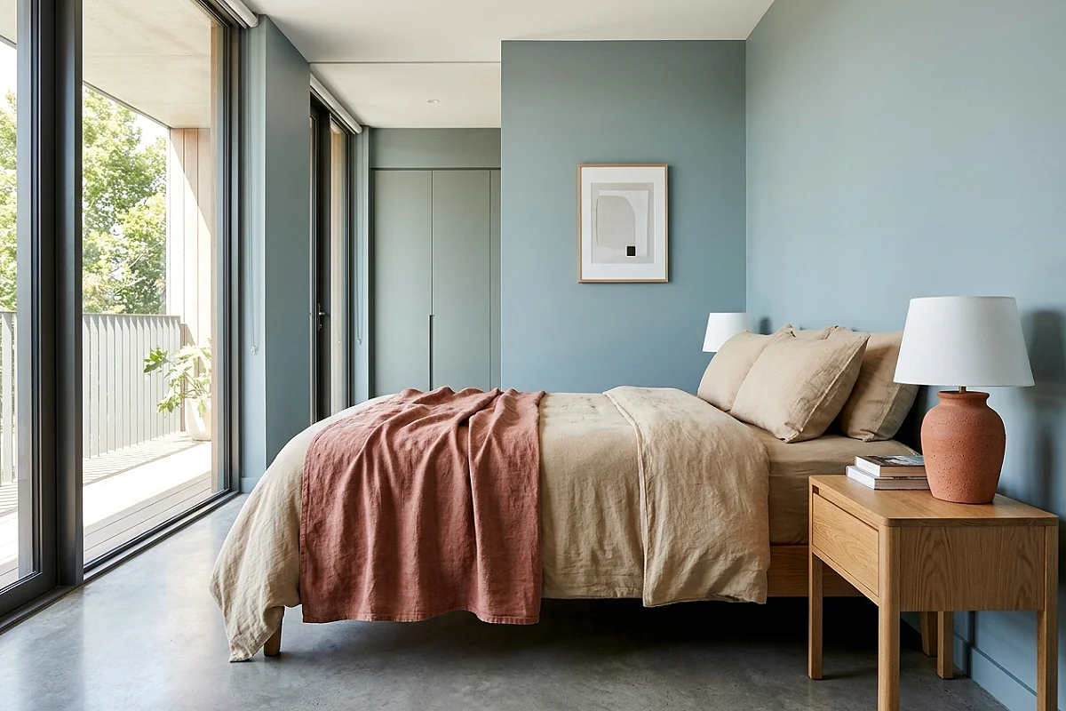
Sage blue — the specific muted, slightly green-tinged blue that reads as a natural halfway point between the sea and coastal vegetation — paired with warm terracotta accents creates a bedroom palette of remarkable organic beauty. The complementary tension between the cool blue and the warm terracotta is what makes the combination so visually alive: each color makes the other more saturated and more interesting by proximity. Sage blue walls with a terracotta ceramic lamp, a blush-terracotta linen throw, a hand-thrown terracotta pot beside a trailing plant, and warm sandy linen bedding — each warm terracotta element sits against the cool blue background like a piece of sun-warmed stone on a sea wall. This is a coastal palette that references the Mediterranean rather than the Atlantic or the Pacific, and it carries a warmth and richness that pure blue-and-white coastal rooms can struggle to achieve.
Pro Tip
Use terracotta accents sparingly — two or three objects, not a terracotta pattern or a full terracotta wall. In a sage blue room, terracotta works as a warm punctuation mark: it makes the blue look richer and the room feel warmer. Used too extensively, it tips the balance away from the calm blue quality that makes this bedroom direction so appealing.
Watercolor Blue Abstract Art as the Focal Point
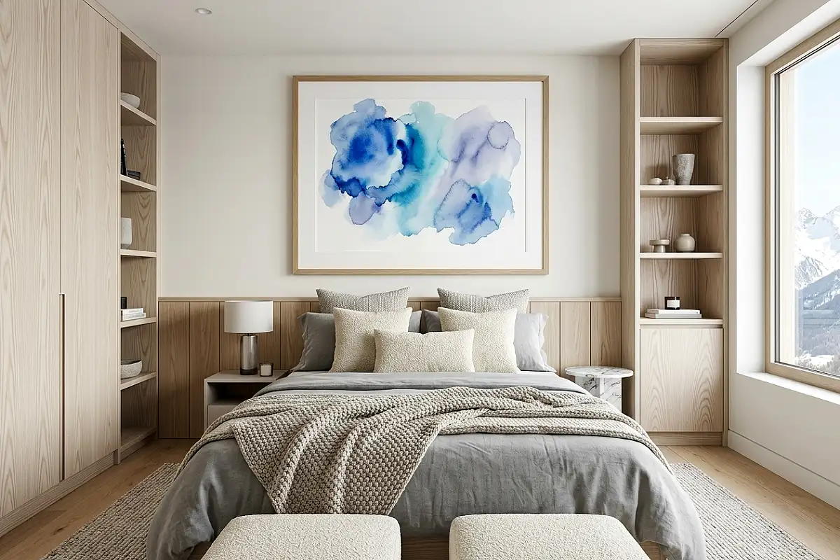
A large-format watercolor abstract in blues — ranging from pale aqua to deep cobalt, with areas of warm ivory and grey — hung above the bed as the room’s single major art piece creates a bedroom focal point that references the visual quality of water and sky in a way that is genuinely beautiful rather than decoratively coastal. The watercolor medium itself contributes to the room’s atmosphere: the soft edges, the bleed of color into wet paper, the unpredictable movement of pigment — all of these are qualities that read as appropriately fluid and calming in a room associated with rest. An original watercolor from an independent artist on Etsy in a large format is often very affordable; alternatively, a high-quality giclée print of a watercolor original, professionally framed with a wide white mat, achieves the same visual quality at a fraction of the cost.
Pro Tip
Frame watercolor art with a mat that is at minimum 3 inches on all sides — wider at the bottom than the top in the traditional gallery proportion. The wide mat gives the painting visual breathing room and separates the art from the wall in a way that signals genuine consideration. A watercolor with a thin or absent mat reads as a poster; the same piece with a proper wide mat reads as fine art.
Washed Blue Linen Curtains Floor to Ceiling
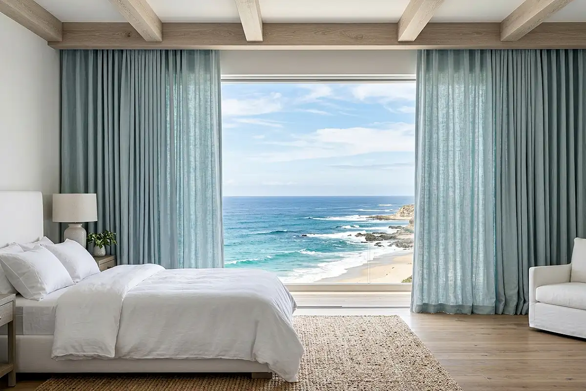
Floor-to-ceiling curtains in a washed, slightly faded blue linen — the color of denim that has been washed many times, or of a blue chambray shirt worn in summer until the color has softened to something between blue and sky — hung from a ceiling-mounted rod and falling all the way to the floor, create a bedroom that feels like it’s been wrapped in the most specific quality of coastal light. When the curtains move in a breeze from an open window, the room takes on a quality of motion and lightness that static walls can never achieve. The washed quality of the linen is essential: new, saturated blue linen reads as bold; pre-washed or stonewashed linen in a faded, complex blue reads as lived-in, relaxed, and genuinely coastal. Many linen mills now offer stonewashed blue linen by the yard for simple curtain panels.
Pro Tip
Wash new linen curtain panels two to three times before hanging them. Each wash softens the fiber, fades the color very slightly in a natural and uneven way, and increases the natural drape of the fabric significantly. Linen that has been pre-washed several times hangs and moves completely differently from linen installed directly from the manufacturer — the aging process is the design.
Deep Teal Accent Wall with Natural Wood Furniture
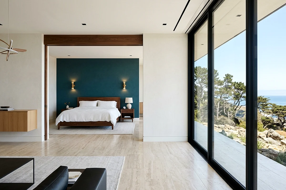
Teal — the specific blue-green that sits exactly between deep sea blue and coastal vegetation green — is one of the most versatile and most beautiful of all the coastal blue tones on a headboard wall. It is warm enough to feel grounded and inviting, complex enough to shift between green and blue depending on the light quality, and deep enough to create genuine visual drama without requiring the full commitment of a navy or midnight blue. Against a teal accent wall, natural wood furniture in medium oak or walnut reads as particularly warm and rich, white or ivory bedding glows cleanly, and any brass or bronze fixture is enhanced rather than overwhelmed. Farrow & Ball’s Vardo, Benjamin Moore’s Teal Ocean, and Behr’s Deep Ocean all sit in this tonal family.
Pro Tip
A teal accent wall reads best when the trim — baseboards, window surround, and door frame on that wall — is painted in a warm white with a slight cream undertone rather than a cool brilliant white. Cool white trim against teal reads as clinical; warm white trim against teal reads as considered. It is a detail that is invisible to most people but immediately register as something being right or slightly off.
Blue and White Zellige Tile Headboard Panel
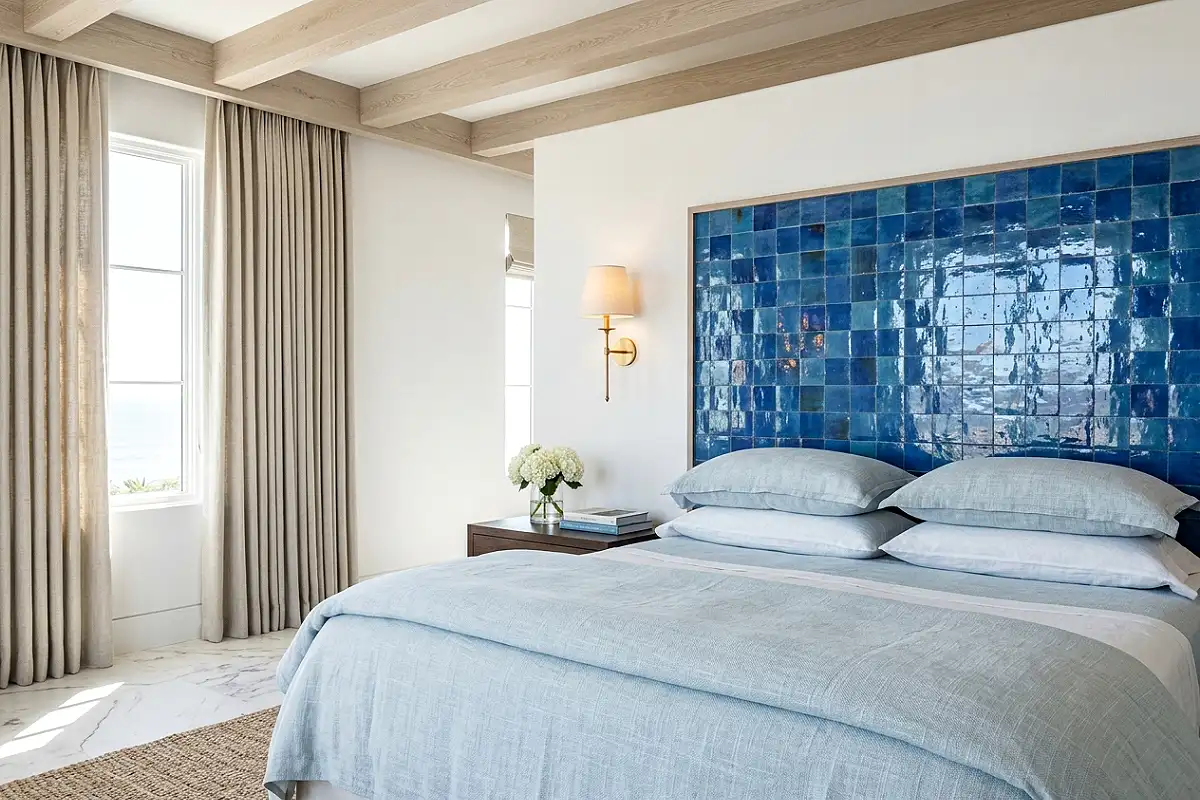
A panel of handmade Zellige tiles in varying tones of blue — from pale aqua to deep cobalt, with the characteristic natural color variation of genuine handmade Moroccan ceramic — installed as a headboard wall treatment creates one of the most visually extraordinary coastal bedroom moments available in any renovation budget. The reflective quality of the glazed ceramic surface catches lamplight and changes character throughout the day in a way that painted surfaces cannot. Each Zellige tile is slightly different in glaze depth and surface texture, which means the panel as a whole has a living, shimmering quality that reads as genuinely artisanal. Pair with white plaster or limewash on the remaining walls, natural linen bedding, and minimal furniture so the tile panel can function as the room’s complete artistic statement.
Pro Tip
Seal Zellige tiles in a bedroom application with a penetrating stone and ceramic sealer after grouting. Zellige’s handmade glaze has micro-pinholes that, unsealed in a bedroom context where body oils, perfume, and hand contact are regular, will absorb staining over time. A penetrating sealer applied annually maintains the tiles’ surface quality indefinitely without altering their appearance.
Coastal Blue Shiplap Accent Wall
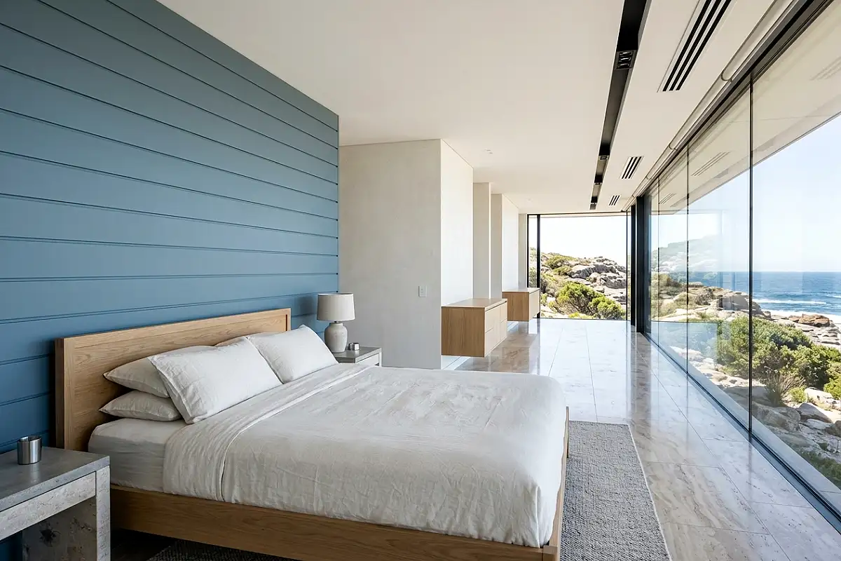
Horizontal shiplap paneling — either genuine wood shiplap or MDF boards spaced with a consistent reveal — painted in a muted coastal blue creates a wall treatment that reads as both architecturally substantial and distinctly coastal at the same time. The horizontal lines of the shiplap boards reinforce the visual language of the horizon — the most fundamental image of the coast — and the shadow lines between boards create a subtle texture that flat paint cannot produce. In a lighter blue, this reads as airy and beach house casual; in a deeper slate or steel blue, it reads as a more contemporary, editorial coastal direction. Either version benefits from being limited to the headboard wall rather than applied to all four sides, which prevents the room from feeling like the interior of a beach hut.
Pro Tip
Space shiplap boards with a consistent 1/8-inch reveal between boards using a spacer cut from a piece of scrap wood rather than eyeballing the gap. Inconsistent spacing is the most visible quality issue in a DIY shiplap installation and is apparent the moment light rakes across the wall at an angle — consistent spacing reads as professional; inconsistent spacing reads as imprecise regardless of how well the individual boards are cut and fitted.
Pale Blue and Pale Blush Tonal Pairing
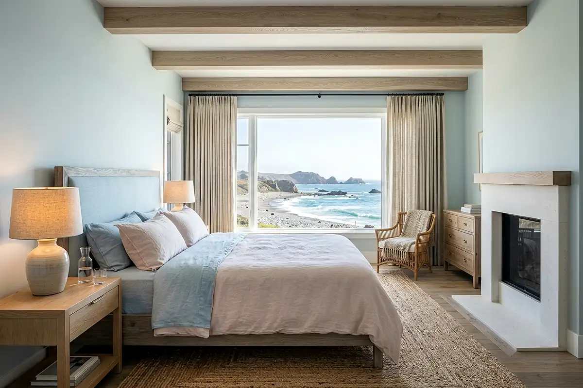
Pale blue and pale blush — both in their most muted, greyed, barely-there versions — create a bedroom palette of extraordinary softness that reads as simultaneously gender-neutral and distinctly beautiful. The two tones share enough grey in their undertones to feel like a family rather than a contrast, and the combination carries the specific quality of early morning light on a misty coastal day — everything slightly blurred, slightly cool, impossibly gentle. Pale blue walls, blush linen bedding, a pale rose-tinted ceramic lamp, a soft blue throw at the foot of the bed, blush Euro shams behind white standard pillows — the room never asserts any color loudly, and the overall effect is one of the quietest and most restful bedrooms available in any palette. Benjamin Moore’s Icy Blue paired with their Pale Blush is a ready-made version of this combination.
Pro Tip
In a pale blue and pale blush bedroom, the warmth must come entirely from lighting and materials rather than from color — the palette itself carries almost no warmth. Use the warmest possible bulbs throughout, introduce natural wood grain wherever furniture allows, and use natural fiber textiles exclusively. Without these warm anchors, a pale blue and blush room can slip from ethereally soft to slightly cold and washed-out.
Blue Grasscloth or Sisal-Weave Wallpaper
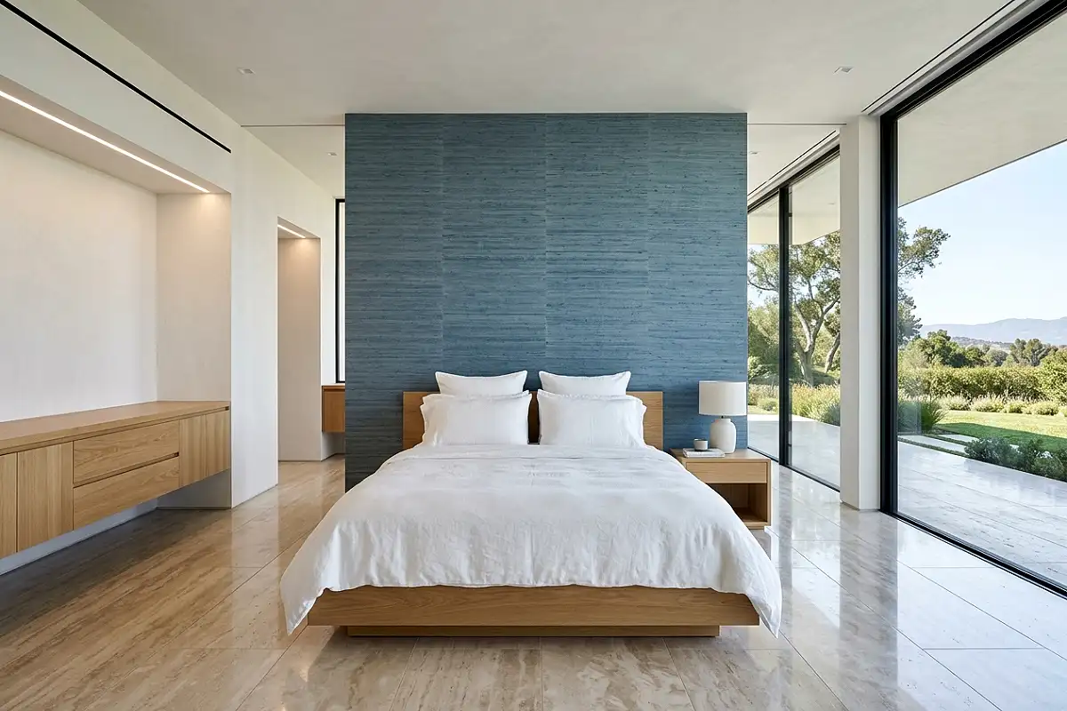
Grasscloth wallpaper in a blue-dyed or blue-tinted natural weave — where the underlying sisal, jute, or seagrass fiber shows through the color and contributes a warm, organic texture to the surface — creates a wall treatment that is uniquely suited to a coastal bedroom. The natural fiber texture references the organic world of the coast — sea grass, woven rope, natural reed — while the blue dye connects it to the water. Because of the fiber’s natural variation, grasscloth wallpaper is never truly uniform: different sections absorb dye at slightly different rates, producing subtle vertical streaking that reads as intentional weave variation rather than defect. This variation is what makes grasscloth feel so warm and alive as a wall surface — it behaves more like a woven fabric than a flat wallcovering.
Pro Tip
Grasscloth wallpaper seams are visible by design — the natural fiber edge cannot be made invisible the way paper or vinyl wallpaper can. Minimize the visibility of seams by planning the layout so they fall in the least-lit areas of the room and by installing panels in the same dye-lot orientation. Mixing orientations of grasscloth panels produces visible tonal streaking differences at seams that are much more apparent than the seams themselves.
Indigo Blue Batik or Block-Print Textile Wall
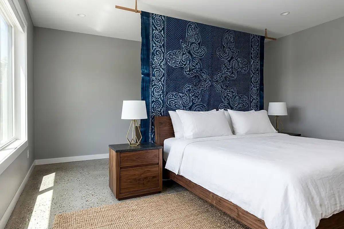
A length of hand-dyed indigo batik fabric or Indian block-print cotton in a deep indigo-blue pattern — moon flowers, geometric resist patterns, or abstract botanical motifs — suspended from a ceiling-height dowel or a slim curtain rod mounted at the top of the wall creates a textile headboard installation of extraordinary beauty and depth. Indigo blue has a specific quality of natural dye richness that synthetic blue cannot replicate: the color varies across the fabric surface in subtle ways that reveal the resist-dyeing process, the hand of the fabric is different from one piece to the next, and the pattern is never mechanically perfect. The result is a wall treatment that reads as genuinely artisanal and global in its reference — connected to centuries of textile craft — rather than as a piece of bought coastal decor.
Pro Tip
Wash indigo-dyed fabric twice before hanging it to remove any excess dye that might transfer to pillowcases or bedding if it comes into contact with them over the bed. Wash in cold water with a tablespoon of white vinegar added to the rinse cycle — the acid in the vinegar sets the indigo dye and significantly reduces future bleeding. Dry flat or over a line in shade rather than in direct sun, which fades indigo more quickly than almost any other natural dye.
Steel Blue and Warm Brass Bedroom
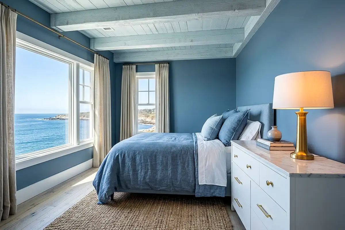
Steel blue — the specific cool, slightly industrial blue that references gunmetal and the grey-blue of still water at dusk — paired with warm, unlacquered brass creates one of the most sophisticated and unexpected color-and-metal combinations available in a coastal bedroom. The pairing works because the warmth of the brass does precisely what warm amber light does to a cool blue room: it activates a hidden richness in the blue’s undertone and prevents the steel from reading as cold or harsh. Unlacquered brass bedside lamps against steel blue walls, brass curtain hardware against steel blue linen panels, a warm brass mirror above a white dresser in a steel blue room — each instance of the metal warms the blue around it and creates a visual tension that reads as genuinely editorial and current.
Pro Tip
In a steel blue and brass bedroom, use unlacquered rather than lacquered brass throughout — the living patina of unlacquered brass deepens and warms over time in a way that harmonizes with the cool blue more beautifully than the flat, uniform tone of lacquered brass, which can read as too yellow against steel blue’s cool sophistication.
Coastal Blue Bedroom with Rattan and Seagrass Accessories
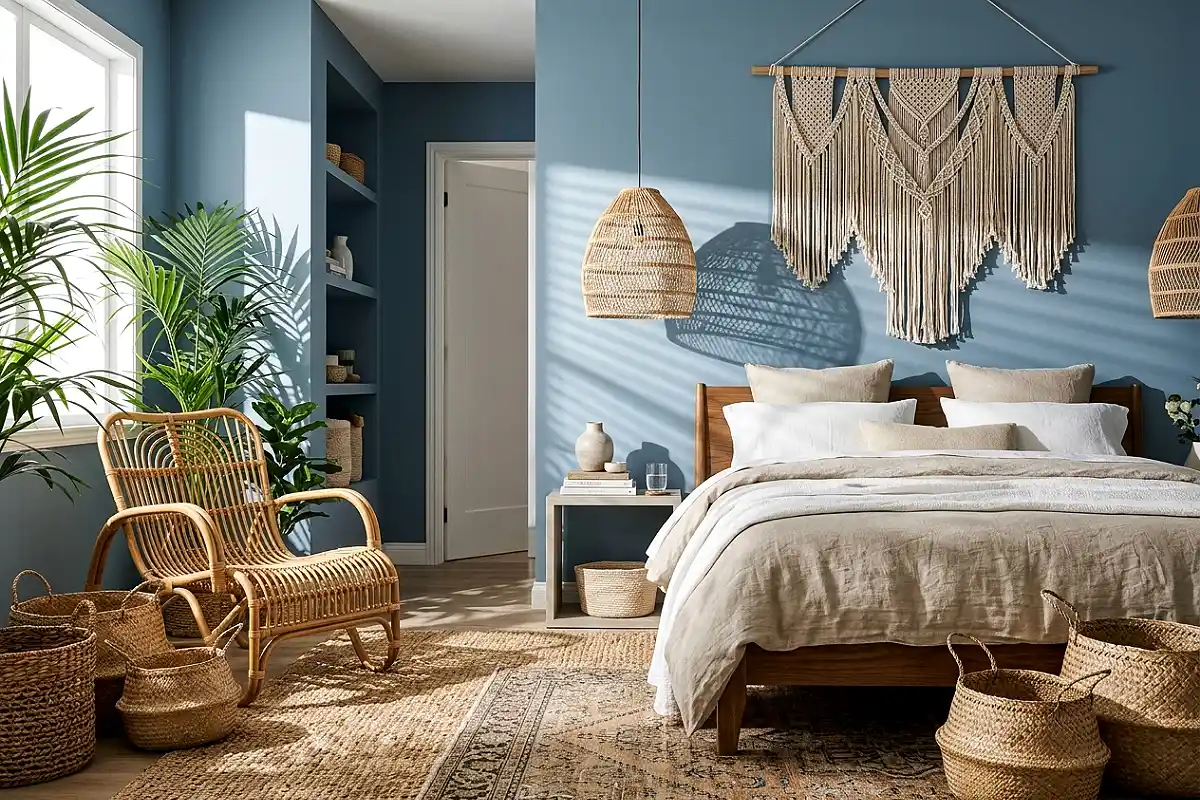
Blue walls or a blue headboard against a collection of natural rattan, wicker, and seagrass accessories — baskets in varying sizes on the floor and open shelves, a rattan pendant light above the bed, woven seagrass lidded boxes on the dresser, a seagrass rug anchoring the floor — creates a bedroom that reads as a fully realized coastal habitat rather than a room decorated with coastal motifs. The natural fiber accessories bring warmth, organic texture, and material authenticity to the blue room in a way that no ceramic or glass accessory can replicate, because they are literally made from the kinds of plants that grow at the water’s edge. The combination of blue paint or fabric and natural coastal fiber is the most elemental and enduring expression of coastal design available in a bedroom context.
Pro Tip
Vary the weave density and color of your natural fiber accessories — some tightly woven and honey-toned, some loosely woven and bleached near-white, some in a darker natural brown — rather than buying a matching set in the same weave. The variation in natural fiber texture and tone creates the organic diversity that makes a collection of woven accessories look gathered rather than purchased as a set.
Blue Bedroom with Warm Ambient Candle Arrangement
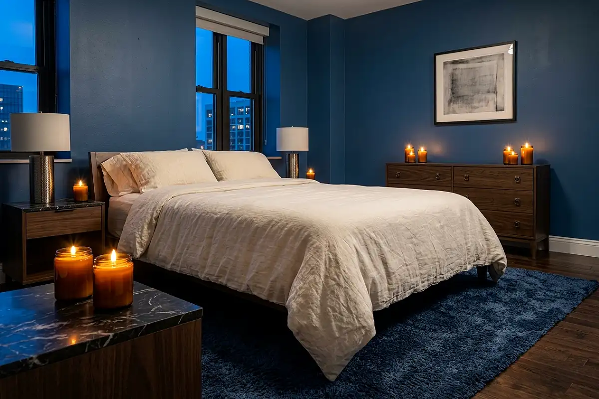
A blue bedroom at night — particularly in a deeper or more saturated blue — is transformed by the specific quality of candlelight in a way that no other room color matches. The warm, amber-gold flame against a cool blue surface creates a visual warmth that reads as cinematically beautiful and that changes the entire character of the room from a daytime cool palette to an evening atmosphere of depth and intimacy. A cluster of pillar candles in varying heights on the dresser, a pair of taper candles in unlacquered brass holders on the nightstands, and a large vessel candle in an amber glass jar on a low side table create multiple points of warm flame light that flicker and animate the blue walls in constantly moving shadows and highlights. A blue room by candlelight is one of the most beautiful domestic environments that exists.
Pro Tip
In a blue bedroom, choose candles in warm amber, beeswax natural, or cream tones rather than white. White candles against a blue wall read as cold and clinical; warm cream or amber candles read as golden and genuinely warm. The color of the wax contributes to the visual temperature of the candlescape even before the candle is lit.
Frequently Asked Questions
What shades of blue work best in a bedroom?
The most livable and beautiful blue bedroom shades tend to fall into two categories: warm-undertoned blues with a slight green or grey component — dusty teal, sage blue, muted aqua, washed indigo — and cool, deeply saturated blues where the commitment is complete enough to create a genuinely enveloping environment — midnight navy, deep Prussian blue, inky teal. The blues that work least well as bedroom colors are the medium, bright blues in the middle of the spectrum — pure primary blue, bright cobalt, electric blue — which have a visual energy that works against rest. Muted, complex, and either very light or very deep versions of blue are consistently the most beautiful bedroom choices.
How do I make a blue bedroom feel warm rather than cold?
Warmth in a blue bedroom comes from three sources: lighting (warm amber bulbs at 2200K throughout, no cool or daylight bulbs), materials (natural wood in warm tones, linen in oatmeal and ivory, jute and seagrass textiles, unlacquered brass fixtures), and accent colors (terracotta, warm sand, ivory, and warm white rather than grey or cool white). A blue room that uses cool lighting and cool white accessories will feel cold regardless of how beautiful the blue itself is. The same blue with warm amber lighting and natural material companions feels genuinely inviting.
What colors go well with blue in a bedroom?
The most beautiful blue bedroom pairings are warm sand and ivory (the most universally successful companion to any coastal blue), warm terracotta and clay (for a Mediterranean rather than Atlantic coastal quality), unlacquered brass and warm gold (the metal finish that most naturally warms cool blue tones), warm white with a cream undertone (the best neutral for blue bedroom trim and bedding), and natural wood in medium to warm tones (oak, walnut, and teak all read particularly richly against blue backgrounds). Cool grey and brilliant white are the least successful companions — they reinforce the cool quality of blue without contributing any warmth.
Is blue a good color for a bedroom?
Blue is arguably the single best color for a bedroom from a sleep-science perspective — research consistently shows that blue environments reduce heart rate and cortisol levels more effectively than any other color family, which directly supports the physiological conditions for better sleep. From a design perspective, blue’s association with sky and water gives it a quality of visual expansiveness that makes even small bedrooms feel less bounded. The important caveat is that the specific shade matters enormously — a cool, bright blue can feel stimulating rather than calming, while a muted, warm, or deeply saturated blue reliably produces the restful quality the color is capable of at its best.
How do I create a coastal bedroom without it looking too themed?
The key is referencing the materials and colors of the coast rather than its decorative motifs. Blue, white, and warm sand are coastal without any shells, anchors, or lighthouse prints being required. Natural fiber textiles — linen, jute, seagrass, rattan — are coastal without being explicitly nautical. Weathered or whitewashed wood reads as coastal through material quality rather than decoration. The moment you introduce objects that are explicitly themed — rope accents, printed maritime motifs, decorative buoys — the room tips from coastal-inspired to coastal-themed, which is a meaningfully different and significantly less elegant register.
What is the best blue paint for a bedroom?
Farrow & Ball’s Skylight is the most admired pale blue bedroom color currently — a barely-there blue with the quality of reflected light rather than applied pigment. Their Hague Blue is the definitive deep bedroom blue, with extraordinary depth and warmth for a cool tone. Benjamin Moore’s Van Deusen Blue and Wedgewood Gray both perform beautifully in mid-tone bedroom applications. Sherwin-Williams’ Uncertain Gray reads as blue in most bedroom lights despite its name and is one of the most nuanced and livable options in the range. All of these should be tested as large painted swatches on the actual bedroom wall, observed at multiple times of day and under both natural and lamp light, before committing — blue shifts more dramatically between light conditions than almost any other color.
A blue bedroom, at its best, does what the coast itself does — it makes the world feel quieter, larger, and more worth being present in.