
21 White and Grey Bedroom Ideas for a Timeless and Elegant Space
White and grey is the palette that never apologizes. While trend colors cycle in and out every few years, the white-and-grey bedroom has stood behind closed doors of grand hotels, Parisian apartments, and the world’s most photographed spaces for over a century — because it’s built on something sturdier than fashion. It’s built on light itself: white reflects it, grey softens it, and together they turn a bedroom into the calmest, most spacious-feeling room in any house. It’s also the palette of restraint, and restraint photographs like money. Every styling trick below is about getting more out of less.
The one rule I’d paint on the wall: white and grey fail by flatness, not by color. A room that’s all smooth white surfaces and one flat grey tone reads as a hospital waiting room; a room that layers the tones — dove next to charcoal, linen next to lacquer, plaster next to marble — reads as a magazine cover. The 21 ideas below cover walls, bedding, light, texture, and the small metal details that tie it all together. Commit to the layering, and you’ll have a bedroom that feels timeless in ten years and timeless in twenty.
The Undertone System
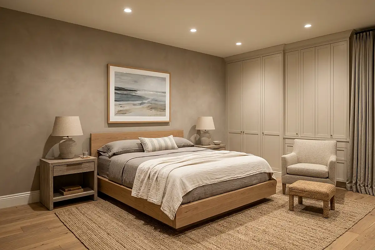
Before buying a single thing, learn your greys’ undertones — this one skill separates elegant rooms from muddy ones. Greys lean warm (greige, mushroom, putty), cool (blue-grey, steel), or neutral (the rare true grey). Whites lean warm (cream, ivory) or cool (paper white, ice). The system: keep every grey in the room on the same side of the fence, and match your white to it — warm greys take warm whites, cool greys take crisp whites. One off-key piece (a blue-grey throw on a mushroom wall) is enough to make the whole room feel “off” without anyone knowing why.
Pro Tip
Test undertones against each other, not against the chip book — hold the paint swatch next to your existing bedding and rug in the room’s evening light, where undertone mistakes show themselves most honestly.
The Hotel Bedding Tower
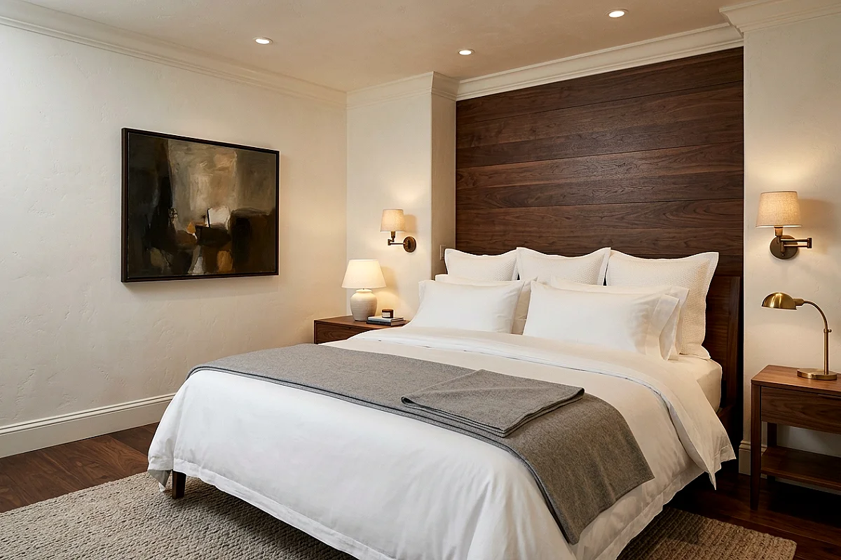
Elegance starts at the bed, and the hotel stacking method is free to steal. Build from the mattress up: fitted sheet, flat sheet folded over the duvet’s top third, duvet tucked smooth to the bed’s center, then a folded grey throw or coverlet across the foot, and finally pillows in graduating order — two sleeping pillows, two shams, one accent. Every layer white or grey, every layer with visible, crisp edges. The folded-over flat sheet is the signature move; it’s what makes beds look made by housekeeping rather than merely made. Wash linens until they soften — hotel sheets are always washed, never new-feeling.
Pro Tip
Iron or steam the flat sheet before the daily fold — the crisp crease across the bed’s top third is the detail that signals intention, and it takes ninety seconds with a steamer.
Textured Charcoal Feature Wall
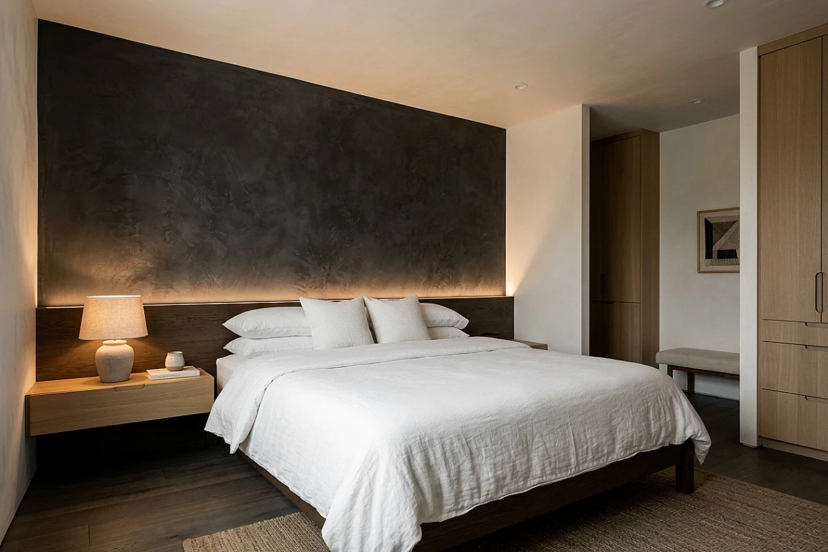
Charcoal isn’t black’s little brother — it’s a different material entirely. A feature wall in charcoal with visible texture (limewash, clay plaster, or textured paint rolled with a heavy nap) gives a white bedroom its one moment of gravity: the eye rests on the dark plane, and the white around it reads brighter by comparison. Texture is mandatory here — smooth charcoal paint reads as a mistake, while plastered charcoal reads as architecture. Keep the wall behind the bed, dress the bed in white, and the room achieves the hotel-suite contrast that makes people photograph their own bedrooms.
Pro Tip
Paint the textured feature wall last, after all white surfaces are finished — charcoal’s darker tone hides nothing, and any white spatter on it shows; the reverse spatter on white walls is easy to touch up.
Grey Wainscoting with White Above
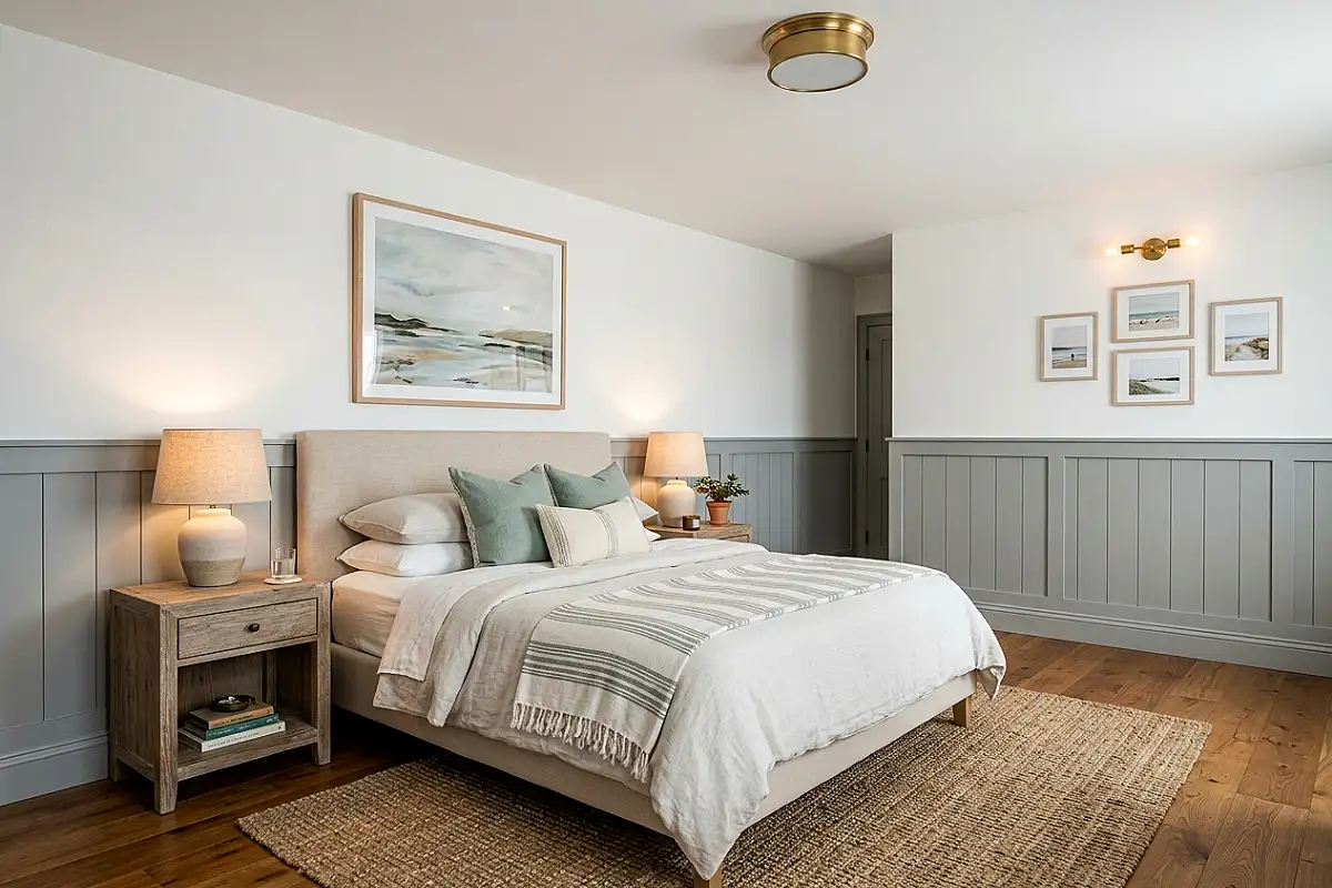
The chair-rail divide — grey paneled or painted wainscoting on the lower third, white above — is the oldest elegant trick in the book, and it does two jobs at once. Structurally, it grounds the room: the darker lower band makes ceilings feel higher and walls feel anchored. Aesthetically, it gives white rooms a built-in horizon line, so the space reads as finished rather than merely painted. Shaker-style panels in soft grey with crisp white trim above is the classic; a simple painted lower band achieves the same effect at a fraction of the cost. Either way, the room gains its architectural credentials for the price of paint.
Pro Tip
Set the chair rail at 32 to 36 inches — furniture height, not mathematical thirds — so beds, dressers, and nightstands tuck under the white zone instead of colliding with the grey band.
Mercury Glass Layer
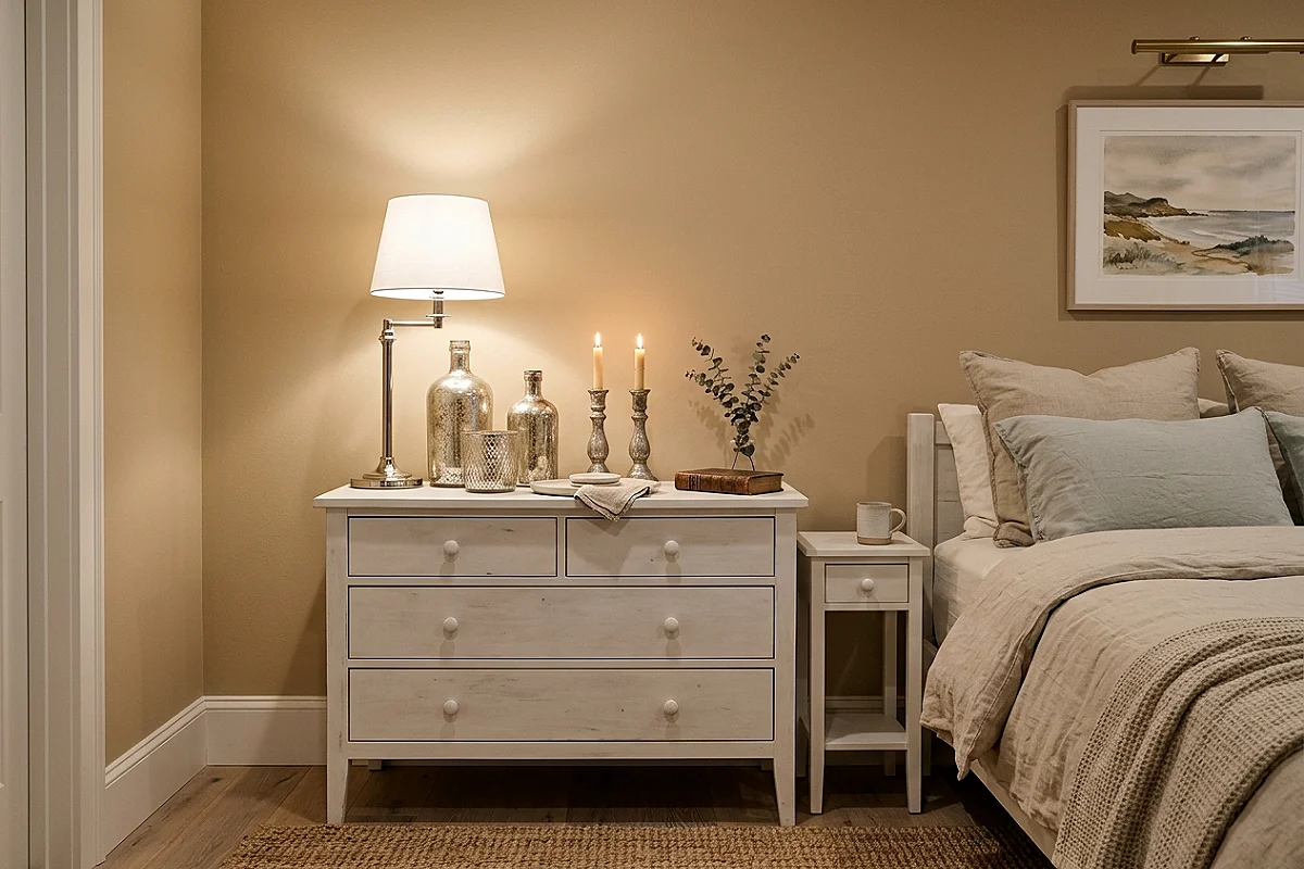
Mercury glass — silvered antique-style glass with its cloudy, mirror-speckled finish — is white-and-grey’s secret metallic. A grouped collection on the dresser or vanity (vases, candle holders, small bowls in graduated sizes) catches the room’s light and breaks it into soft silver glints, adding a third register between the white’s brightness and the grey’s shadow. The cloudy finish keeps it from ever looking like chrome display pieces; each object looks discovered rather than purchased. Group in odd numbers on a white surface, and the collection becomes the room’s jewelry — understated, luminous, and completely timeless.
Pro Tip
Clean mercury glass only with a dry microfiber cloth — water and glass cleaners seep behind the silvering of some pieces and cloud them permanently, and the cloudy look is exactly what makes them beautiful.
Relaxed Grey Linen Drapes
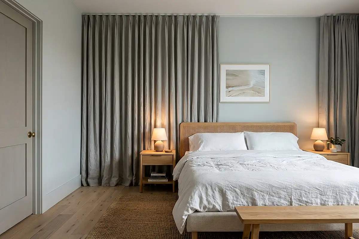
Grey linen curtains, hung ceiling-to-floor and left to fall with their natural rumple, are the textile that gives white rooms their grown-up softness. Linen’s uneven weave catches daylight differently across every inch, so the drapes shimmer faintly as the sun moves — a quiet animation no synthetic can imitate. Choose a medium-grey dove tone: lighter reads as white-by-accident, darker edges toward blue-grey drama. Linen filters light without blocking it, so mornings stay bright and soft, and the fabric’s honest wrinkles mean the drapes never look staged. They look lived-in, which in this palette is the highest style.
Pro Tip
Buy linen with weight — 170 gsm or heavier — and steam the full drop before first hanging; lightweight linen looks translucent and cheap at the window, while heavy linen falls like architecture.
Grey-on-White Textural Wallpaper
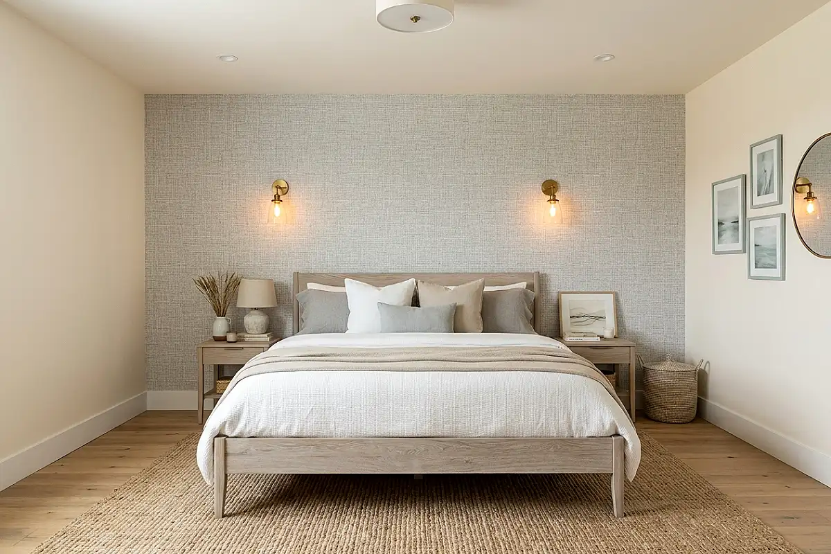
Wallpaper in this palette is almost invisible at first glance — and that’s the point. A grey-on-white design (subtle linen weaves, delicate tonal damasks, whisper-thin stripes) covers the walls in texture the eye feels before it reads. The effect in a white bedroom is richness without color: walls that look like fine fabric, light that lands softer, and a room that photographs with depth. Choose patterns where the grey is printed, not embossed, so it reads graphically rather than as texture-only. One feature wall keeps it restrained; all four walls make the room feel upholstered. Either choice beats flat paint permanently.
Pro Tip
View tonal wallpaper samples at an angle in evening light — subtle patterns reveal themselves only in raking light, and a sample that looks blank head-on may be stunning from the doorway at night.
Nickel & Chrome Punctuation
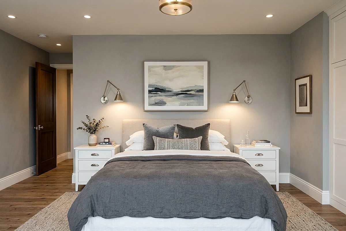
Where warm rooms wear brass, white-and-grey bedrooms wear nickel and chrome — the cool metals that extend the palette into its objects. Polished nickel sconces, chrome table lamp bases, brushed-nickel drawer pulls: each one a small bright moment that reads as light rather than color. The trick is consistency — choose one cool metal family and use it on every fixture, pull, and frame in the room. Mixed metals fracture a neutral palette instantly, while a single cool metal threads the whole scheme together like a silver pencil line through a pencil sketch.
Pro Tip
Buy fixtures in the same finish family from the same manufacturer — “polished nickel” varies noticeably between brands, and mismatched shades of silver are visible the moment you look for them.
Grey Marble Nightstand Tops
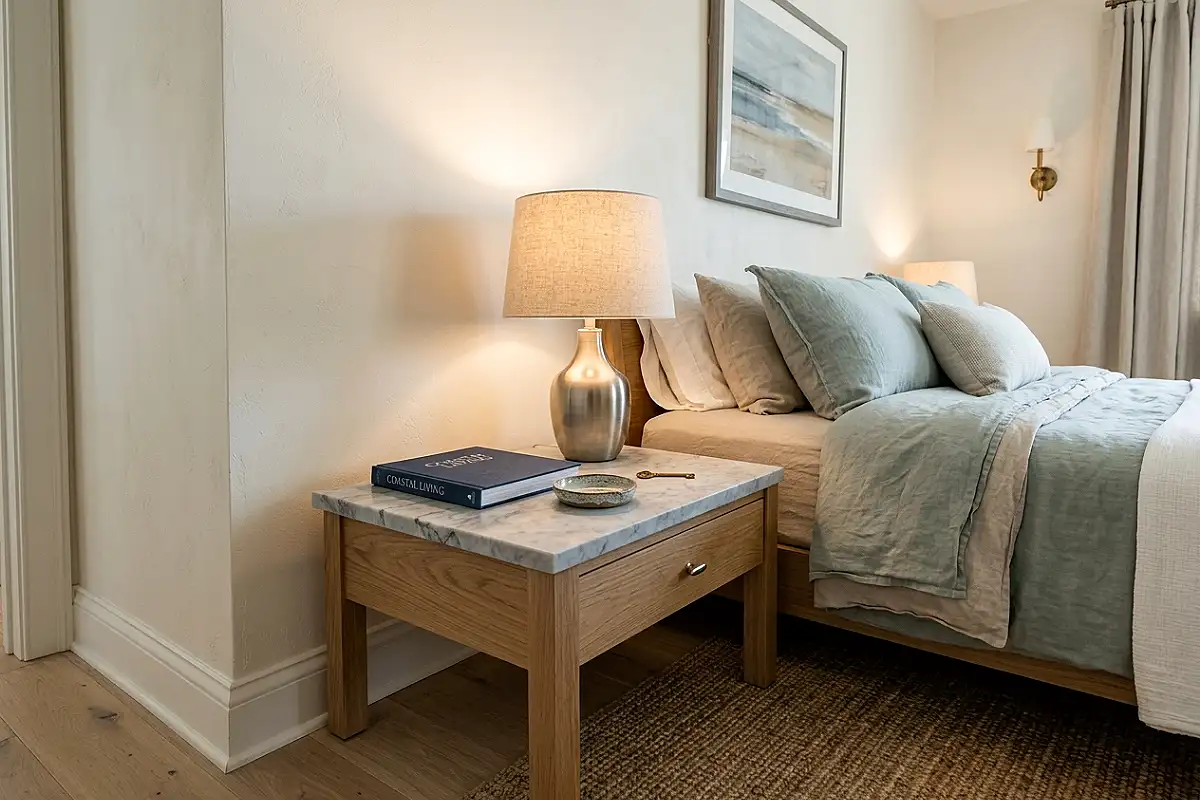
Grey-veined marble — light Carrara with its grey streaks, or deeper Bardiglio — brings geology onto the nightstands. The stone’s cool veining harmonizes with every grey in the room while its polished surface throws light around, so the nightstands glow even in shadow. Choose tops an inch thick or more for presence, set them on simple white or light-oak bases, and style each with one book, one small object, one lamp. The marble is the room’s quiet luxury marker — the detail that tells visitors this palette was chosen, not defaulted to.
Pro Tip
Seal marble tops at installation and reseal annually — grey marble shows tea rings and toner spills immediately on unsealed stone, and a penetrating sealer buys years of worry-free styling.
White Oak Bed Frame
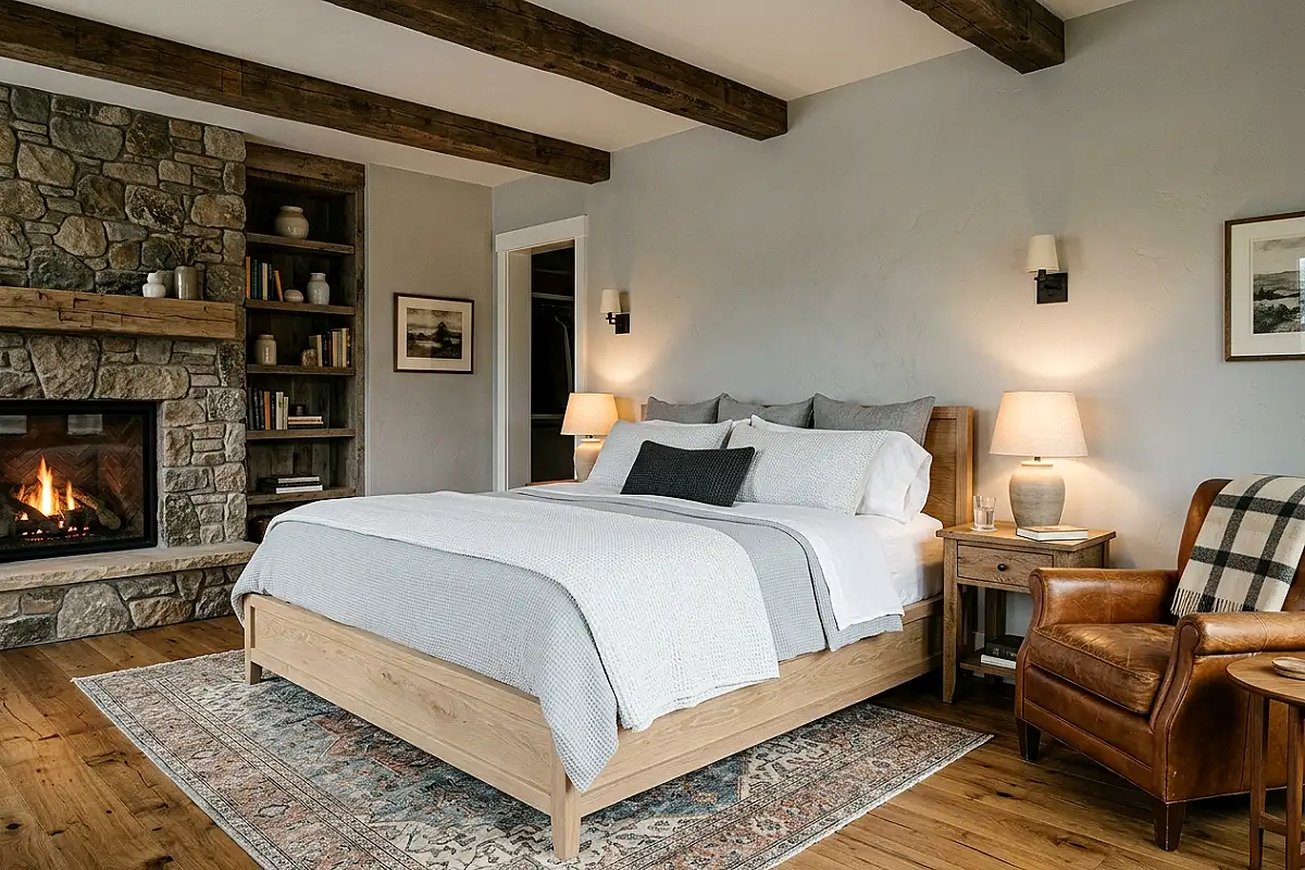
Wood belongs in a white-and-grey room, and white oak is its perfect citizen: pale, grey-washed by nature, its grain a map of silver lines. A white-oak bed frame — or any substantial piece in the same wood — warms the palette by a degree without adding color, because the wood reads as tone, not hue. Its grey-brown warmth sits exactly between the whites and the greys, bridging them the way a good negotiator does. Choose wide-plank or slatted profiles for presence, and let the bed’s natural tone lead: it will pull every other grey in the room toward its side of the fence.
Pro Tip
Finish white oak with a white-oil or whitewash, never yellow-toned poly — conventional clear finishes push oak toward amber, and that amber drift pulls the whole grey palette off-key within a season.
Layered Grey Rugs
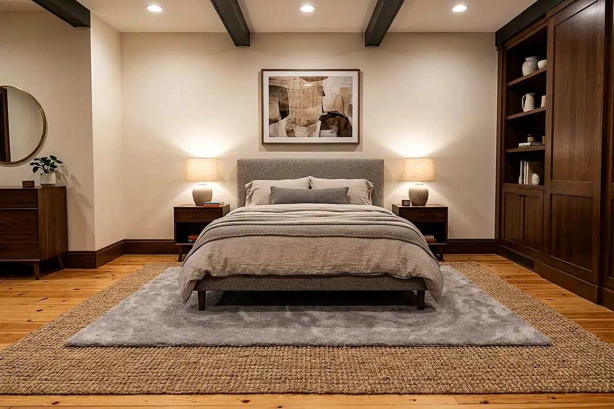
Two rugs where one would do: a natural jute base layered under a soft grey rug (wool, flatweave, or low-pile) is the flooring formula that gives white bedrooms their comfort and their finish. The jute brings texture and warmth underfoot; the grey top layer brings softness and palette; together they anchor the bed without a single dark object in sight. Size the top rug generously — two feet of grey showing beyond the bed’s sides — and the layering reads as intentional design, not afterthought. It’s also the cheapest way to make a floor look custom.
Pro Tip
Use a thin rug pad between the layers, not under the jute — pads under jute trap grit that abrades it, while a pad under the grey rug alone keeps both layers flat and the top one from wandering.
Pleated White Lampshades
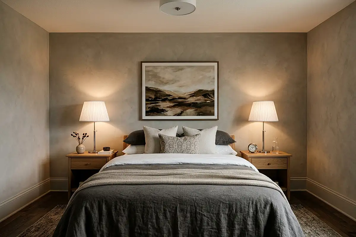
The pleated lampshade is this palette’s most elegant object — the detail that whispers “grand hotel” across any bedroom. Crisp white pleated silk or cotton shades on slim nickel bases throw a soft, diffused cone of light that makes white walls glow and grey textures breathe. Pleats multiply the shade’s surface, so even a modest lamp looks substantial and expensive. Fit one to each nightstand at identical heights, and the twin shades give the room the symmetry that neutral palettes rely on — symmetry is the skeleton of elegance, and the shades are its most polite bones.
Pro Tip
Dust pleated shades with a soft brush attachment, never a cloth — cloth snags pleats and flattens them, while gentle vacuuming keeps the folds crisp for decades.
Grey Velvet Upholstered Headboard
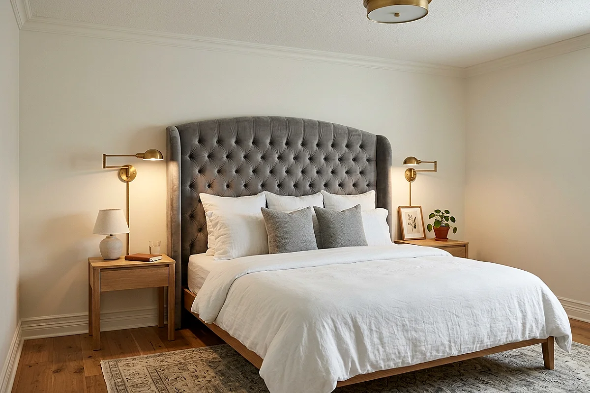
A headboard in dove-grey velvet is where the palette gets tactile. The velvet’s pile turns grey into something you want to touch — deep in shadow, luminous where light catches the nap — and its upholstered curve or panel gives the bed a soft architectural crown. Choose a tall profile (fifteen to twenty inches above the mattress) so the headboard anchors the wall’s empty space above the pillows, and let its grey choose the room’s direction: cool dove pulls the palette crisp, warm mushroom pulls it cozy. Against white bedding, the headboard becomes the room’s single soft grey statement — nothing else needs to compete.
Pro Tip
Vacuum velvet headboards monthly on the lowest suction with a soft brush — dust settles deep into the pile and turns grey velvet visibly dull, and light regular cleaning keeps the nap lifting light evenly.
Monochrome Photography Suite

A suite of black-and-white photographs — three or five, thematically linked (coastlines, architecture, old city streets) — hung in slim white frames on the white wall opposite the bed. The photography’s grayscale is the palette made art: every image extends the room’s own color story, so the art never competes with the scheme but completes it. Choose white frames with white mounts so the art floats without borders, and hang the suite’s centerline at eye level. In a white-and-grey room, monochrome photography isn’t decoration — it’s the room’s argument, made visual.
Pro Tip
Use UV-filtering glass on photographic prints — even indirect window light fades silver-based and inkjet photographs over years, and UV glass is the difference between an archive and a memory.
White Built-In Wardrobes
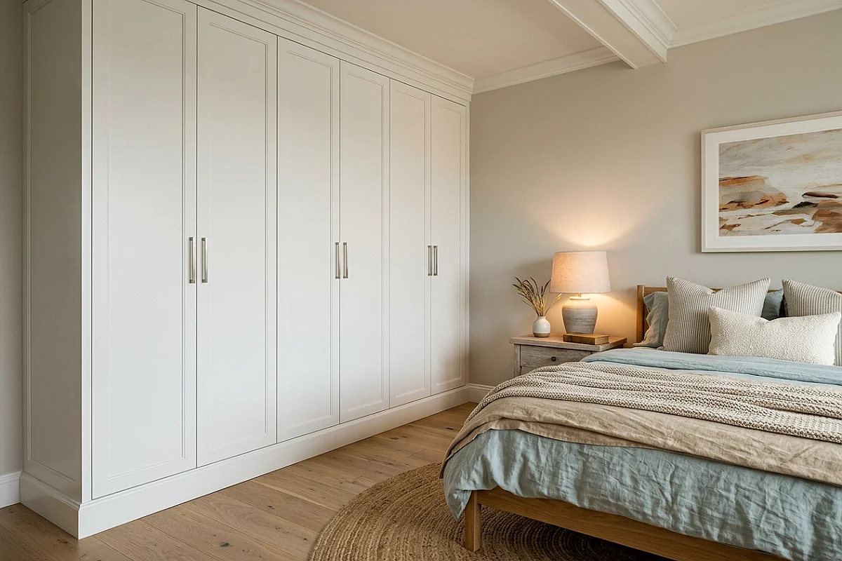
Floor-to-ceiling white built-in wardrobes are the storage idea that keeps this palette clean: doors flush with the walls, hardware minimal, the whole storage wall reading as architecture rather than furniture. Behind the doors, organize by grey tone — charcoal hang, dove fold, white accessories — so opening any door feels like opening a page of the room’s own color story. The built-in’s white surface also bounces daylight deeper into the room than any freestanding wardrobe can. It’s the idea that makes “timeless” functional: storage that disappears, surfaces that multiply light.
Pro Tip
Specify matte or satin finish, never gloss — glossy white doors fingerprint daily and show every seam; matte white hides handling and makes the storage wall read as a single calm surface.
Crystal & Clear Glass Moments
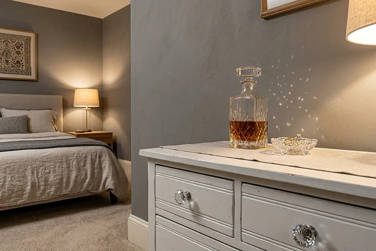
Clear crystal and glass objects are this palette’s invisible luxury: cut-crystal knobs on the white wardrobes, a crystal decanter on the dresser, glass candlesticks, a clear glass tray on the vanity. Each object catches and fractures the room’s light into tiny rainbows at the edges — invisible from across the room, glittering up close. The effect is sparkle without color, which is exactly what white-and-grey needs: light that behaves decoratively. Keep the collection small and mixed — knobs, one vessel, one tray — and the room gains its jeweler’s touch.
Pro Tip
Dust cut crystal with a dry cloth or compressed air — water leaves droplet marks that glitter against the light, and dust on facets is exactly what kills the sparkle you bought the pieces for.
Grey & White Gingham Bedding
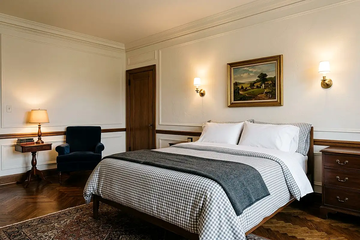
Gingham — the small grey-and-white check — is this palette’s pattern permission. A gingham duvet or coverlet brings the checkered rhythm of country-house elegance without a single color note: the pattern is literally the palette, woven. Choose small checks (quarter- to half-inch) for refinement; large checks drift toward picnic blankets. Layer the gingham over plain white sheets with a dove-grey throw at the foot, and the bed reads as classic, not casual. Gingham is also the rare pattern that never dates — it has dressed beds for three centuries and shows no sign of stopping.
Pro Tip
Match gingham panels by cutting from the same fabric run — mismatched check alignment at the duvet’s center seam breaks the pattern’s geometry, and aligned checks are what make it read as intentional.
Picture-Framed Box-Moulding Panels
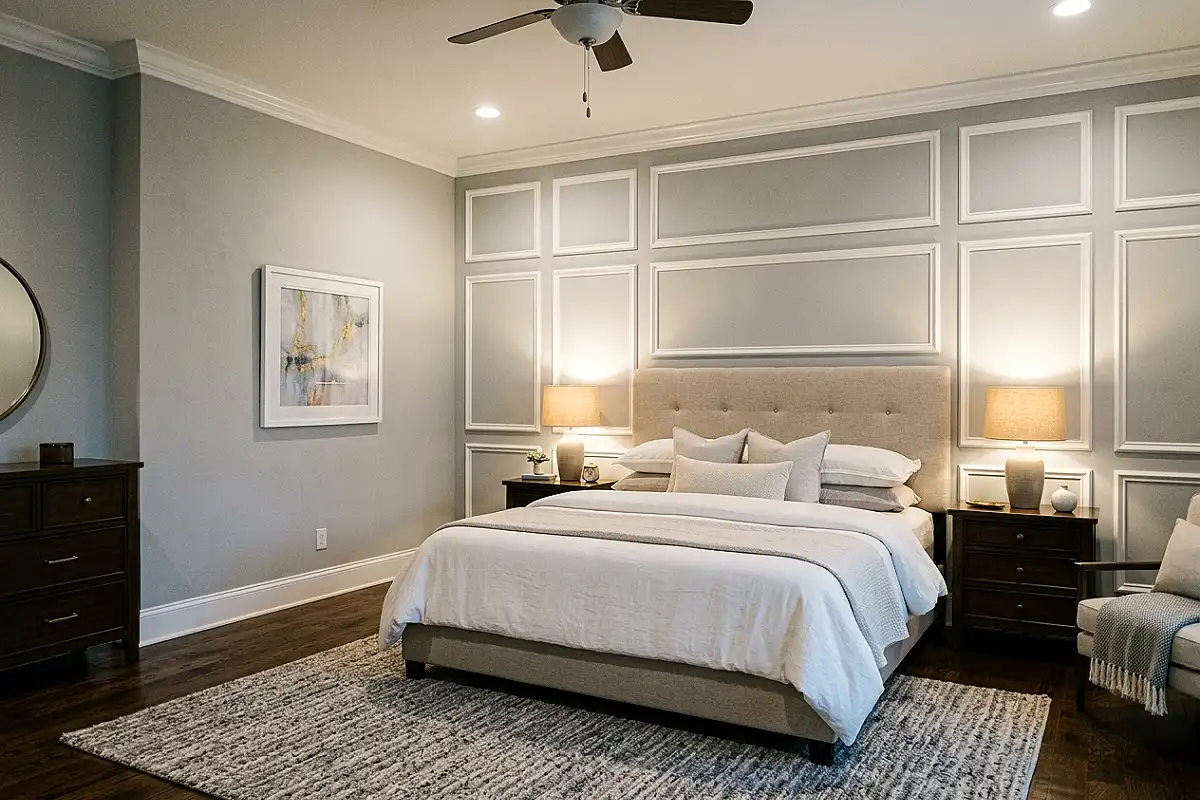
Box moulding — rectangular panels of trim applied to the wall in a grid, painted white over grey walls — gives a bedroom the panelled elegance of a townhouse at DIY prices. Each “frame” becomes a wall compartment, and the shadows inside the moulding add depth the flat wall never had. Paint the walls soft grey and the moulding crisp white (or all white for a subtler shadow-play), and the wall reads as architecture. The technique suits the wall behind the bed and the facing wall; skip the window wall, where the panels would crowd the light.
Pro Tip
Layout the panel grid with chalk lines before cutting trim — uneven panel spacing is visible from every angle, and two evenings of careful layout saves the whole installation from looking DIY.
Frosted Globe Pendant Trio
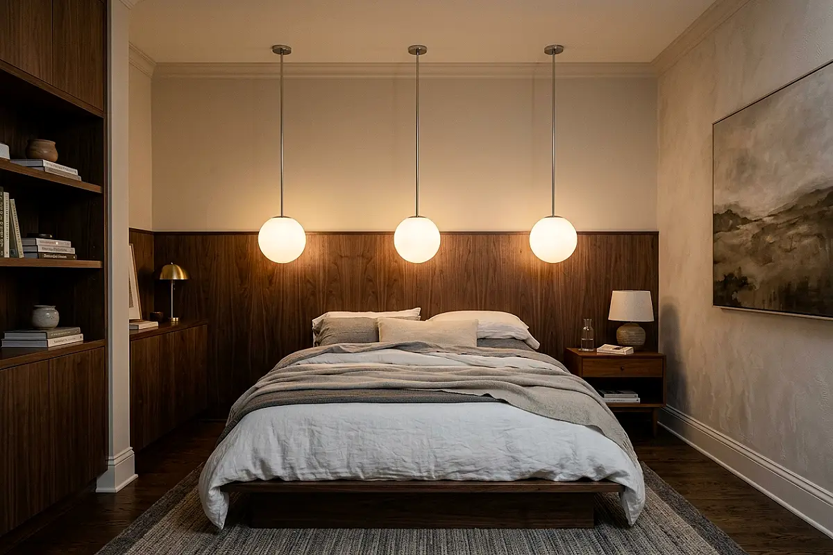
Three frosted glass globe pendants — hung in a row over the bed’s foot or flanking a dresser — are this palette’s softest light source. The frosted glass diffuses each bulb into a glowing orb, so the light they give is shadowless and pearl-like, exactly the quality neutral rooms need to avoid harshness. Choose opal or frosted white globes with slim chrome stems, and at night the trio looks like three low moons — serene, symmetric, and quietly spectacular. Dimmable bulbs are non-negotiable here: the pendants’ charm lives in their dimmest settings.
Pro Tip
Use warm-white bulbs (2700K) in frosted globes — cool bulbs make frosted glass read clinical, while warm bulbs turn the globes into pearls, which is the entire effect you’re paying for.
Clustered Round Silver Mirrors
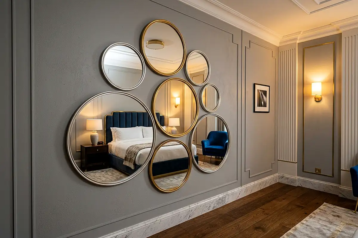
A cluster of round mirrors — five to seven, in silver frames of mixed sizes, arranged in a loose constellation — multiplies everything this palette does well: it bounces light into grey corners, reflects white walls back at themselves, and adds silver punctuation without a single object on a shelf. Round forms soften the room’s rectangles, and the constellation arrangement reads as art rather than vanity. Hang the cluster where morning light crosses, and the mirrors spend the day moving a slow bright spot across the room — the cheapest animation a bedroom can own.
Pro Tip
Hang the cluster on one central anchor with the outer mirrors on subtle hooks — mirror weight surprises, and a single secure center point means one failure can’t cascade into a wall of falling glass.
Concrete Planters & Trailing Green
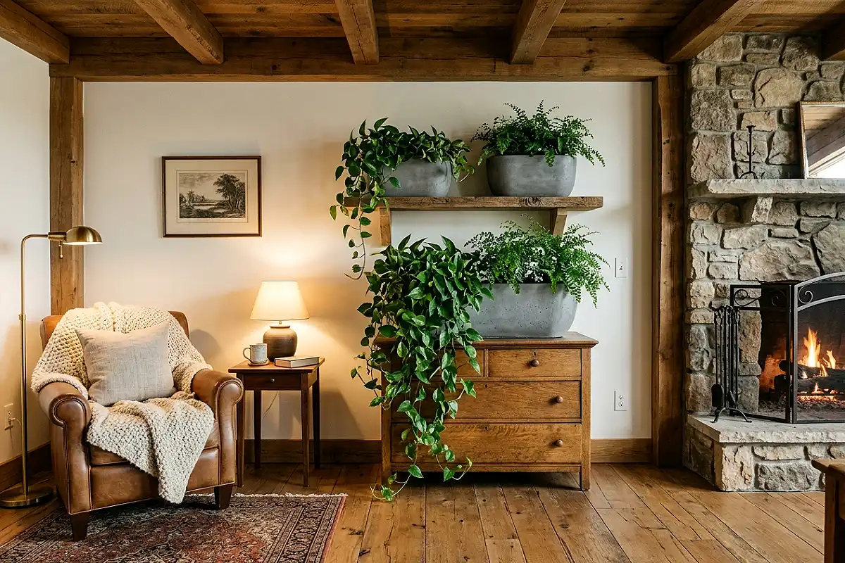
Grey concrete planters holding trailing greenery (pothos, string of pearls, ferns) bring the palette’s one living note — and it belongs, because every elegant white-and-grey room in history has had green near it. The concrete’s matte grey matches the room’s stone and textiles, so the planters read as designed objects first, vessels second, while the trailing green spills over their edges and softens every line it touches. Group three planters at different heights — floor, dresser, shelf — and the greenery moves through the room’s levels like a quiet current. It’s the detail that keeps the elegance breathing.
Pro Tip
Set plants in plastic nursery pots inside the concrete planters — concrete sweats mineral salts through its walls when watered, and inner pots keep both the plant’s roots and your furniture protected.
Elegance That Never Expires
Twenty-one ideas, and the honest architecture of all of them is the same: white as the light, grey as the shadow, texture as the language, and restraint as the grammar. Start with the undertone system, layer the bedding like a hotel, and let one or two signature details — the pleated shades, the mirror constellation, the gingham — carry the personality. Rooms built this way don’t age; they settle, like good linen, into something better than new.
Frequently Asked Questions
How do I keep a white and grey bedroom from feeling cold or clinical?
Texture and warmth do the work: choose warm greys (greige, dove, mushroom) over cool steels, layer tactile fabrics like linen and velvet, use warm-white 2700K lighting, and add one pale wood such as white oak. A clinical feeling is always an undertone or lighting problem, never a palette problem.
Should I choose warm grey or cool grey for a bedroom?
For most bedrooms, warm greys — greige, mushroom, and dove — create the calmer, more restful atmosphere because they carry a hint of beige’s softness. Cool greys suit rooms with north-facing light or existing blue tones. Whichever you choose, match all greys in the room to the same family.
What accent colors work with white and grey?
The palette’s best accents are metallic (silver, nickel, chrome), pale wood, green plants, and — for a bolder touch — a single jewel tone like emerald or navy in small doses. Avoid warm saturated accents in large amounts, which fight the palette’s quiet character.
How do I add depth to a white and grey room without adding color?
Depth comes from contrast of tone and texture: pair charcoal with ice white, layer rugs, add textured wallpaper or plaster, use marble and concrete surfaces, and introduce reflective objects like mercury glass and crystal. Each adds shadow and light without adding a hue.
Is a white and grey bedroom hard to keep clean?
Surprisingly manageable — mid-tone greys hide dust and wear better than either extreme, so the practical recipe is white on large fixed surfaces (walls, wardrobes) with grey on the pieces that absorb daily life (upholstery, rugs). Washable linen and slipcovers make the white textiles easy to maintain.
Does white and grey work in small bedrooms?
It’s one of the best palettes for small rooms: white walls reflect light and expand the space visually, while grey layers add coziness without shrinking it. Keep the largest surfaces white, reserve deeper greys for textiles, and use mirrors to multiply the light.