16 Modern Kids Room Decor Ideas for a Fresh & Stylish Bedroom
Modern kids’ rooms have a design problem most people never name: they’re styled for toddlers and outgrown by eight-year-olds. The solution that contemporary designers have settled on is refreshingly simple — stop decorating for the child’s current age and start designing for their intelligence. Give the room clean geometry, honest materials, and one brave color, and the space works at three and still works at thirteen. A modern kids’ room isn’t a showroom that says “don’t touch”; it’s a bright, orderly world that happens to be beautiful, where every element earns its place twice — once for how it looks, once for what it does.
The modern formula has three parts, and every idea below obeys them. First, the monochrome base: white walls, natural wood, and one single accent color repeated in small doses — modern rooms stay fresh because they never juggle more than one color at a time. Second, functional geometry: storage that stacks, desks that float, beds that double — furniture with a job. Third, playful punctuation: one mural, one mobile, one graphic rug — a handful of joyful moments inside a disciplined frame. Sixteen ideas, three rules, and a room that photographs like a design magazine and lives like a childhood.
Geometric Color-Block Wall
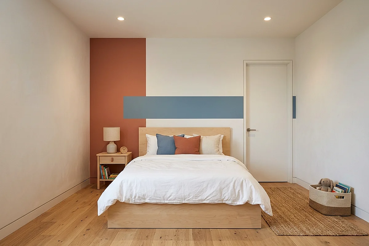
The modern room’s defining wall: two or three flat color blocks painted directly onto the wall in clean geometric shapes — a vertical panel in muted terracotta beside a horizontal band in dusty blue, meeting at sharp, taped lines against the white field. Color-blocking is modernism’s oldest toy: it turns paint into composition, giving the room its energy without a single object. Choose matte finish in all blocks (sheen differences break the illusion of flat geometry), keep blocks to large simple shapes — rectangles, half-circles, one arch at most — and let the accent colors repeat in the bedding and cushions so the wall and the room read as one design.
Pro Tip
Plan color blocks around the room’s fixed elements — align block edges with the window frame, the bed’s edge, or the rug’s border, so the geometry reads as architecture responding to the room rather than paint floating on a blank wall.
Loft Bed with Desk Beneath
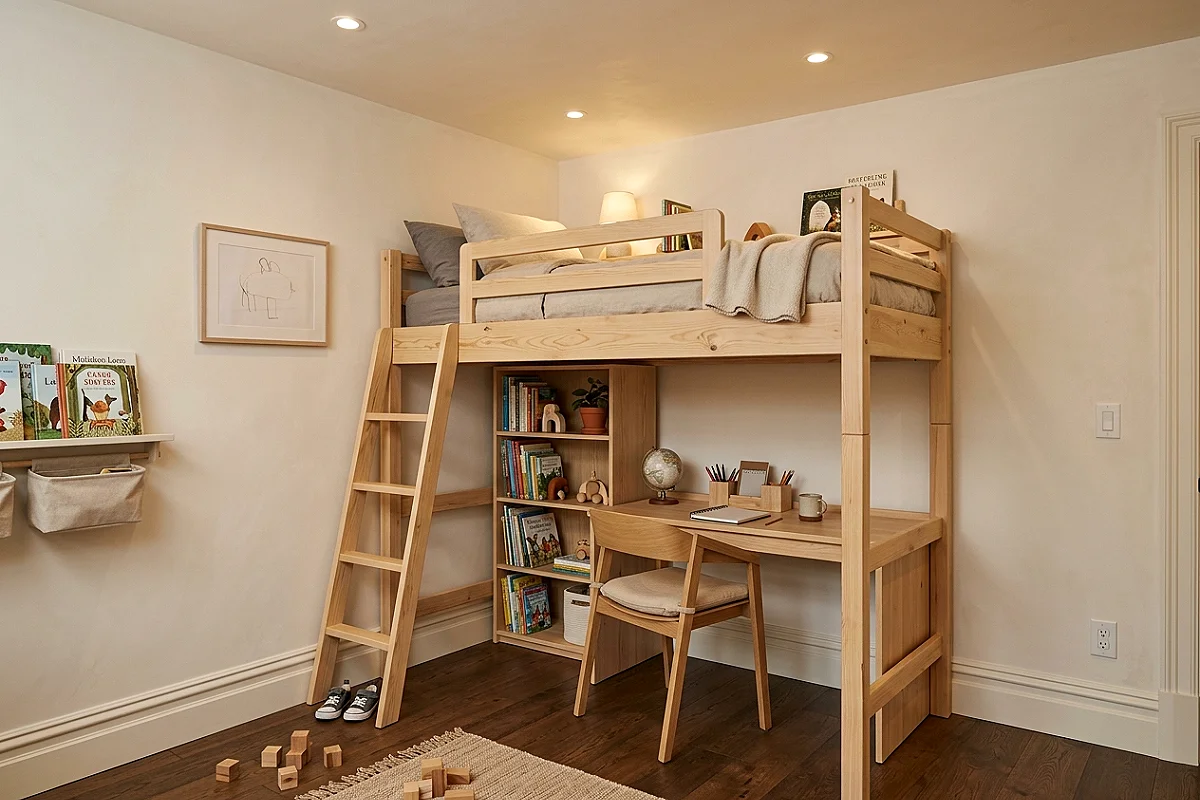
The furniture that gives a small room two floors: a loft bed raised high enough for a full desk station underneath — homework below, sleep above, all in one footprint. The loft is modernism applied to square footage, and it transforms the room’s logic: the sleeping platform becomes a private room within the room (perfect for a reading lamp and a curtain), while the desk level gets dedicated task lighting and wall space of its own. Choose birch or solid pine with clean rectangular profiles (no fussy carvings), and make the ladder part of the design — a slim rung ladder in matching wood reads as a feature, not an afterthought. Rooms with lofts photograph with a dimension flat rooms can’t compete with.
Pro Tip
Check ceiling clearance against the mattress plus the child sitting upright — the modern disaster is a loft where the child can’t sit up in bed; measure mattress depth, add 30 inches of seating height, and buy the frame only if the room clears it.
Modular Cube Storage Wall
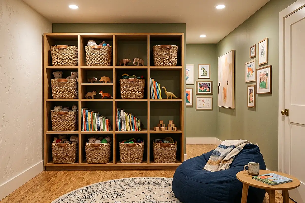
The wall that turns storage into architecture: a grid of open cube units — three across, three or four high — covering one wall floor to ceiling, some cubes filled with woven baskets, others left as open shelves, one or two holding plants and books. The cube wall is modernism’s most democratic storage: each cube is a decision (basket, book, toy, display), and the mix of filled and empty cubes creates the pattern that makes storage look designed. Keep baskets in one material (natural seagrass or identical fabric), let the remaining cubes breathe empty, and the wall reads as a composition rather than a warehouse. Cube systems grow with the family — add rows, re-shuffle cubes — without ever changing their lines.
Pro Tip
Anchor tall cube walls at their top row to wall studs — a three-high cube grid is a bookshelf-height hazard in a room children climb, and a top-mounted anchor converts a tip risk into fixed furniture with two screws.
Plywood & Felt Furniture Set
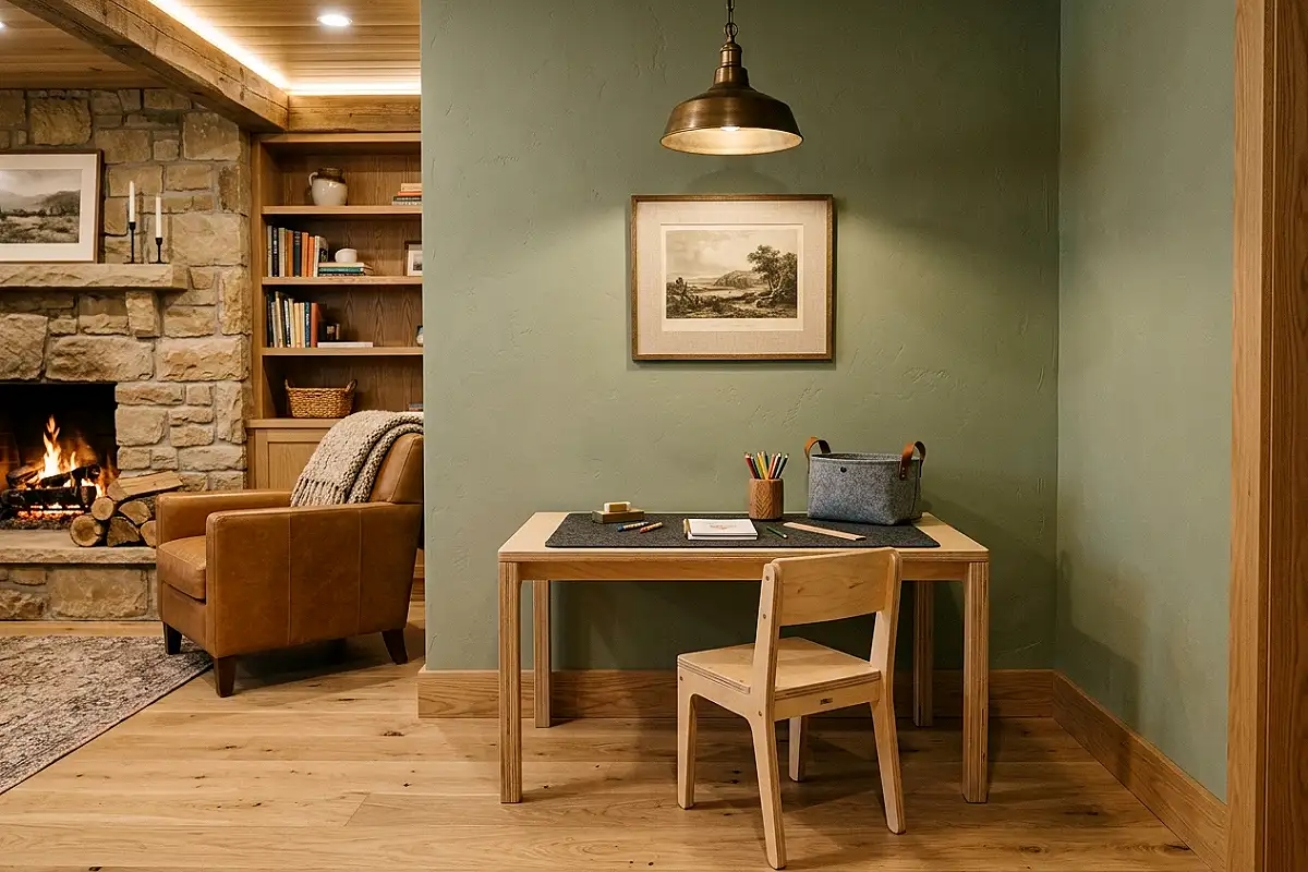
The material pairing that defines contemporary kids’ design: furniture in bent or layered plywood — a shelf, a small chair, a desk — paired with felt accessories in the room’s accent color: felt drawer liners, felt desk pads, felt toy boxes. Plywood wears its honest layers as design (the stacked birch edges are the detail), and felt — soft, quiet, modern — answers the material’s hardness with exactly the warmth a child’s room needs. Choose furniture where the plywood edges are visible and sanded (finished edges hide the material’s signature), and pick felt in a single tone so the accents read as a system. Together they’re the modern kids’ room in miniature: honest structure, soft contact points.
Pro Tip
Check plywood furniture is made from Baltic birch or furniture-grade ply, not construction ply — the difference shows at the edges: furniture ply layers fine and clean, construction ply shows voids and glue lines that no sanding fixes.
Arched Headboard & Curved Silhouettes

The softening move every modern room needs: an arched headboard or a bed frame with curved corners — the rounded silhouette that keeps clean-lined rooms from reading as office furniture. An arched headboard in natural wood or upholstered in the accent color becomes the room’s signature: curves at the bed, straight lines everywhere else, and the tension between the two is exactly what modern design lives on. Extend the curve sparingly — one round mirror, a pouf with a curved seam, a pendant with a dome — and the room’s geometry stays disciplined while feeling friendly. The rule is one curve family per room; two competing curves (arch plus circle rug plus spherical lamp) start a geometry committee.
Pro Tip
Center the arch’s curve on the bed’s actual width — arched headboards purchased wider than the mattress leave visible frame past the pillows, and centering the curve on the sleeping width keeps the silhouette reading as intentional, not oversized.
Single-Line Art Mural
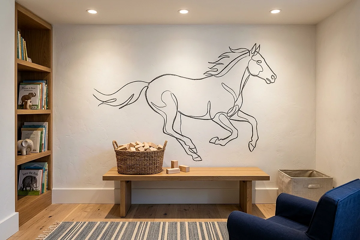
The mural that made the modern kids’ room famous: one continuous line drawing painted on the wall — a horse, a dinosaur, a landscape — executed in a single unbroken brush line, in the room’s accent color on white. Line-art murals give the room its storytelling moment with total modern restraint: the subject is playful, the execution is graphic, and the result photographs like a designer’s signature. Commission it or paint it (with a projector tracing the sketch first — every muralist starts that way), keep it to one wall, and let everything else stay quiet. A single-line mural is the difference between a modern room and a plain room: it’s the moment of joy inside the discipline.
Pro Tip
Trace the mural at child-eye level — projected sketches tend to drift upward during painting, and a mural whose subject floats above the child’s line of sight reads as wallpaper; at eye level it reads as a companion.
Wooden Dome Pendant Cluster
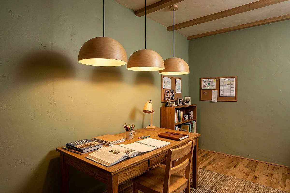
The lighting that caps a modern kids’ room: a cluster of three wooden dome pendants — bent birch shells, matte outside, glowing warm within — hung in a row over the desk or at staggered heights beside the bed. Wooden domes do what every kids’ room light should: they’re sculptural by day (the shell’s curve is the object) and lantern-soft by night (light escaping under the rim, never the bulb). Match the wood tone to the room’s furniture exactly — one wood tone is the modern rule, two reads as an accident — and use warm dimmable bulbs so the pendants scale from homework brightness to bedtime glow. Three pendants in a row over a desk is the single most photographed lighting moment in contemporary kids’ design.
Pro Tip
Hang the cluster so the lowest dome sits above eye level for the tallest person standing — pendants that dip into sightlines read as hazards, and a dome row whose bottom edge clears the eye line stays sculptural from every angle.
Geometric Flat-Weave Rug
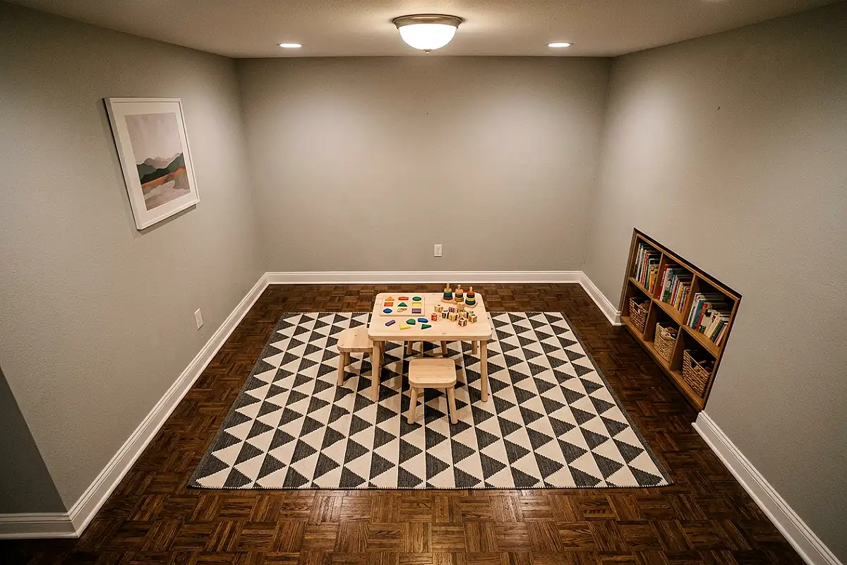
The floor’s graphic moment: a rug in a flat-woven geometric pattern — triangles, diamonds, or a modern chevron — in the room’s two-tone scheme (white and the accent color, or black-and-white with an accent border). The rug gives the modern room its only busy surface, and because the pattern is graphic rather than pictorial, it stays fresh across ages — no cartoon road maps to outgrow. Choose flat-weave specifically: low pile stays safe under running feet, lays flat under desk chairs, and machine-washes (the kids’-room non-negotiable). Size it to the play zone, not the whole floor — the modern rug floats inside the room with visible border of floor around it, and that visible border is what keeps the space feeling fresh.
Pro Tip
Fold (don’t roll) flat-weave rugs for transport against the pile direction — flat weaves crease permanently when folded with the pile, and a creased rug edge becomes the wavy border that never lays flat again.
Desk & Chair Design Station
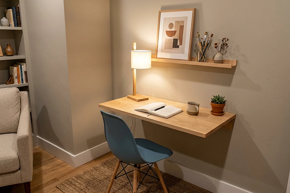
The homework corner that doubles as a design studio: a clean floating desk in natural wood, an Eames-style molded chair in the accent color, and a wall above it dedicated to display — a cork strip, a hanging folder, one framed print. The station’s power is its adulthood: furniture scaled to the child but styled like an adult’s workspace, which tells the child their work matters. Keep the desk’s surface to three things (lamp, cup, current project), mount the desk floating so the floor beneath it stays clear — visible floor is modernism’s most reliable freshness trick — and pair the chair’s molded shell with the desk’s flat plane: curved seat, straight surface, geometry doing its job.
Pro Tip
Set the floating desk’s height to the child’s elbow level seated — a desk 2 inches too high turns shoulders into tired messengers; measure the seated elbow, add a half inch, and the station stays comfortable through three growth spurts.
Cork & Magnetic Wall Grid
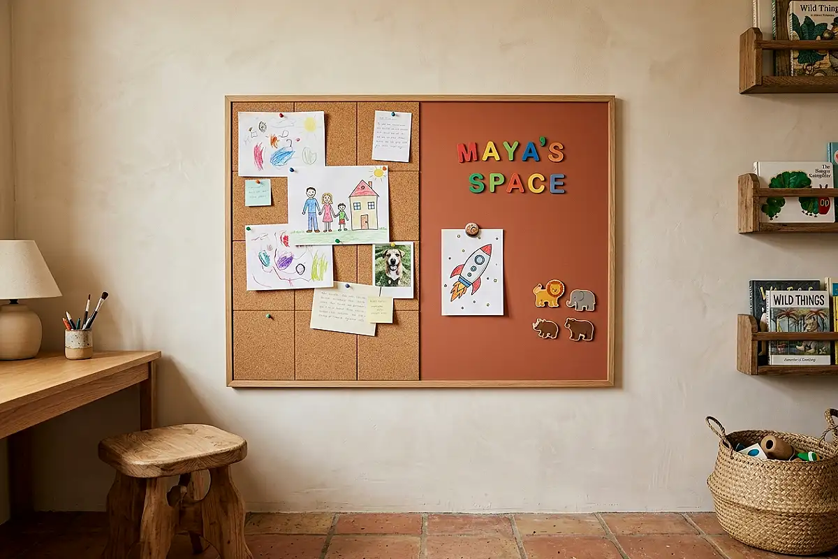
The dual-function wall that keeps the modern room alive: a panel combining cork tiles and magnetic paint zones — drawings pinned on cork, homework and art held by magnets on the magnetic field, all in one disciplined rectangle framed with slim wood trim. The panel is the room’s living surface: nothing nailed, everything movable, the child’s evolving world displayed inside a frame that never changes. Choose cork tiles with clean square edges (beveled vintage cork reads old-fashioned; square reads modern), paint the magnetic field in the room’s accent color so it reads as a designed zone rather than a utility strip, and position the panel beside the desk where its daily use is natural.
Pro Tip
Apply two coats of magnetic paint, not one — one coat holds a single paper sheet weakly, and magnetic paint only performs under multiple coats; the second coat is the difference between a working wall and a disappointed magnet.
Open Clothing Rail Wardrobe
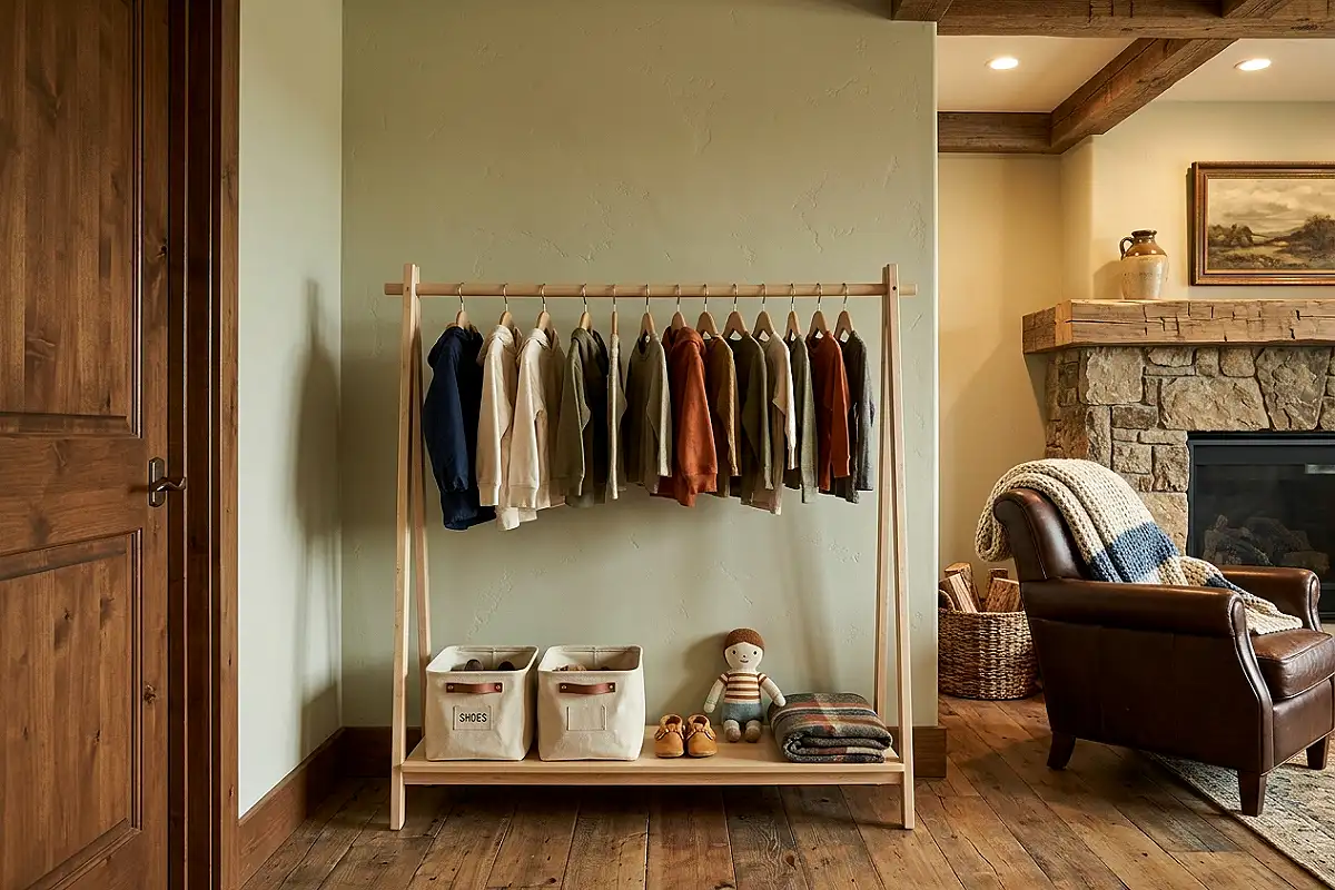
The storage that teaches independence modern-style: a slim open rail — two wooden posts and a hanging bar, or a wall-mounted rail with a low shelf beneath — replacing half the built-in wardrobe, with the child’s current wardrobe visible and reachable. Open rails turn dressing from a parent chore into a child’s daily choice: outfits visible, choices visual, tidying a matter of rehanging. Style the rail with matching wooden hangers (one hanger type is the modern rule; mixed hangers read as caught mid-move), keep the hanging count modest — a half-full rail looks designed, a stuffed rail looks like a closet — and add the low shelf for folded basics at the child’s own height.
Pro Tip
Set the rail’s bar height so the child can reach it with a flat palm — shoulder-height rails ask adults to fetch everything, and a bar the child reaches comfortably is the entire difference between independence and another clothes-on-the-floor morning.
Graphic Monochrome Bedding
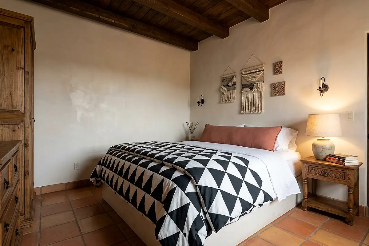
The bed styled like a design object: bedding in a single graphic pattern — bold black-and-white geometry, or the accent color on white — layered over plain white sheets with one solid accent cushion. Graphic bedding gives the modern room its textile moment without introducing a second color: the pattern carries the energy while the palette stays disciplined. Choose percale or crisp cotton (the weave reads as fresh; sateen reads as hotel), keep the pattern’s scale generous (oversized triangles, large checks — small busy prints read as nursery), and let the bed be the room’s loudest object: everything else whispers, the bed speaks, and that contrast is the modern room’s whole strategy.
Pro Tip
Wash graphic bedding inside out in cool water — dark inks in geometric prints crack and fade at fold lines when washed hot and right-side out, and inside-out cool washing keeps print edges sharp through seasons of daily use.
Kinetic Mobile Over the Bed
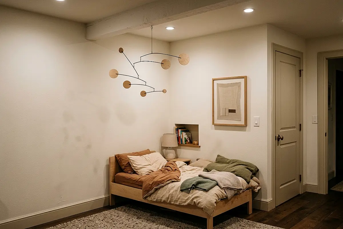
The hanging art that gives a modern room its movement: a sculptural mobile — wooden discs, metal rods, or felt shapes in the room’s two-tone scheme — suspended over the bed or beside the window, turning slowly in the room’s air currents. Mobiles are modernism’s oldest children’s art form (Calder built them for rooms like these), and a well-designed mobile gives the still room a living element: shapes that drift, catch lamplight, and change with every breath of air. Choose mobiles with balanced arms that rotate freely (test the balance before buying — a stuck mobile is a dead mobile), in materials matching the room’s wood and metal, and hang it high enough to stay a ceiling sculpture rather than a hazard.
Pro Tip
Anchor mobiles to a ceiling joist with a proper hook — mobiles swing, and swinging multiplies a fixture’s dynamic load; a joist hook holds decades of gentle motion, while a drywall anchor releases the mobile exactly when a child is underneath.
Built-In Window Desk Nook
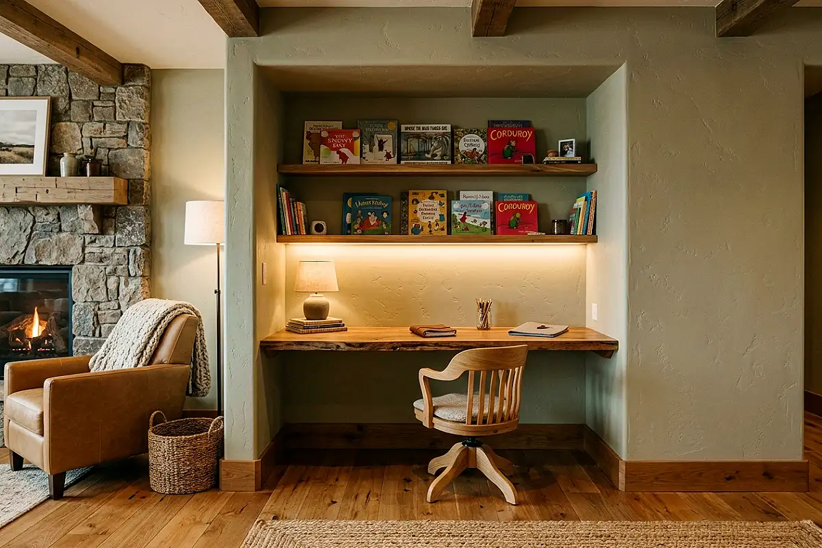
The corner every small modern room needs: the window bay converted into a desk — a floating surface spanning the window recess, with the view as the wallpaper and daylight as the task lamp. Window desks make the room’s best natural asset the homework station’s best feature, and the floating design (no legs, no bulk) keeps the modern room’s signature clear floor visible beneath. Build or mount the surface in the room’s wood tone, add a slim shelf above the window for books, and the nook becomes the room’s most coveted square footage. Children work longer at desks that face daylight — and photographs of a child at a window desk are the internet’s favorite image for a reason.
Pro Tip
Orient the desk so daylight falls across the writing hand, not behind it — side light (left for right-handers) eliminates the writing shadow; light directly behind the child casts their own hand shadow across every page they write.
Terrazzo Accent Objects
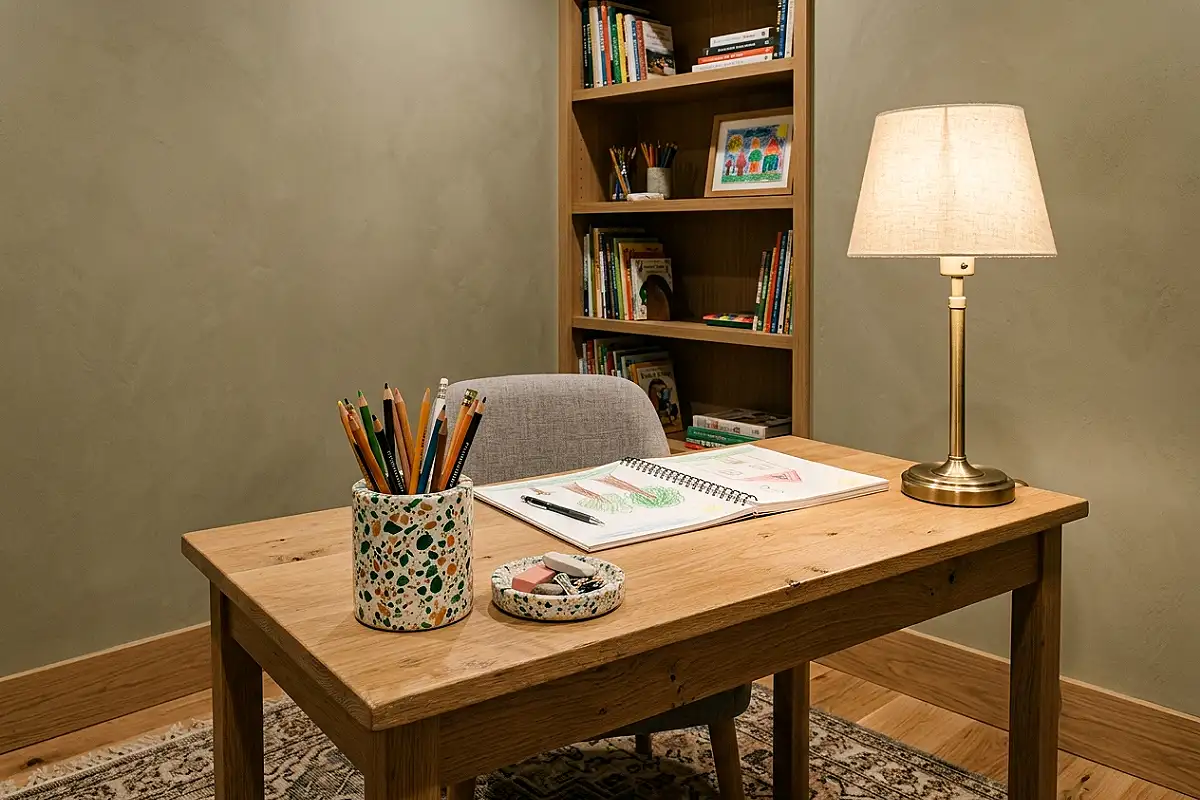
The detail that brings the room its contemporary edge: terrazzo — the composite stone of marble chips in soft concrete — appearing as small objects: a lamp base, a tray, a pencil cup, one stool. Terrazzo carries a hundred tiny colors inside a single calm surface, which makes it the perfect accent material for a one-color room: it holds the accent tone plus whispers of its neighbors, and its speckled surface photographs like jewelry. Keep terrazzo to small scale — bases, trays, vessels — where its pattern reads as richness; a terrazzo floor would fight the rug, and the modern room never has two loud surfaces competing. Three terrazzo objects, scattered, never grouped — the room’s quiet luxury.
Pro Tip
Seal terrazzo objects with a stone sealer before daily use — unsealed terrazzo drinks spills the way its stone chips drink stains, and a five-minute sealing makes pencil-cup terrazzo survive juice years longer.
Felt Acoustic Wall Tiles
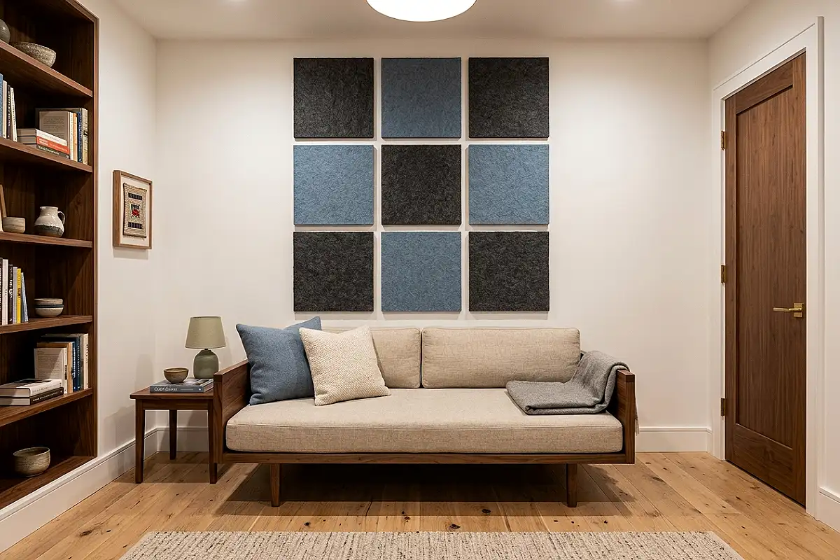
The quiet upgrade that doubles as design: acoustic felt tiles — squares of dense recycled-polyester felt — mounted in a deliberate grid or scattered composition across one wall, in the room’s two-tone scheme. The tiles do what modern rooms need most: they swallow the echoes of hard floors, flat walls, and energetic children, making the room audibly calmer — and their geometric mounting turns the solution into art. Choose tiles with self-adhesive backs or hidden clips, mount them in a deliberate pattern (a 3×3 grid reads as design; random patches read as soundproofing), and let one tile color match the accent so the treatment reads as intentional styling. Calm rooms photograph calm; the tiles are the invisible reason.
Pro Tip
Start the tile grid from the wall’s center, not a corner — grids started at corners amplify every measurement error toward the visible edges, and a center-start hides drift symmetrically at both sides where the eye barely notices.
Fresh, Functional, Growing
Sixteen ideas, one philosophy: modern kids’ rooms respect children enough to give them real design — geometry, honest materials, working furniture — and trust that beauty and playfulness don’t need to compete. Keep the palette disciplined, make every object earn two jobs, and let one mural, one mobile, and one brave color carry the joy. A room built this way stays fresh through every age it hosts, and that’s the most modern luxury a family room can have.
Frequently Asked Questions
Won’t a modern kids’ room feel sterile or boring?
Only when people execute modernism without its joy. The cure is in the formula itself: one brave accent color, one line-art mural, one graphic rug, one mobile. Modern rooms aren’t minimal by deprivation — they’re minimal so the playful moments get full attention. A room with one beautiful mural beats a room with forty decorations every time.
What colors work best for a modern kids’ room?
The proven modern formula is white walls, natural wood, and one accent: terracotta, dusty blue, sage, or mustard. Black-and-white graphic bedding pairs with any of them. Avoid more than one accent color — modern rooms stay fresh precisely because they never juggle; pick one tone and repeat it in small doses throughout.
What ages does a modern kids’ room suit?
Every age from nursery onward — that’s the point of the style. Loft beds, cube storage, floating desks, and open rails all scale up as the child grows, and swapping the accent color plus bedding transitions the room from toddler to tween without renovation. The bones are ageless; only the punctuation changes.
How do I do modern kids’ room design on a budget?
Modernism is budget-friendly by nature: flat-pack cube systems, floating plywood desks, and painted color-block walls deliver most of the look for little money. Spend on the three things that matter — the bed, the rug, the lighting — and let paint, cork panels, and felt accessories do the rest cheaply and beautifully.
How do I keep toys from ruining a modern room’s clean look?
Design the mess in rather than out: cube walls with matching baskets, an open clothing rail, rolling under-bed bins, and one dedicated play-rug zone. Modern rooms tolerate abundant toys when storage is categorical and visible — everything has a cube, and a room where everything has a cube is a clean room five minutes after cleanup.
How do I transition a modern kids’ room into teen years?
Keep the bones (white walls, wood furniture, cube storage), swap the punctuation: the mural becomes band posters or photography, the accent color shifts to something older (charcoal, rust, deep green), the loft’s lower level becomes a lounge with bean bags. The geometry stays; the story updates — which is why modern rooms cost one renovation instead of three.