23 Peel and Stick Backsplash Ideas That Look Like a Luxury Kitchen Makeover
The backsplash is the surface in a kitchen with the most visual impact relative to its actual size. It sits at eye level, frames the stove, runs behind the sink, and is the first thing anyone notices when they walk in — which makes it equally the most effective place to make a change. Peel and stick backsplash tiles have crossed a quality threshold in the last few years that has genuinely retired the old objections: that they look cheap, that they peel, that they scream rental apartment. With the right product and a careful installation, the difference from traditional tile is often undetectable at kitchen-counter distance.
These 23 ideas cover every kitchen aesthetic — from spare Scandinavian to boldly maximalist — and every product type, from rigid vinyl tiles to real stone veneer peel-and-stick sheets. Each one is styled the way a designer would actually put it together, with the countertop material, cabinet colour, and hardware finish that makes the backsplash read as part of a complete, intentional kitchen rather than an isolated upgrade.
Calacatta Marble-Effect Subway Tile
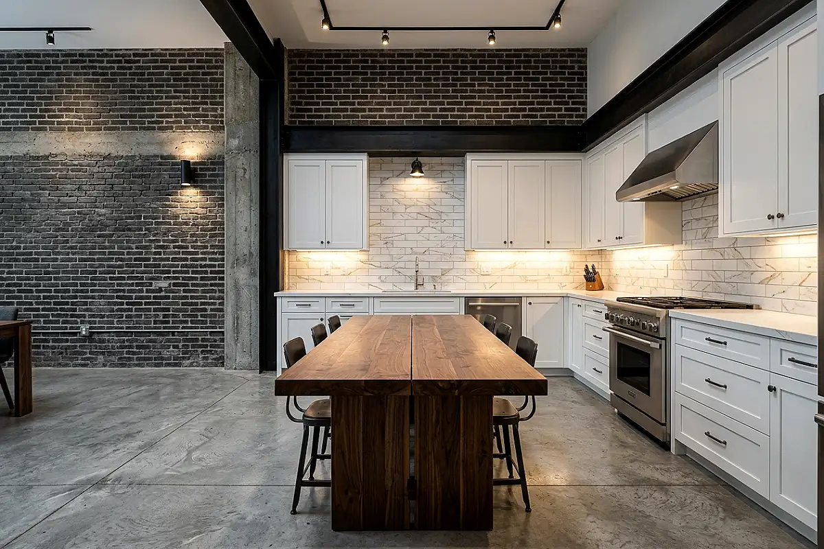
The white marble subway tile is the most universally flattering backsplash in existence, and a high-quality peel-and-stick version in a Calacatta pattern — white ground, bold grey and gold veining, a slight surface texture that catches light — is genuinely difficult to distinguish from the real thing at counter distance. Run them in a classic horizontal brick layout between white Shaker cabinets and a white quartz countertop, or set them in a herringbone for something with more visual energy.
- Look for tiles with a slight gloss or semi-gloss finish to mimic the polished surface of real marble
- Choose tiles with realistic variation in the veining pattern across individual pieces so no repeat is visible
- Light grey grout rather than bright white reads as a more natural marble installation
- The Art3d Peel and Stick Marble Tile and Tempaper Dimensions marble collections are among the most convincing options widely available
Pro Tip
Apply a thin bead of clear kitchen-grade caulk along every edge where the tiles meet the wall, cabinets, or countertop. It seals out moisture and prevents the most common failure point of any adhesive backsplash — the edges lifting in a humid kitchen environment.
Black Hexagon Mosaic Tile
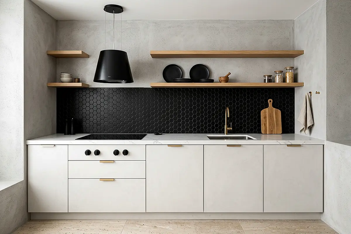
Black hexagon mosaic in a peel-and-stick format brings a graphic, geometric boldness to a kitchen that reads as deliberately designed rather than default. It works with equal confidence in a contemporary all-white kitchen — where it provides the dark anchor the room needs — and in a moody, dark-cabinet kitchen where it deepens the dramatic palette. The small hexagon scale creates visual texture that reads as sophisticated tilework from across the room.
- Matte black hexagon reads as more contemporary than gloss black
- Pair with brass or unlacquered gold hardware for the combination that makes this tile look genuinely luxurious
- Works beautifully as a full-wall statement or as a contained accent between upper and lower cabinets
- Use dark grey grout — never white — so grout lines don’t interrupt the all-over black quality of the tile field
Pro Tip
When installing hexagon mosaic sheets, offset each row by half a hexagon width to maintain the true honeycomb pattern. Most sheet products include alignment marks on the backing paper — use them, because even a small misalignment becomes obvious once the sheet is applied and the paper is removed.
White Bevelled Subway Tile with Dark Grout
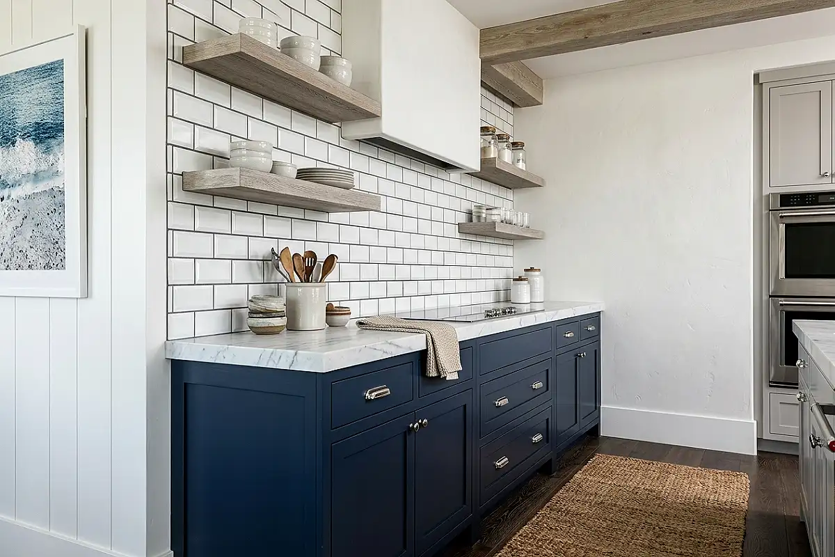
The bevelled subway tile — a classic white rectangular tile with a sloped, angled face that creates a shadow line along each edge — in peel-and-stick format with pre-applied dark grey grout is one of the most reliably elegant backsplash combinations available. The dark grout makes each individual tile visible, so the pattern reads as a designed element rather than a plain white surface. It pairs effortlessly with navy, dark green, and black cabinetry.
- The bevel catches overhead lighting and creates subtle shadow play that flat subway tiles don’t have
- 3×6 inch is the classic subway proportion; 2×8 inch elongated subway creates a more contemporary, linear quality
- Dark grey grout shows the layout clearly without the harshness of black grout
- Pair with polished nickel or chrome hardware for a crisp, black-and-white kitchen aesthetic
Pro Tip
Always start the first row from the centre of the wall and work outward — never from one corner. Starting from centre ensures any cut tiles at each end are equal in size, which is the detail that distinguishes a professional installation from an amateur one.
Zellige-Effect Terracotta Tile
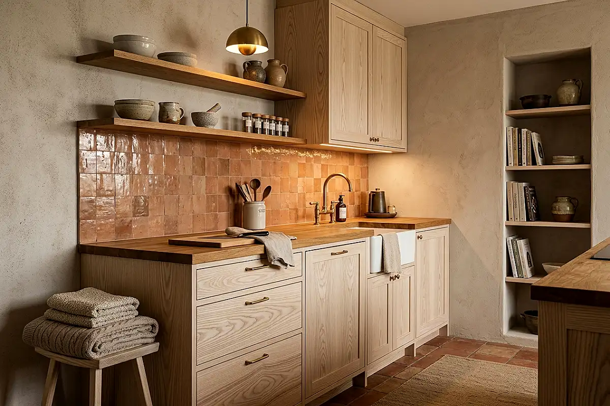
Zellige — the hand-glazed Moroccan ceramic tile with its slightly irregular surface and richly varied glaze — has become one of the most coveted backsplash materials in high-end kitchen design. Its peel-and-stick equivalent, in warm terracotta, burnt orange, or earthy red, brings exactly that handmade, sun-drenched quality at a fraction of the cost. It transforms an ordinary kitchen into a room that looks designed with genuine cultural reference rather than assembled from a catalog.
- Choose tiles with intentional surface variation — slight ripple, glaze pooling, tonal shifts — that mimic the handmade quality of real zellige
- Pair with a butcher-block countertop, open shelving in oiled oak, and brass fixtures
- A warm, sand-coloured grout rather than white maintains the earthy quality of the tile field
- Shuffle tiles from multiple packets before installing to distribute any tonal variation evenly
Pro Tip
Terracotta-toned tiles can vary significantly between production batches. Mixing tiles from different packs before installation ensures tonal variation is distributed evenly across the wall rather than appearing as visible patches where one batch ends and another begins.
Sage Green Matte Ceramic-Look Tile
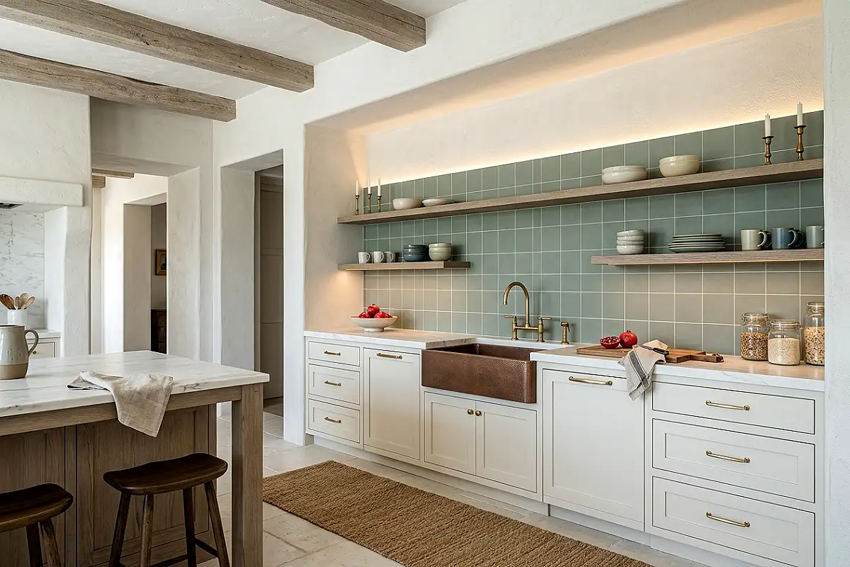
Sage green is the most requested kitchen colour of the moment, and a sage green peel-and-stick tile in a matte, slightly chalky ceramic-effect finish extends a green kitchen palette to the wall with a warmth and cohesion that white tile never provides. It works behind sage Shaker cabinets in a tonal arrangement, or as the single green element in a white kitchen where it introduces colour without the commitment of painted walls.
- Matte sage green complements both warm white and cool grey kitchen schemes depending on the specific green tone
- Pair with brushed brass hardware — the warm metal and cool sage have a natural, complementary harmony
- A slightly textured tile face adds the ceramic quality that makes it read as genuine tile rather than flat vinyl
- Choose a grout colour that matches the tile as closely as possible for a seamless, high-end look
Pro Tip
Test the sage tile against your specific cabinet colour in the actual kitchen light before committing — sage green shifts considerably between warm incandescent and cool LED or natural light. The combination needs to work in both conditions, morning and evening.
Gold and White Art Deco Geometric Tile
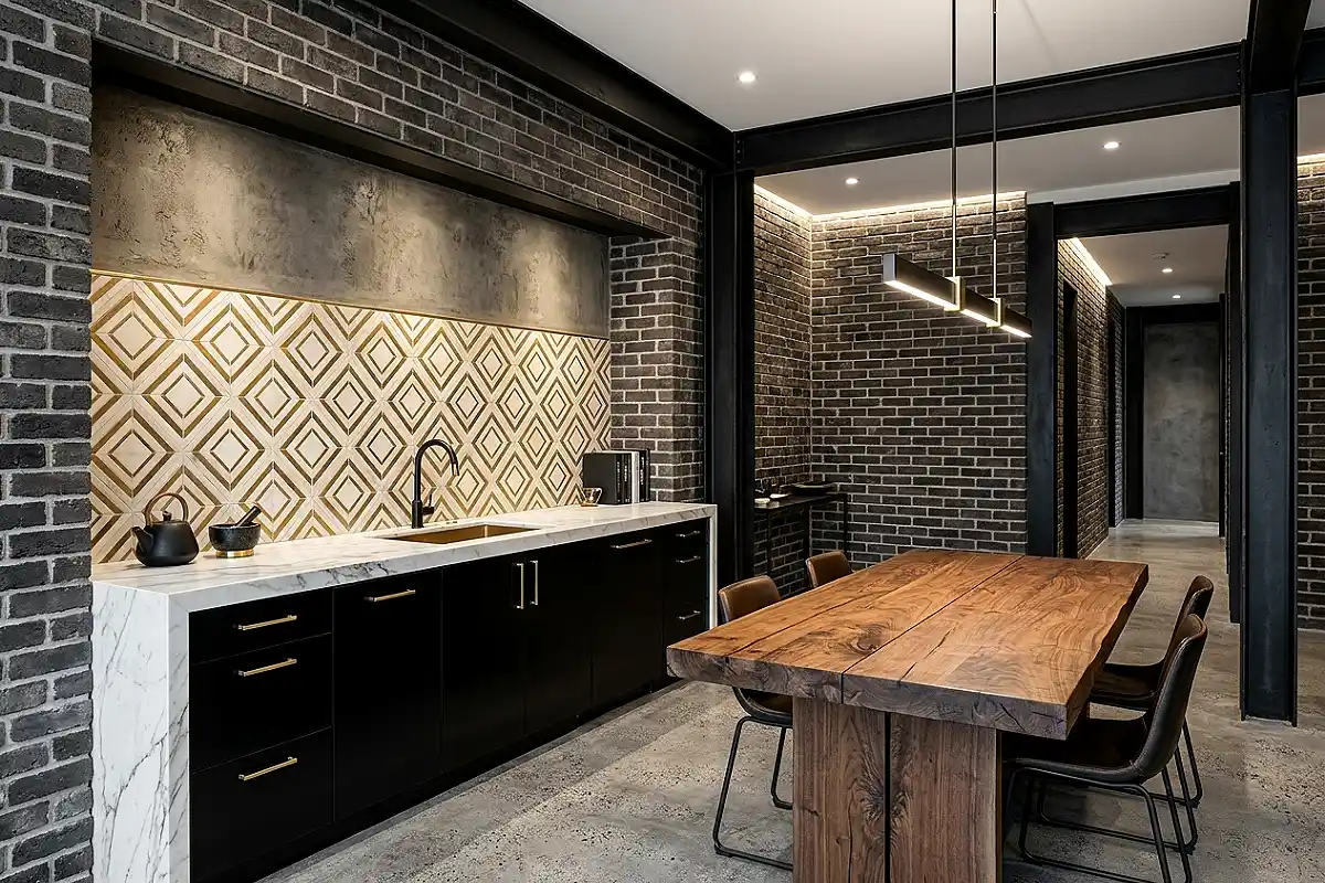
An Art Deco geometric tile pattern — sharp, angular shapes in cream and gold, or black and brass, arranged in a fan or interlocking diamond repeat — brings a level of visual sophistication that solid-colour tiles simply cannot achieve. It reads as a design decision with genuine historical reference and pairs best with dark lacquered cabinetry, a stone countertop, and pendant lights in smoked glass or polished brass.
- Look for tiles with a metallic foil layer rather than a printed gold, which can look flat and dull
- Keep surrounding elements understated so the tile pattern reads clearly — plain cabinet fronts, uncluttered countertop
- Works as a full-wall installation or as a targeted accent behind the stove alone
- Black grout lines sharpen the geometric pattern and make the repeat readable at a distance
Pro Tip
Geometric pattern tiles are unforgiving of misaligned installation — even a small rotation from level becomes magnified across the full wall. Use a laser level rather than a spirit level, and check alignment after every third row rather than waiting until the end to discover a drift.
Travertine-Effect Real Stone Peel and Stick Sheet
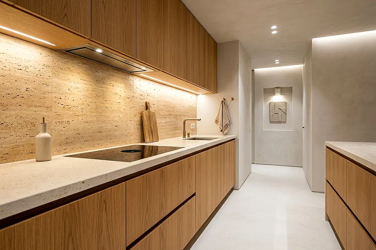
Real stone veneer peel-and-stick sheets — actual thin-cut travertine, marble, or limestone mounted on a flexible adhesive backing — sit at the premium end of the peel-and-stick category and are genuinely indistinguishable from a traditional stone installation because they are, in fact, real stone. The travertine version, in its warm honey-beige with characteristic void patterning, creates a backsplash of unmistakable natural quality. The Aspect Natural Stone range includes genuine travertine, marble, and slate at accessible prices.
- Real stone sheets are heavier than vinyl — ensure the wall surface is completely flat and clean for maximum adhesion
- Seal the stone surface after installation with a food-safe stone sealant to prevent grease absorption
- Travertine works best beside warm-toned countertops — cream quartz, butcher block, warm limestone
- Apply to a wall primed with a bonding primer rather than directly to painted drywall for best long-term adhesion
Pro Tip
Apply real stone peel-and-stick sheets to a wall primed with bonding primer rather than directly onto painted drywall. The primer dramatically improves adhesion on porous surfaces and is the single most important installation step for ensuring stone sheets stay in place long-term.
Deep Navy Glossy Tile
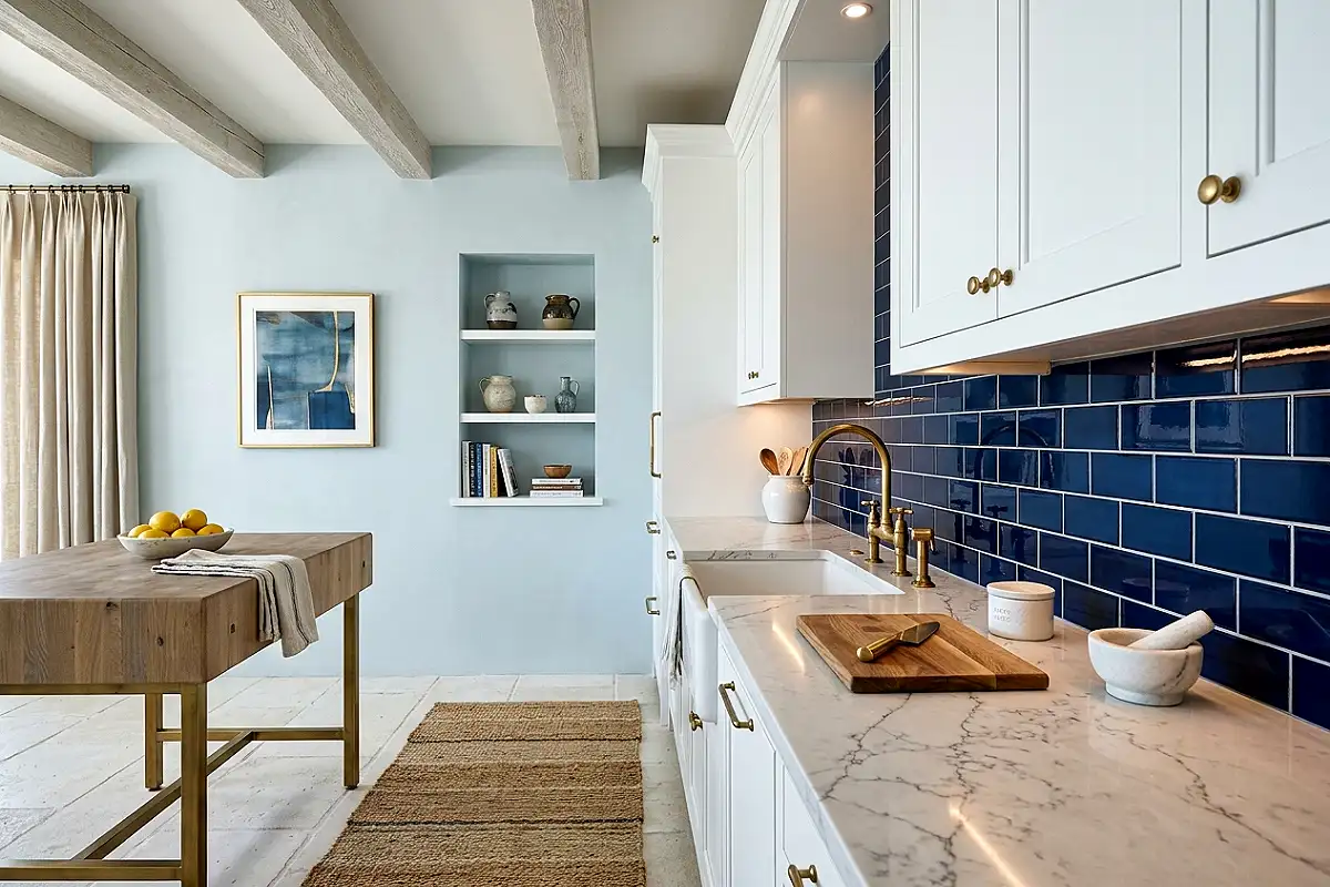
A deep navy glossy tile backsplash makes a kitchen look like it was designed by someone who knows exactly what they’re doing. The high-gloss finish reflects light around the room, the deep blue-black tone adds drama and sophistication, and the combination with white or cream upper cabinets and brass hardware creates the most reliably editorial kitchen aesthetic available. Small kitchens especially benefit from the way glossy navy tiles bounce light.
- High-gloss tiles require a perfectly smooth, flat wall surface — any bumps or imperfections show through the reflective finish
- Pair with unlacquered brass or aged bronze hardware — the combination most associated with high-end kitchen design
- White grout beside navy creates nautical crispness; navy or charcoal grout creates a more dramatic, continuous colour field
- Clean glossy tiles with a microfibre cloth only — abrasive cleaners scratch the finish permanently
Pro Tip
Wipe the wall with isopropyl alcohol before installing glossy tiles — it removes invisible oil residue left from hands during surface preparation that prevents the adhesive from bonding fully, especially on reflective-finish tiles where adhesion failures are most visible.
Warm White Penny Round Mosaic
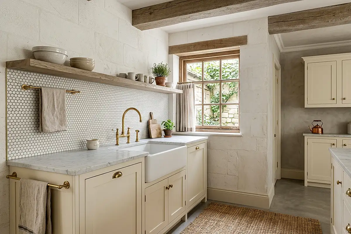
Penny round tiles — the small circular mosaics originally associated with 1920s soda fountain counters — in a warm white or cream finish bring a vintage, artisan quality to a kitchen backsplash that is hard to achieve with any other tile format. The circular shapes create a softer, more organic tile field than squares or rectangles, and the overall effect has a handcrafted warmth that suits country, cottage, and transitional kitchen styles particularly well.
- Warm white penny rounds beside cream or ivory cabinets create a seamless, tonal kitchen where tile reads as texture rather than colour contrast
- Choose cream or warm grey grout — white grout between warm white tiles can look clinical and overlit
- The small scale is ideal for narrow backsplash areas where larger tiles might look clipped or abbreviated
- Mixing in a single row of black or a scatter of gold penny rounds creates a custom, bespoke quality
Pro Tip
Penny round sheets have more cut lines per square foot than any other format — take your time aligning each sheet carefully before pressing, because the curved edges are less forgiving of slight misalignment than straight-edged subway tile sheets.
Concrete-Effect Large Format Tile
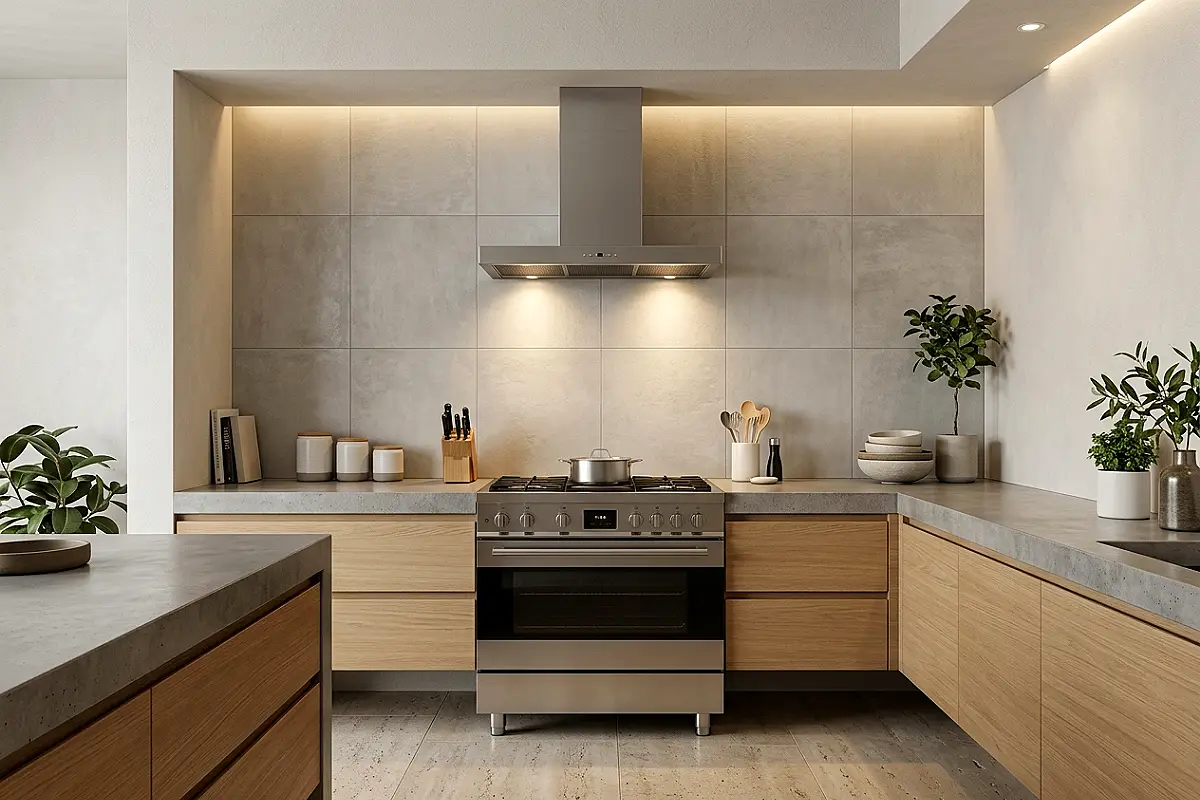
Large-format peel-and-stick tiles in a concrete or raw plaster effect — pale grey, slightly textured, minimal — create a backsplash that looks like polished concrete or Venetian plaster: an upscale, architectural finish particularly at home in industrial, Japandi, and contemporary minimal kitchens. The absence of grout lines in large-format tiles gives the wall a continuous, seamless quality that small mosaic tiles can never achieve.
- Choose a format of at least 12×12 inches — larger tiles mean fewer visible seams, which creates the seamless, high-end wall appearance
- A very slight surface texture prevents the tile from looking like a flat vinyl sheet
- Works best in kitchens with concrete, quartz, or stone countertops where the material language is consistent
- Matte black or brushed stainless hardware beside concrete-effect tiles is the most coherent industrial combination
Pro Tip
For large-format tiles, use a squeegee or flat-edged smoothing tool to press the surface firmly and evenly from the centre outward — this removes air bubbles that, on a large sheet, become visible ripples under raking light.
Handmade-Look Cream and Ivory Tile
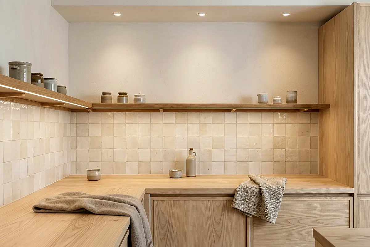
A slightly irregular, handmade-look tile in cream, ivory, or the palest warm white — with subtle variation in surface texture and glaze that mimics the imperfection of hand-thrown ceramic — brings a warmth and artisan quality that machined-look tiles can’t replicate. In a kitchen with natural wood shelving, linen curtains, and warm brass fixtures, this backsplash creates the specific quality of a kitchen that feels made rather than installed.
- The variation in surface and colour between tiles is a feature, not a defect — it’s the quality that makes the tile look expensive and handmade
- A wide, off-white grout line — 3/16 inch or wider — reinforces the artisan, old-world quality of the tile field
- Pair with open shelving in oiled oak or aged walnut rather than closed upper cabinets
- Fresh herbs in terracotta pots on the windowsill above this backsplash complete the picture entirely
Pro Tip
Don’t try to make the installation too perfect — a handmade-look tile with slightly varied grout line widths reads as even more authentic than a machined-precision installation. Let the tiles’ own variation do the visual work rather than fighting to keep every line perfectly uniform.
Emerald Green Glossy Brick Tile
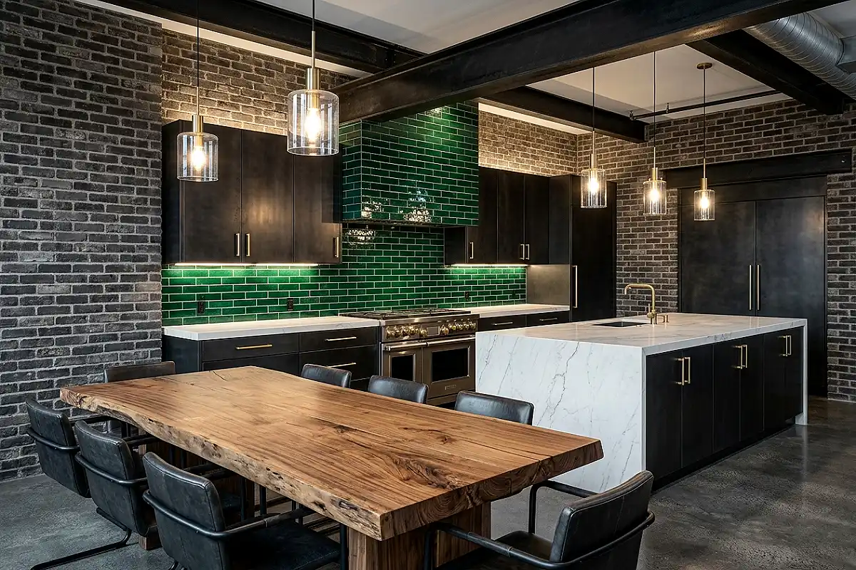
Emerald green in a high-gloss brick format is one of the most striking backsplash choices available and one of the most discussed in kitchen design circles for good reason. It turns a plain kitchen into something with genuine personality and visual commitment. Behind a gas range with a stainless hood or a matte black range cooker, it’s a combination that photographs beautifully and improves even more in person.
- True emerald — not sage, not forest, but a genuine jewel-toned green — needs brass or polished gold hardware to reach its full richness
- Pair with white marble or white quartz countertops for the contrast that makes the emerald pop most clearly
- White grout creates a graphic, Mediterranean quality; dark green grout creates a more continuous, enveloping colour field
- The Merola Tile Tessera Subway Emerald peel-and-stick range is among the most colour-accurate options widely available
Pro Tip
Glossy emerald tiles show fingerprints and water spots very clearly near the sink. Wipe the backsplash with a damp microfibre cloth after any splashing and dry immediately. The maintenance is worth it, but it is a daily habit rather than an occasional task.
Arabesque Tile in White and Gold
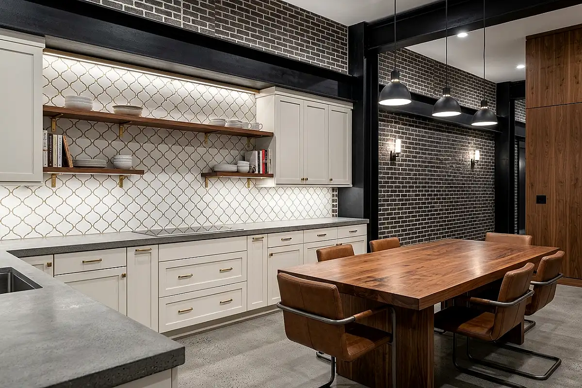
The arabesque tile — a pointed oval or lantern shape derived from Moorish architectural ornament — in peel-and-stick format creates a backsplash with far more visual complexity and cultural richness than any standard rectangular tile. In white with gold metallic grout lines, it creates a kitchen that reads as effortlessly global and thoroughly designed. It works particularly well in smaller kitchens where one wall of pattern makes a complete statement.
- The arabesque shape creates natural negative space between tiles that can be filled with contrasting grout for additional pattern dimension
- Pair with floating shelves in brass or gold-finished metal brackets to continue the warm metallic thread
- The pointed top of the arabesque shape creates a natural vertical emphasis that makes low-ceilinged kitchens feel taller
- White arabesque with gold grout beside warm white cabinets has a specific, elegant quality that reads as Moroccan-influenced without being thematically heavy
Pro Tip
Arabesque tiles have a specific orientation — the pointed end should face upward. Lay out a full row on the floor before applying to the wall to confirm every tile’s orientation, because inverting even one tile immediately disrupts the rhythm of the pattern.
Terrazzo-Effect Peel and Stick Tile
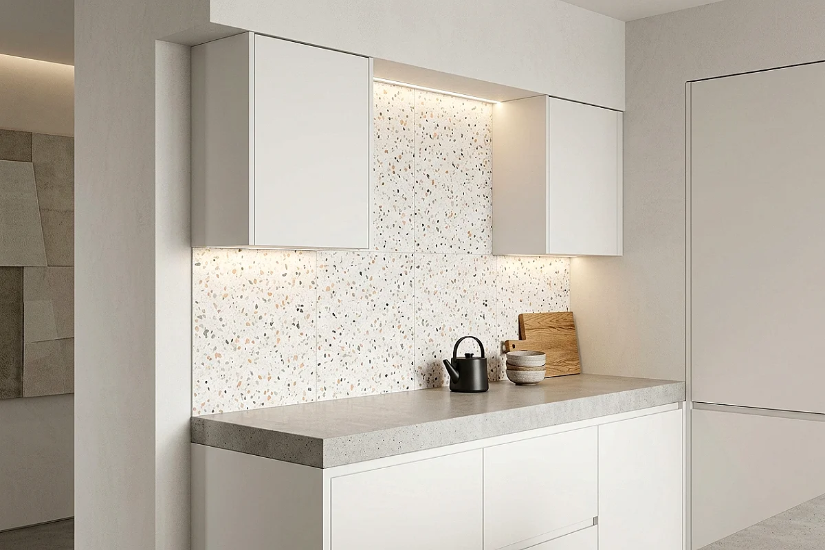
Terrazzo — the Venetian composite of marble chips set in a cement ground — has had one of the most remarkable design revivals of the past decade. A terrazzo-effect peel-and-stick tile in a white or grey ground with multicoloured chip detail brings all the visual excitement of genuine terrazzo without the weight, the cost, or the specialist installation. In a white kitchen, it introduces subtle colour and pattern simultaneously without committing to a single dominant hue.
- Choose chip colours that are harmonious with the room — warm-toned chips (pink, peach, terracotta) suit warmer kitchens; cool-chip terrazzo (grey, black, teal) suits more contemporary palettes
- Large-format terrazzo tiles minimise visible seams and read more convincingly as genuine terrazzo
- Pair with a marble or stone countertop to place the terrazzo in the company of genuine stone materials
- Rotate alternating tiles 90 degrees during installation to distribute the chip pattern more randomly
Pro Tip
Rotate alternating terrazzo tiles 90 degrees during installation — this distributes the chip pattern more randomly and prevents any directional repeat from becoming visible across the wall, which is the detail that makes terrazzo look genuinely random rather than patterned.
Reclaimed Wood-Effect Plank Tile
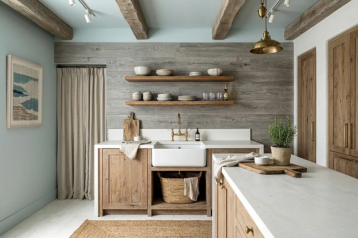
A wood-plank-effect peel-and-stick tile — printed with convincing grain, saw marks, and aged colouring in barn-grey, warm walnut, or whitewashed pine — brings the warmth and texture of a wood backsplash to a kitchen where genuine wood behind a cooking surface would be a practical problem. The best versions use a slightly embossed surface that gives the grain real tactile presence. Behind a farmhouse sink or a butcher-block counter, the material cohesion is genuinely convincing.
- Look for tiles with an embossed wood grain surface rather than a flat print — the texture is the detail that sells the illusion at close range
- Barn-grey and silver-weathered tones suit coastal and Scandi kitchens; warm walnut tones suit farmhouse and transitional styles
- Install horizontally for a traditional panel look, or vertically for a contemporary wall-cladding effect
- Seal the surface with a kitchen-safe matte sealant after installation to protect the printed finish from grease and steam
Pro Tip
Never install wood-effect tiles directly behind a gas or electric stove burner — peel-and-stick materials are not rated for direct heat exposure. Maintain at least 6 inches of clearance from any open flame or heating element, and use a genuine stainless steel or stone insert directly behind the cooking surface.
Iridescent Glass-Effect Tile
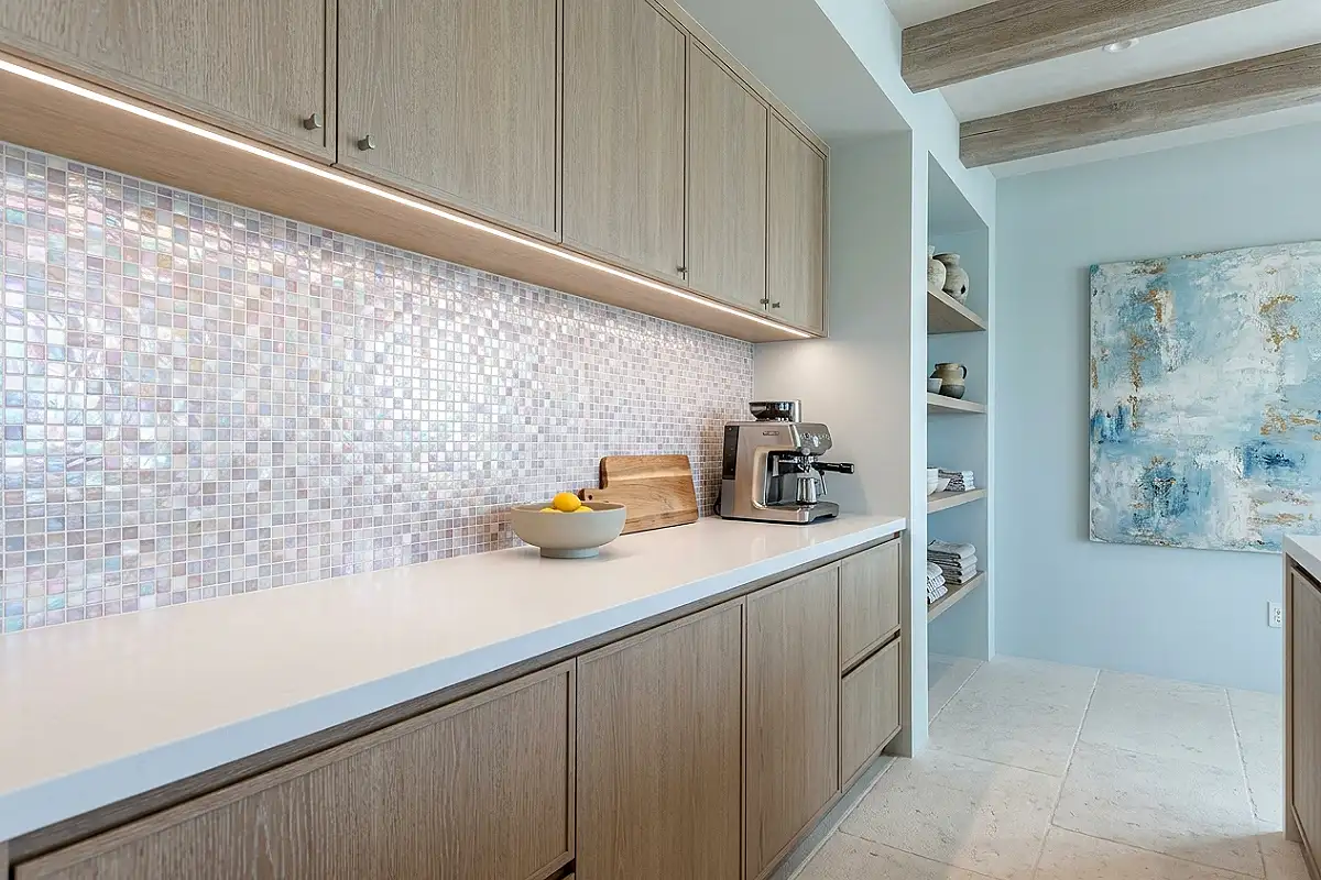
Iridescent peel-and-stick tiles — with a surface finish that shifts between colours as the viewing angle changes, refracting light the way mother-of-pearl does — are among the most glamorous and visually surprising backsplash options available. A kitchen backsplash that changes colour as you move around the room has a quality of magic that no flat-finish tile can replicate. They suit contemporary, coastal, and maximalist kitchens equally, and make even a basic kitchen layout feel considered and special.
- The iridescent shift works most dramatically in kitchens with natural light — position the tile where morning or afternoon sun can reach it
- Pair with simple, neutral cabinets in white, cream, or pale grey so the tile is the room’s undisputed focal point
- White or silver grout maintains the tile’s light-catching quality without introducing a competing colour
- Clean with a soft cloth and warm water only — chemical cleaners dull the iridescent surface finish
Pro Tip
Install a strip of warm LED lighting beneath upper cabinets specifically to showcase iridescent tile in the evening when natural light is gone — directed light at an angle reveals the colour-shift quality of the surface far better than flat overhead light does.
Charcoal and White Chevron Tile
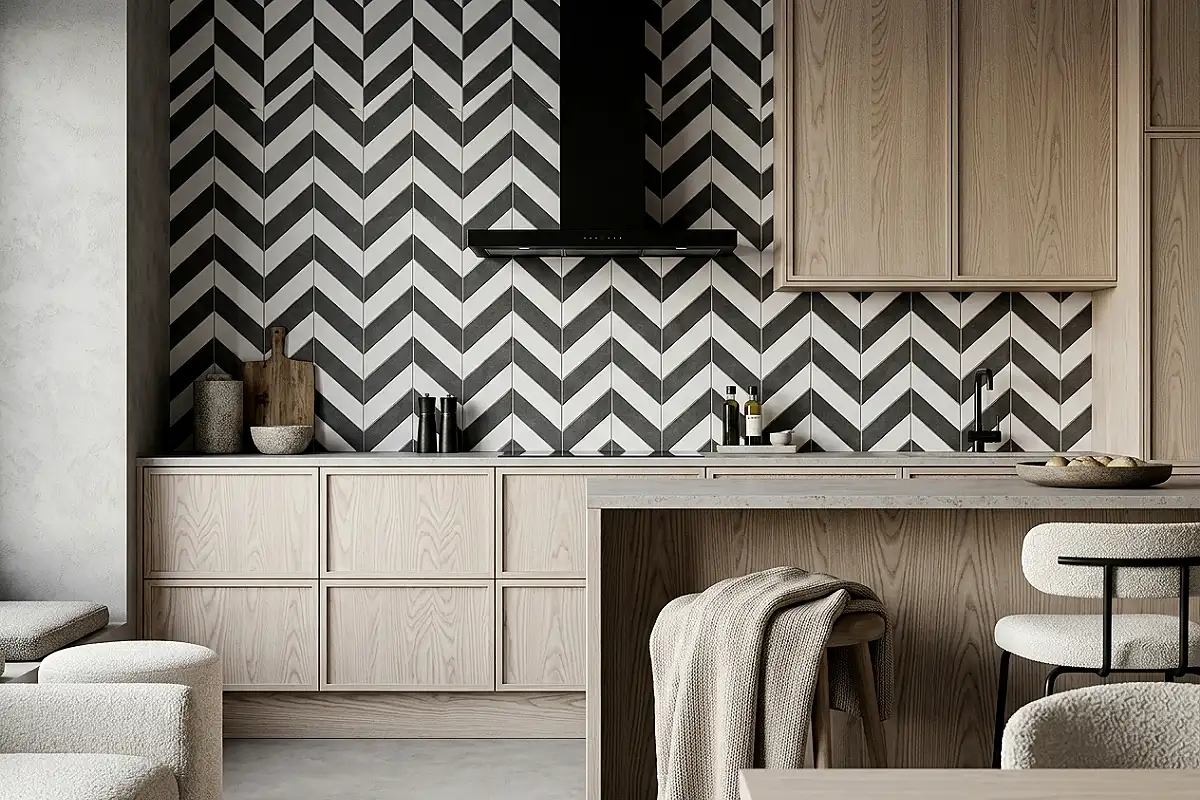
Chevron — parallelogram tiles arranged in a continuous V formation pointing upward — in charcoal and white creates one of the most energetic and visually dynamic backsplash patterns available. It has a strong directional quality that draws the eye upward and outward simultaneously, a mid-century graphic confidence that suits contemporary, industrial, and Scandi kitchens, and a contrast that photographs with exceptional clarity.
- True chevron (where the Vs join cleanly at points) is distinct from herringbone (where joins are staggered) — the two patterns look quite different at scale
- White grout maintains the clean, graphic quality of the pattern; grey grout softens it slightly
- Pair with matte black hardware, stainless appliances, and pale oak or concrete countertops
- A 50/50 colour split creates maximum graphic impact; a 70/30 ratio (more white, a charcoal accent row) creates a softer version
Pro Tip
Chevron is the most alignment-demanding pattern in the peel-and-stick category — even a slightly off-level installation becomes very obvious because the continuous V-points need to be perfectly consistent across the full wall. Use a laser level and check every row before pressing tiles firmly into place.
Blush Pink Glossy Tile with Gold Grout
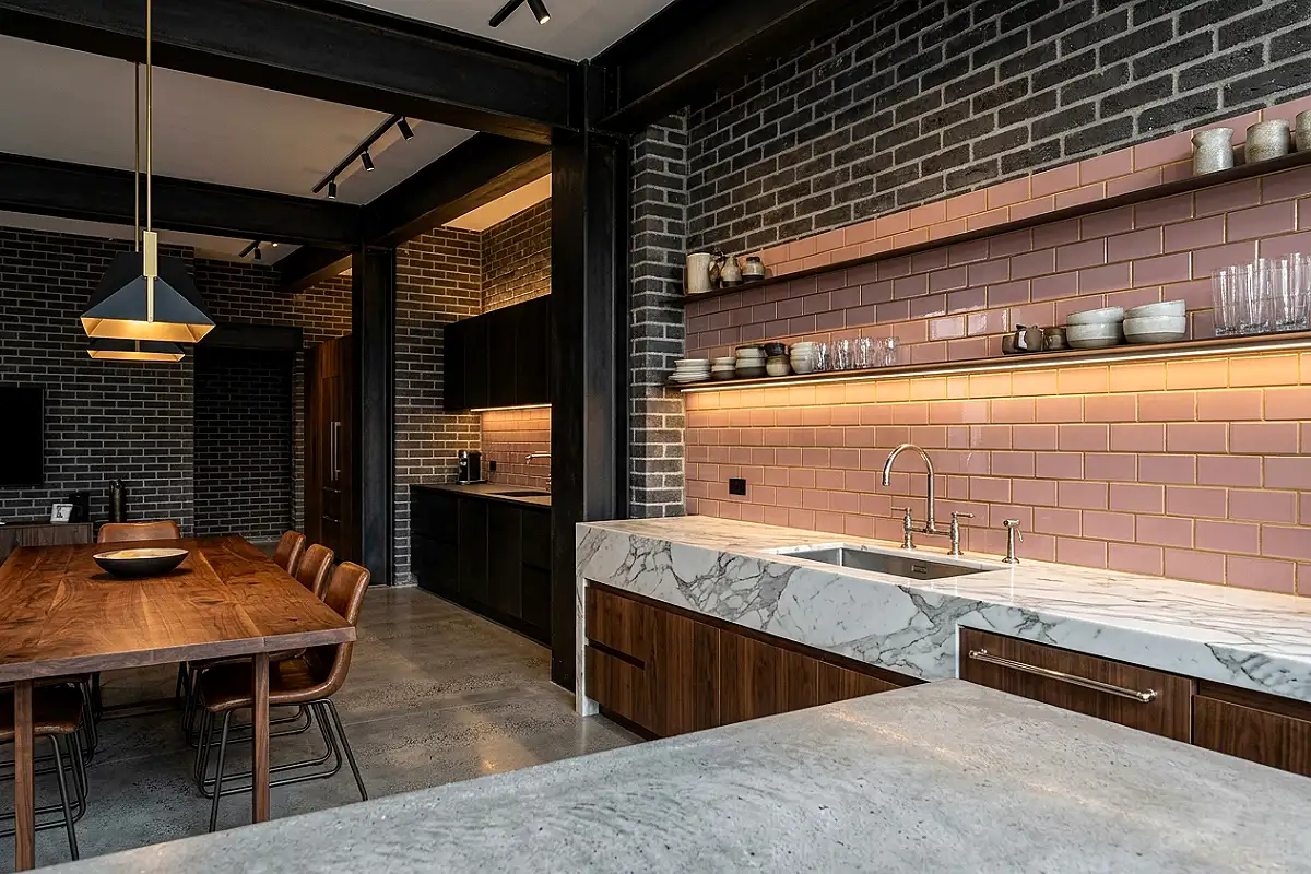
Blush pink in a high-gloss tile format with gold metallic grout lines creates a kitchen backsplash that is simultaneously glamorous, contemporary, and deeply feminine — the aesthetic of a Parisian pâtisserie translated into a domestic kitchen. It is a bold choice and absolutely the right one for those who want a kitchen with genuine personality rather than inoffensive good taste. Paired with dark hardware and marble countertops, it becomes something that feels genuinely curated.
- Dusty rose or antique pink reads as more sophisticated than pure candy pink — the slightly greyed tone prevents it from reading as nursery rather than kitchen
- Pair with calacatta or white marble countertops for maximum luxury contrast beside the pink tile
- Gold metallic grout caulk from Mapei is excellent, easy to apply, and widely available
- Polished nickel or chrome hardware creates a cooler, more fashion-forward contrast than warm brass in this specific combination
Pro Tip
Gold grout applied near a sink requires a grout sealer applied immediately after curing — metallic grout is more porous than standard grout and will absorb water and soap residue over time if left unsealed, losing its metallic sheen within months.
Stacked Vertical Subway in Warm Grey
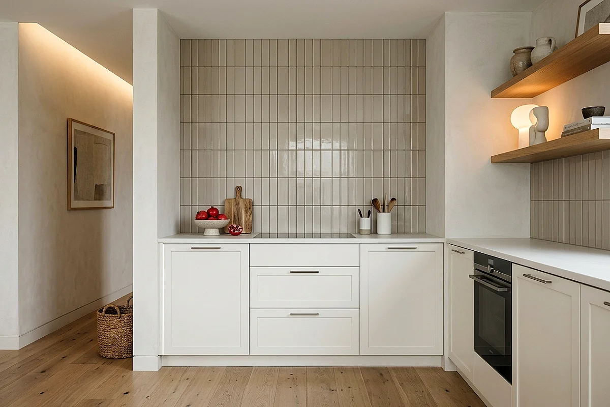
Vertical stacking — subway tiles laid directly above each other in aligned columns rather than the traditional brick offset — creates a completely different visual quality from the same tile. It reads as taller, more architectural, more contemporary, and in a warm grey tone it creates a backsplash with a quiet sophistication that suits modern farmhouse, transitional, and contemporary kitchens without overshadowing the rest of the room’s design.
- A 2×8 or 3×12 elongated subway tile reads most convincingly in a vertical stack — shorter tiles can look too blocky when stacked
- A warm greige (grey-beige) rather than a cool blue-grey keeps the backsplash feeling warm and organic rather than cold and industrial
- White or cream grout beside warm grey creates a clean, fresh quality; warm grey grout creates a more tonal, restrained effect
- Pair with Shaker cabinets in linen white or warm greige for the most cohesive transitional kitchen
Pro Tip
Vertical stacking requires every single tile to be perfectly plumb — there is no offset between rows to absorb small misalignments. Snap a vertical chalk line down the centre of the wall before installing a single tile and use it as your continuous reference throughout the installation.
Cobalt Blue Fish Scale Tile
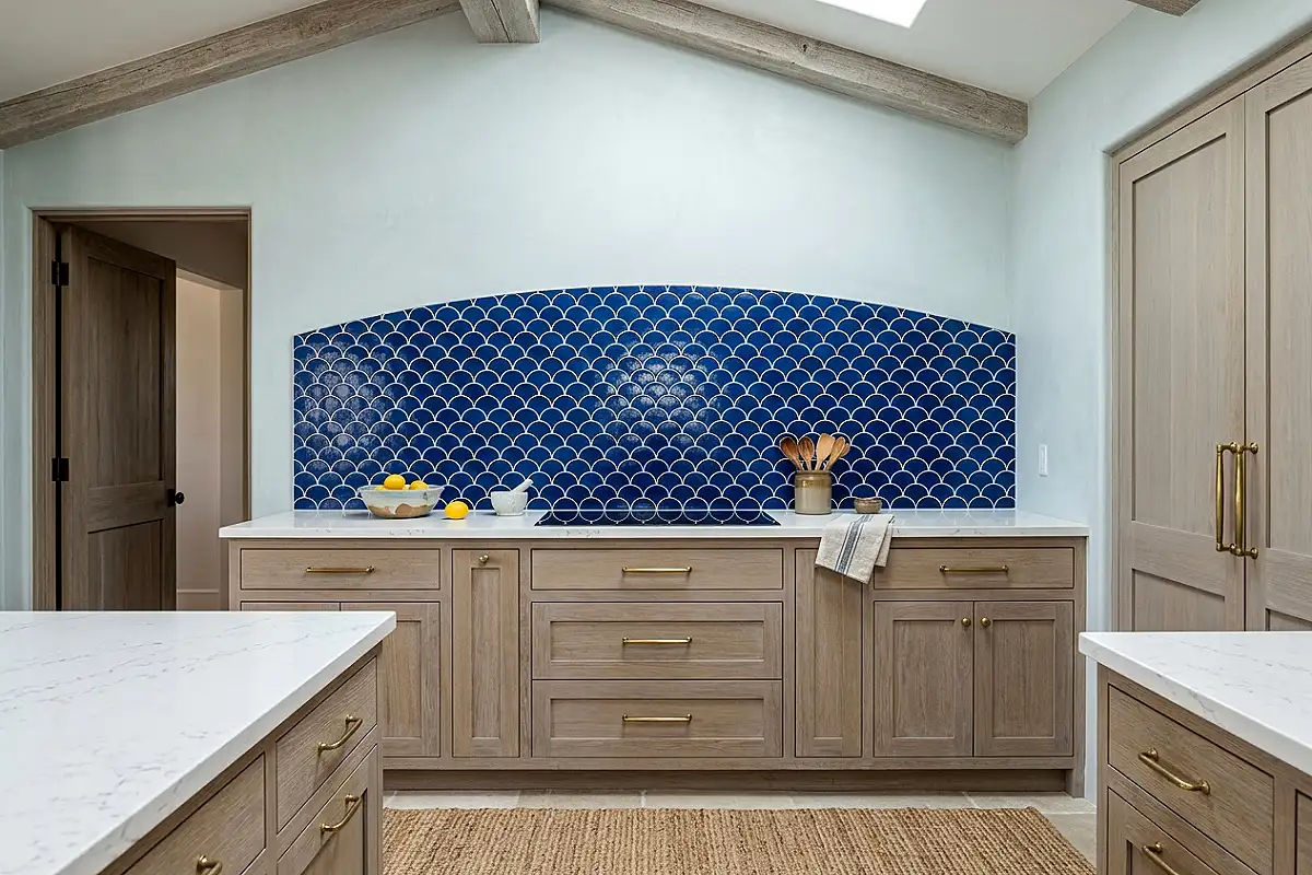
The fish scale tile — a convex semicircle that overlaps the row below in a pattern derived from fish scales and Victorian architectural shingles — in cobalt blue is one of the most visually arresting backsplash formats available. The overlapping curves create dimensional shadow play that changes with the kitchen light throughout the day, and the intense cobalt adds colour with genuine visual confidence. It transforms an ordinary kitchen into a room with an unmistakable point of view.
- Fish scale tiles install from the bottom upward — each row’s lower edge sits above the row below, exactly replicating the natural scale pattern
- White grout beside cobalt creates maximum colour contrast and the clearest reading of the scale pattern
- Pair with white or cream cabinets and brass hardware — cobalt and brass is one of the most complementary colour-and-metal combinations in kitchen design
- The convex surface catches and reflects light from different angles simultaneously — most beautiful in kitchens with natural side light
Pro Tip
Fish scale tiles require more precise alignment at the sheet-to-sheet junction than square or rectangular tiles. Dry-fit at least two full sheets side by side on a flat surface before applying to the wall, to confirm the scale pattern flows continuously across the seam without interruption.
Mixed Neutral Mosaic Stone Tile
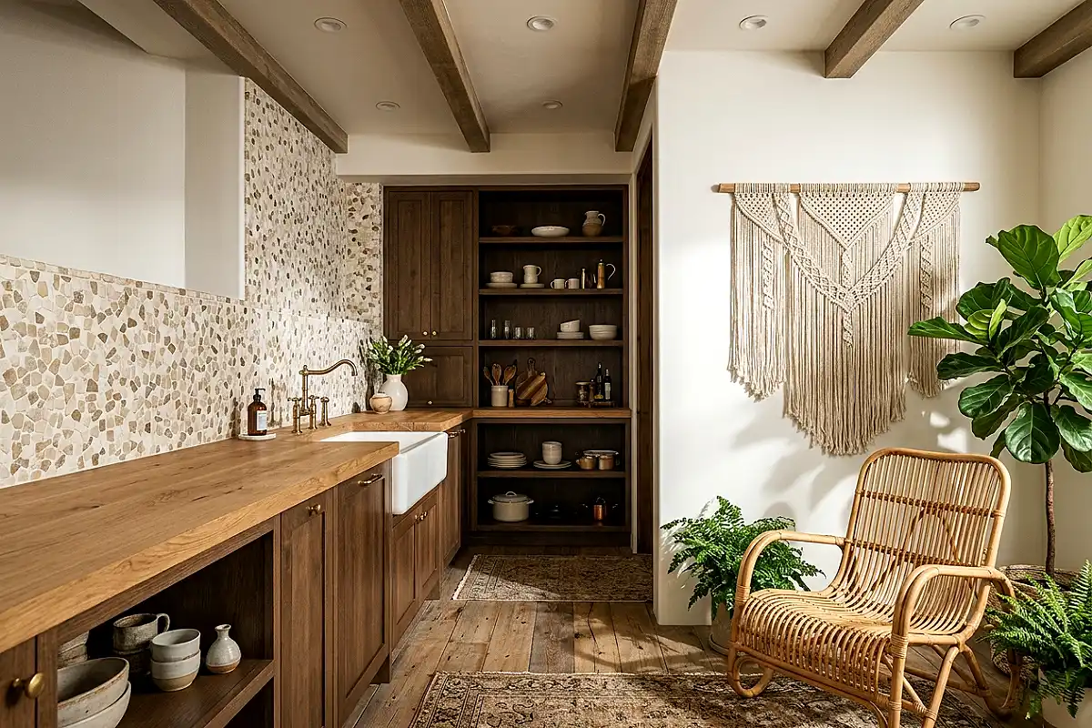
A mixed neutral mosaic — small squares or irregular pieces of stone in varied tones of cream, taupe, warm grey, and sandy beige set in a random pattern — creates a backsplash with the organic, natural quality of a stone wall in an Italian courtyard. No two sections look identical, every tile has its own colour variation, and the overall effect is of genuine material richness achieved through accumulation rather than drama. It suits Tuscan, Mediterranean, organic modern, and warm contemporary kitchens equally well.
- Real stone mosaic peel-and-stick sheets — travertine, limestone, and slate chip mixes — give the most authentic result
- A sand-coloured or warm grey grout creates the organic quality of a traditional stone installation
- Pair with natural wood countertops, ceramic farmhouse sinks, and oil-rubbed bronze hardware
- Seal the stone surface after installation to prevent olive oil, wine, and kitchen acids from staining the porous stone
Pro Tip
When applying stone mosaic sheets, use a grout float to press the sheets firmly and evenly into the adhesive rather than hand-pressing alone — the float distributes pressure across the full sheet surface and ensures every stone makes complete contact with the wall, preventing hollow-spot adhesion failures over time.
Jet Black Herringbone Tile
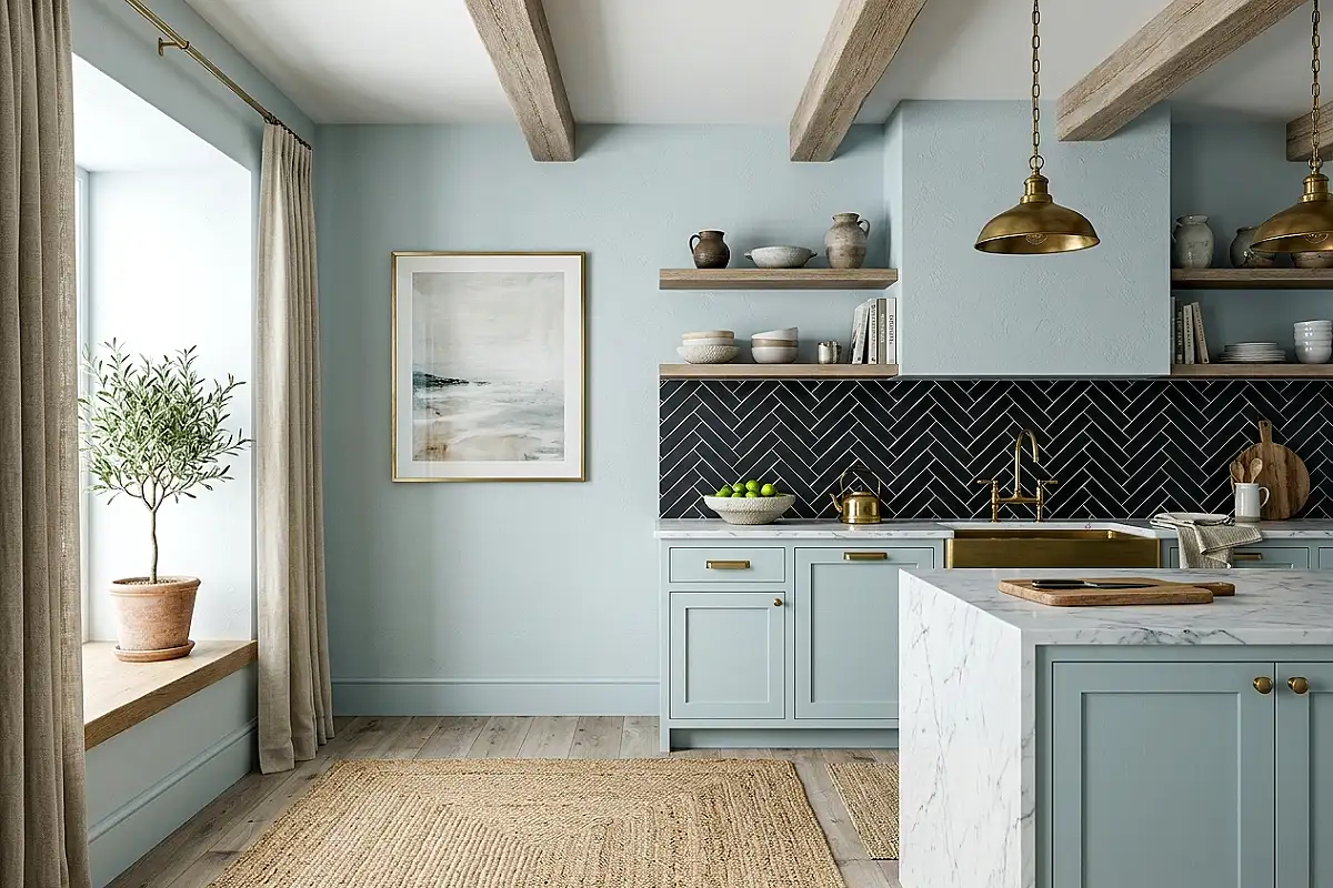
Black herringbone is the backsplash that makes a kitchen look like it was designed for a fashion shoot — graphic, precise, and uncompromising in its visual authority. The herringbone pattern’s diagonal direction creates energy and movement in what is otherwise the most static surface in a kitchen, and in jet black it reads as definitively luxurious and architectural. It pairs with white marble, light oak, and polished brass with the kind of effortless contrast that only really confident colour choices produce.
- Matte black herringbone reads as more contemporary and design-forward; gloss black reads as more dramatic and classical
- White or cream grout shows the pattern at its clearest; charcoal grout creates a more continuous, immersive dark surface
- Pair with a white marble waterfall countertop and unlacquered brass fixtures for the combination most associated with premium kitchen design
- The herringbone pattern requires precise 45-degree cuts at edges — a sharp utility knife and metal straight-edge handle these cleanly on peel-and-stick material
Pro Tip
Find the midpoint of the wall, snap a vertical chalk line, and begin the herringbone from that line outward in both directions — this ensures the pattern is symmetrically balanced around the wall’s centre, which matters more on a dark tile where the geometry is the most visible element.
Blue and White Delft-Inspired Pattern Tile
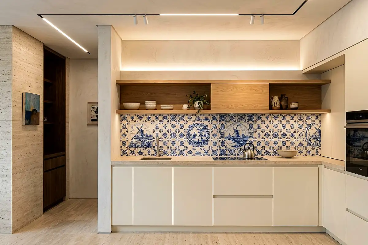
A Delft-inspired blue and white patterned tile — hand-painted-looking designs of windmills, tulips, or abstract floral flourishes in cobalt on white — creates the most maximalist and most joyful backsplash on this list. It turns the kitchen wall into a narrative surface: something to look at and read closely rather than just a background. In a kitchen where everything else is quiet and white, a single wall of Delft pattern is the detail that makes the room genuinely unforgettable.
- Pair with white or cream cabinets that don’t compete — the tile should be the room’s single most decorated element
- Open shelving in natural wood rather than upper cabinets allows the full tile pattern to be visible without interruption
- White grout maintains the blue-and-white colour story without adding a third tone
- Peel-and-stick Delft-inspired tiles are available from Spoonflower and Wallpaper Direct in both patterned sheet vinyl and individual tile formats
Pro Tip
With a patterned tile, check where the pattern repeat falls at the most visible eye-level section of the wall — the middle third between countertop and upper cabinet — before starting. The full, most legible version of each pattern should appear at that eye-level zone, not a clipped or partial repeat at the top or bottom edge.