
19 Bedroom Refresh Ideas That Make Your Room Look Expensive
“Expensive” in interior design isn’t necessarily about how much you spend—it’s about how thoughtfully a room is designed. Bedrooms that feel elevated usually have warm, intentional lighting, edited surfaces, balanced proportions, and materials chosen for their visual and tactile quality.
The good news is that most of these qualities can be recreated without a designer-level budget. Small adjustments to scale, lighting, texture, furniture placement, and styling can make a noticeable difference without requiring a complete room makeover.
The 19 ideas below focus on the specific details that make a bedroom feel polished and luxurious. Many can be completed in a weekend, while others cost little or nothing. The key is to invest selectively, remove visual clutter, and let a few well-chosen elements create the impact.
Repaint with a True Designer Color
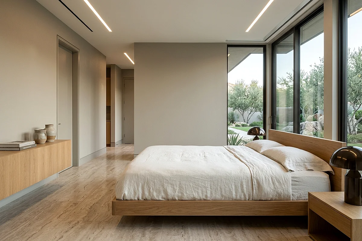
The single largest surface in a bedroom is the walls, and the quality of the paint color chosen for them is the most immediately readable signal of whether or not the room has been considered. Flat, generic beige and off-white readings from a standard paint store communicate neutral-by-default rather than neutral-by-design. True designer colors — Farrow & Ball’s Elephant’s Breath, Benjamin Moore’s White Dove, Sherwin-Williams’ Accessible Beige, or Portola Paints’ limewash in Roman Clay — carry a depth and a complexity in their undertones that standard paint simply doesn’t. They shift with the light, read differently at every hour, and have a specificity that makes the room feel chosen rather than defaulted into. A single gallon of designer paint costs $30 to $90, which is the lowest cost-per-square-foot design upgrade available in any room.
Pro Tip
Paint your trim, baseboards, and door frames in the same color as your walls — or a single shade lighter — rather than the default glossy white. White trim against a colored wall is the most common visual element that makes a designed room look like a rental. Tonal trim immediately reads as architectural and considered.
Invest in One Genuinely Good Lamp
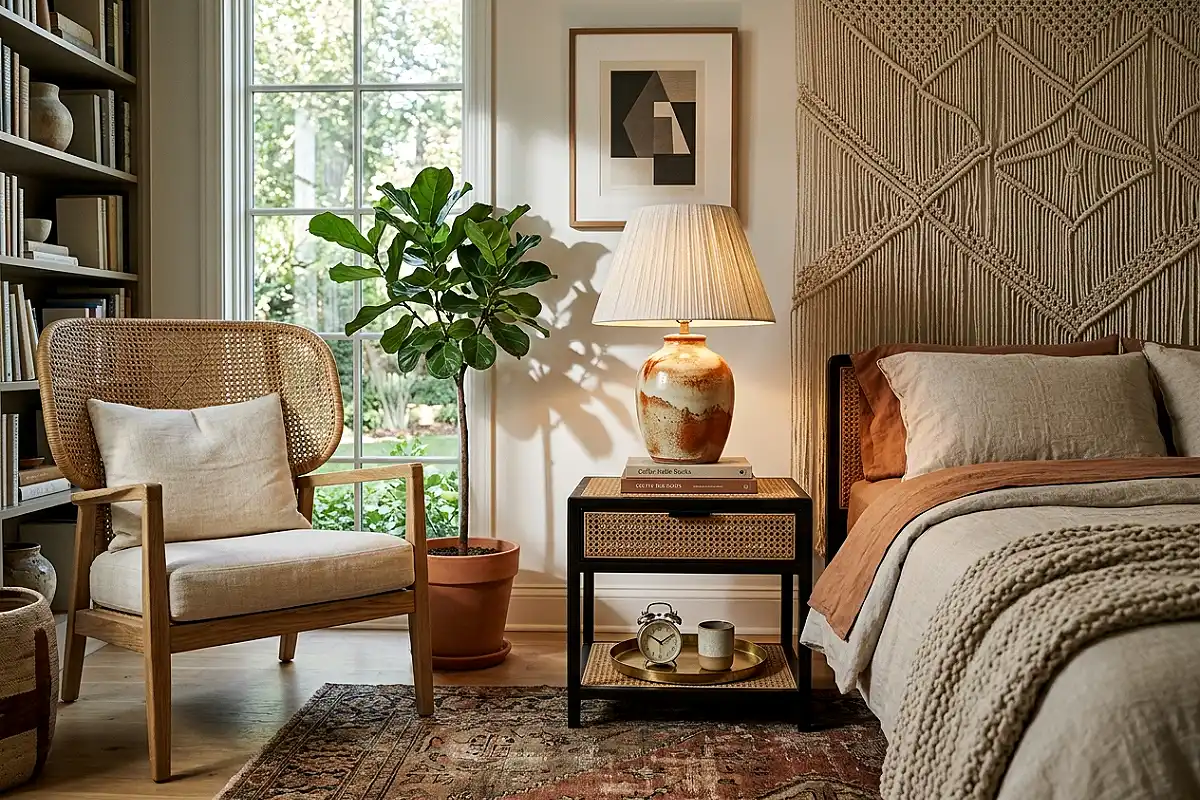
Most bedroom lamps are chosen for function and price, which produces lamps that look functional and inexpensive. One genuinely well-designed lamp — a hand-thrown ceramic base in a warm earthy glaze with a pleated linen shade, a solid brass column lamp with a weighted base and a drum shade in warm ivory, or a sculptural alabaster table lamp that diffuses light through the stone itself — changes the visual register of the entire nightstand and the surrounding area. It’s one of those objects that guests notice and comment on without always being able to identify why the room feels more elevated than expected. Lamps from Visual Comfort, Rejuvenation, or Arteriors occupy the mid-to-upper price range but hold their quality and relevance far longer than five equivalent purchases from a mass-market source.
Pro Tip
The shade is doing at least as much visual work as the base. A great base with a cheap, thin, or poorly proportioned shade reads as unfinished. When buying a lamp, check that the shade width at the bottom is roughly equal to the height of the base — this proportion creates a visually balanced, well-resolved lamp silhouette.
Upgrade to Euro Shams Behind Your Standard Pillows

The single fastest bed upgrade — achievable in under ten minutes and for under $40 — is adding two Euro shams (26-by-26-inch pillows) in a coordinating linen or cotton behind your standard sleeping pillows. The layered depth this creates at the headboard is what separates a hotel-quality bed from a domestic one. The Euro shams give the bed a sense of architectural backdrop; the standard pillows in front become a middle layer; and one or two front accent pillows complete the arrangement at the lowest level. Euro pillow inserts are available at IKEA for under $10 each; covers in Belgian linen or washed cotton from H&M Home and Zara Home both deliver a quality that reads well above their price point. The entire transformation takes one order and one afternoon.
Pro Tip
Overstuff your Euro sham inserts — buy a 28-inch insert for a 26-inch cover. The extra two inches of fill makes the sham stand upright and hold its shape confidently rather than collapsing forward. An overstuffed Euro sham looks expensive; an underfilled one looks limp regardless of the cover quality.
Replace Standard Curtain Rods with Solid Brass Hardware

Curtain rods are one of those background elements that nobody consciously notices when they’re right but that drag the entire room down when they’re wrong. A standard chrome or matte black hollow rod with plastic finials communicates mass-market regardless of the curtains hanging on it. A solid brass rod — or an unlacquered brass rod that will develop a warm patina over time — with simple, proportional finials in a matching finish immediately elevates whatever fabric hangs below it. The warmth of brass against natural linen, velvet, or cotton panels is a material combination that reads as genuinely considered. Atlas Homewares, Pottery Barn, and CB2 all carry solid brass rod hardware; for an unlacquered version that patinas naturally, specialist hardware retailers carry versions that look extraordinary within six months of installation.
Pro Tip
Choose a rod diameter of at least one inch — ideally 1.25 inches. Thin rods look insubstantial, especially with heavier curtain panels. A thick, solid rod communicates weight and permanence; the visual mass of the hardware tells the eye that the curtains were chosen seriously.
Commission or Print One Large Original Art Piece
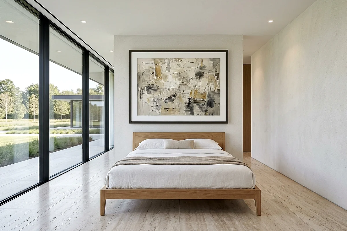
A large piece of original art — or a high-quality large-format print from an independent artist, printed on fine art paper and framed well — above the bed signals taste and intention in a way that a collection of smaller, generic prints simply can’t. The scale matters enormously: for a queen bed, the art or art grouping should span at least 60 to 70 percent of the headboard width. Original oil paintings from emerging artists on Etsy, Society6, or Saatchi Art are available at remarkably accessible prices when you know what you’re looking for — abstract expressionist work in tonal neutrals, large-scale botanical studies, or minimal gestural pieces in earthy tones. A piece that looks like it was chosen by someone with a specific point of view is one of the clearest signals of an elevated room.
Pro Tip
Frame large art prints in a simple gallery frame with a wide white or off-white mat — the mat should be at minimum 3 inches on all sides, and wider at the bottom than the top. The wide mat gives the image visual breathing room and is the specific detail that distinguishes a properly framed fine art print from a poster in a frame.
Install Wall Sconces Instead of Table Lamps
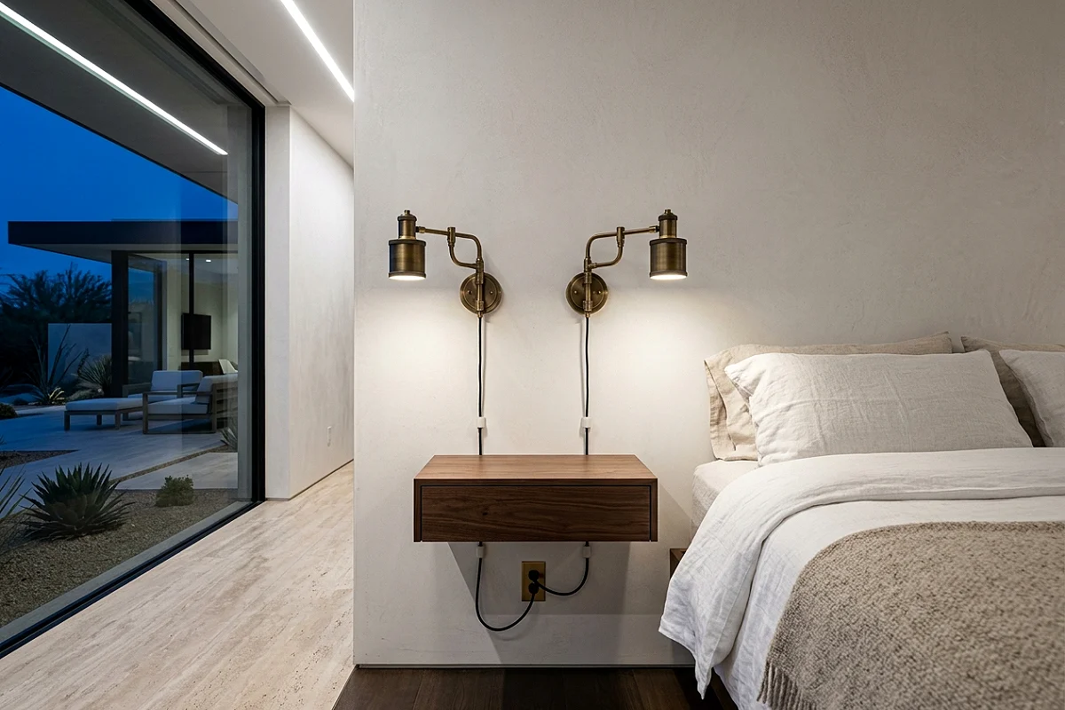
Plug-in wall sconces flanking the bed — positioned at approximately 60 inches from the floor, or about 15 to 20 inches above the mattress surface — free up the nightstand surface entirely while delivering the directional reading light and ambient warmth that table lamps provide. The absence of lamps on the nightstand immediately makes the surface look cleaner, more spacious, and more intentionally designed. In a bedroom, this single change creates the visual impression of a room that has been professionally laid out rather than furnished by convenience. Plug-in versions require no electrical work; route the cord up the wall and secure it with adhesive cable clips painted the wall color so they disappear entirely. Cedar & Moss, Schoolhouse, and West Elm all carry beautifully proportioned plug-in sconce options in brass, bronze, and matte black.
Pro Tip
Paint your wall sconce cord clips — small adhesive clips that hold the cord flat to the wall — the exact same color as your wall using a small brush before pressing them on. The cord and clips become virtually invisible, and the sconces appear to be hardwired even when they’re entirely plug-in. This one detail separates a sconce installation that looks designed from one that looks improvised.
Add Architectural Interest with Crown Molding
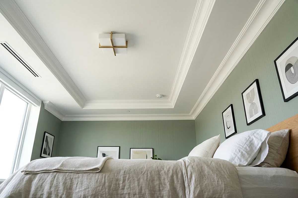
Crown molding — the decorative trim where the wall meets the ceiling — is the single architectural detail that most reliably makes a standard bedroom feel like a room in a well-built home rather than a rental unit. Even a simple 3-to-4-inch ogee or cove profile painted the same color as the ceiling (not the wall) creates a visual transition that the eye reads as craftsmanship and permanence. In older homes where molding has been removed or never existed, pre-primed MDF crown from any home improvement store installs with finishing nails and paintable caulk in a weekend. In rental situations, adhesive foam crown molding in classic profiles has improved significantly in quality and, painted carefully, can be surprisingly convincing from a normal viewing distance.
Pro Tip
Caulk every joint and seam in crown molding before painting and do not skip sanding the caulk smooth once it’s dry. Unpainted caulk lines and visible seams are what make crown molding look DIY regardless of the profile quality. The finish work is 80 percent of the result.
Dress the Bed with a Coverlet or Quilt Layer
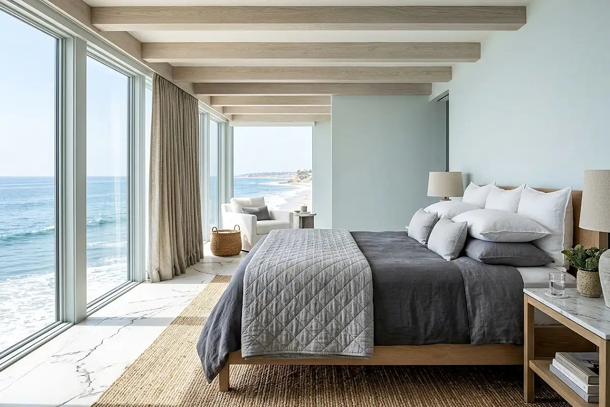
A duvet alone — even a beautiful one — makes a bed look like it was made, not styled. Adding a coverlet or a lightweight quilt folded across the lower third of the bed introduces a layered quality that communicates abundance and deliberateness. Choose a coverlet in a complementary tone to the duvet — a matelassé white over cream linen, a diamond-quilted dove grey over charcoal, a waffle-weave ivory over warm white — and fold it so approximately 18 to 24 inches of its surface is visible at the foot of the bed. The texture of the coverlet against the smoothness of the duvet creates a material contrast that reads as carefully considered even when the entire arrangement took three minutes to achieve. Pottery Barn’s Belgian flax linen matelassé coverlet and Parachute’s waffle weave throw both deliver this quality at a reasonable price.
Pro Tip
Fold the coverlet so the fold line falls horizontally across the bed at the exact height where the last sleeping pillow ends. This connects the coverlet visually to the pillow arrangement rather than sitting as a separate element, making the whole bed composition read as a single coordinated decision rather than several independent choices.
Upgrade Your Duvet Insert, Not Just the Cover
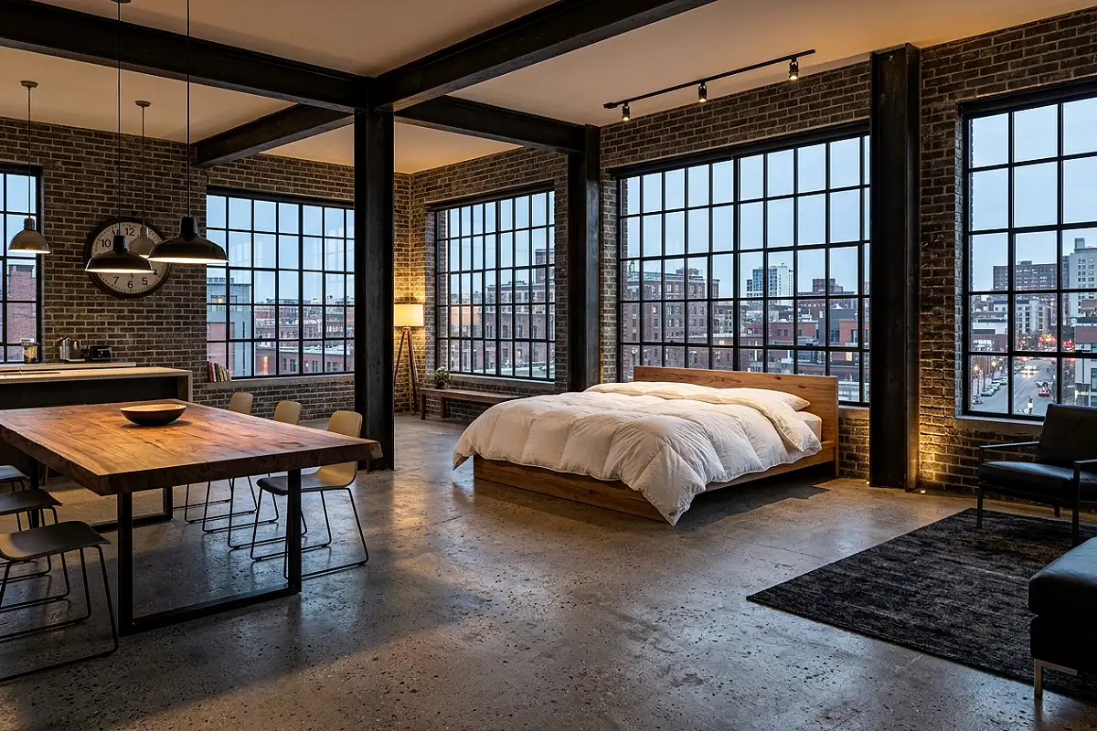
Most people focus entirely on the duvet cover and ignore the insert — but a flat, low-loft insert under a beautiful cover makes the whole bed look deflated, regardless of the cover’s quality. A high-fill-power down insert — 600 fill and above — lofts visibly above the mattress and creates the cloud-like depth that makes a bed look genuinely luxurious. The duvet should look like it has volume and weight, not like a flat envelope of fabric. Down alternative inserts at this loft level have improved significantly: brands like Buffy and Casper make inserts that achieve real visual loft with a softer, more ethical fill. Size up by one dimension — use a king insert in a queen cover — for extra loft and the slight overhang that makes a bed look indulgently abundant rather than precisely fitted.
Pro Tip
Use duvet clips or ties at all four corners to anchor the insert to the cover. An insert that shifts inside the cover creates lumpy, uneven distribution that no amount of shaking restores properly. Anchored inserts hold their position indefinitely and make daily bed-making two minutes faster.
Hang a Statement Mirror That Does Double Duty
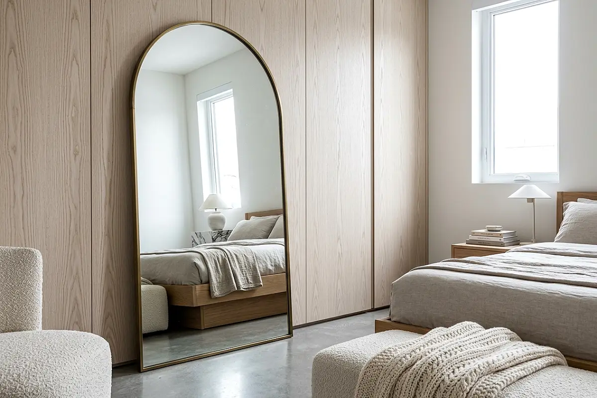
A well-chosen mirror in a bedroom is one of those rare objects that earns its wall space on multiple grounds simultaneously: it adds depth to the room by reflecting the space back at itself, it bounces light into darker corners, it provides a functional dressing surface, and — when the frame is genuinely beautiful — it serves as art. In a bedroom refresh, the mirror is often the piece that makes the biggest immediate difference because it addresses scale, light, and design character in a single object. An oversized arched mirror in a slim antique brass frame leaned against the wall, a large round mirror in a woven rattan frame above the dresser, or a beveled rectangular mirror in a hand-forged iron frame all communicate a level of consideration that a frameless IKEA mirror — however useful — simply doesn’t.
Pro Tip
Position a leaning floor mirror so it reflects the most visually appealing part of the room — ideally a window, a lamp, or the bed arrangement — rather than the closet door or an empty wall. The reflection it shows is part of its design contribution, and choosing what it reflects is a decision worth making deliberately.
Use Paint to Create a Faux Headboard Panel
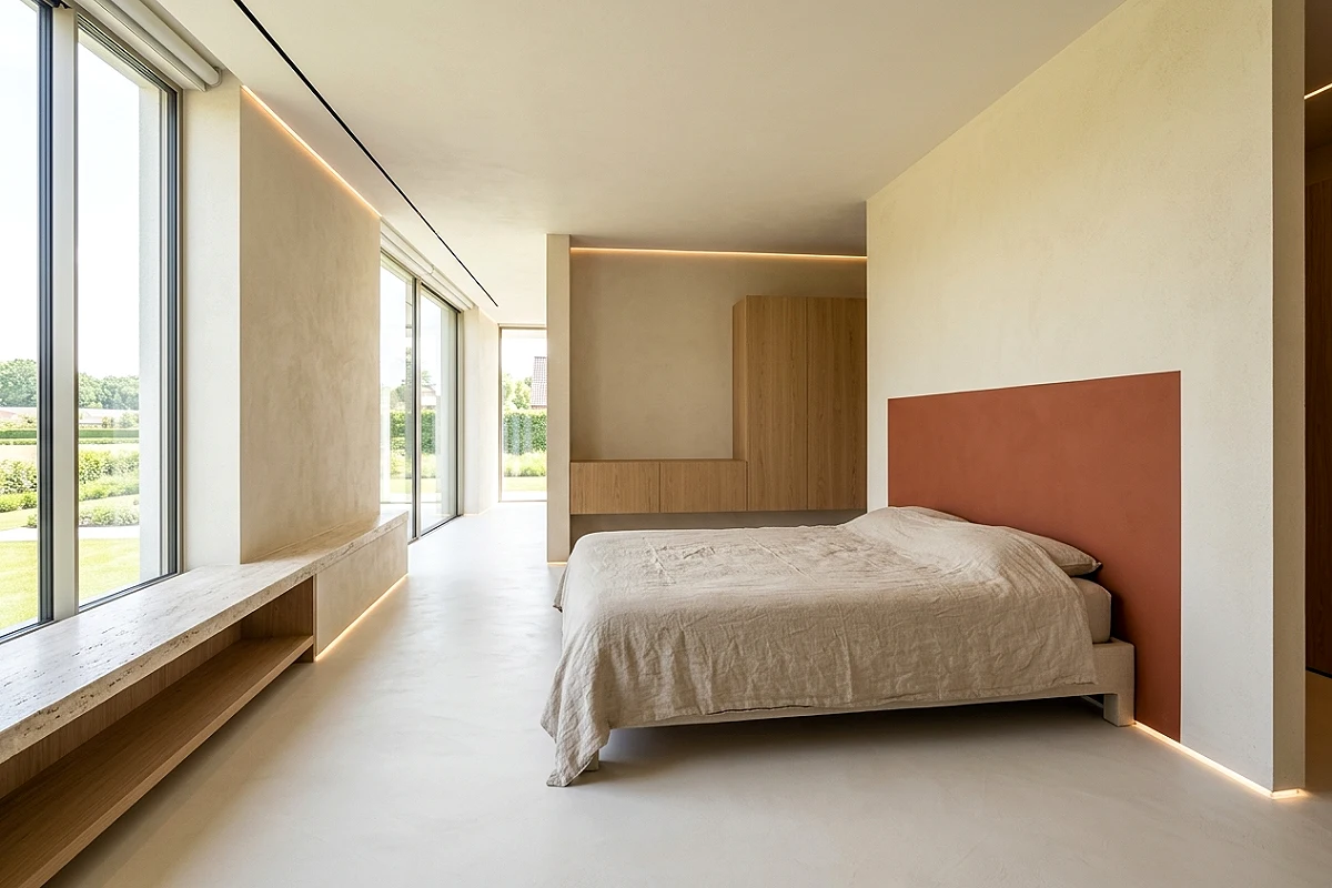
A painted headboard panel — a rectangle of color applied directly to the wall behind the bed, slightly wider than the bed frame and tall enough to rise above the pillow stack — creates a strong focal point that reads as architectural intent for the cost of a sample pot of paint. Use a tone that’s two to three shades deeper than the surrounding wall color: a warm terracotta against a cream wall, a deep sage against a pale green, a dusty mauve against a warm ivory. The painted rectangle grounds the bed on the wall in a way that floating beds in the middle of blank walls never achieve, and it creates a visual framing effect that makes whatever headboard or pillow arrangement sits in front of it look more considered and deliberate.
Pro Tip
Make the faux panel slightly wider than you think it needs to be — the panel should extend 6 to 8 inches beyond the sides of the bed frame rather than just clearing the frame edge. A panel that feels generous in proportion reads as a design decision; one that barely clears the bed reads as a measurement.
Edit Your Nightstand Down to Three Objects
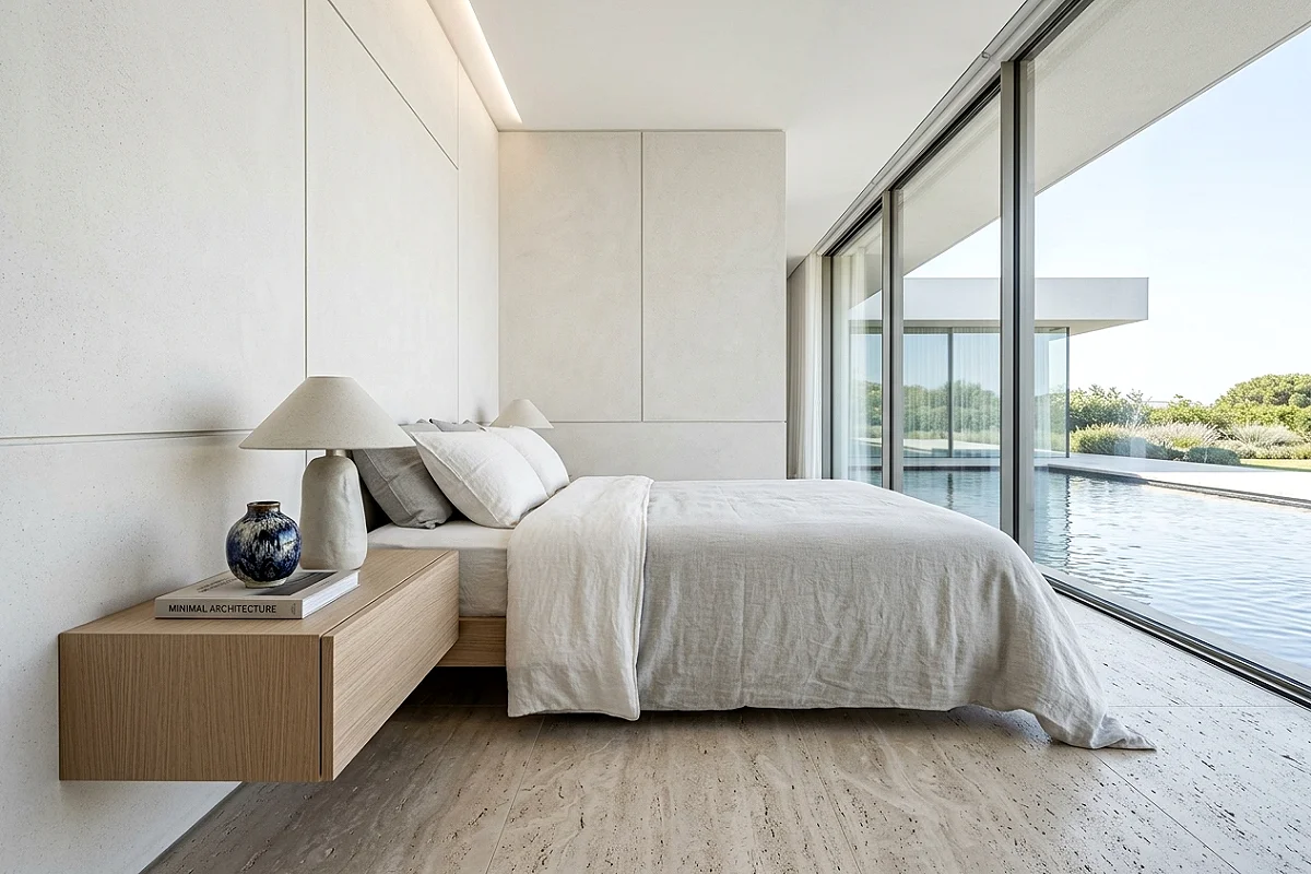
Nothing signals an expensive, professionally styled room quite as reliably as negative space — and nothing destroys it as reliably as a cluttered nightstand. A lamp, one small carefully chosen object (a single ceramic, a small vase with one stem, a smooth stone), and one book: this three-object arrangement is all a nightstand needs to look intentional, calm, and considered. The lamp provides function and visual height; the small object provides material warmth and personality; the book signals inhabitation without chaos. Everything else — the water glass, the phone, the charger cable, the lip balm, the hair tie — lives in the nightstand drawer. The surface does the visual work; the drawer does the storage work. Keeping these two functions completely separate is the discipline that separates styled nightstands from cluttered ones.
Pro Tip
Route your phone charger cable through a small hole drilled in the back corner of the nightstand drawer — or use an adhesive cable clip inside the back of the drawer to hold the cable end at the drawer’s interior edge, so the plug is always accessible without the cable being visible on the surface. Visible cables on nightstands are one of the most common things that undercut an otherwise well-styled bedroom.
Layer Window Treatments for Depth and Function

A single curtain panel per window is a functional solution; two layered window treatments are a design one. The combination of a slim roller blind or a Roman shade close to the glass — providing privacy and light control — with full-length drape panels in a beautiful fabric hanging from the ceiling on either side creates the layered depth that distinguishes a designed bedroom from a furnished one. The inner layer handles function; the outer layer handles atmosphere and scale. Even with the drapes permanently open, their presence on either side of the window adds vertical structure and fabric softness that a window with only a blind looks architecturally bare without. Sheer inner panels with an opaque outer curtain in a complementary tone is the other classic combination that achieves the same result.
Pro Tip
When layering window treatments, use separate hardware for each layer — a slim bracket close to the window for the blind or sheer, and a ceiling-mounted or wall-mounted rod 4 to 6 inches in front of it for the drape panels. This separation gives each layer room to function independently and prevents the fabric from bunching against the blind when the drapes are open.
Invest in a Quality Rug, Not More Furniture
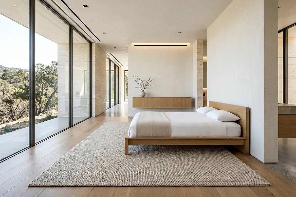
If there’s one area of a bedroom where spending genuinely makes a visible difference, it’s the rug — and it’s also the area where most people under-invest. A quality wool or wool-blend rug in the right size — extending at least 18 inches beyond the sides and foot of the bed on a queen, more on a king — grounds the entire room in a way that a small, thin rug cannot. The pile density, the softness underfoot, and the visual richness of a well-made rug communicate quality from across the room. A thin synthetic rug in an interesting pattern reads as budget regardless of the pattern; a dense, well-woven natural fiber rug in the simplest solid tone reads as considered and well-sourced. Loloi, Rugs USA’s Amber Lewis collection, and Revival Rugs carry beautiful options at a range of price points without requiring a designer’s trade account.
Pro Tip
Always test a rug’s pile density before buying by pressing your thumb firmly into the surface and releasing. On a quality rug the pile springs back immediately and fully; on a thin or loosely constructed rug it compresses and recovers slowly. This test works on samples in stores and is the single most reliable quality indicator available without pulling threads or checking backing construction.
Reframe Existing Art with Better Frames and Mats
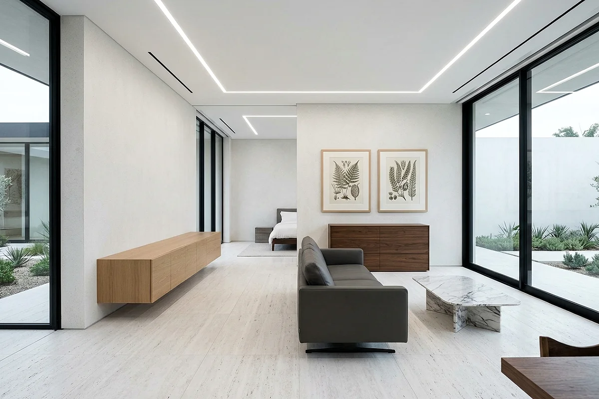
Most printed art in most bedrooms is either unframed, in a cheap clip frame, or in a frame that was chosen for price rather than proportion. Reframing existing prints — or even photographs — in a proper gallery frame with a wide white or warm-toned mat transforms the same image into something that reads as a deliberate art collection. The mat does the heavy lifting: a 3-to-4-inch mat border all around (slightly wider at the bottom) takes an 8-by-10-inch print and turns it into a piece that behaves like a 16-by-20-inch work on the wall. The print itself doesn’t change; the presentation is doing all the work. IKEA’s HOVSTA frames in a natural or dark stain are a genuinely good quality option; for a step up, Framebridge and Simply Framed both offer custom framing at reasonable prices with excellent mat quality.
Pro Tip
Use conservation or museum-quality UV-filtering glass in any frame holding art you care about keeping. Standard glass transmits UV light that fades art within a few years of hanging; UV-filtering glass slows this to a near-imperceptible rate. It costs $20 to $40 more per frame and is genuinely worth it for pieces that are meaningful or valuable.
Style One Surface as a Considered Vignette
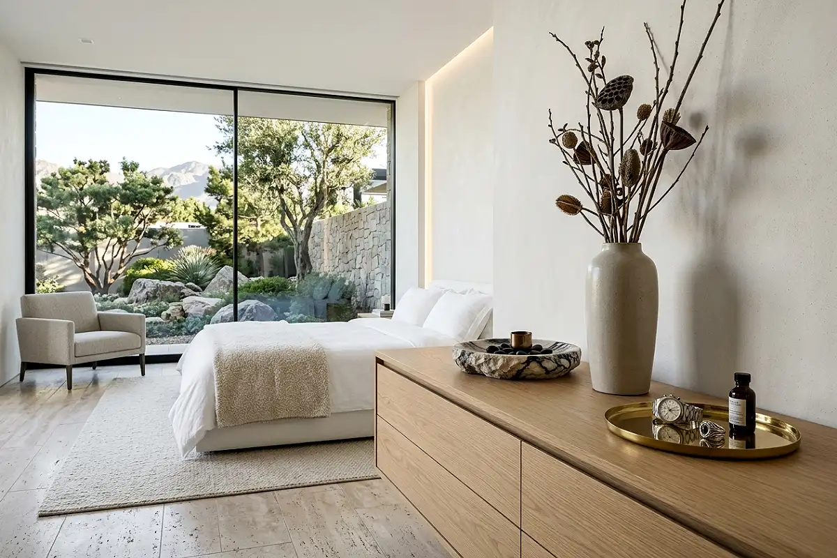
The difference between a room that looks like someone lives in it and one that looks like someone styled it is usually the presence of one deliberately arranged surface — a dresser top, a floating shelf, a window ledge — where every object has been chosen and positioned with a clear compositional logic. Height variation (one tall object, one medium, one low or flat), material contrast (one smooth ceramic beside one rough-textured object beside one reflective surface), and visible negative space (30 to 40 percent of the surface left clear) are the three structural principles that make a vignette read as curated rather than accumulated. Apply all three to one surface in the bedroom and leave everything else deliberately simple, and the room acquires a focal point of genuine visual intelligence.
Pro Tip
Build your vignette around one anchor object that has genuine visual weight — a substantial ceramic, a piece of carved stone, a meaningful book — and arrange everything else in relation to it. Vignettes without an anchor tend to look like a collection of objects placed near each other; vignettes with a clear center of gravity look like they were composed.
Replace Builder-Grade Door Hardware
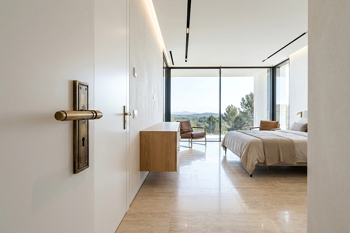
Builder-grade interior door handles — the standard lever or round knob in a brushed nickel or chrome finish that comes with virtually every new construction and rental — is one of the most persistent and most correctable signals of a room that hasn’t been thoughtfully finished. Replacing the bedroom door handle, the closet door hardware, and any drawer pulls on built-in furniture with a cohesive set in unlacquered brass, satin brass, oil-rubbed bronze, or matte black takes under an hour and costs between $20 and $60 per piece. The change is noticed by virtually everyone who enters the room, even when they can’t identify what specifically feels more finished. Hardware is the jewelry of a room, and builder-grade hardware is the equivalent of a great outfit with a plastic watch.
Pro Tip
Choose one metal finish and use it for every piece of hardware in the bedroom — door handles, drawer pulls, curtain rod, lamp base, picture hanging hardware — rather than mixing metals. A single cohesive metal tone throughout a room reads as intentionally designed; multiple metals reads as assembled over time from whatever was available.
Add a Proper Headboard at the Right Height

A bed without a headboard is a bed without a focal point, and a bedroom without a focal point is a room that the eye doesn’t know where to settle in. A proper headboard — at minimum 48 inches tall from the floor for a queen, 54 inches or taller for a king — creates the vertical anchor that the entire bed arrangement needs to read as architecturally complete. In a bedroom refresh where the budget doesn’t extend to a new bed frame, a wall-mounted upholstered panel in a neutral linen or boucle, or even a raw wood panel finished with a matte stain and mounted directly to the wall, delivers the same structural benefit as a purchased headboard at a fraction of the cost. The height rule is non-negotiable: a low headboard that barely clears the pillow stack looks like a practical afterthought; a tall one looks like the room was designed around it.
Pro Tip
For a DIY upholstered headboard, use 3-inch-thick high-density foam over a plywood base, wrapped in a layer of batting and then your chosen fabric. The thickness of the foam determines how luxurious the headboard looks and feels when leaning against it — 1- or 2-inch foam reads as thin and hard; 3-inch foam reads as deeply upholstered and genuinely comfortable.
Introduce One Genuinely Tactile Material
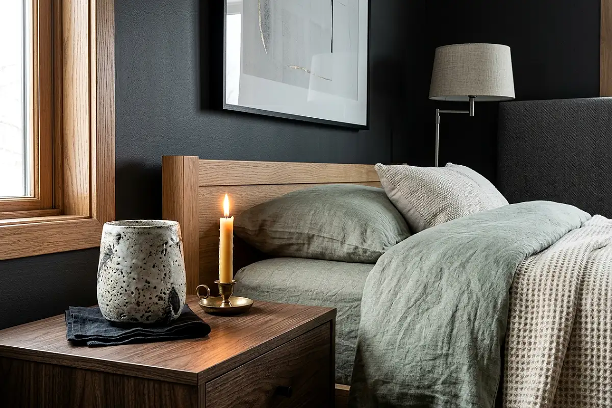
The most reliably expensive-feeling rooms are ones where at least one surface or object invites — and rewards — being touched. Not because touch is part of the room’s intended use, but because the presence of a material with genuine tactile quality communicates craft, sourcing, and care in a way that visual elements alone cannot. In a bedroom refresh, this means introducing one object whose material quality is the point: a hand-thrown ceramic vessel with a textured, imperfect surface; a piece of solid travertine or marble used as a tray or a small side surface; a genuinely heavy linen cushion with visible slub texture; a beeswax candle in an interesting mold. The specific object matters less than the material quality. One thing that makes someone pick it up, turn it over, and feel it for a moment does more for a room’s perceived quality than a dozen decorative objects that are only interesting to look at.
Pro Tip
Shop for tactile objects in person rather than online whenever possible. The quality differential between a genuinely hand-thrown ceramic and a machine-made one that photographs identically is impossible to judge from a screen — but unmistakable the moment you hold both. One good piece found in person at a craft fair, a pottery studio sale, or an independent ceramicist’s shop is worth ten online orders in the same category.
Frequently Asked Questions
How do I make my bedroom look expensive without spending a lot?
The highest-impact zero-to-low-cost changes are: declutter every surface down to three objects or fewer, hang your curtains at ceiling height instead of window height, replace all bulbs with 2200K warm amber options, paint your trim the same color as your walls, and add two Euro shams behind your standard pillows. These five changes cost under $60 in total and address the most readable signals of a room that hasn’t been deliberately considered.
What is the one thing that makes the biggest difference in a bedroom refresh?
Lighting — specifically, eliminating overhead lighting in the evening and replacing it with warm, low-level sources at body height. This single change shifts the register of any bedroom from functional to atmospheric, and it works regardless of the furniture quality, wall color, or bedding. A badly furnished room with great low warm lighting feels better to be in than a well-furnished room under a bright overhead fixture. If you can only do one thing, do the lighting first.
What colors make a bedroom look the most expensive?
Colors with complexity and warmth in their undertones — rather than flat, single-note hues — consistently read as more expensive. Farrow & Ball’s Elephant’s Breath, Benjamin Moore’s White Dove, Sherwin-Williams’ Accessible Beige, and any limewash finish in a warm terracotta or clay tone all carry a depth that shifts with the light and communicates deliberate selection. The least expensive-looking wall colors are those that read identically at every time of day and in every light — they indicate a color chosen off a chip without testing in the actual room.
How do I make cheap furniture look more expensive?
Three upgrades work reliably on mass-market furniture: replace the hardware with unlacquered brass or ceramic alternatives, paint or refinish the surface in a more considered tone if the original finish is visibly cheap, and style the top surface as a deliberate vignette rather than a storage surface. Additionally, placing quality objects — one good lamp, one beautiful ceramic — on or near a cheap piece of furniture transfers some of their perceived quality to the context around them. The quality of what surrounds a piece of furniture affects how the piece itself is perceived.
Where should I spend versus save in a bedroom refresh?
Spend on: the rug (quality and size are both visible from across the room), the duvet insert loft (fill power is immediately readable), one genuinely good lamp per side of the bed, and the curtain hardware (solid brass versus hollow chrome is a visible quality difference). Save on: the duvet cover (many mid-market options photograph and feel indistinguishable from expensive ones), throw pillows (shape and fill matter more than brand), art prints (public domain and independent artist prints framed well outperform expensive prints framed poorly), and plants (a healthy $15 pothos in a beautiful $25 pot outperforms a struggling $80 fiddle-leaf fig in any context).
How long does a bedroom refresh typically take?
A meaningful bedroom refresh — painting, new bedding, curtain rehang, hardware swap, and surface edit — is achievable over a single weekend when the materials are already sourced and on hand. The sourcing and decision-making is what takes time. A useful approach is to complete the no-cost and low-cost changes first (declutter, curtain rehang, bulb swap, surface edit) and live with them for a week before deciding what purchases will actually make a visible difference. Most people find they need to buy considerably less than they initially anticipated once the editing work has been done.
An expensive-looking bedroom is ultimately a well-edited one — and editing, unlike spending, gets easier the more deliberately you practice it.