
16 Charcoal and White Bedroom Ideas for a Modern Designer-Inspired Look
High contrast is modernism’s oldest trick, and charcoal and white is its most livable form. The great modernists understood something painters had known for centuries: the human eye reads edges, and the boldest edge there is sits between near-black and pure white. That’s why charcoal-and-white bedrooms photograph like magazine spreads — the contrast creates visual crispness no other palette achieves, and the near-blacks stay softer and more forgiving than true black. Le Corbusier built with it, Japanese ink painters lived inside it, and today’s best interior designers keep returning to it for one simple reason: it looks like a decision.
This article is about achieving that decided look — the graphic clarity, the sculptural furniture, the deliberate asymmetry that reads as “designed” rather than “decorated.” The ideas below run from the walls to the smallest object, each one a distinct modern move. Two commitments will carry all of them: keep your charcoal a warm near-black (never a blue-grey, which drains the scheme of its designer edge), and let white do the talking by occupying at least sixty percent of every surface. Contrast only works when one side dominates.
Asymmetric Color-Blocked Walls
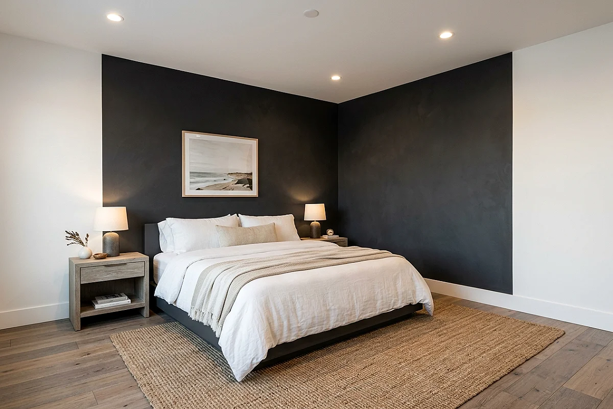
The designer move that defines this look: paint the walls as an asymmetric composition rather than four equal surfaces. Charcoal takes the wall behind the bed — and extends onto a measured section of the adjoining wall, say eight feet, stopping at a taped, razor-straight edge — while the rest of the room stays white. The sudden vertical stop is the whole trick: it reads as architectural intent, not a feature wall with commitment issues. Keep the charcoal’s edge aligned with a furniture line (the bed’s corner, a shelf), and the block looks drawn into the room’s geometry rather than slapped onto it.
Pro Tip
Use a hard-edged tape and burnish it down with a credit card before painting — the crispness of the block’s boundary is the entire aesthetic, and fuzzy edges turn a designer moment into a DIY confession.
Low Charcoal Platform Bed
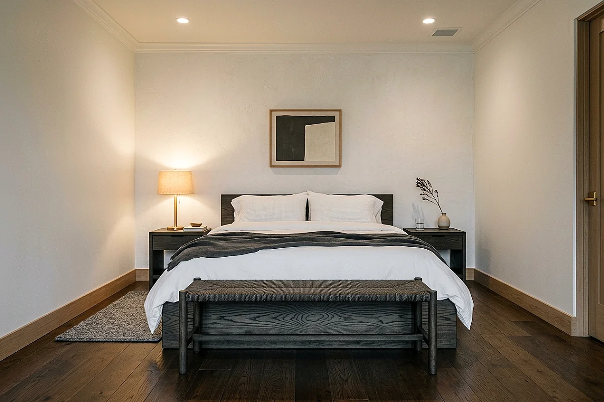
The platform bed in charcoal-stained wood is the furniture that anchors this aesthetic — low, wide, and horizontal, it reads as a slab of dark matter against the white room. Choose white oak stained in an ebony-washed tone so the grain stays visible (solid painted black loses the wood’s soul), with a profile under fourteen inches high so it hovers visually above the floor. The low bed does what tall upholstered beds can’t: it makes ceilings feel higher and the room more spacious, while the charcoal stain gives it the weight that makes white linens pop. Add a long charcoal-stained bench at its foot and the bed becomes a composed still life.
Pro Tip
Stain in two thin coats with a water-based ebony stain, sanding lightly between — heavy single coats blotch on open-grain oak, and the sanded second coat is what gives the finish its even, gallery-like depth.
Monolithic White Plaster Bedhead
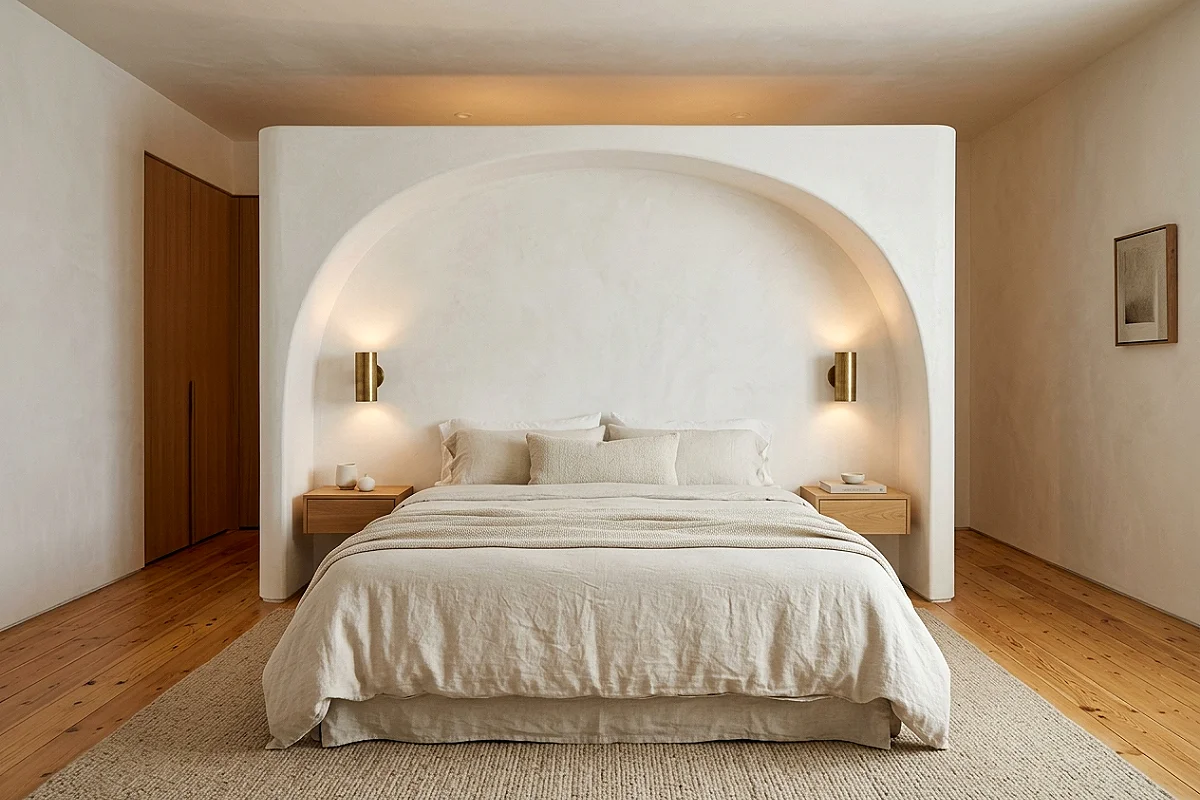
The sculptural headboard as solid form: a curved, monolithic white plaster volume rising behind the bed — an arched, cave-like shell that makes the bed feel excavated from stone. The effect is Axel Vervoordt’s wabi-sabi modernism applied to a bedroom wall, and modern plasters (Roman clay, lime-based finishes) make it achievable in stages over existing drywall. Curve the shell’s sides inward slightly so it frames the bed like an alcove, and the result is a headboard that can never be bought off a shelf. In lamplight, the plaster’s soft sheen turns the whole sleeping area into a chapel of white.
Pro Tip
Build the shell’s form with curved corner beads and foam backing before plastering — the armature decides the curve’s smoothness, and a well-built armature makes the plastering itself almost effortless.
Blackened-Steel Grid Shelving
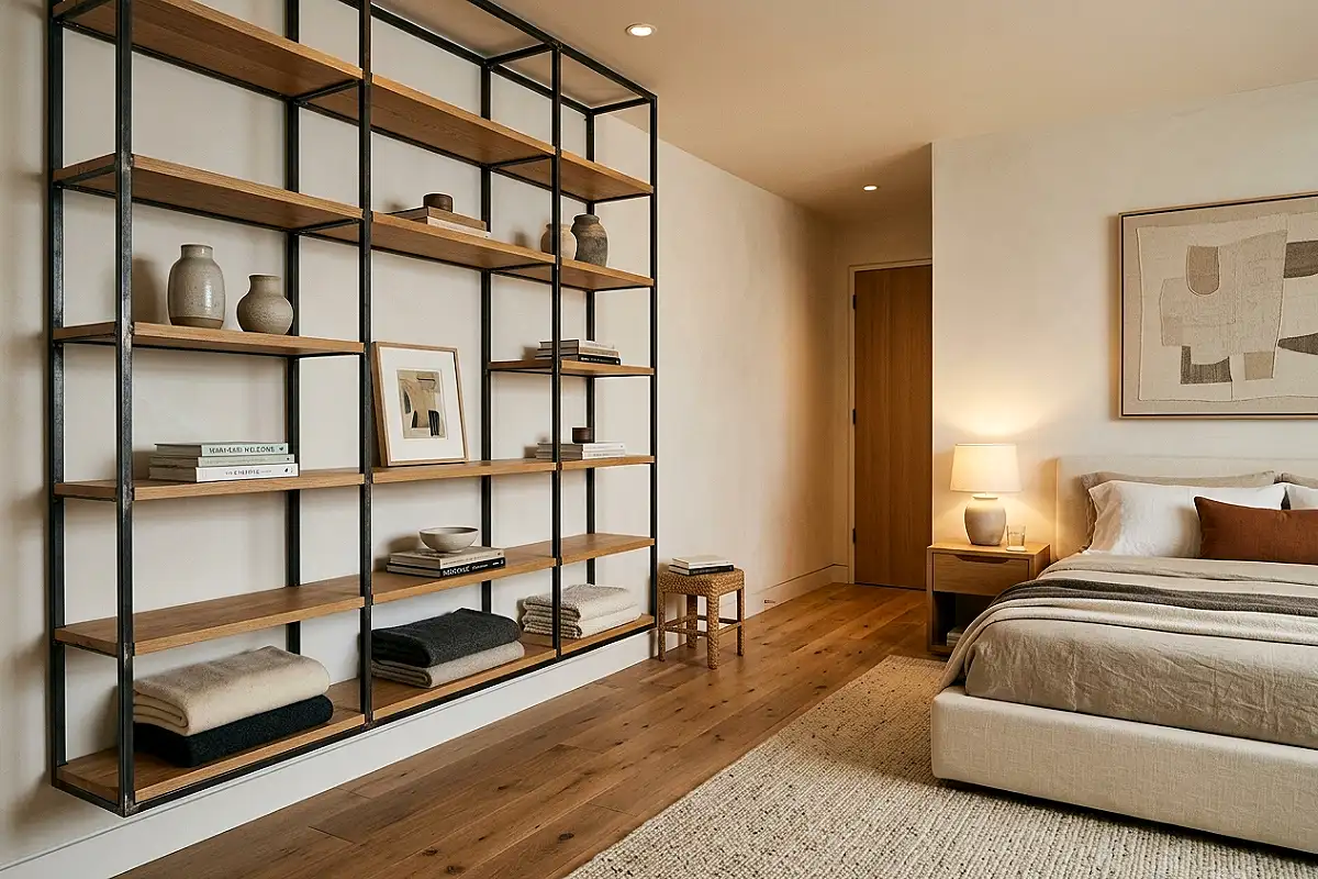
Industrial steel shelving — blackened-steel uprights with white or oak shelves — brings this palette’s structural honesty into storage. A floor-to-ceiling grid beside the bed holds books, ceramics, and folded throws as a graphic composition: the steel’s thin vertical lines against white walls read like ink strokes, and the open shelves keep the room’s air moving visually. Load it deliberately — books stacked both ways, one ceramic vessel per shelf, generous empty space — because in this aesthetic, shelving is display, not storage. The grid’s discipline is what makes it modern: every shelf the same height, every line parallel, no exceptions.
Pro Tip
Anchor steel shelving into studs at every upright, not just the top — loaded shelves cantilever enormous leverage onto the wall, and stud anchoring at every level is the difference between furniture and architecture.
Bold Charcoal Stripe Rug
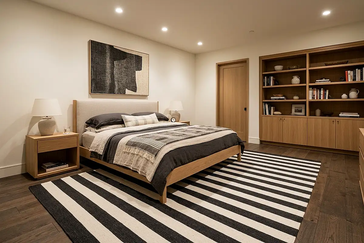
A rug of oversized charcoal and white stripes — bands three to six inches wide, running the rug’s length — puts the palette’s graphic energy underfoot. The scale is everything: small checks are country, bold stripes are modern, and stripes this wide make the floor read as a designed plane rather than a surface someone walks on. Center it under the bed with generous showing, and the stripes visually widen a narrow room — horizontal bands are the oldest width trick in floor design. Keep every other pattern in the room small or absent; the rug is this room’s one loud voice, and it should be heard clearly.
Pro Tip
Order striped rugs flatweave rather than pile — pile stripes blur at distance and collect dust in their shadows, while flatweave keeps the bands graphically sharp and vacuums clean in one pass.
Charcoal Linen Wall Panels
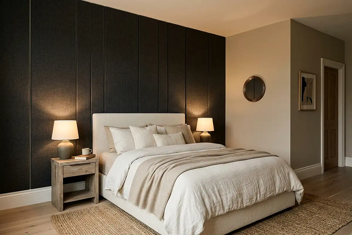
Fabric-wrapped wall panels in deep charcoal linen give the bedroom its textile architecture: vertical panels — slim, floor-to-ceiling — upholstering the wall beside the bed or behind the dressing area. The linen’s weave softens the charcoal into something tactile, the panels absorb sound (a bedroom luxury nobody expects), and the vertical divisions make ceilings feel taller. Mount them as slim battens of insulation board wrapped in fabric, spaced with hairline white gaps, and the wall reads as a row of dark monoliths with light drawn between them. It’s the most acoustic idea in modern bedroom design, disguised as decoration.
Pro Tip
Wrap panels with fabric pulled taut and stapled at the back edges, never the front — front staples create visible dimples in dark linen where lamplight finds every wrinkle, and clean backs keep the faces museum-flat.
White Bouclé Accent Chair
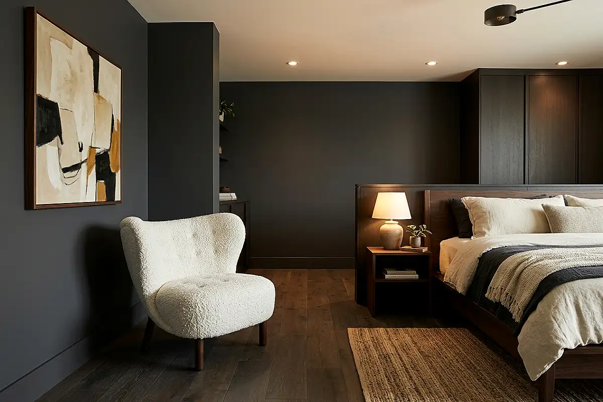
Against charcoal, white bouclé is this palette’s single most photographed object. A curved accent chair in white bouclé — the nubby, looped wool that reads as sculpture — placed in the room’s white territory near the charcoal wall creates the palette’s signature collision: soft white mass against dark flat plane. Choose a chair with a sculptural shell shape (curved back, no visible frame) so it reads as an art object, and let it occupy a corner with nothing else nearby. In photographs, the bouclé chair is the moment — and in person, it’s the seat everyone reaches for, which is exactly how good design should behave.
Pro Tip
Choose bouclé with a stain-resistant finish or apply a fabric guard at delivery — white nubby wool drinks spills through its loops instantly, and a proactive guard makes the chair actually livable.
Matte Charcoal Ceramic Collection
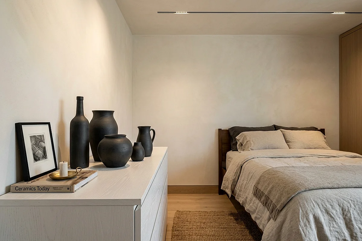
A curated group of matte charcoal ceramics — three to five vessels in graduated heights, arranged on a white dresser or shelf — is the object styling that completes this aesthetic. The ceramics’ matte black-grey surfaces read as polished stone, and their varying silhouettes (tall cylinder, round squat form, one leaning vessel) make the group read as a composed sculpture rather than a shelf of vases. Matte is mandatory: gloss charcoal reads as lacquer furniture, while matte reads as geology. Style them with nothing beside the group — the white wall behind is their gallery, and crowds would ruin the composition’s breath.
Pro Tip
Dust matte ceramics with a barely-damp cloth, never dry — matte glazes are porous and absorb dust into their surface over time, and a monthly damp wipe keeps the finish reading as fresh-fired stone.
Floating Charcoal Vanity Console
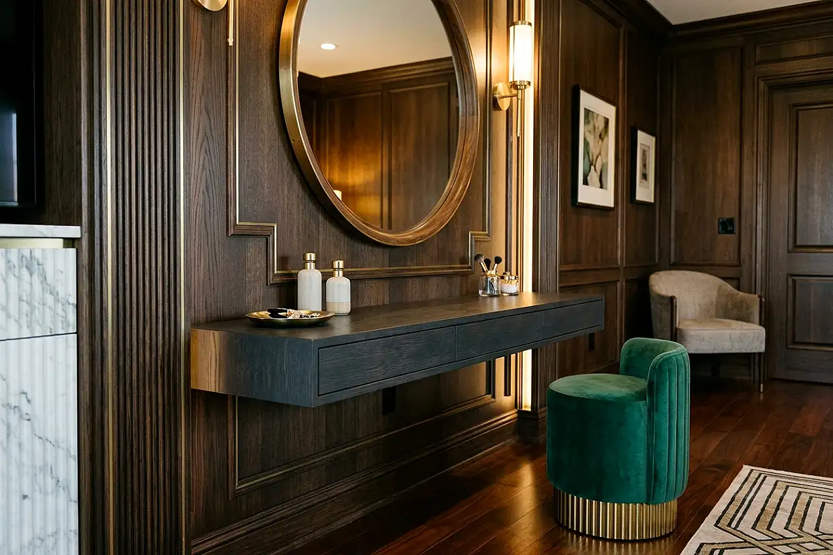
A wall-mounted vanity console in charcoal-stained wood — floating twelve inches off the floor beneath a round mirror — brings the palette into the grooming ritual with architect’s discipline. The floating design keeps the floor visible, which keeps the room feeling spacious, while the console’s long horizontal line (forty to sixty inches) gives the mirror a drawn underline, like a caption. Fit it with one ceramic basin or keep it dry as a dressing surface for perfume and jewelry, and the wall becomes a composed unit: round mirror, horizontal console, and the negative space that makes both legible. It’s bathroom thinking applied to a bedroom, and it works beautifully.
Pro Tip
Mount floating consoles to studs with a hidden steel cleat, not just brackets — a vanity takes daily leaning weight, and a cleat distributes the load across the full wall width instead of concentrating it at two screw points.
Checkerboard Floor Pattern
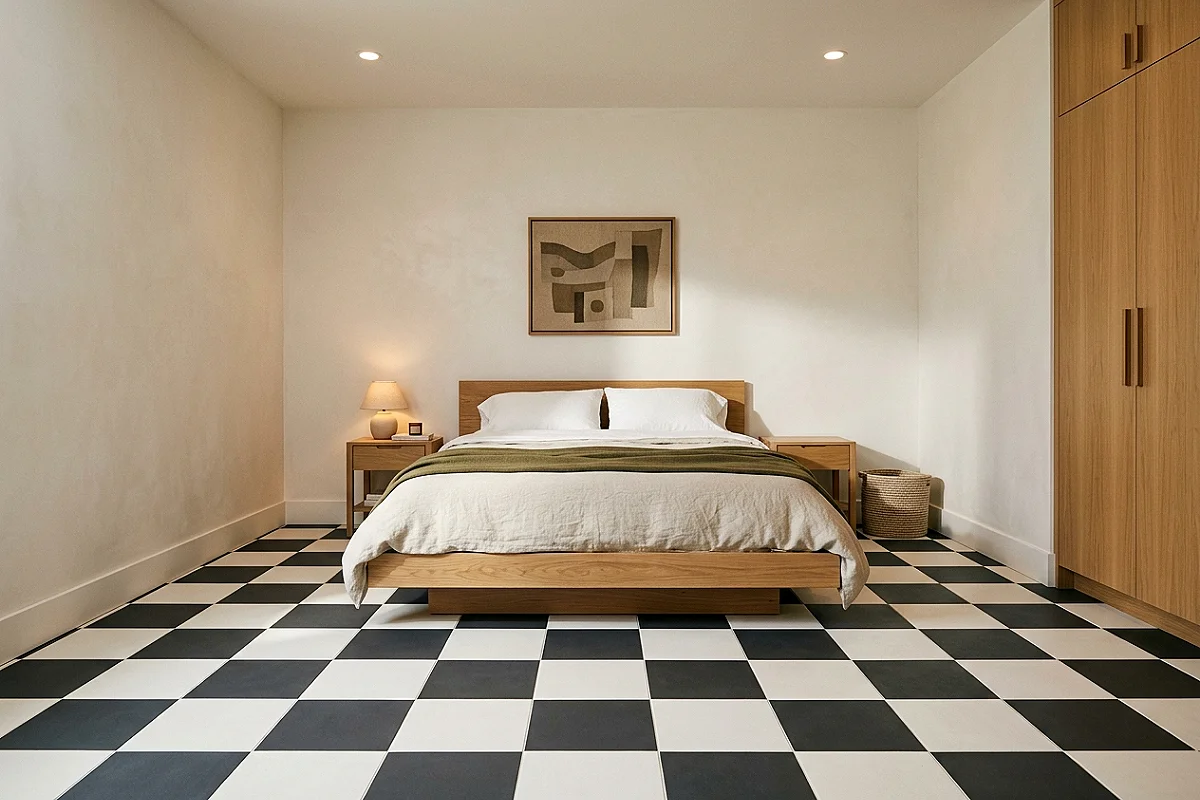
The boldest floor statement in this palette: a charcoal-and-white checkerboard, painted on existing flooring or laid in encaustic tiles. Oversize the squares — eighteen to twenty-four inches rather than chessboard-small — and the pattern reads as modern geometry instead of diner nostalgia. The checkerboard does what few floors can: it makes the entire floor a designed surface, so even an unfurnished room looks finished. Keep it to the area under the bed and its foot, and let plain white flooring continue elsewhere; the pattern becomes a “room within the room,” framing the sleeping area like a stage.
Pro Tip
Snap chalk lines in a full grid before painting any square — checkerboard accuracy is unforgiving, and a grid mapped floor-to-floor catches wall-out-of-square errors before they compound across the pattern.
Cast Concrete Pendant
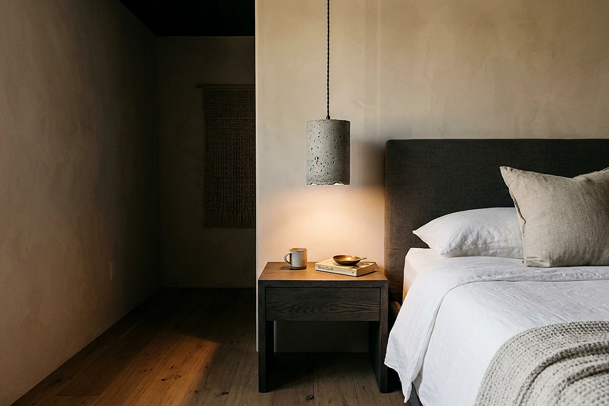
A pendant lamp cast from concrete — the raw grey of the material, its surface pocked with the molds’ texture — is this palette’s most sculptural light source. Hung low beside the bed, the concrete shade throws light downward through its open bottom, creating a defined pool of light on the nightstand while the shade itself reads as a suspended stone. Concrete’s natural grey sits perfectly between the room’s charcoal and white, a third register that neither paint nor fabric can fake. Choose one with a visible suspension cord in black — the cord becomes part of the composition — and pair it with a warm bulb so the raw material gets warm light.
Pro Tip
Use low-wattage LED bulbs in concrete shades — concrete conducts heat and prolonged high wattage can craze the material, while modern LEDs give full brightness at a fraction of the thermal load.
Solid Charcoal Duvet Block
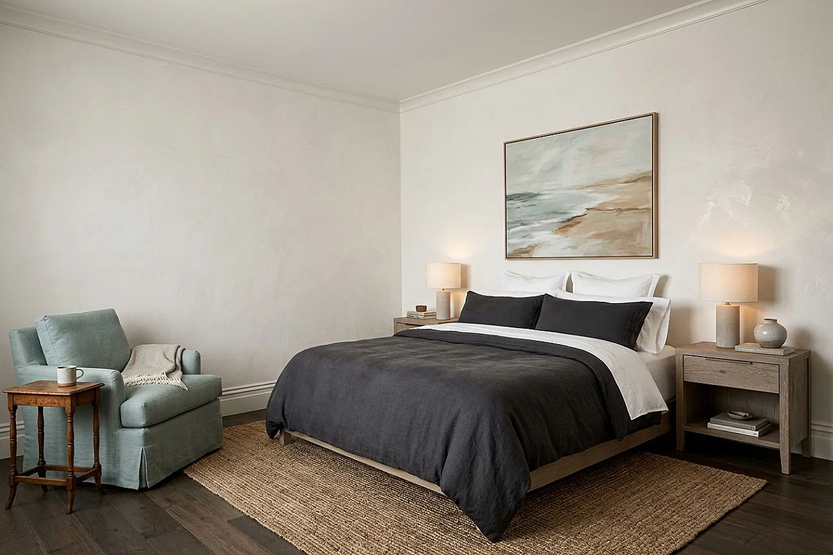
The bedding styling that photographers love: a solid charcoal duvet on a fully white bed — white sheets visible at the folded edge, white shams behind, and the charcoal cover as one uninterrupted plane. The contrast is absolute and the styling minimal, which is exactly the modern brief. Fold the duvet back twelve inches to reveal the white sheet beneath — that reveal line is the composition’s only gesture — and resist every temptation to add pattern. A pillow in white bouclé or a single charcoal bolster can finish it, but the power of this bed is in its restraint: two tones, one fold, zero noise.
Pro Tip
Buy the duvet cover with corner ties and tie them to the duvet’s loops — untied inserts shift overnight and bunch at the corners, ruining the solid plane that is the entire point of this styling.
Botanical Line-Art Suite
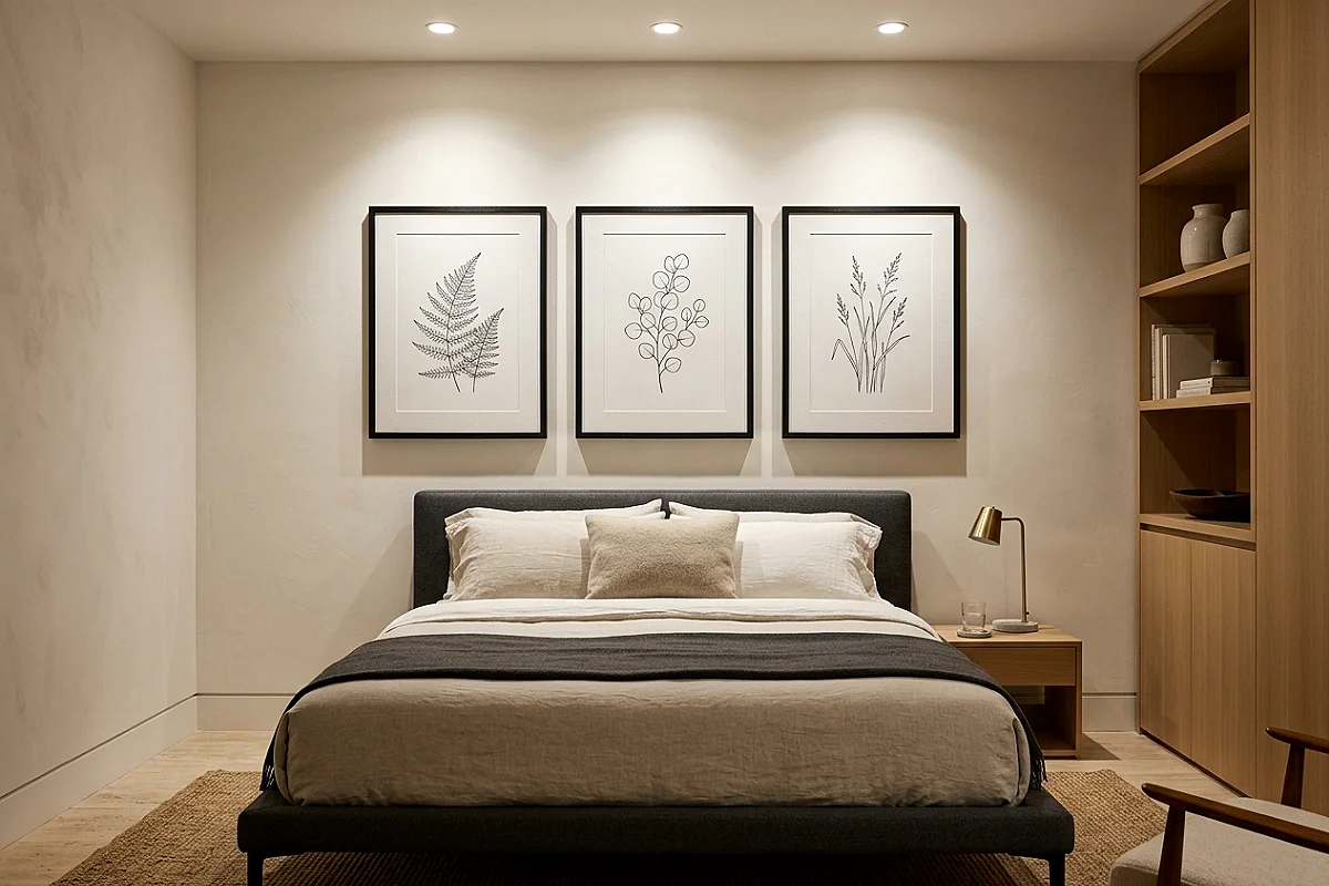
Line-drawing botanical art — plants rendered in single black ink strokes on white paper — gives a charcoal-and-white bedroom its most natural wall moment. Frame a set of three in slim black frames with white mounts and hang them in a horizontal row above the bed, and the ink strokes echo the room’s own graphic edges while their subject matter brings organic softness to an otherwise hard-edged palette. Vintage botanical plates work too, but modern single-line drawings (think Matisse-contour plants) read more contemporary. The art’s white paper becomes part of the walls, and its black lines become the room’s drawing — a bedroom that looks sketched, which is the highest modern compliment.
Pro Tip
Hang the suite with the frames’ inner edges exactly four inches apart — even spacing makes three frames read as one work, and uneven gaps fracture the composition faster than mismatched art does.
Asymmetric Bedside Pairing

Designer bedrooms rarely mirror perfectly — and the asymmetric bedside is the move that signals intention. One side of the bed gets a charcoal lantern pendant hanging from the ceiling; the other gets a white ceramic table lamp on a small charcoal stool. Same light level, same warm bulb, completely different forms. The asymmetry gives the room movement — the eye travels between the two sides instead of resting — and it makes a symmetrical bed feel custom-designed. Keep the heights close (both light sources ending within six inches of each other) so the difference reads as styling, not accident.
Pro Tip
Balance the asymmetry with a shared element — same bulb temperature, same dimmer, or matching switch plates — so the room reads as one designed scheme with playful sides, not two separate experiments.
White Leather Bench
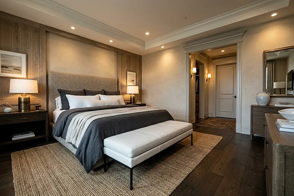
A bench in white leather at the foot of the bed is this palette’s most adult luxury — the smooth, wipeable surface that keeps the scheme hotel-clean while adding a form the bedding can’t. Choose a bench with clean, squared lines (no carved legs, no ornament) and a seat height around eighteen inches, so it tucks under the bed’s edge like a plinth. White leather against a charcoal duvet is the palette’s purest collision: soft industrial material against soft textile, both in perfect contrast. A bench also solves the “where do the shoes go” problem invisibly — the modern bedroom’s most underrated function.
Pro Tip
Condition white leather quarterly and keep it from direct afternoon sun — white leather yellows under sustained UV, and quarterly conditioning with a UV-filtering product preserves its cool tone for years.
Terrazzo Accent Objects
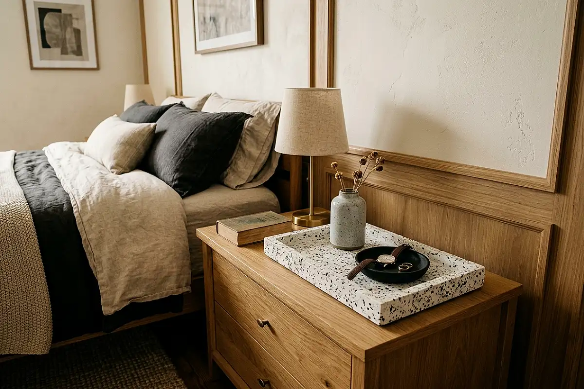
Terrazzo — the composite stone of marble chips in cement — brings this palette a third texture with a modern heritage: mid-century Italian design’s favorite material. A terrazzo tray on the vanity, a terrazzo vase on the shelf, terrazzo coasters at the dressing table: each object sparkles with embedded white and grey chips, catching light in a way solid surfaces can’t. The material’s scale matters — choose objects where the chips are visible (four to eight millimeters) so the pattern reads up close, and let terrazzo stay an accent: one or two pieces per surface, never a collection that competes with itself.
Pro Tip
Seal terrazzo objects with a penetrating stone sealer before daily use — the cement matrix is porous and drinks oils and dyes, and sealing preserves both the surface and the chips’ brightness.
Minimal White Track Lighting
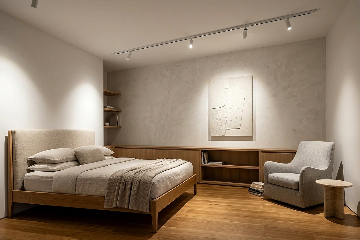
Track lighting, done with designer discipline, is this palette’s most architectural light: a slim white track on the white ceiling with three adjustable heads aimed as a gallery would aim them — one washing the art, one grazing the plaster bedhead, one pooling on the reading chair. The effect is controlled daylight at night: each head a precise instrument, the whole system a drawing in light. Keep the track on the white ceiling only (never on the charcoal wall, where it would read as an afterthought), and choose heads with narrow 24-degree beams for drama — wide floods make track lighting read as office, not gallery.
Pro Tip
Run the track on its own dimmer, separate from the room’s other lights — gallery lighting is choreographed scene by scene, and independent dimming is what lets you set “reading,” “art,” and “sleep” moments.
A Room Drawn in Two Tones
Twenty-two moves, and the modern lesson in all of them is the same: restraint is a style, contrast is a structure, and the boldest rooms are often the simplest ones. Begin with the asymmetric color-blocked wall and the low charcoal platform bed — the room’s two foundational drawings — and let two or three of the details (the concrete pendant, the line-art suite, the zebra cushions) carry the personality. Charcoal and white doesn’t age because it was never young: it’s the palette of ink on paper, and good drawings never go out of style.
Frequently Asked Questions
What’s the difference between charcoal and black in a bedroom?
Charcoal is a warm, softened near-black — think graphite rather than jet — that keeps contrast while feeling more forgiving than true black. It reveals texture (wood grain, fabric weave, plaster) that pure black swallows, which makes it the better choice for a livable modern bedroom that still wants drama.
What ratio of charcoal to white works best?
Roughly 60/40 in white’s favor on fixed surfaces: white walls, ceiling, and most textiles, with charcoal concentrated on the bed, one or two walls, rugs, and objects. If charcoal exceeds half the room, the space shifts from modern to moody — a different look with different lighting needs.
Will a high-contrast bedroom feel stark or cold?
Only if the surfaces stay flat. The fix is material variety: plaster, wood grain, bouclé, leather, ceramics, and warm 2700K lighting all soften the contrast into something tactile. Add one pale wood tone (white oak) and the room reads as warm-modern rather than clinical.
What lighting works best in a charcoal and white bedroom?
Layered, directional, warm: adjustable track or picture lighting for art and walls, low-hung pendants for pool lighting, and table lamps for reading. All on dimmers. Charcoal surfaces absorb light, so plan more light sources than a white room needs — three to five layered sources is the comfortable minimum.
Which wood and metal tones pair with charcoal and white?
White oak and ash for pale wood; blackened steel, matte nickel, and gunmetal for metals. Avoid warm brass in large doses (it pulls the scheme cozy-traditional) and avoid walnut’s chocolate tones, which muddy the crisp two-tone contrast.
Does charcoal and white work in small or dark bedrooms?
Yes, with discipline: keep walls and ceiling white, place the charcoal on furniture and one accent surface, and use reflective objects (gloss ceramics, metal sculpture) to bounce light. The contrast actually helps small rooms by defining zones — the dark bed area versus the bright circulation area reads as deliberate planning, not cramped quarters.