Purple and orange can look theatrical in a bedroom, but they do not have to feel like party-store color. The most sophisticated schemes adjust the undertones, give one shade a clear lead, and introduce the other through a deliberate material or architectural detail. These 15 pairings move from saturated aubergine and persimmon to misty lilac and rust, with practical proportions, lighting notes, renter-friendly alternatives, and the extra finishing details that make each room feel complete.
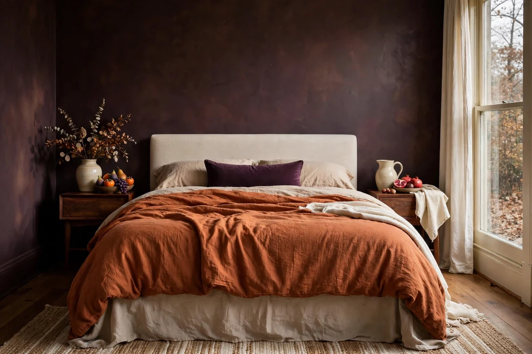
1. Drench the Room in Aubergine and Persimmon
Deep aubergine walls make a bedroom feel cocooning, while persimmon linen keeps the palette warm rather than solemn. The combination has the richness of late-autumn fruit, especially beside walnut and creamy off-white. It suits anyone who wants unmistakable Halloween color without a single themed accessory.
The Setup:Paint the walls in a matte aubergine with brown undertones, then dress the bed in natural flax sheets, a persimmon duvet, and one narrow plum lumbar pillow. Keep purple at roughly 60 percent of the room, orange at 25 percent, and let wood, cream, and aged brass make up the rest. In a rental, use an aubergine fabric wall panel behind the bed instead of painting every wall.Why It Photographs Well:The dark envelope creates clean contrast around the orange bed, so the mattress becomes the immediate focal point. Matte paint and rumpled linen absorb and scatter light differently, giving photographs depth without busy pattern. A three-quarter angle that includes one cream bedside surface will keep the shadows readable.Pro Tip:Test the aubergine beside the persimmon in both daylight and lamplight; purple that leans too blue can make the orange look harsh. Choose a muddier, red-based purple and repeat the persimmon only once outside the bed—perhaps in a book spine or small ceramic bowl—so the scheme feels edited.
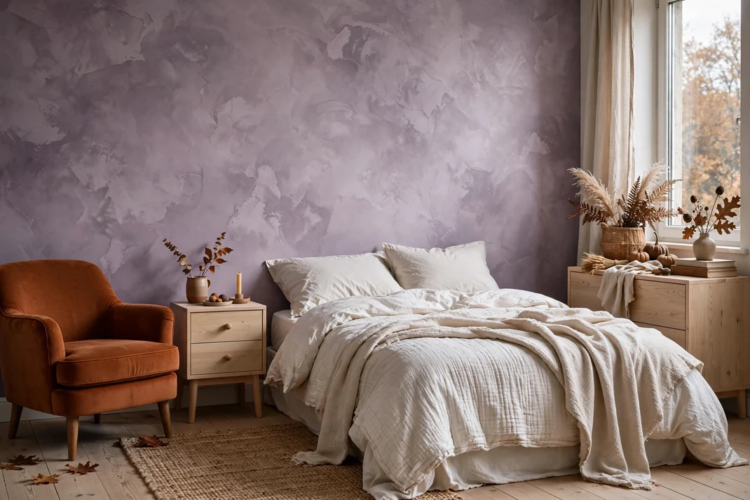
2. Soften Burnt Orange with Smoky Lilac Plaster
Smoky lilac walls and burnt-orange upholstery create an earthy, powdery room that feels gentler than a classic purple-and-pumpkin scheme. The clouded wall finish gives the color age, while a single rust-toned chaise or slipper chair adds a confident autumn note. Pale oak and unbleached cotton keep the pairing airy enough for a smaller bedroom.
The Setup:Apply a smoky lilac mineral-effect finish or a washable faux-plaster paint to the main wall, varying the strokes lightly rather than creating high contrast. Place one compact burnt-orange chair near the window and connect it to the bed with a lilac-gray throw folded across the lower third. Use pale oak furniture, off-white bedding, and a small oatmeal rug to prevent the two colors from feeling heavy.Why It Photographs Well:Soft tonal movement on the wall catches side light beautifully, while the chair provides one clear block of saturated color. The restrained furniture palette leaves negative space around the pairing, which makes the room look calm and expensive in a vertical image. Photograph toward the window but slightly off-axis so the plaster texture remains visible.Pro Tip:Match the undertones rather than the paint names: the lilac should contain gray and a trace of red, while the orange should lean rust rather than yellow. Add one charcoal object near the chair to sharpen the edge between the two dusty colors without introducing another competing hue.
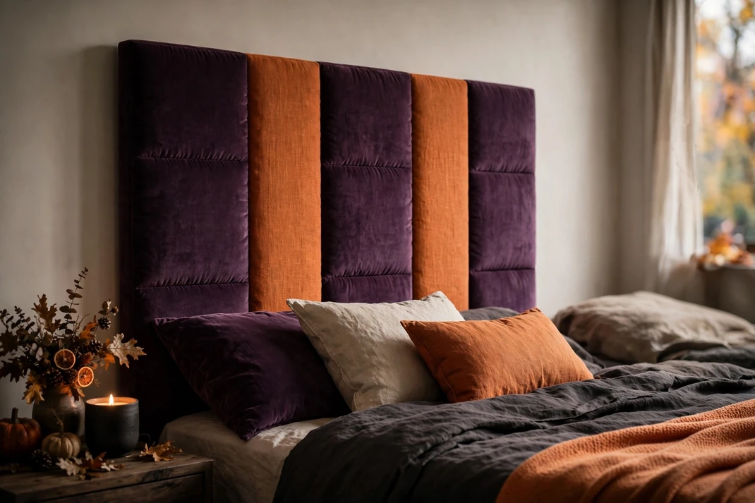
3. Tailor a Plum-and-Tangerine Striped Headboard
A broad striped headboard turns plum and tangerine into a crisp, boutique-hotel statement. Alternating bands of velvet and linen bring Halloween color to the bed in a graphic, controlled way, while plain surrounding walls let the upholstery do the work. The look feels playful from a distance and beautifully tailored up close.
The Setup:Upholster a simple rectangular headboard in five vertical bands: three wider plum velvet sections alternating with two narrower tangerine linen sections. Make the headboard 6 to 10 inches wider than the mattress on each side and carry it 28 to 36 inches above the mattress for balanced proportions. Finish the bed with solid ivory sheets, a cocoa coverlet, and no more than two unpatterned pillows.Why It Photographs Well:The vertical rhythm creates a strong center line and makes the ceiling appear taller, particularly in straight-on compositions. Velvet darkens at the edges while linen stays bright, so the stripes remain distinct even in warm evening light. A symmetrical crop with matching bedside lamps will emphasize the tailored effect.Pro Tip:Do not divide the headboard into equal stripes; slightly wider plum bands make the orange read as an accent rather than a novelty. Ask the upholsterer to railroad the fabrics and align every seam perfectly, because even a small drift becomes obvious in a frontal photograph.
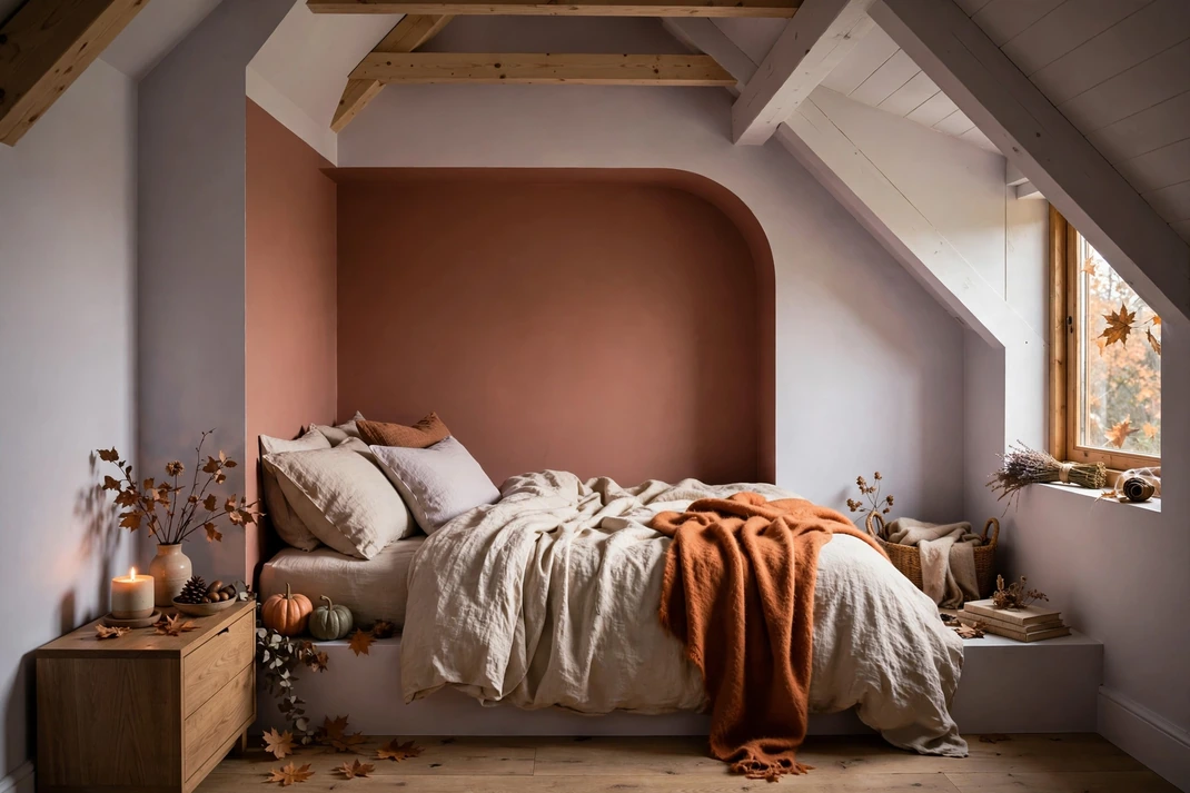
4. Color-Block a Lavender and Terra-Cotta Bed Alcove
Lavender and terra-cotta can feel architectural rather than decorative when they define a shallow sleeping alcove. A lavender outer wall frames a terra-cotta recess, creating a warm pocket around the bed without darkening the whole room. This is an especially useful pairing for studio bedrooms, attic rooms, or beds tucked between wardrobes.
The Setup:Paint the recess or the wall area exactly behind the bed in a muted terra-cotta, then cover the surrounding wall and side returns in pale lavender. Stop the orange at real architectural edges whenever possible; without an alcove, create a clean rectangle extending 12 inches beyond the bed on all sides. Repeat the lavender in the sheets and introduce only one small terra-cotta cushion so the painted geometry remains dominant.Why It Photographs Well:The nested rectangles naturally frame the bed and produce a clear focal point even in a compact room. Lavender reflects daylight into the space, while terra-cotta adds a warm inner glow that reads well at dusk. Shoot squarely from the foot of the bed to keep the color boundaries precise and Pinterest-friendly.Pro Tip:Use the same low-sheen finish on both colors so one plane does not appear closer simply because it reflects more light. Before painting, tape up large paper swatches and check that the terra-cotta is at least two tonal steps darker than the lavender; otherwise the frame effect disappears on camera.
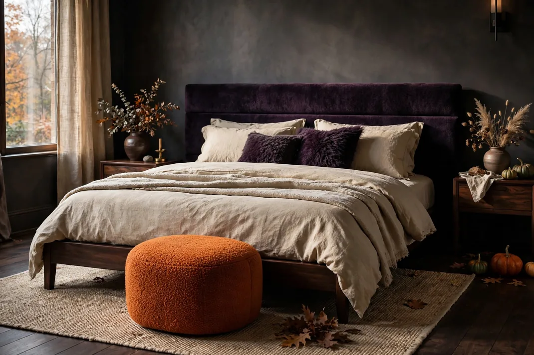
5. Contrast Blackberry Mohair with Pumpkin Bouclé
Blackberry mohair and pumpkin bouclé make a luxurious pairing because one surface is sleek and shadowy while the other is nubby and light-catching. Used on two compact pieces rather than across the whole bed, the textures create a sophisticated conversation at the foot of the room. Espresso wood and parchment bedding keep the mood grounded.
The Setup:Choose a slim blackberry-upholstered headboard or wall cushion, then place a pumpkin bouclé ottoman at the foot of the bed with at least 30 inches of walking space beyond it. Keep both silhouettes simple—no tufting, fringe, or ornate legs—so the tactile contrast remains the feature. Add parchment linen, espresso-stained wood, and one small smoked-brass tray to complete the scheme.Why It Photographs Well:Mohair develops deep tonal shadows, while bouclé creates hundreds of tiny highlights, giving the image dimension even in a restrained composition. The orange ottoman anchors the foreground and leads the eye toward the darker headboard. Side lighting from a window will reveal both textures better than a bright overhead fixture.Pro Tip:Request fabric samples and rub them together before buying; loose bouclé loops can catch on a long mohair pile. If either material is impractical for pets or children, choose a tight performance velvet and a low-loop woven upholstery in the same colors for a cleaner, more durable version.
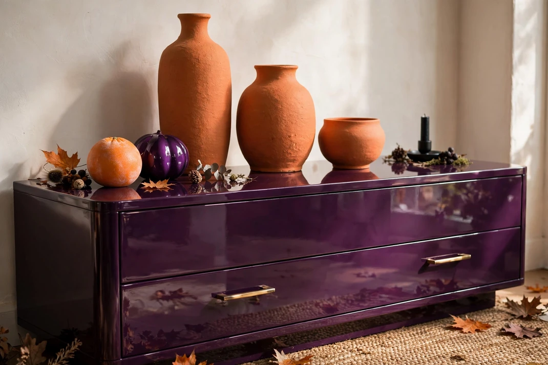
6. Gloss Grape Lacquer Against Matte Clay
A grape-lacquered dresser paired with matte orange-clay objects gives the room a sharp artisan-modern edge. The purple surface reflects light like polished fruit, while chalky ceramics keep the orange grounded and handmade. Against warm white walls, this small vignette can carry the entire Halloween palette without changing the bed.
The Setup:Refinish one low dresser in high-gloss grape lacquer or use removable glossy furniture film on flat drawer fronts. Arrange three matte clay pieces of different heights on one side—a rounded lamp base, a shallow bowl, and a lidded vessel—leaving at least half the dresser surface empty. Keep the wall warm white and choose simple black or dark-bronze hardware so the two colors remain clear.Why It Photographs Well:The lacquer produces crisp highlights and subtle reflections, while the ceramics read as soft, sculptural silhouettes. Uneven heights create a balanced still life that works beautifully in close crops as well as wider bedroom views. Position the camera slightly above drawer level to catch the glossy top without showing distracting reflections.Pro Tip:Repeat the clay orange in just one thin element elsewhere, such as the edge of a bed throw, rather than scattering pottery across the room. Wax the matte ceramics or use felt pads beneath them so they do not leave pale abrasion marks on the lacquered surface.
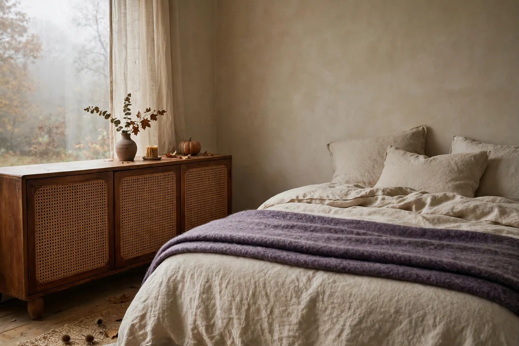
7. Warm Heather Wool with Burnt-Sienna Cane
Heather-purple wool and burnt-sienna cane create an organic Halloween palette with no theatrical gloss. A cane-front cabinet or bedside table supplies the orange note through natural fiber, while a heather wool blanket adds misty color and softness. The result feels relaxed, modern, and easy to live with beyond October.
The Setup:Place a low cane-front cabinet in a burnt-sienna stain against a warm neutral wall and keep its top sparsely styled. Fold a heather-purple wool blanket lengthwise across the lower quarter of the bed, then add one square cushion in the same heather tone to connect the color vertically. Use mushroom linen, pale oak, and a woven jute basket to support the natural material story.Why It Photographs Well:Cane casts delicate shadows and brings a fine grid to the composition, while wool adds a soft, irregular surface. Because the colors are muted, daylight reveals texture instead of blowing out saturation, producing a believable editorial image. Frame the cabinet and one corner of the bed together so the relationship between the two colors is immediately clear.Pro Tip:Choose cane with an orange-brown stain, not yellow rattan, and keep the heather purple grayed down enough to feel mineral. If the room lacks warmth, use a 2700K lamp with a linen shade near the cabinet; cooler bulbs can flatten both the wood and the wool.
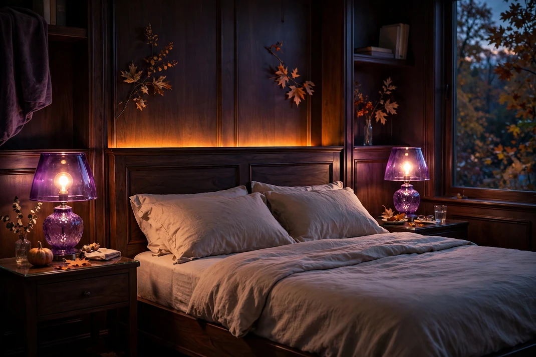
8. Pair Amethyst Glass with Amber-Orange Light
Amethyst glass and amber-orange light create a jewel-box bedroom that glows after sunset yet stays elegant during the day. Colored glass shades or vessels provide translucent purple, while warm concealed illumination supplies the orange. Clear surfaces, simple bedding, and dark wood prevent the room from feeling like a party display.
The Setup:Set two amethyst-glass lamps or cordless lanterns on opposite sides of the bed and fit them with low-lumen warm bulbs around 2200–2400K. Add an amber LED strip behind a floating shelf or under the rear edge of the headboard, fully concealed so only the reflected glow is visible. Keep the bed in charcoal, taupe, or cream and remove other brightly colored accessories from the immediate area.Why It Photographs Well:The purple glass holds crisp highlights while the amber wash creates a soft halo, producing layered light without visible Halloween symbols. The pairing is most cinematic during blue hour, when a little daylight still separates furniture from the shadows. Lower the camera exposure slightly so the glass retains color rather than turning white.Pro Tip:Use dimmers and tune the orange glow lower than the bedside lamps; equal brightness makes the scene look flat and overlit. Hide every cord along the back of the furniture with color-matched clips, because loose cables are especially noticeable around illuminated glass.
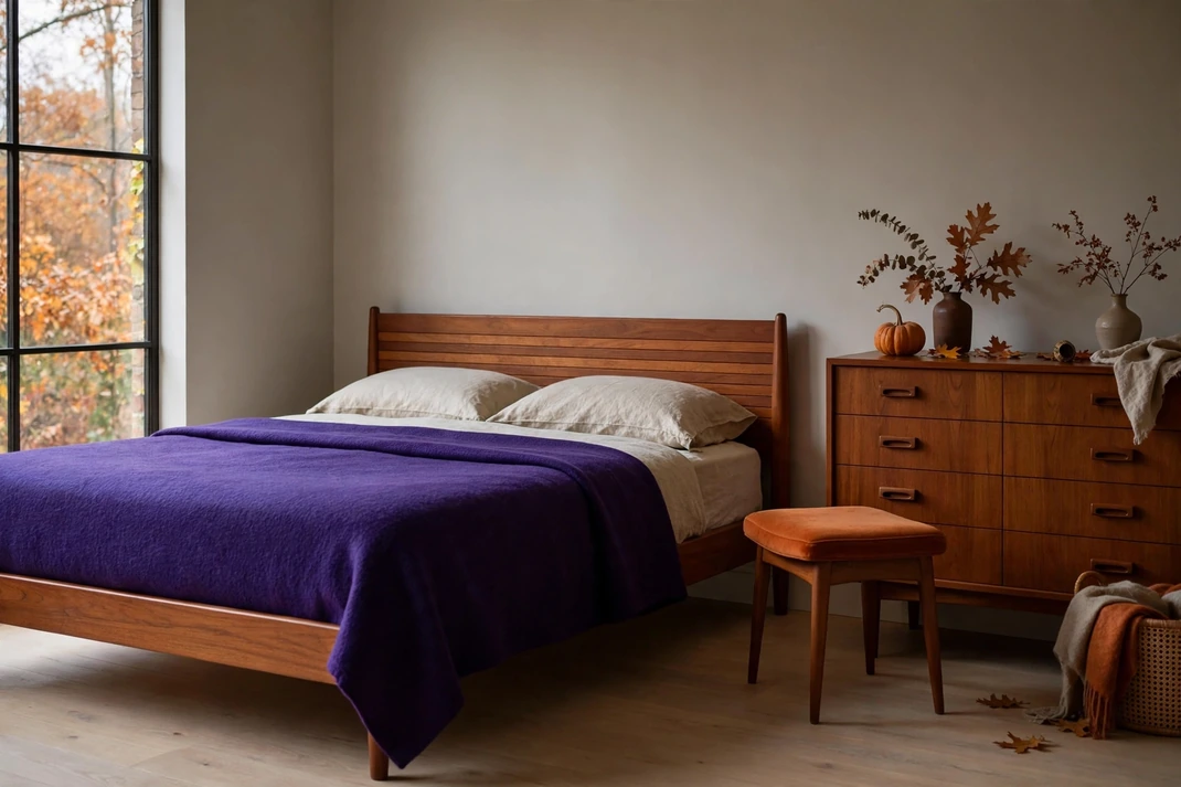
9. Set Royal Purple Against Persimmon Teak
Royal purple becomes unexpectedly midcentury when paired with teak and persimmon upholstery. The clean-lined wood tempers the saturated purple, while the orange seat or cushion echoes teak’s warm grain. It is a bold combination that works best with disciplined silhouettes and generous breathing room.
The Setup:Anchor the bed with a low teak headboard or a simple teak-look panel, then add a royal-purple wool coverlet folded flat rather than rumpled. Place one persimmon-upholstered stool beside a dresser or under a vanity, keeping at least two feet of clear floor around it. Finish with ivory walls, a cream lampshade, and one black linear detail such as a frame or tray.Why It Photographs Well:Teak introduces warm linear grain between the two saturated colors, helping the composition feel layered rather than blocky. The low furniture creates a long horizontal line that photographs well from the doorway and makes the room appear wider. Morning light will bring out the red notes in both the wood and the orange upholstery.Pro Tip:Avoid blue-white walls, which can make royal purple feel synthetic; choose a creamy white with an LRV high enough to keep the room bright. If the teak is already very orange, shift the stool toward deeper persimmon so the two warm tones remain distinct instead of blending together.
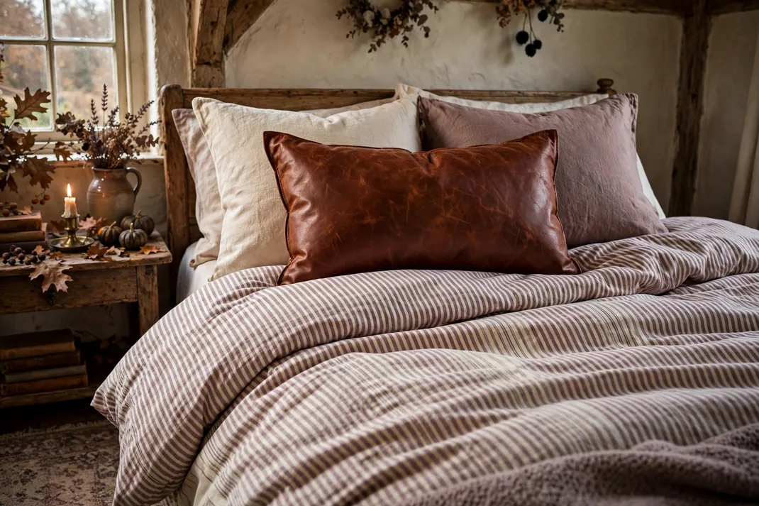
10. Mix Mauve Ticking with Paprika Leather
Mauve ticking and paprika leather offer a tailored, heritage-minded interpretation of Halloween color. Fine stripes feel familiar and restful on the bed, while one piece of warm leather adds structure and age. The mix is particularly convincing in cottage, farmhouse, or traditional bedrooms where bright orange would look out of place.
The Setup:Use mauve-and-cream ticking on a duvet cover or two standard pillow shams, keeping the stripe narrow and low contrast. Add a paprika leather lumbar pillow or a small leather-edged tray on the bedside table, then ground the room with dark oak and aged nickel. Keep other fabrics plain—washed cotton, wool, or linen—so the ticking remains the only pattern.Why It Photographs Well:The tiny stripe creates subtle visual movement, while leather catches a warm highlight and gives the eye a clear resting point. The materials look most authentic in soft side light, where creases and grain remain visible. A close bedside composition can capture the palette without requiring a full room restyle.Pro Tip:Use real or high-quality recycled leather in a muted paprika rather than glossy faux orange, which can look costume-like under flash. Turn the ticking stripe vertically on the pillows and horizontally on the duvet to create quiet direction changes without adding a second pattern.
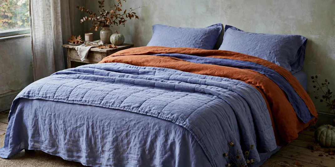
11. Layer Periwinkle Linen with Rusted Orange
Periwinkle and rust offer a cooler, fresher route to Halloween color, balancing blue-violet calm with the warmth of oxidized orange. Layered in washed linen, the pairing feels relaxed and slightly weathered rather than high contrast. It is an easy choice for pale bedrooms that need seasonal depth without dark paint.
The Setup:Start with periwinkle linen sheets or a lightweight quilt, then add a rust-orange duvet folded back to expose a broad band of blue-violet. Use a 2:1 ratio of periwinkle to rust and separate the colors with a narrow ivory coverlet or sheet edge. Add light ash wood and one gray ceramic lamp to keep the palette cool and modern.Why It Photographs Well:The visible folds create alternating bands of cool and warm color, making even a simple bed look styled and dimensional. Washed linen softens highlights, so the saturation remains believable in bright natural light. Photograph from a slight side angle and include the folded corner where all three layers meet.Pro Tip:Choose periwinkle with enough gray to avoid a nursery feel, and use rust with brown undertones rather than clear pumpkin orange. Steam only the pillow fronts; leave the main linen layers naturally creased so the bed looks inviting instead of showroom-stiff.
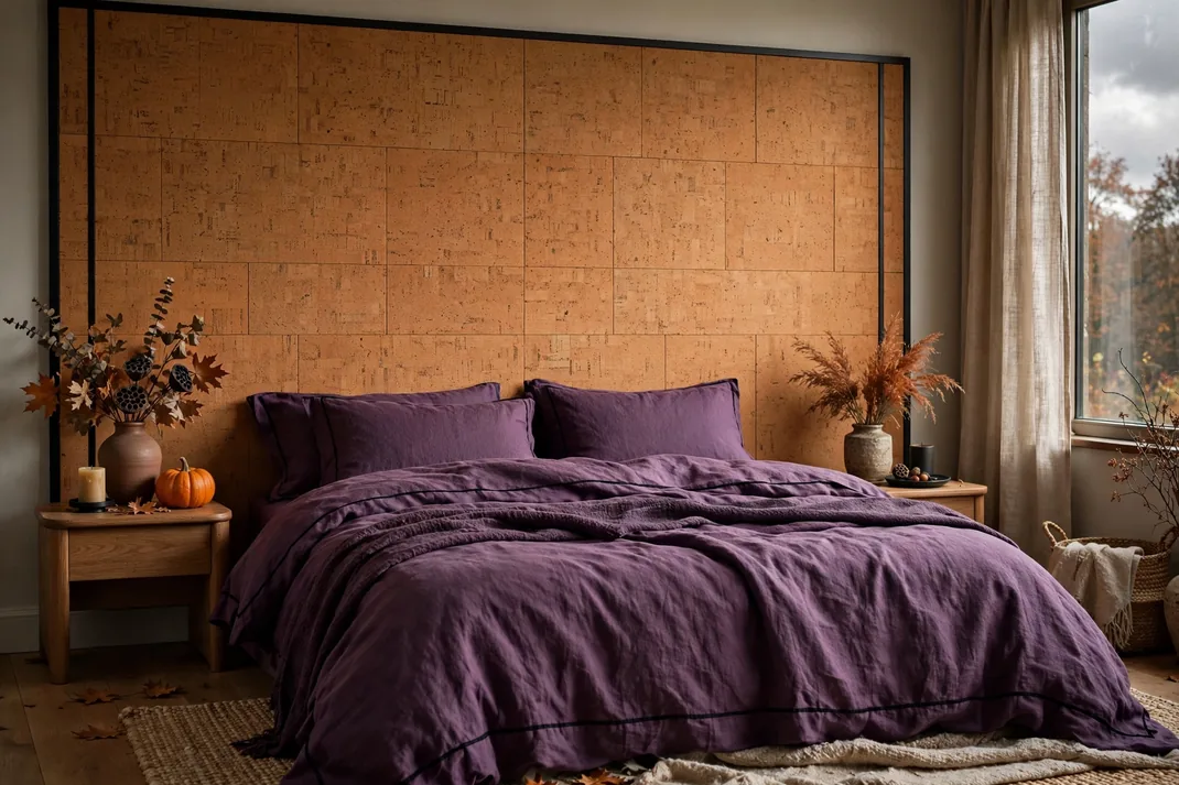
12. Back Mulberry Bedding with Ochre Cork
Mulberry bedding against an ochre-toned cork panel creates a warm, tactile backdrop with excellent sound-softening benefits. The cork supplies orange through a natural material rather than paint, while mulberry linen deepens the composition for Halloween. Clean black lines keep this eco-minded pairing contemporary.
The Setup:Install sealed cork tiles or a roll of fine-grain cork behind the bed, creating a rectangle at least as wide as the mattress and 36 to 48 inches high. Dress the bed in mulberry linen with a black piping detail, then add off-white sheets to prevent the center from becoming too dark. Renters can mount thin cork sheets to lightweight boards and lean or safely secure the panels rather than adhering tiles directly to the wall.Why It Photographs Well:Cork’s speckled surface gives the background fine detail, while the solid mulberry bed reads as a strong foreground shape. The warm panel catches angled daylight and frames the bed without the visual noise of wallpaper. A straight-on shot makes the simple geometry and material contrast feel especially polished.Pro Tip:Seal sample cork before committing, because clear finishes often deepen it by several shades and can turn ochre into brown. Keep the panel edges perfectly square and finish them with a slim black trim; that small line makes the material look intentional rather than like a noticeboard.
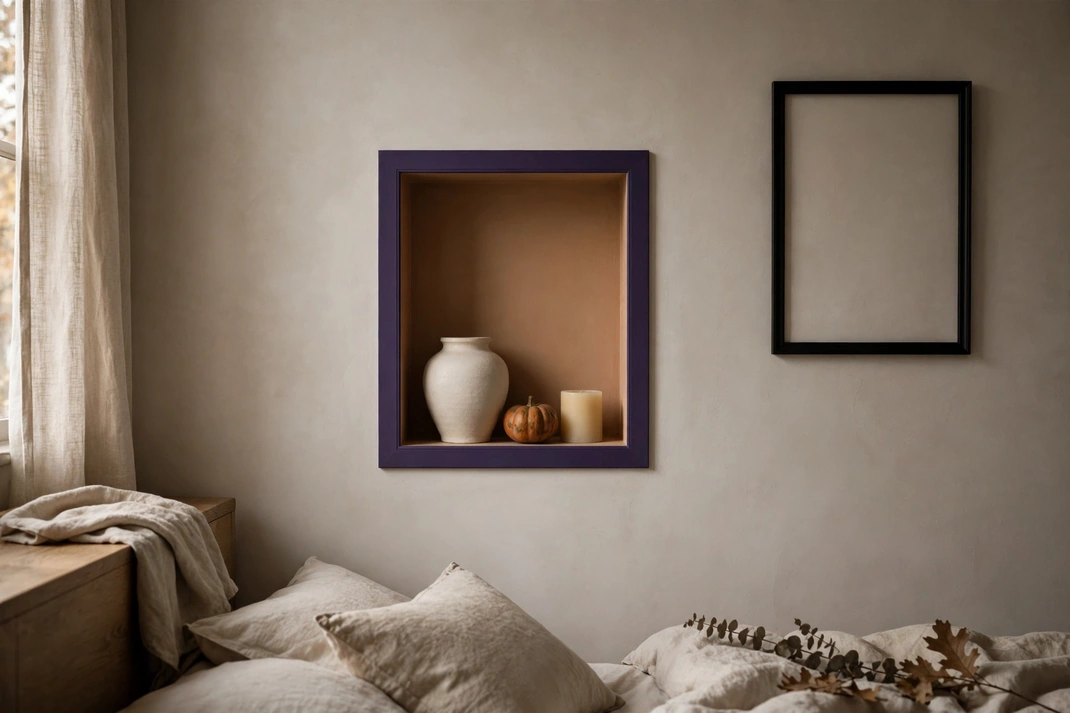
13. Outline a Pumpkin Niche in Deep Violet
A pumpkin-painted wall niche outlined in deep violet turns a small architectural recess into a precise Halloween focal point. The dark border sharpens the orange interior and gives displayed objects a gallery-like frame. One niche is enough to energize an otherwise neutral bedroom.
The Setup:Paint the inside of an existing niche or open shelf unit in a muted pumpkin tone, then add a 1- to 2-inch deep-violet border around the front edge. Style the recess with only two or three neutral objects—an ivory vessel, a dark wood box, and a small brass lamp—leaving visible orange around every piece. If no niche exists, paint the inside of a single wall cube and mount it beside, not directly over, the bed.Why It Photographs Well:The violet outline acts like a picture frame, producing crisp edges and strong color separation in close-up images. Light from the side creates a shadow inside the recess, making the orange appear deeper and more dimensional. Keep the camera parallel to the wall so the border remains even on all four sides.Pro Tip:Paint the border first and use high-quality low-tack tape after it cures; this produces a cleaner purple edge than trying to cut around wet orange. Match the border width to the niche scale—narrow for a small cube, broader for a built-in—so it reads as trim rather than an accidental line.
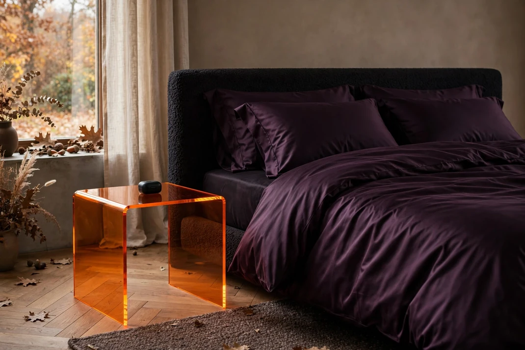
14. Sharpen Black Plum with Tangerine Acrylic
Black-plum textiles paired with transparent tangerine acrylic create a fashion-forward bedroom with a subtle nightclub edge. The plum absorbs light, while the acrylic seems to glow at the edges, giving Halloween color a sleek contemporary character. Used sparingly, the combination feels sophisticated rather than neon-heavy.
The Setup:Dress the bed in black-plum cotton sateen or velvet and place one transparent tangerine acrylic side table beside it. Keep the table mostly clear, styling only a compact black lamp and one book, so light can travel through the material. Add a pale gray wall, smoked-chrome hardware, and a neutral floor to give the saturated colors visual space.Why It Photographs Well:Transparent acrylic creates luminous edges and casts a faint orange reflection, while the dark bed provides the contrast needed to see it. The combination looks strongest in a low three-quarter view that captures both the tabletop and the plum bedding. Use indirect daylight or a diffused lamp to avoid harsh hotspots and fingerprints.Pro Tip:Choose cast acrylic with polished edges and remove protective film only after the room is styled. Keep a microfiber cloth nearby and avoid placing the table directly against orange objects; a little negative space is what makes the transparent color appear crisp and intentional.
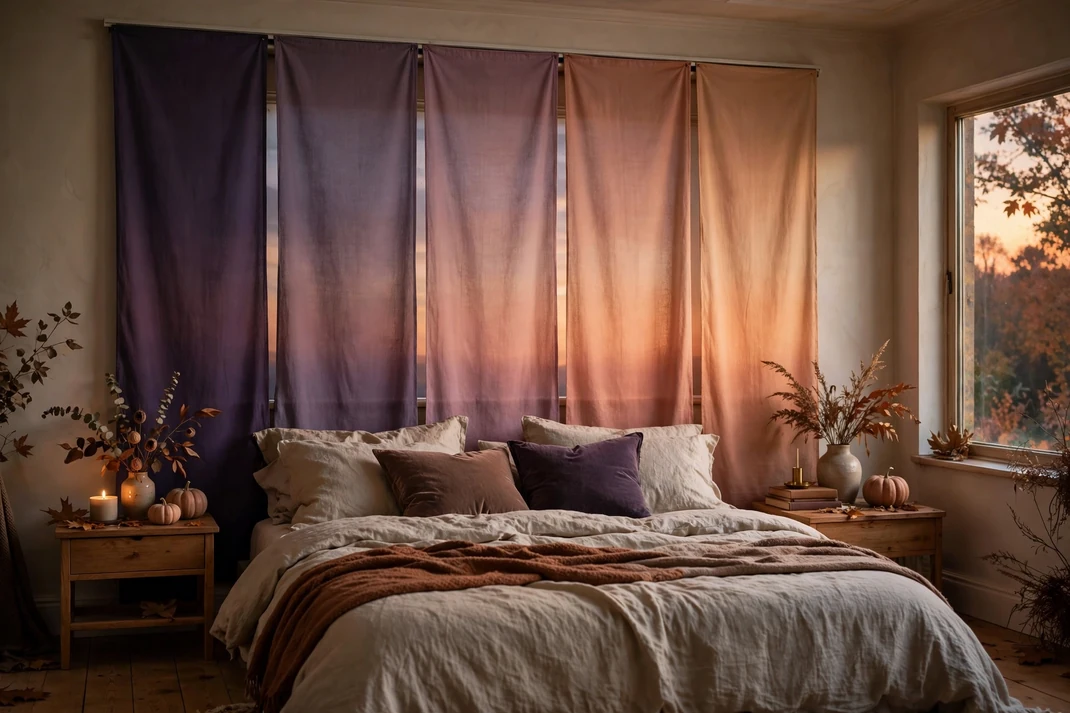
15. Blend Dusky Violet into Candlelit Apricot
Dusky violet and candlelit apricot can meet in a soft gradient rather than a hard color block. A set of tonal textile panels moving from cool purple to warm orange creates the feeling of an October sunset behind the bed. The effect is atmospheric, quiet, and more nuanced than using two solid accent colors.
The Setup:Hang five narrow fabric panels on a concealed track or secure them to a lightweight framed backing: dusky violet, mauve, muted rose, peach-clay, and apricot. Keep each panel equal in width and stop the installation 6 to 10 inches beyond the bed on either side. Use solid oatmeal bedding, walnut nightstands, and warm dimmable lamps so the gradient remains the room’s only major color event.Why It Photographs Well:The gradual transition leads the eye across the bed and produces a naturally cinematic backdrop without printed imagery. Fabric absorbs glare, allowing every step in the gradient to remain visible in both daylight and lamplight. Center the camera on the middle rose panel for a balanced composition, or crop one side for a more editorial asymmetry.Pro Tip:Lay all five fabrics on the floor and photograph them in grayscale before hanging; each panel should change slightly in value as well as hue. If two neighboring colors appear identical in black and white, darken or lighten one so the gradient does not collapse in photos.
The secret to a polished purple-and-orange bedroom is restraint: choose a dominant color, let the second shade appear in one meaningful material or zone, and give both enough neutral space to breathe. Whether the room leans moody, natural, tailored, or modern, the palette will feel more convincing when texture, sheen, and undertone are considered as carefully as the colors themselves.
Bella Hart here, founder and senior editor of StyleGlowly.I love cozy homes on real budgets simple decor ideas, easy DIYs and seasonal touches that make a house feel like yours. I started this site to share the inspiration I always wanted to find. Practical, no fuss inspiration. Learn More!